Smarket in the house (2021)
PT-BR
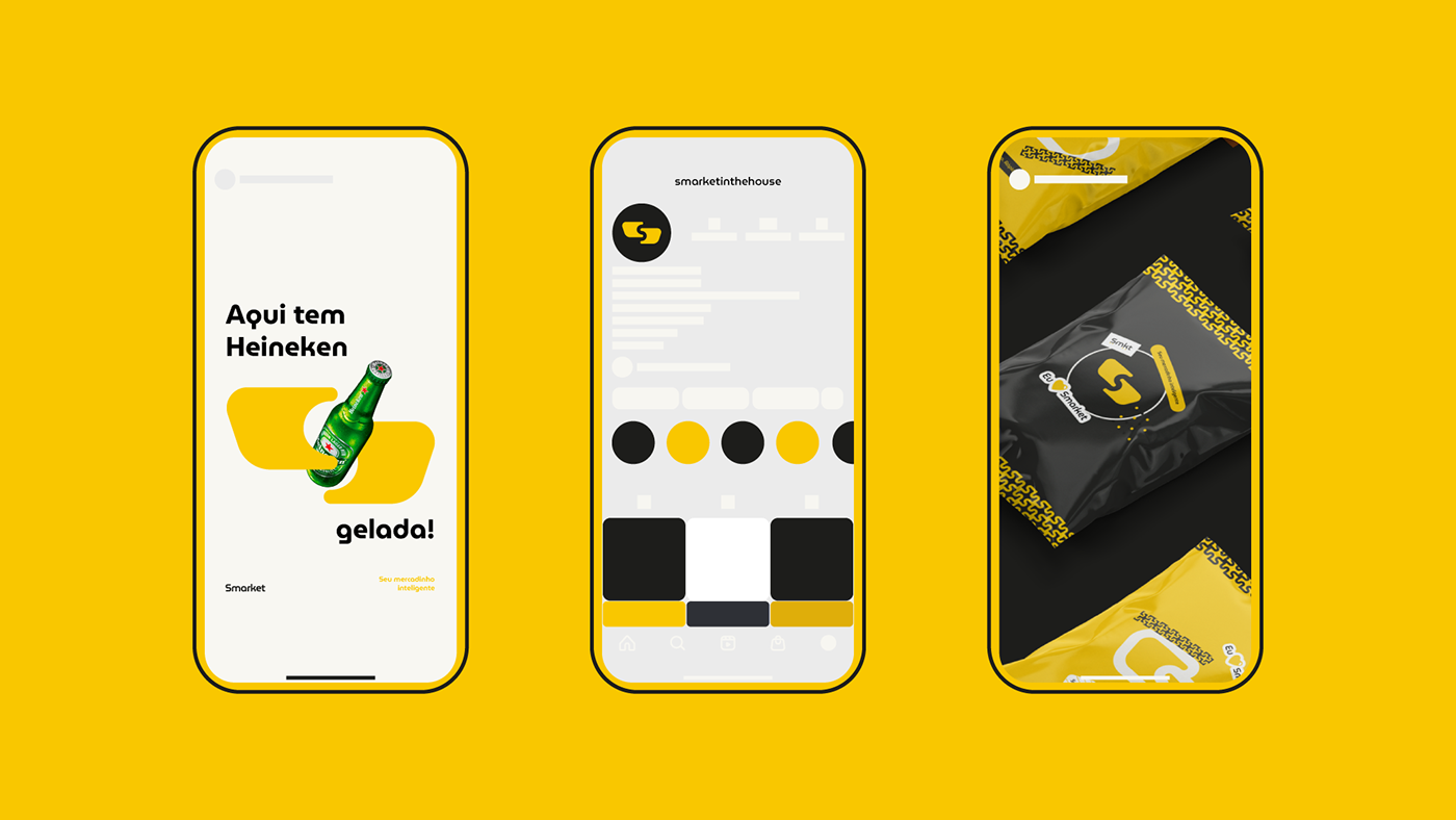
Smarket é um mercadinho inteligente do modelo honest market, que oferece uma variedade de produtos de acordo com a necessidade e preferência dos seus clientes, 24h por dia e 7 dias por semana. Atuará inicialmente em condomínios residenciais e em breve empresariais. É uma empresa nova, formada por jovens, com o intuito de trazer inovação, praticidade, eficiência e comodidade para os condomínios de Fortaleza.
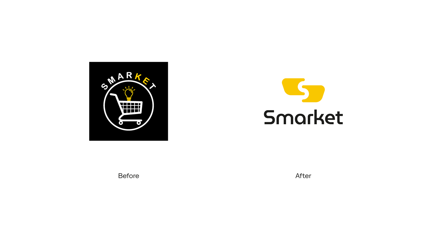
A missão consistia realizar um redesign da marca, enfatizando a ideia do próprio naming, sem fugir muito do que já vinha sendo trabalhado — onde se utilizava no símbolo o carrinho de compras como principal elemento — só que dessa vez de forma mais abstrata e moderna, buscando estabelecer uma identidade visual alegre e criativa, que consiga chamar atenção e ter uma presença forte no mercado.
EN
Smarket is a smart market of the honest market model, which offers a variety of products according to the needs and preferences of its customers, 24 hours a day and 7 days a week. It will initially work in residential condominiums and soon in business. It is a new company, formed by young people, with the aim of bringing innovation, practicality, efficiency and convenience to the condominiums of Fortaleza.
The mission was to carry out a redesign of the brand, emphasizing the idea of the naming itself, without deviating much from what was already being worked on — where the shopping cart was used as the main element in the symbol — only this time in a more abstract and modern way, seeking to establish a cheerful and creative visual identity, which can attract attention and have a strong presence in the market.


PT-BR
A ideia de movimentação e praticidade é causada pelo deslocamento dos carrinhos, utilizando os princípios da gestalt, que acabam formando o S do naming. O resultado é um símbolo simples e moderno de fácil aplicação.
EN
The idea of movement and practicality is caused by the displacement of the carts, using the principles of gestalt, which end up forming the S of naming. The result is a simple and modern symbol that is easy to apply.


PT-BR
No logotipo foi utilizada uma font sem serifa bem elegante, que possui linhas simples e limpas, o que a deixa moderna. Outra mudança foi na uniformidade das cores do naming.
Quanto ao símbolo, foi sugerido não fugir muito da ideia já presente, em representar o carrinho de compras, pois já remete bem a empresa ao nicho de mercadinhos inteligentes.
Também foram mantidas as cores principais: amarelo e preto. O amarelo traz felicidade, atenção e realça bastante com o preto e o cinza, que trazem solidez e modernidade. Além da paleta ser diferente dos seus principais concorrentes locais.
EN
In the logotype, a very elegant sans serif font was used, which has simple and clean lines, which makes it modern. Another change was in the uniformity of the naming colors.
As for the symbol, it was suggested not to stray too far from the idea already present, in representing the shopping cart, as it already refers the company well to the niche of smart markets.
The main colors were also kept: yellow and black. Yellow brings happiness, attention and enhances a lot with black and gray, which bring solidity and modernity. In addition to the palette being different from its main local competitors.