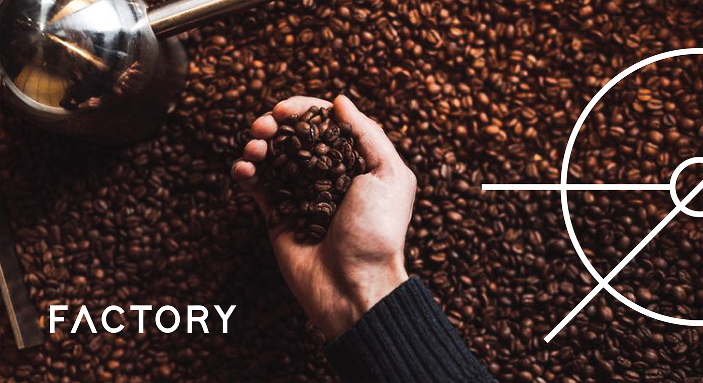
FACTORY / Brand Identity
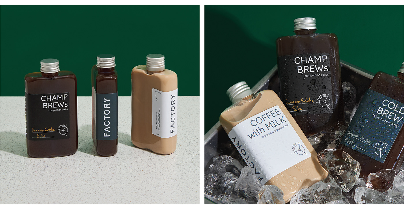
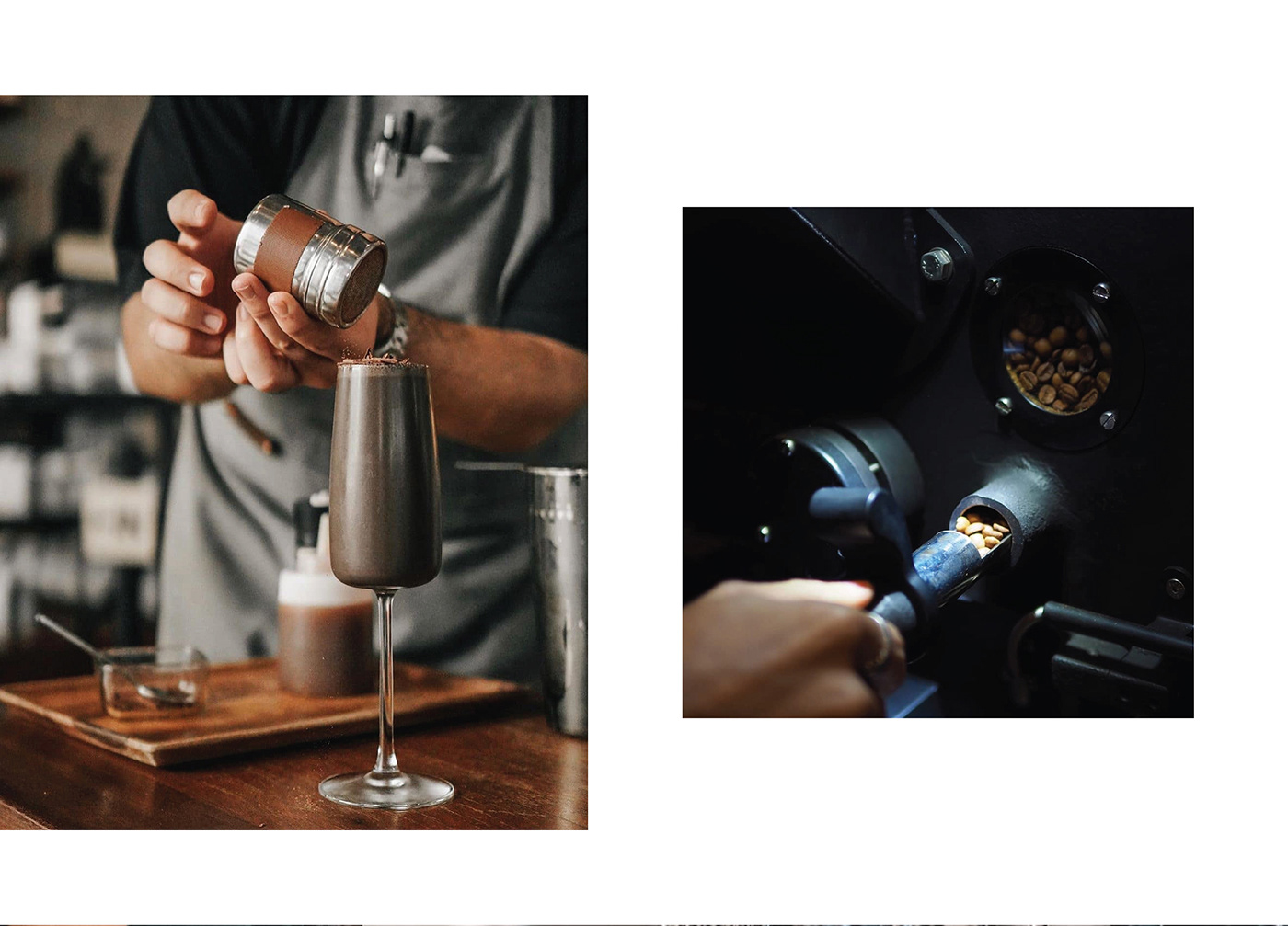
The brand was found by a group of coffee enthusiasts, collaborating with baristas to develop products with farmers, resulting in factory-specific recipe quality coffee beans with the slogan ‘Professional baristas & coffee roaster’
Objectives:
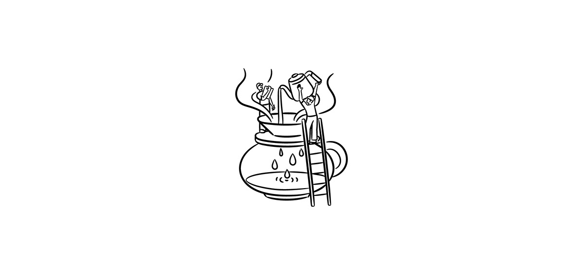
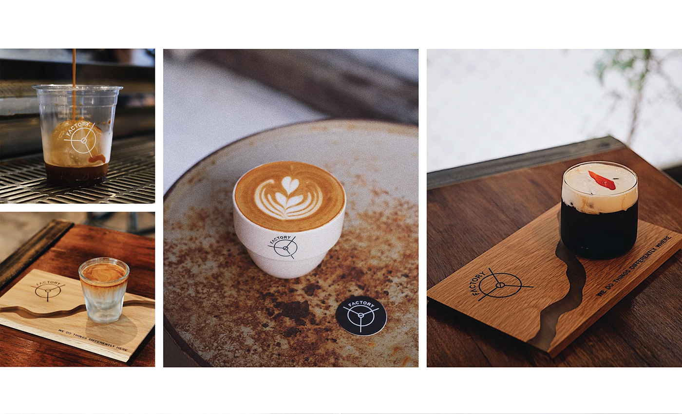
Factory coffee aims to present everyone the production process in the form of a production line, beginning with upstream and ending with downstream. Initially, the cafe section consisted of only a storefront that was integrated into the roasting plant and the barista training section.
Compared to a coffee-making school where every detail and step of the process is covered, including providing complete knowledge to everyone while the Factory coffee grows to meet the world-class standards.
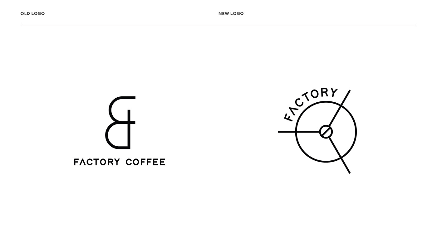
Logo design:
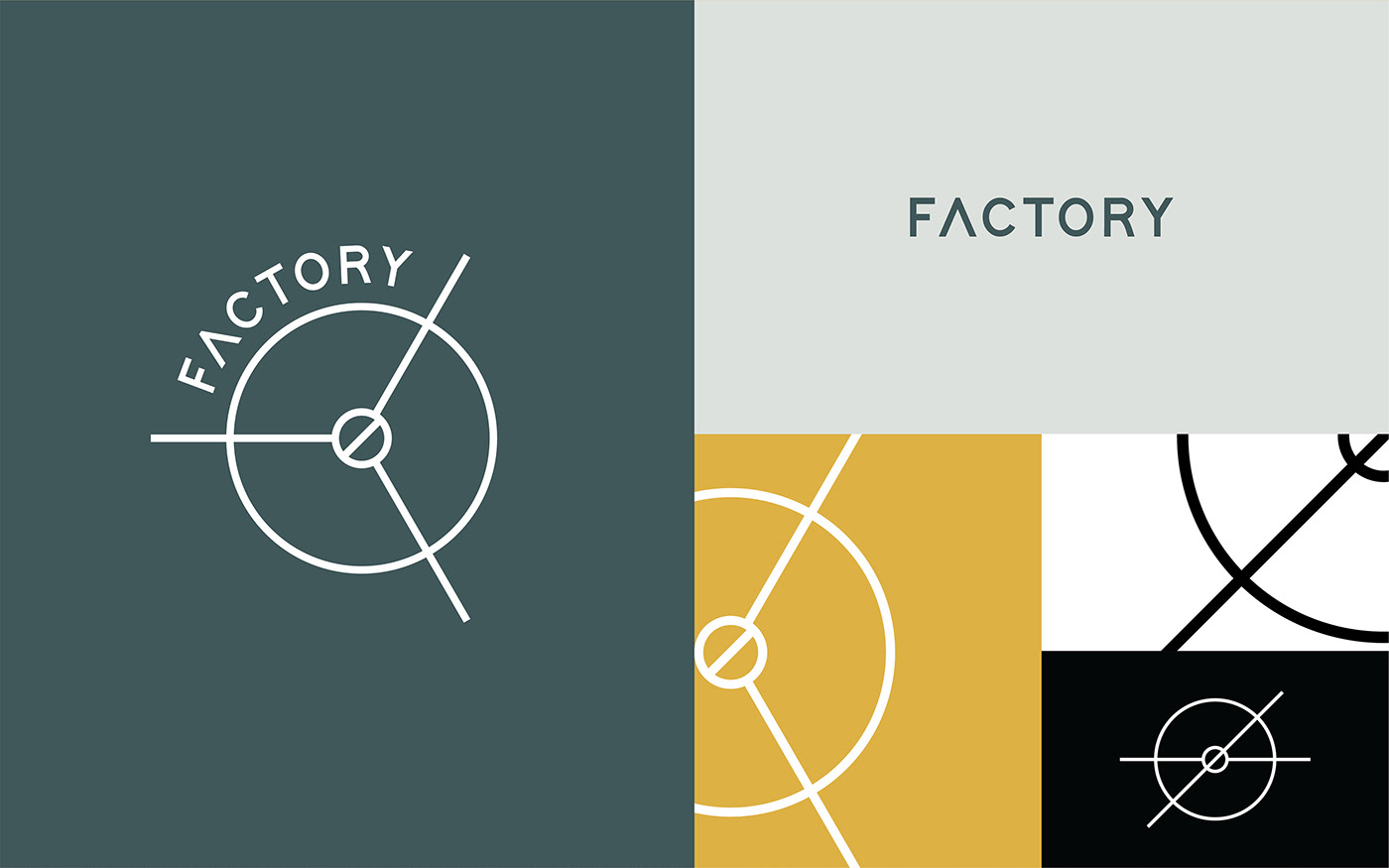
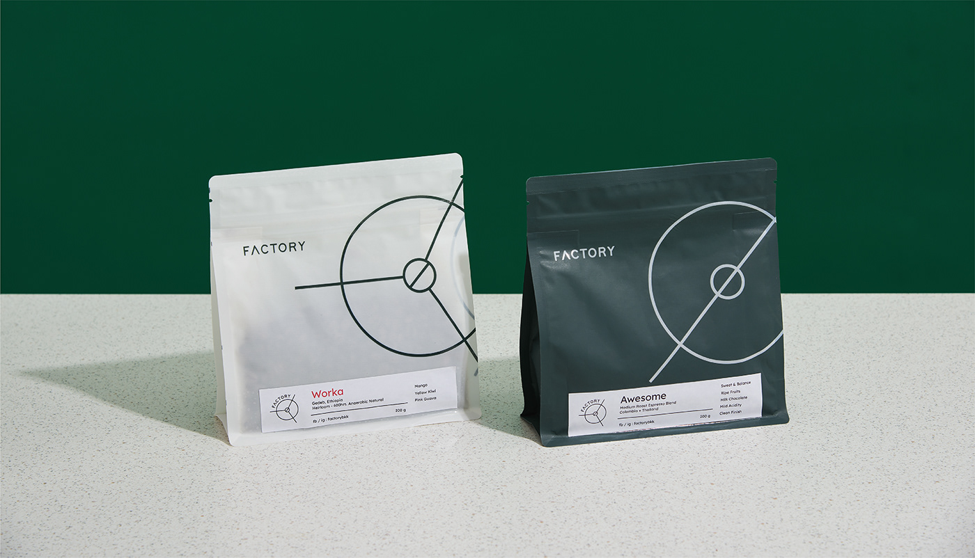
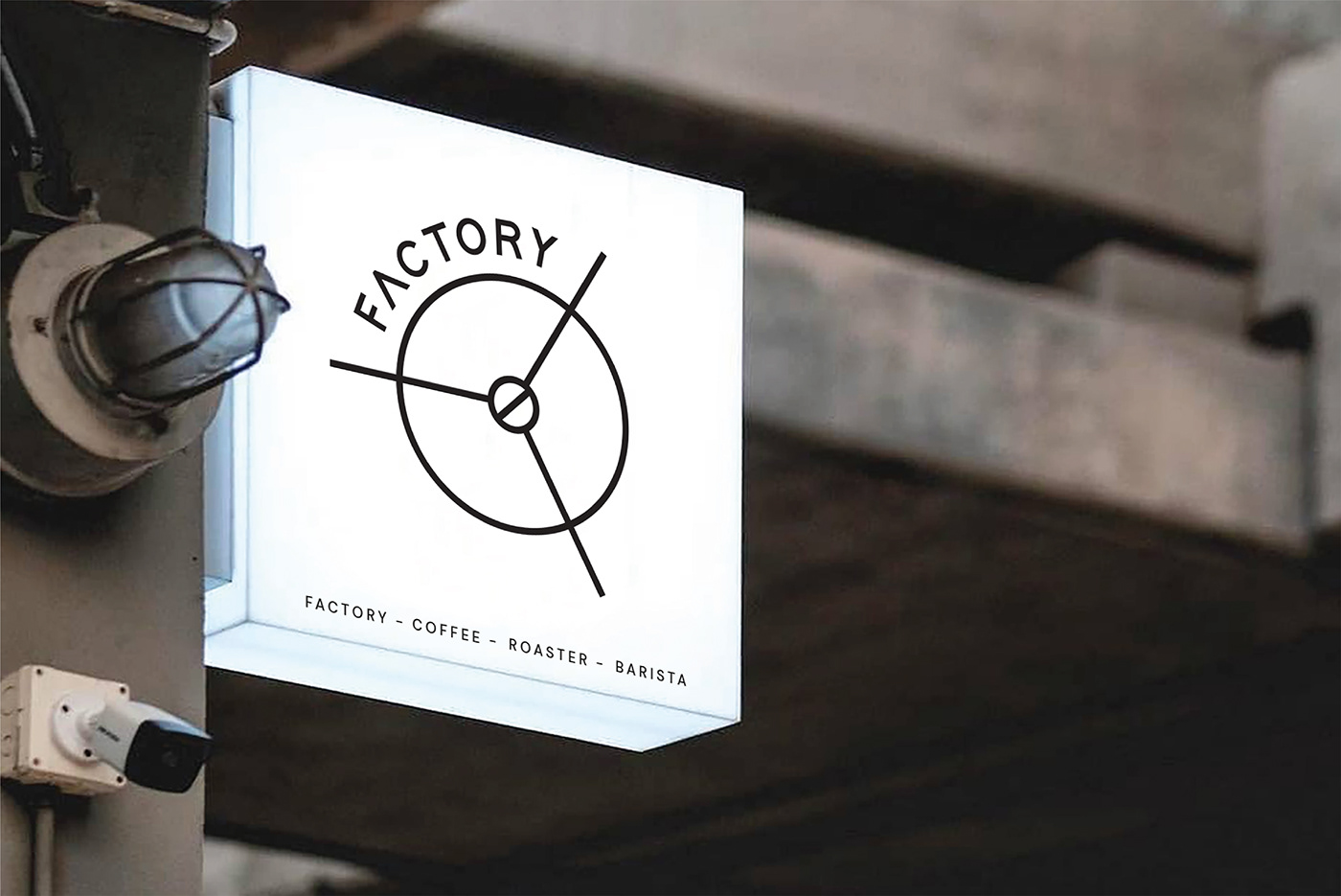
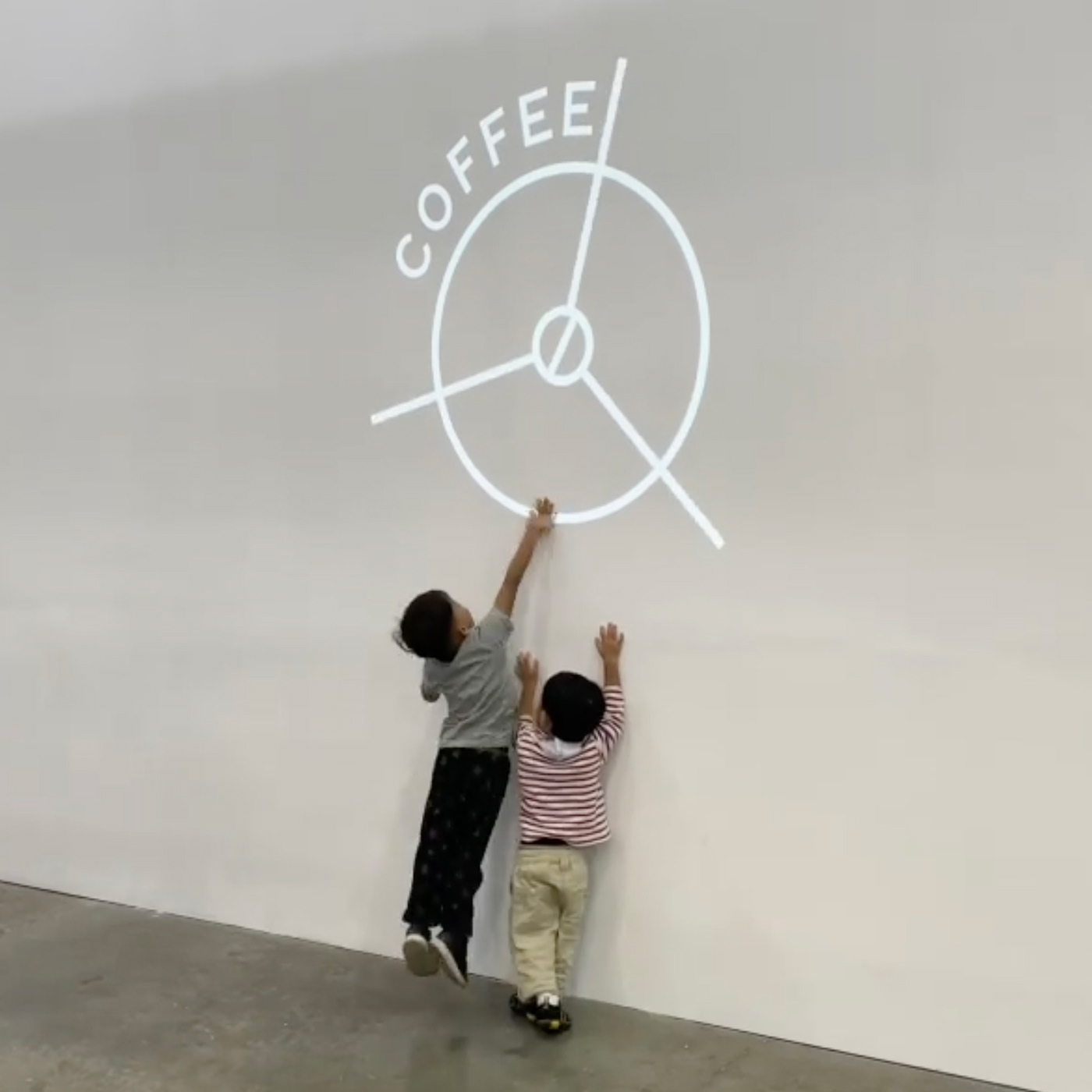
Logo design developed from understanding the process of making coffee and the main purpose that the brand wishes to communicate. The logo is constructed from a coffee roaster, drum and cooling tray that resembles a rotating propeller.
Through the top view, with simple lines reduced to the bare minimum for the most effective communication. The outer circle represents a coffee cup. The three cutting lines represent the manufacturing process. The circle in the center represents the coffee beans, which is its core.
As well as the heart of the shop, the logo is intended to move in a circular motion, with the words coffee - roaster - barista - factory assisting all to communicate at the same time.
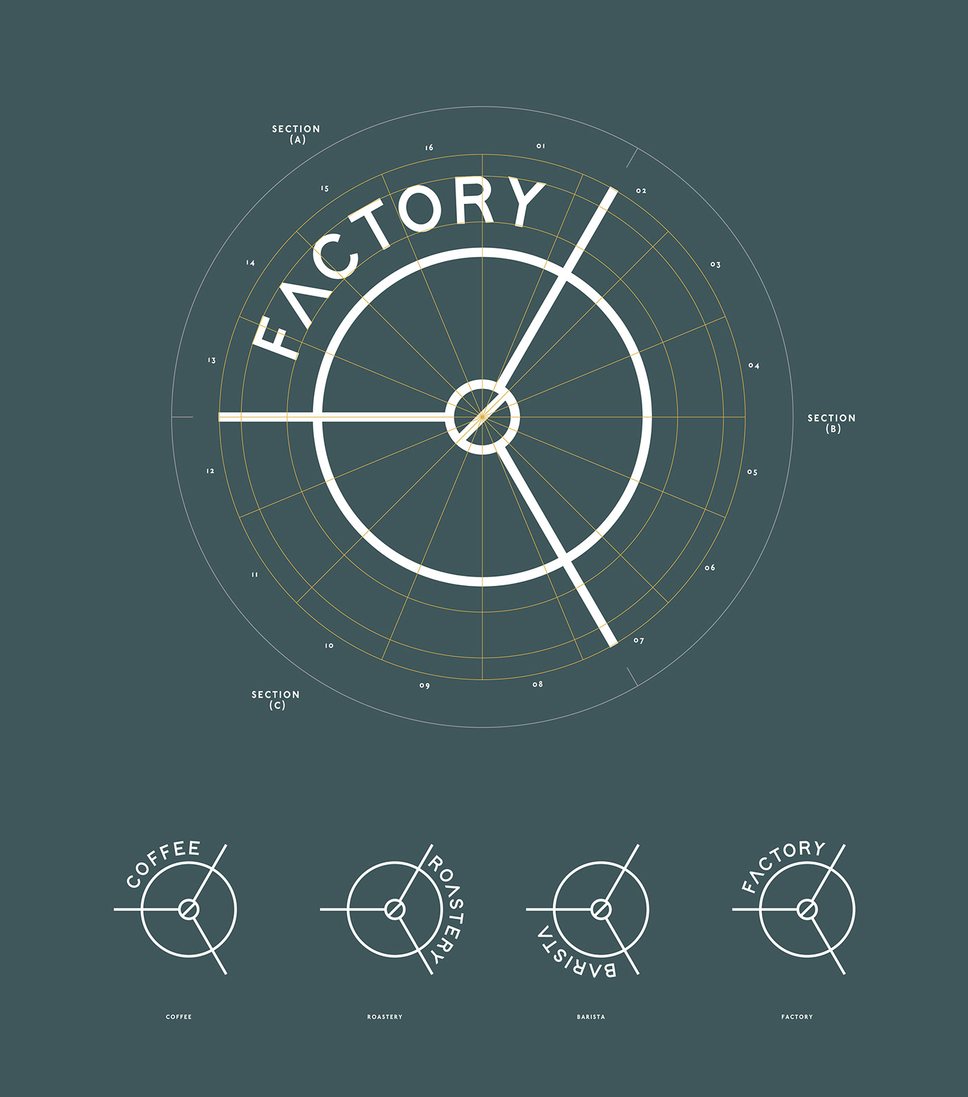
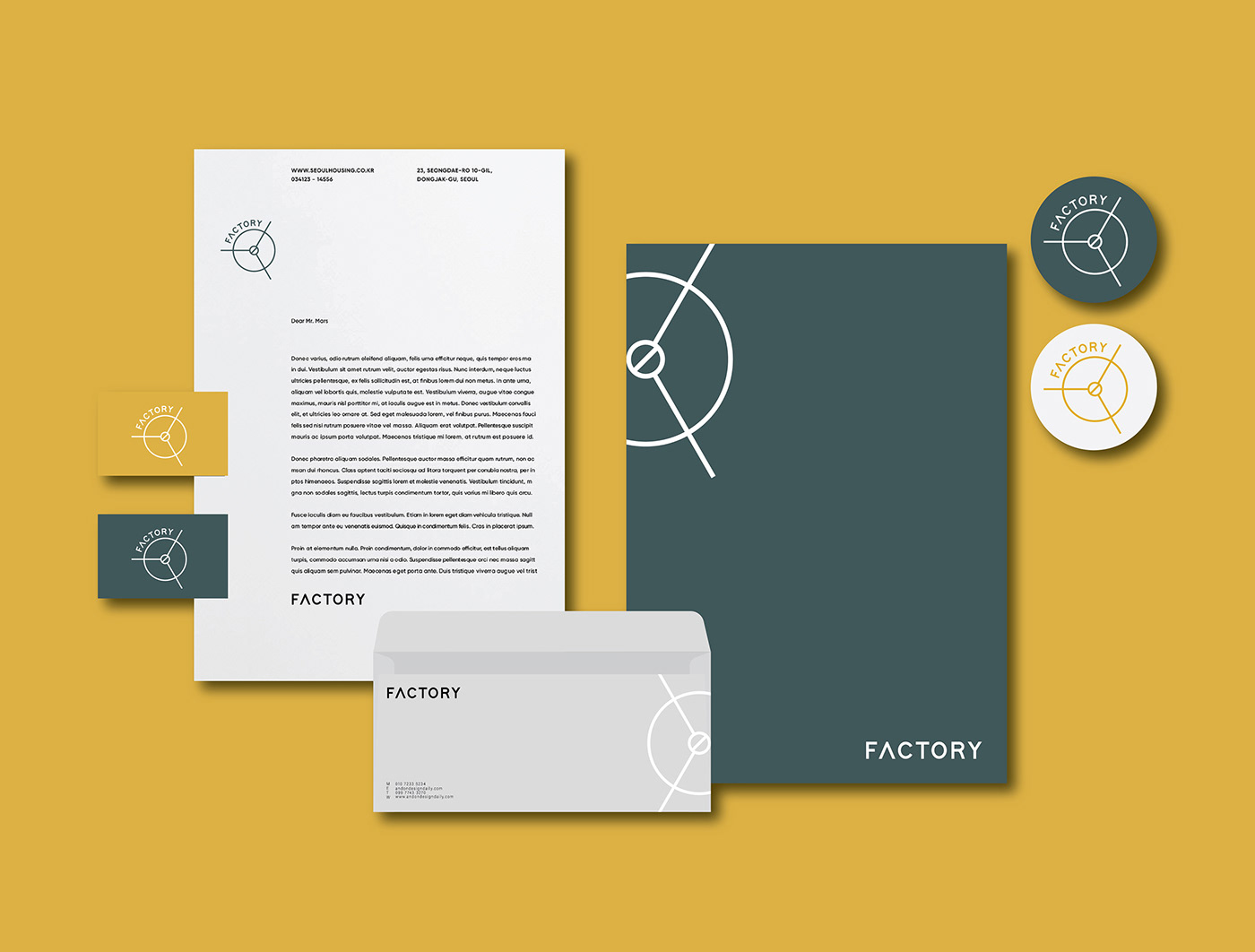
Graphic identity:
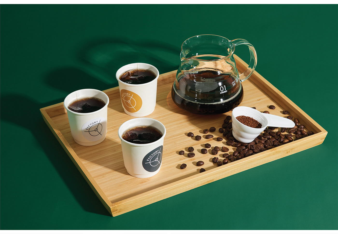
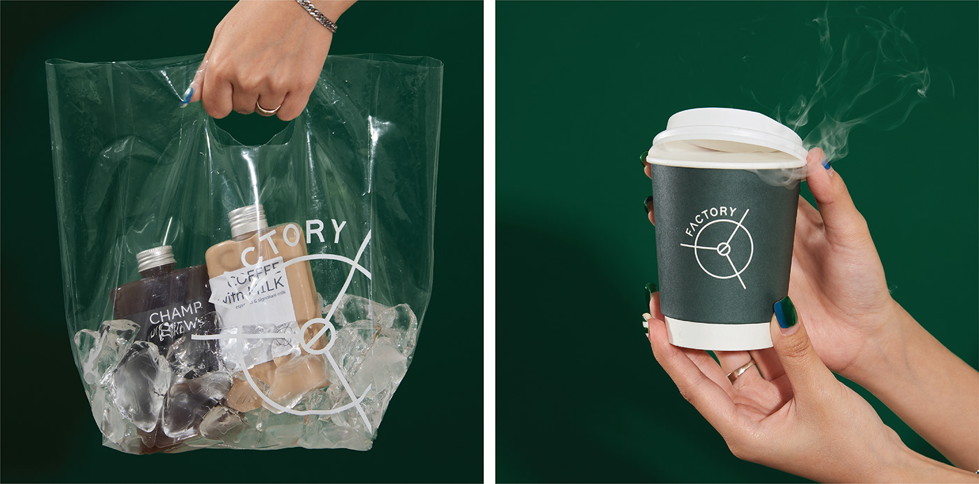
Introducing the visual by cropping and enlarging the logo to present the Factory’s occupied area by using each stroke of the logo movement. Resulting in the brand image system.
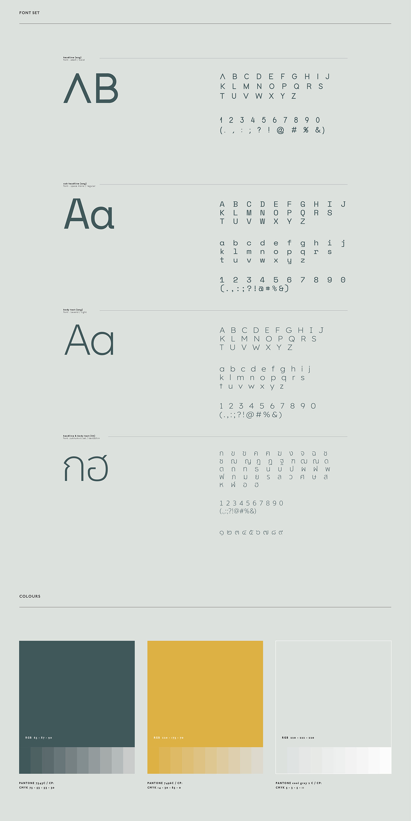
Font & color design:
The brand fonts were chosen to blend in between the modern era-digital age for social media uses and the analogue era created by the machine mechanics to demonstrate the harmonious transition from one era to another while remaining readable for all ages.
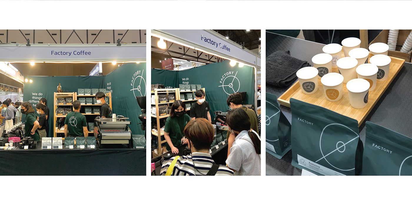
To create a brand image, the brand is designed to use two primary colors, green and yellow.
Green represents a collaborative effort with farmers and yellow represents the manufacturing process.


AGENCY :
Andon Design Daily Co.,Ltd.
CREDIT :
Design Director by Pongtorn Wachirapoka
Designed by Waratchaya Boonket , Nuttavee Jiratthitikan
Motion Graphic by Wannaporn Bangsuanluang
VIA :
https://www.facebook.com/factorybkk
https://www.instagram.com/factorybkk/
Copyright © Andon Design Daily Co.,Ltd. All Rights Reserved.


