

EN
-
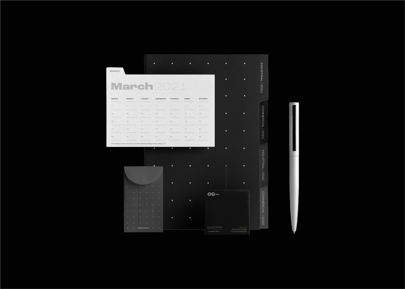
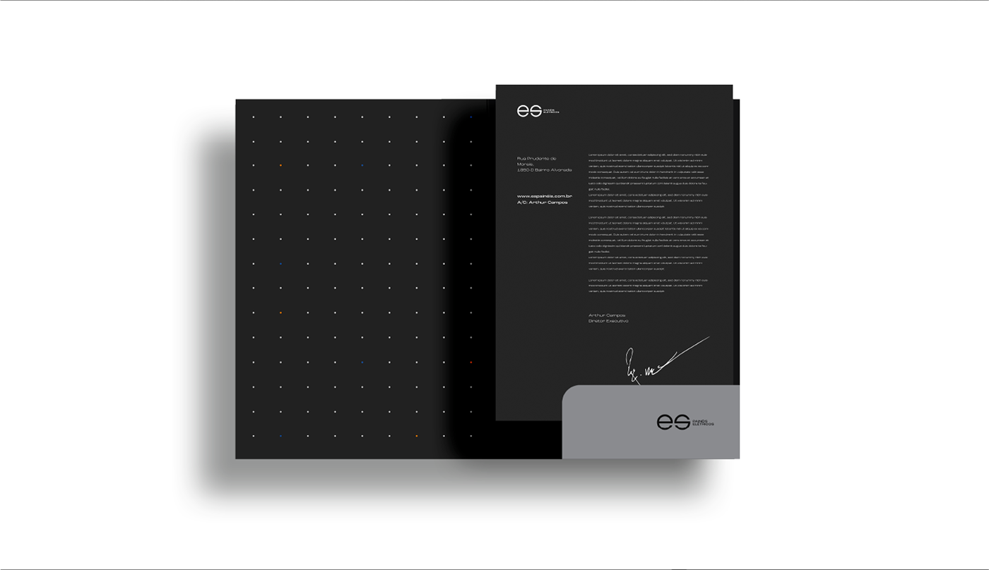
ES is a company specialized in the manufacture of medium and low voltage electrical panels. In 2021, in full expansion, the company decided that it was time to build a solid brand and identity, which represents all the trust that customers place in their work. The challenge was to build a brand that showed the solidity, sobriety and competence of ES. The creation was designed in an identity capable of dialoguing with the client. The result was applied to all stationery and uniforms, showing a strong brand and identity that is easy to assimilate, bringing exclusivity to the company.
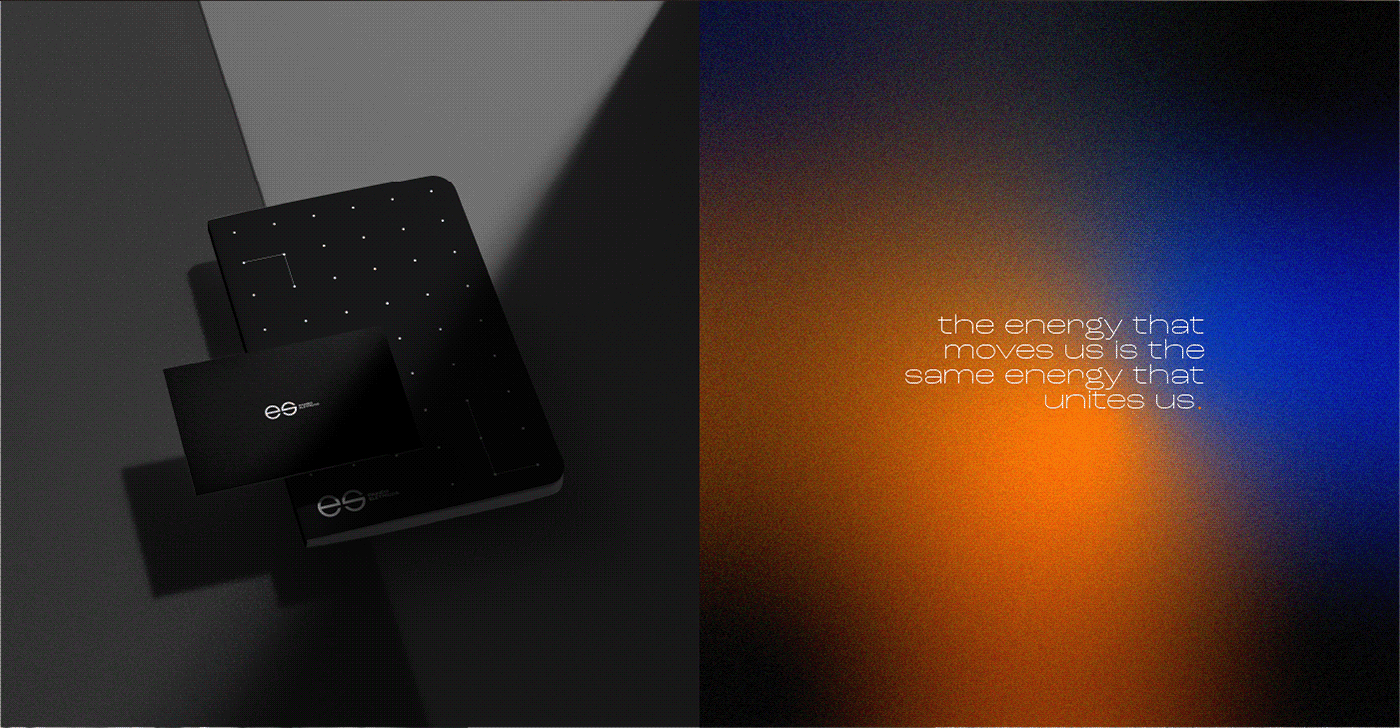
The brand and identity creation project started with the study of the fantasy name, formed from the letters E and S. With the name and research of references, the creation of a brand and identity began to come to life. For the symbol, the simple form and the ES naming were used, with the support of Electric Panels. Our path was minimalism that had elegance and relevance.
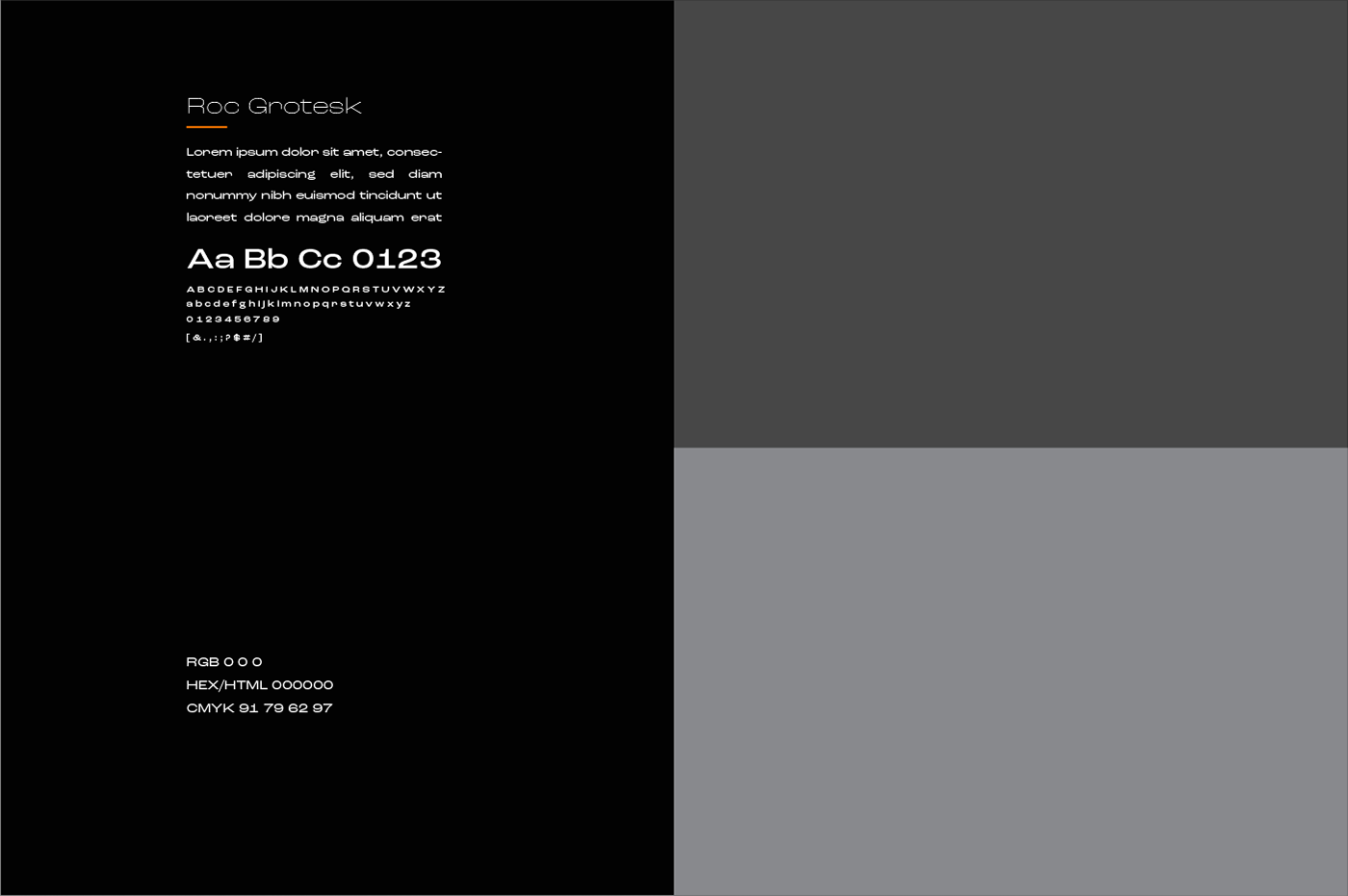
The typography developed was created following the premises designed for the company's communication: solidity, sobriety and competence. The sober and solid black, white and gray colors were chosen because they are directly part of the universe in which the company operates: the production of electrical panels.


Projeto desenvolvido por Dair Pazzini | Chapecó - Brasil | ITSME


