Branding___ 2021
Antithetica ©
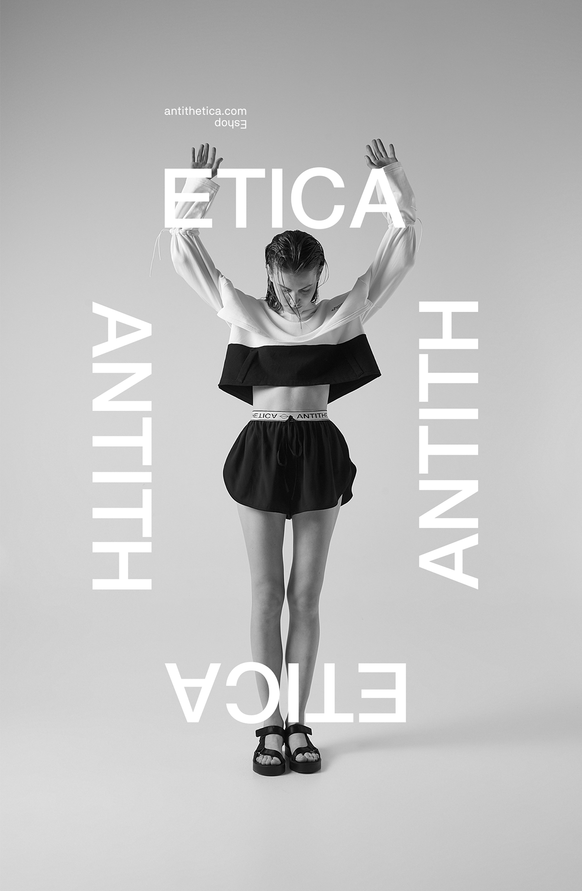
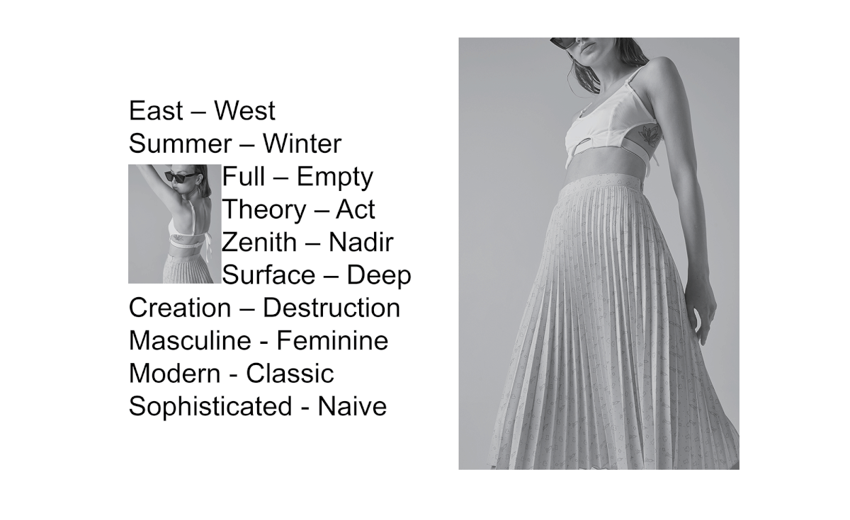
A complementary antithesis
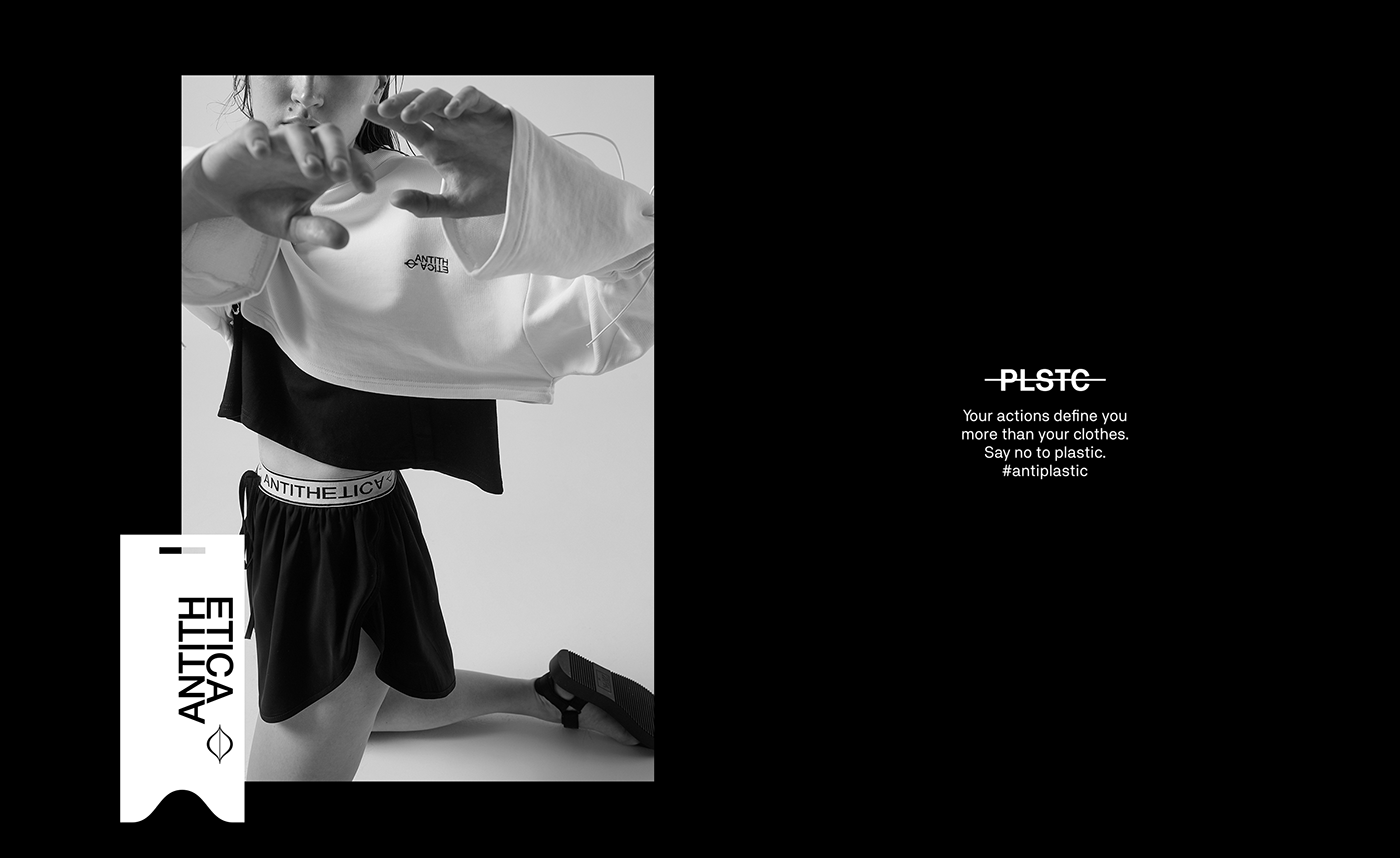
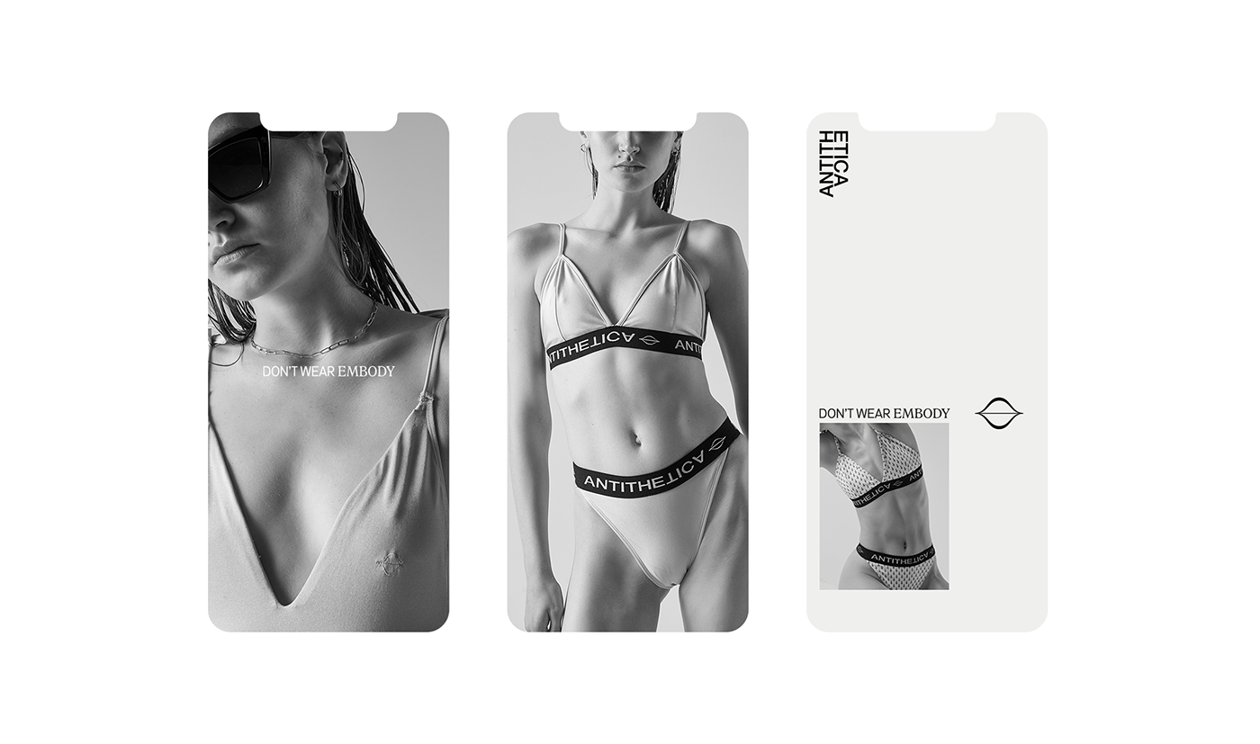
A fashion brand, using ethical materials to produce limited editions, approached us in order to design its visual identity and develop its naming. Its clothing line is defined by the symbiosis of diverse materials, shapes and textures.
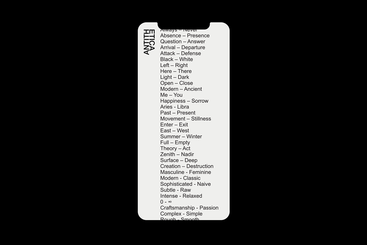
Diving into linguistics and literature, we came up with the name Antithetica that draws inspiration from the term “antithetical pairs” that describe the state or creation of opposition.
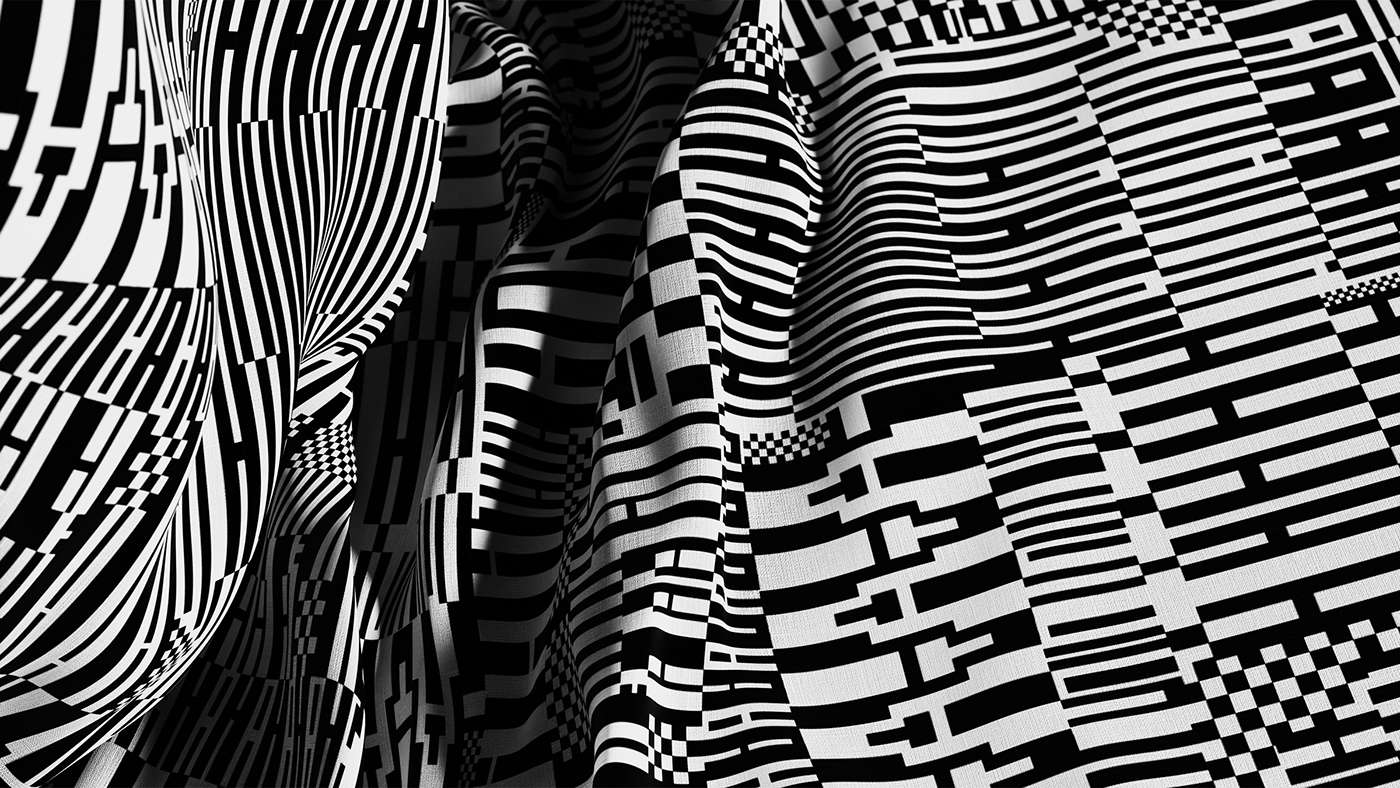
The dominant black & white colors for the visual identity were a no-brainer choice, as they stand as the primordial palette of antithesis. Moreover, we designed the brand’s signature pattern, which was also used in the collection line-up presented.
Athens _______ Greece