
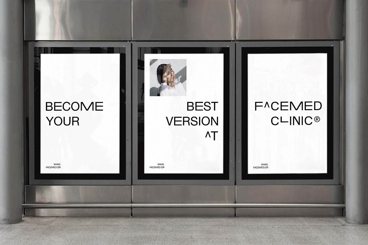
Facemed - The best version of yourself
Client:
Facemed Clinic
Deliverables:
Brand Strategy, Brand Design, Brand Guidelines
Industry:
Medical Clinic
Location:
Athens, Greece
Year:
2021
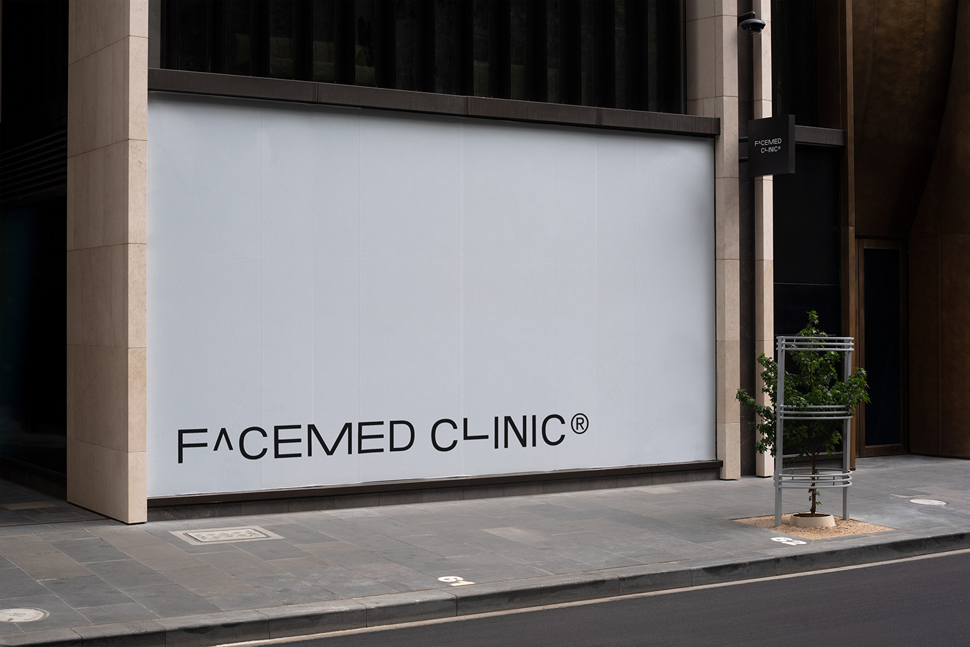
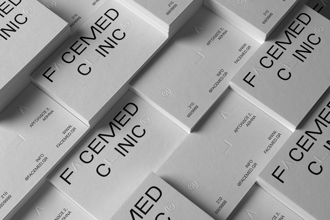
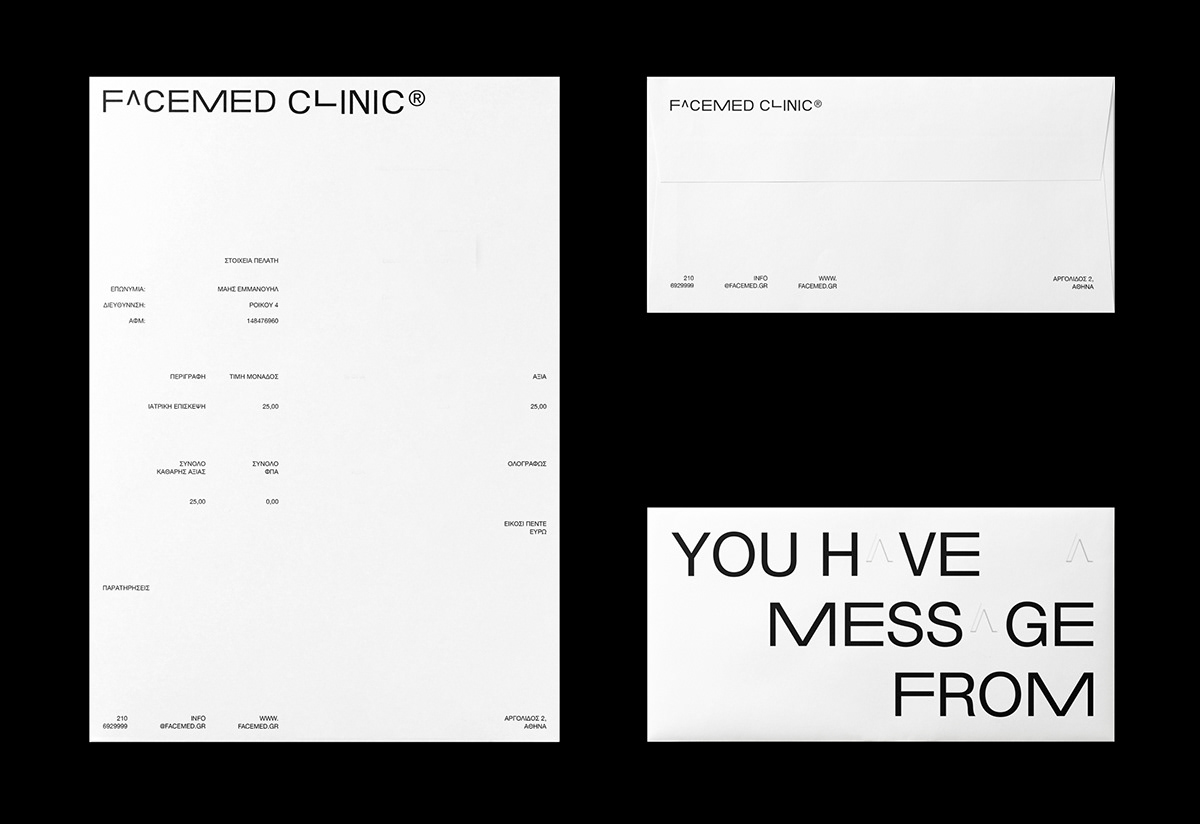
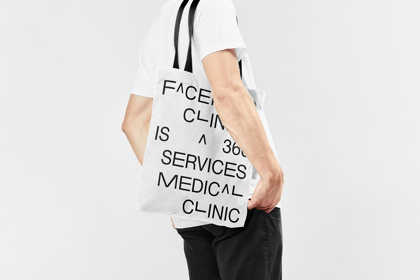
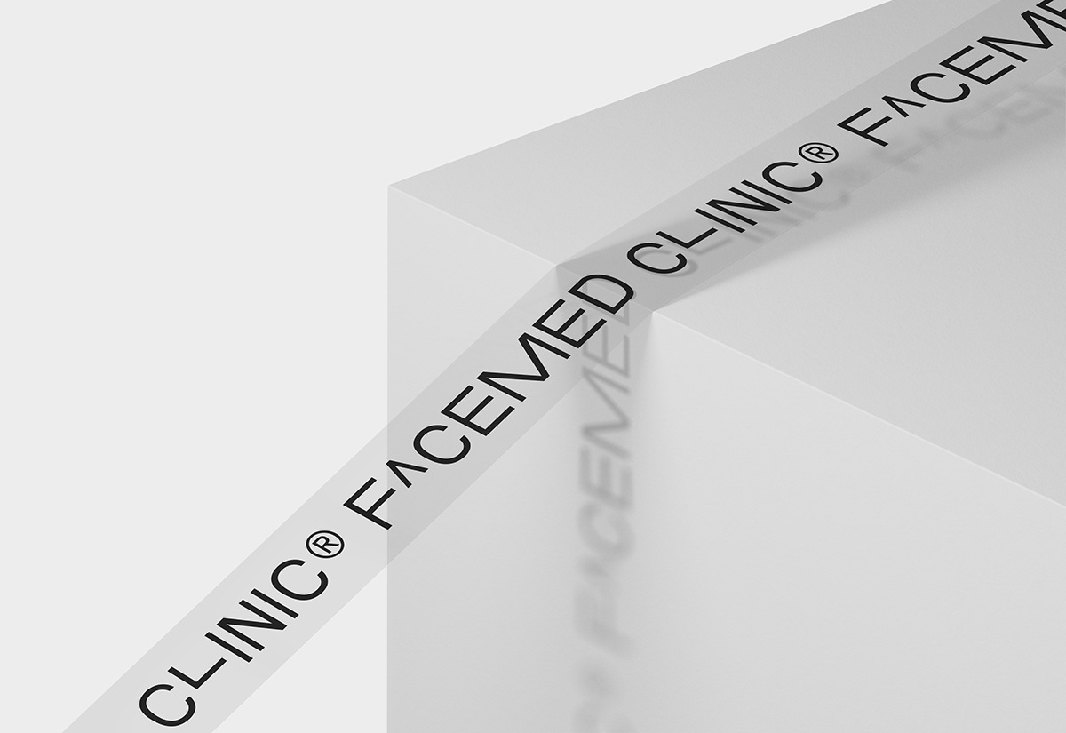
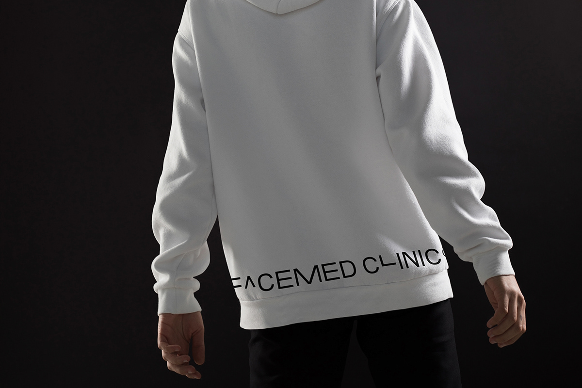
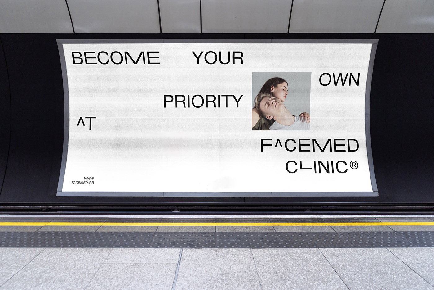
Facemed's logotype design reflects a timeless typographic aesthetic.
Through the typographic composition of the logo, one can distinguish the differentiation of the symbols A and L which occupy a special role for the applications but also the values that characterize the brand in its entirety.
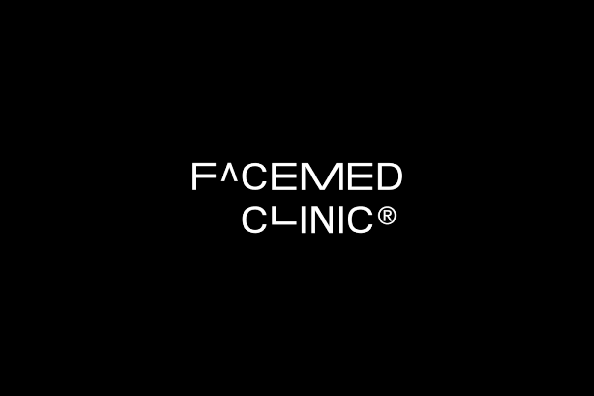
The letter A has the meaning of an arrow that emphasizes upwards and indicates the motivational character of the clinic and the basic goal of the brand, where it is to help each person to know the best version of himself.
The letter L, which in its form forms an imaginary angle, symbolizes the cutting-edge technology used in every technological means of the clinic.
Both symbols together are designed in such a way that they have the meaning of the mathematical exponent, a feature that gives the technological and scientific style in which Facemed wants to project.

© 2021 Haritos Co. All rights reserved.