Morag Myerscough Publication Design

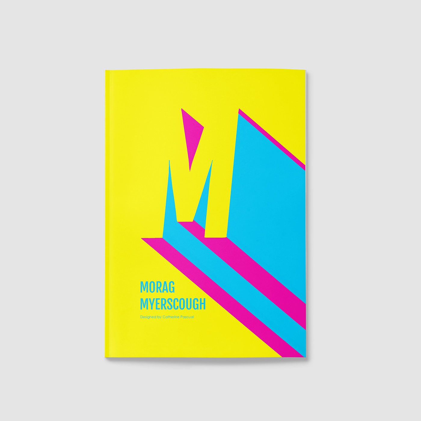
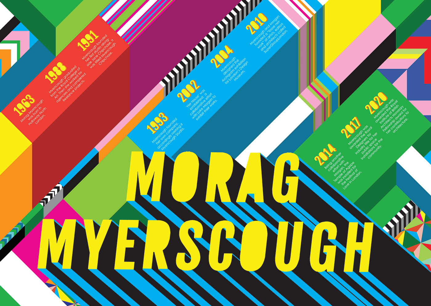
Illustrator was the main program used since most of Myerscough’s work involve solid colours and sharp shapes. Therefore, the vectors in Illustrator would achieve a cleaner finish. The most complex part of this process was the main title, 'Morag Myerscough’. After many tutorials and lots of experimenting, I found that turning the letters into an outline, then playing around with the 3D effect and bevel tool achieved this eye-catching typography.
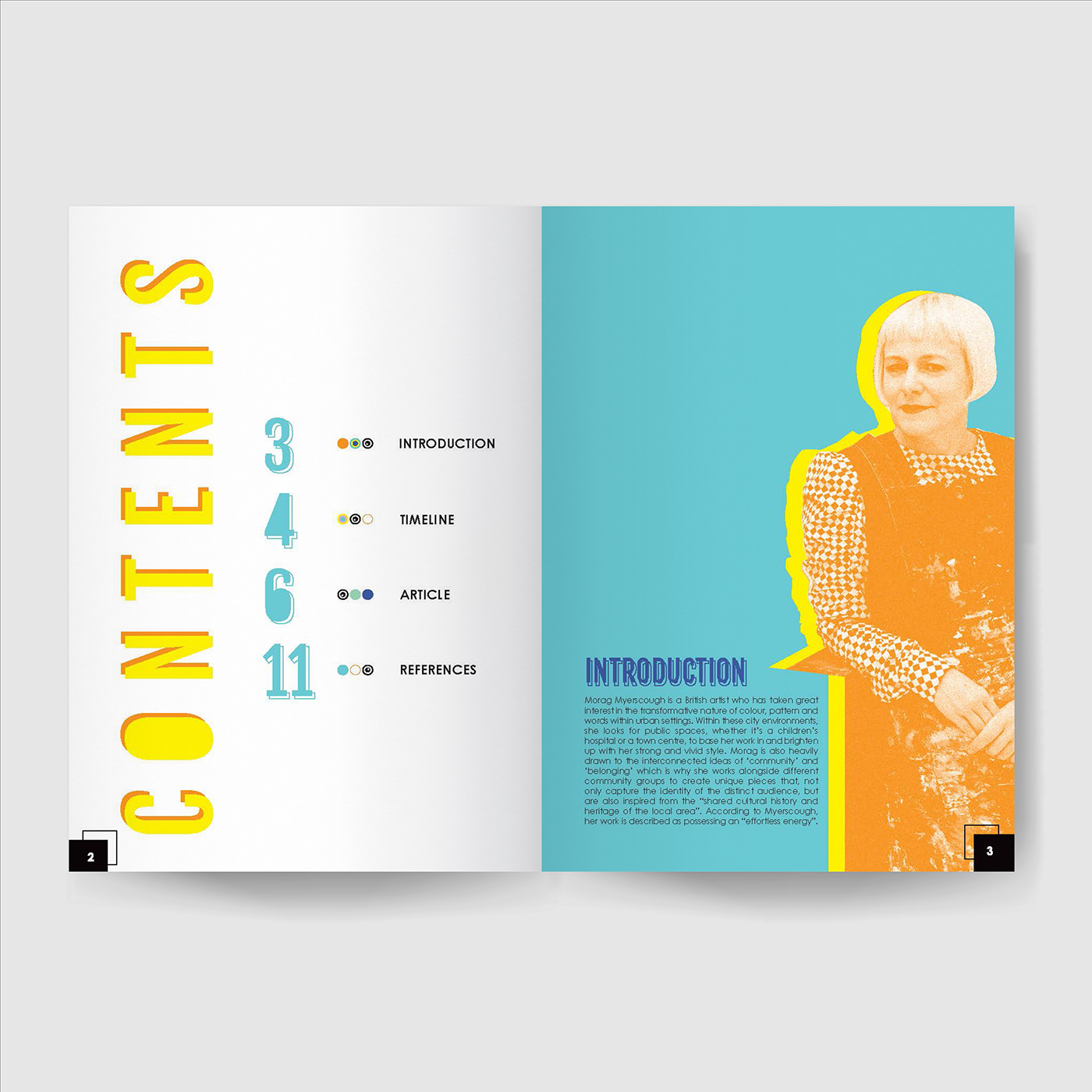
Building upon the previous project, we then had to create a publication that also celebrated the designers’ work and life. This part of the brief was a lot easier since I spent the first half learning Myerscough’s visual language and so I was lot more confident in my formatting and colour choice. The overall experience increased my appreciation for her art style and it was something I want to continue exploring in the future.
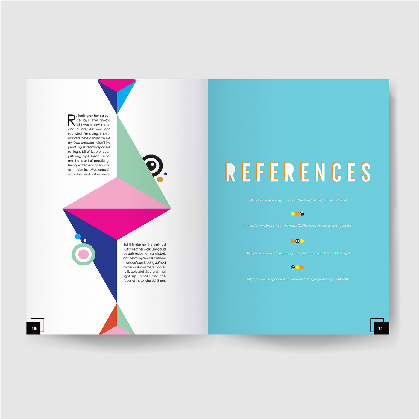
The vector designs were made on Illustrator, then placed into an Indesign document. Grid systems were used to inform elements’ positions and a constant reference to Myerscough’s work were essential for an accurate representation.