Development Process
I’m first started to digitise the mark with black and white to see the silhouette and shape of the combination aspect to determine which could develop further and combine with type.
After I select the mark, I experiment with combining the mark and type. I experiment with Configuration, Proportion, Configuration, Casing and spacing again to see which could be best to adapt with the circular shape mark. I decided to should the mark that adapted the Configuration. I arrange the type on the left-hand side, and I can see the relationship between the palm tree and the word “Byron.” I think there is a reflection of the shelter from the palm tree on the letter N, just like mimicking when we sit under the tree on the beach.


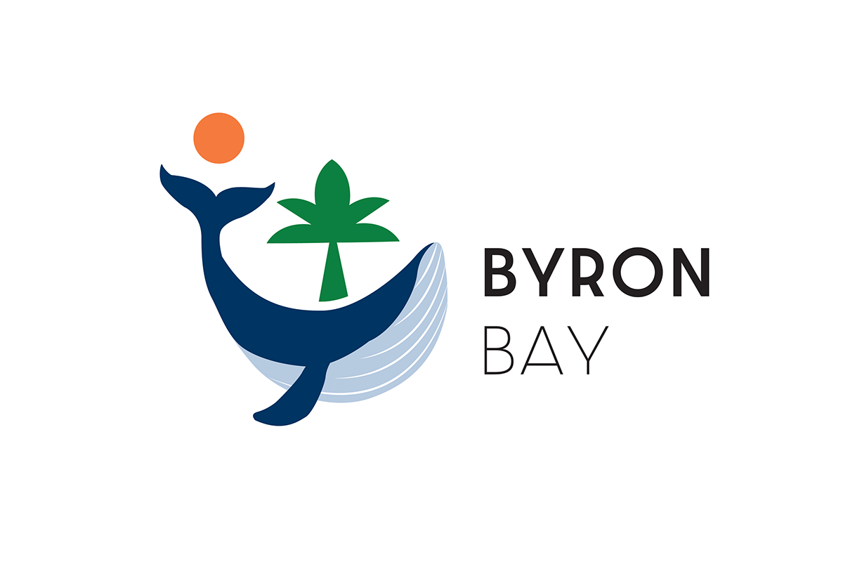
Final Mark
The tree in the middle of the whale gives a sense of A whale spouting water as well, as it could give a hint of the Lighthouse. The position of the sun also reflects the time of sunset.
For the final mark, I recreate the line on the whale belly as the previous version is too small and difficult to see. I implemented the gestalt principle with the gradient line on the whale belly creates Continuity on the mark.