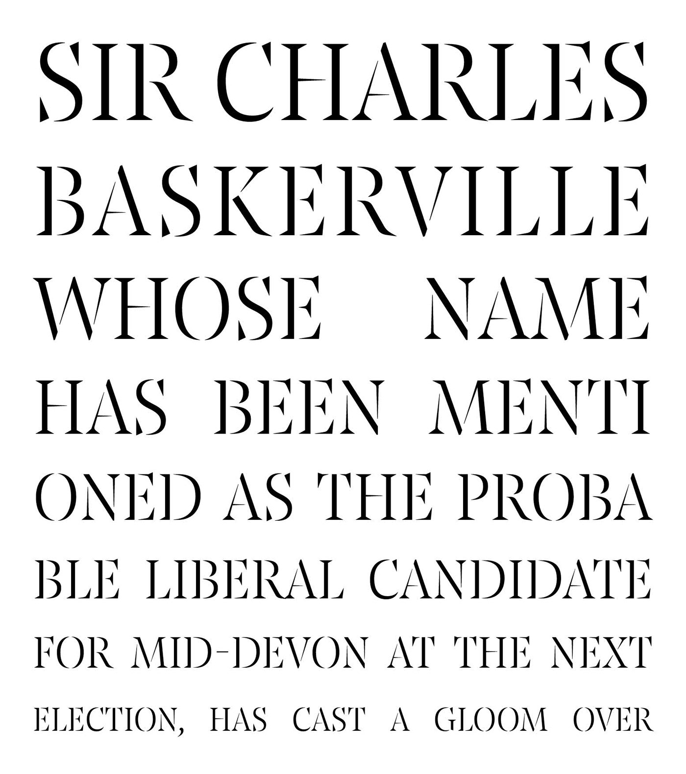
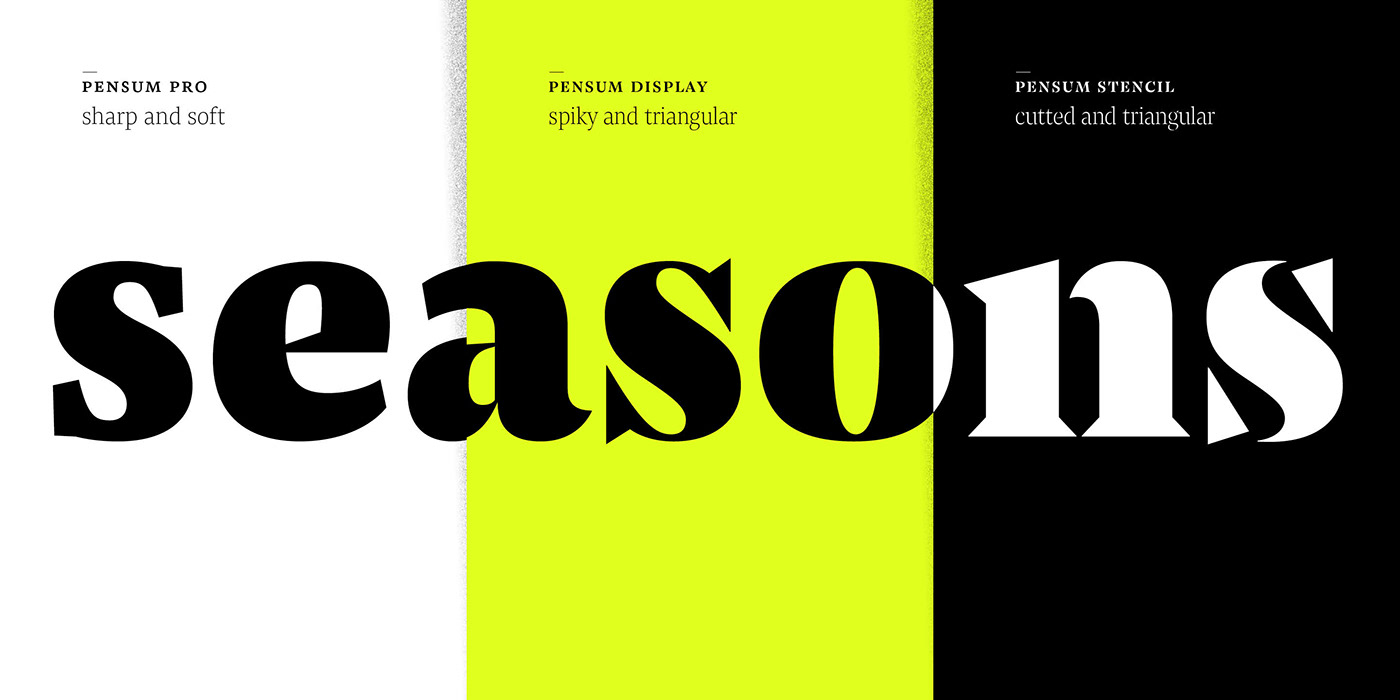
Pensum Stencil exaggerates. Inspired by Pensum Display, it turns up the contrast: breaking letters into individual shapes to create a fusion of brushy elements and spiky details. A high contrast design, Pensum Stencil brings expression to editorial headlines, confident branding, artisanal packaging or anywhere that its sharp stencil cuts can work their magic.
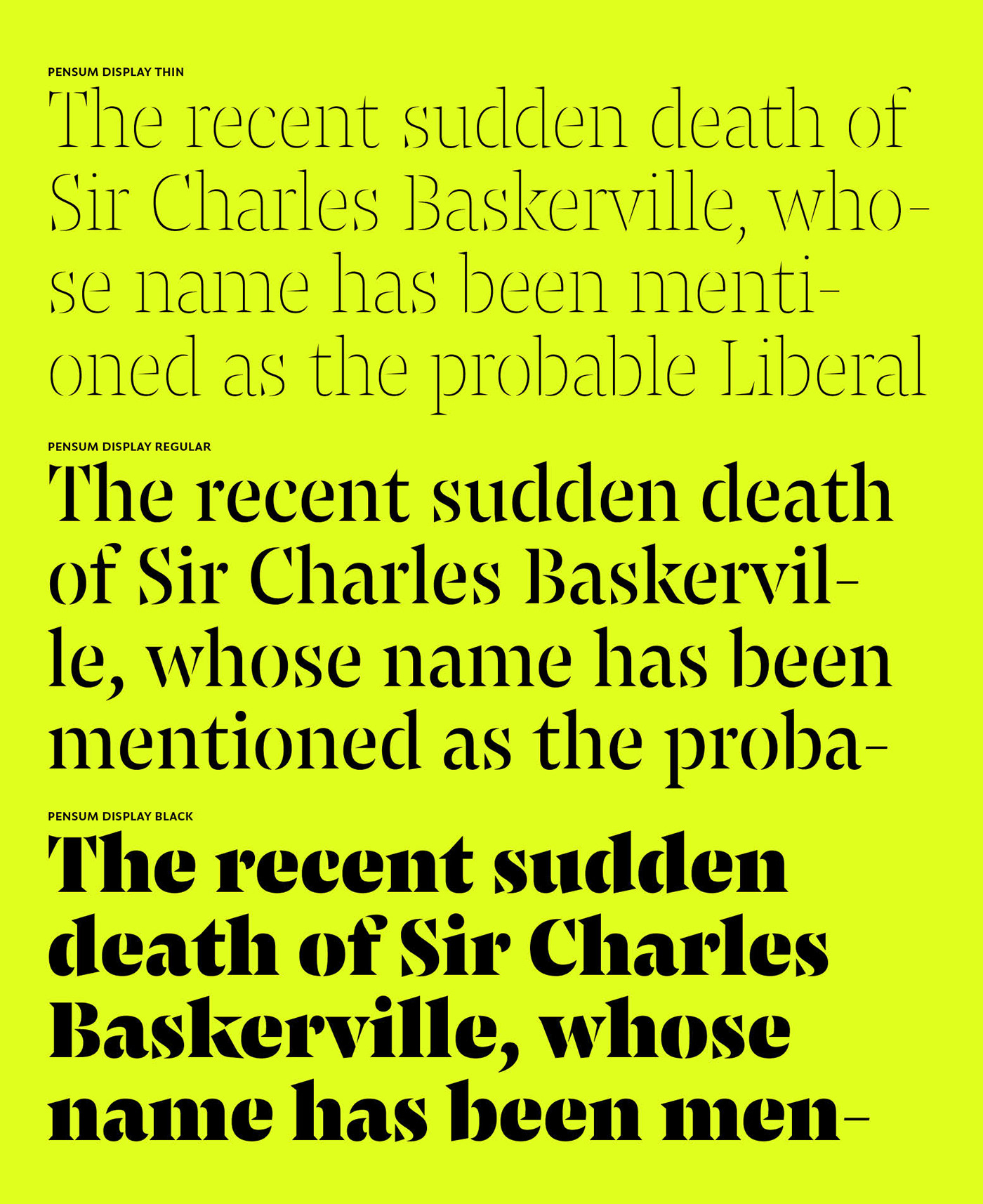
From an almost hairline Thin to a striking, elemental Black, Pensum Stencil’s nine weights offer a broad spectrum of expression and embody a sophisticated, elegant look and feel. As Pensum Stencil’s weight darkens, its accents and some punctuation stay a little lighter—a delicate detail that accentuates its character in the boldest weights.