Decoding the brief
● Defining an easy way to use the marketplace
● A strategy for users who are non-tech savvy
● A solution that covers a wider user or market range
● A simple and easy way to use app for shopkeepers and end-users
User Research
I conducted interviews and created empathy maps to understand the users I’m designing for and their needs. A primary user group identified through research was vendors to get a better understanding of their day to day tasks and what type of application they currently use to manage their clients. I found that there was actually a demand for better CRM applications for vendors to manage their customers and perform their daily tasks all in one place, like creating invoices and managing orders.
Pain Points
● Business contraction due to pandemic
● A decline in the daily sales
● Hard to sustain business
● Lesser customer reach
User Persona
During the COVID-19 Pandemic, shop owner M.Bilal is facing huge losses because the customers are unable to reach his shop physically. To cater to a massive number of users placed in the same situation, there is a need to create an online and easy to access marketplace where the customers can connect with a shopkeeper and get items delivered to their homes.
Vendor's Biggest Challenges
● Multitasking for most of the time while working
● Doesn’t have time to use complex applications
● Non-tech savvy
● Short attention span

Proposed Solution
The user persona suggests that if we envision this problem in the light of user experience; using a simple and clean design would be the best practice, keeping the cognitive load to a minimum which the client will be bearing in accordance with his nature of the job.
The design has to be kept spacious and user-friendly because the client wouldn’t be having the time to care about the unnecessary details due to the busy schedule. More pictorial options must be used in case the user can’t comprehend the text. The font has to be selected considering the legibility and informality.
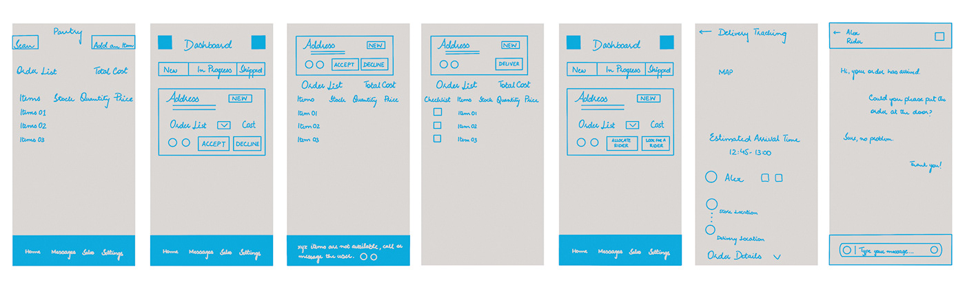
User Flow
User flow helped in mapping out each and every step the “Vendor” will be taking; from the accept an order entry point right through to the order’s final destination. Below is a visual representation made digitally, one of the many avenues that can be taken when using this app. It gives you an idea of the sitemap (formed hierarchy), the way pages are prioritised and linked with each other.

Design Strategy For This Exercise
Design Principles
● Legibility of the font
● Color contrast
● Emphasis | Stand out
● Proportions
● Balance
● Hierarchy | The importance of elements within a design
4/8-Point System
● More granularity
● Better typography
● Multiples of 4
● Breaking the grid
● 4-Point Grid gives more flexibility on smaller devices
The Box Model
● Border
● Padding
● Margin
Cognitive Load
As a UX designer, a common goal when designing interfaces was to keep users’ cognitive load to a minimum.
Wireframe Design
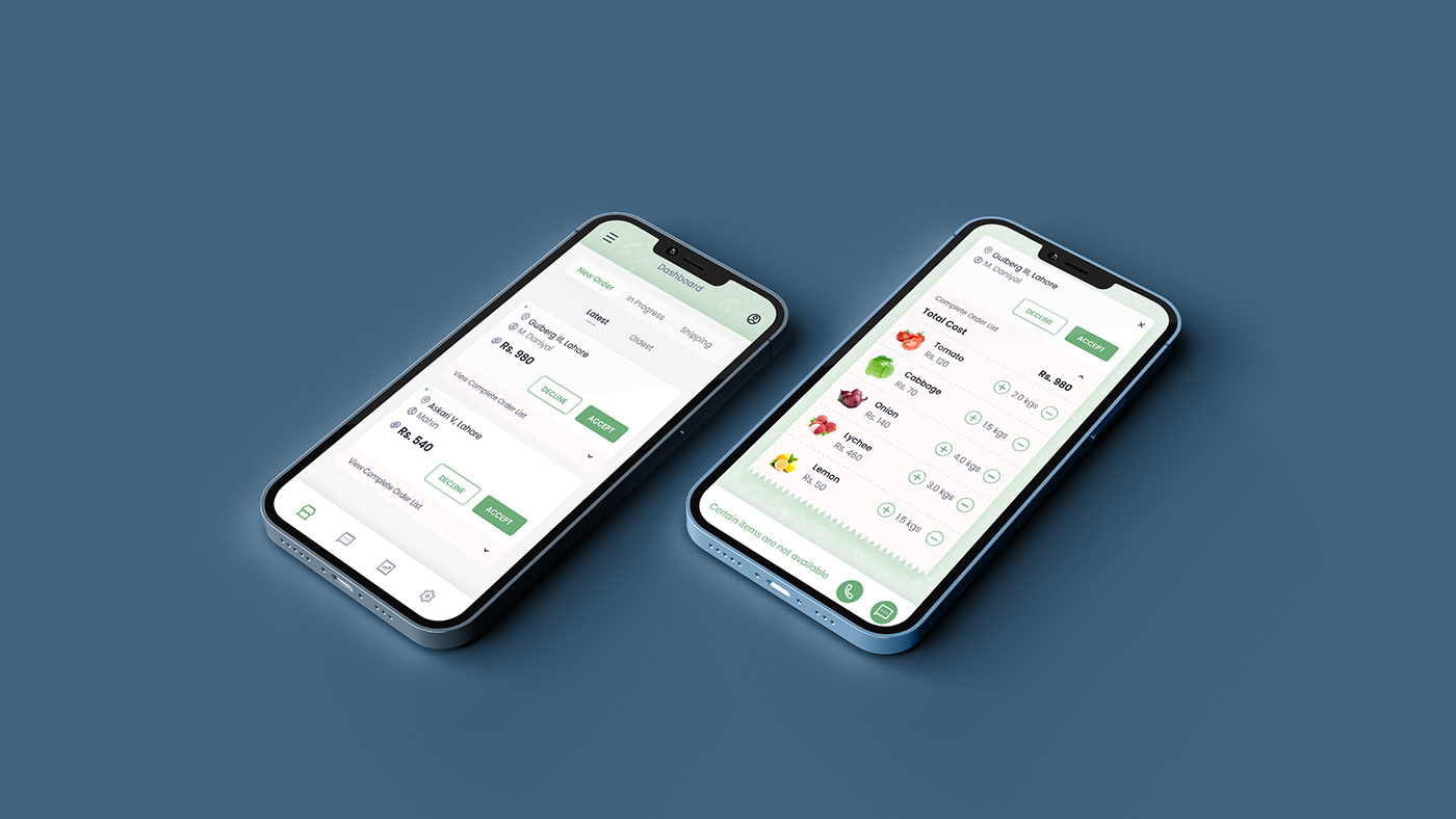
Most of the users are familiar with application gestures, and swipe functionalities which have been added to the design to declutter the order cards. In the final deliverables, the call and message button has been moved under the card which will be revealed upon a simple left swipe.
User Interface Design
Key Findings
The 2 high-fidelity designs are curated keeping in mind the color and typography. My main focus was functionality and empathising with the user, the goal was to create an easy-to-use application providing a seamless experience. Negative space on a micro and macro level has been used intelligently to form a hierarchy within the information displayed on the screen.