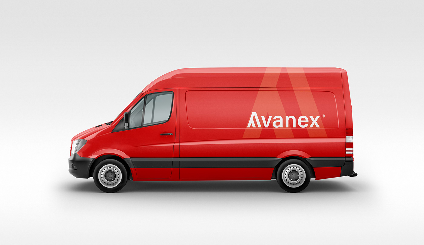
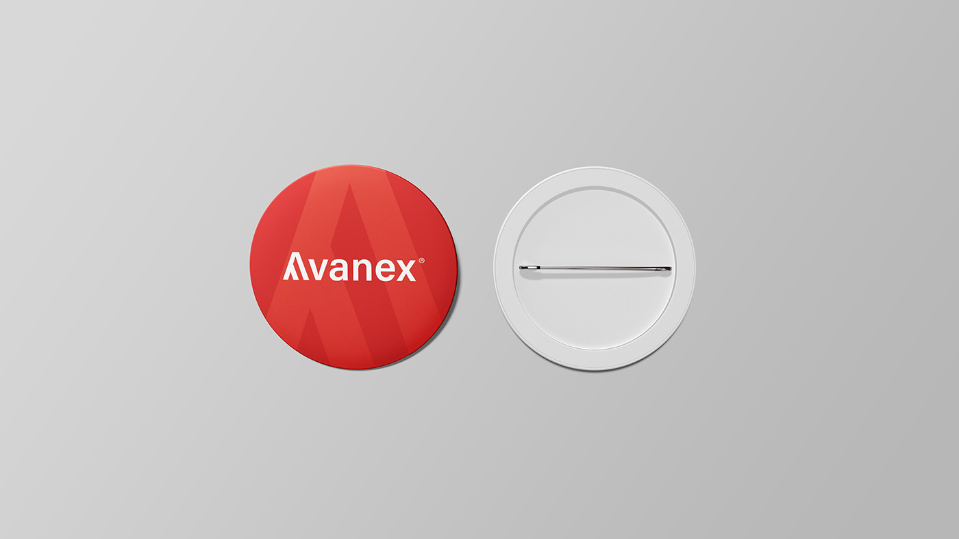
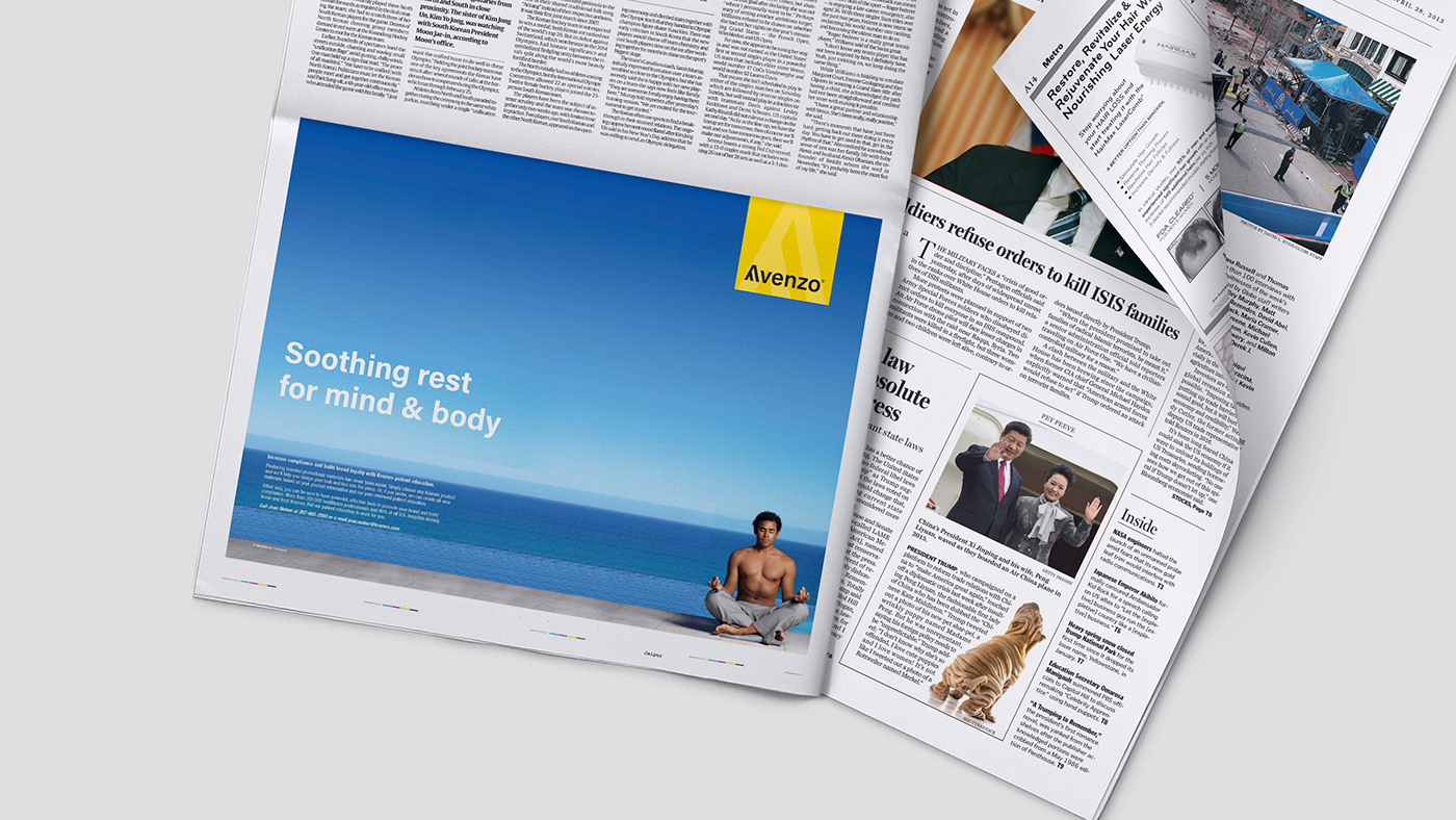
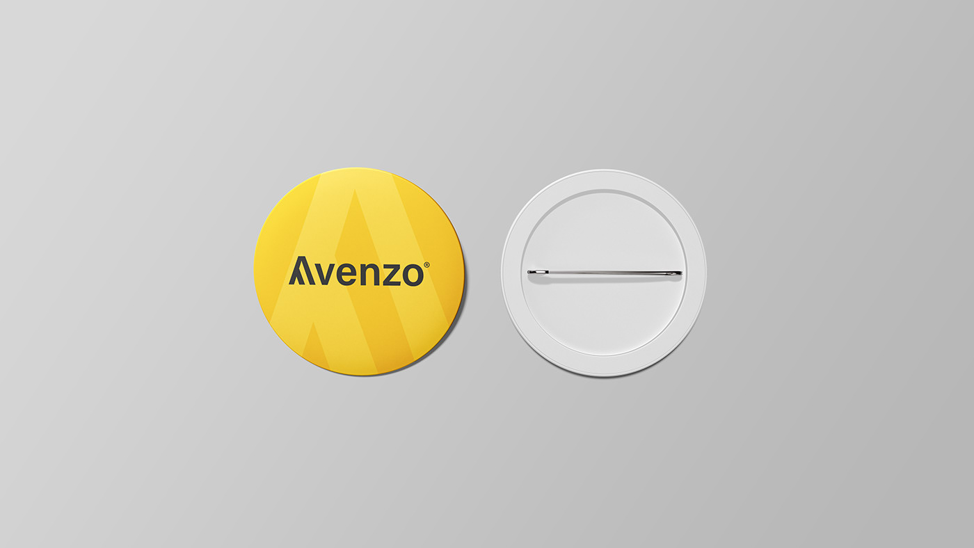
Avanex and Avenzo
Avanex and Avenzo are a pair of pharmaceutical import and export sister brands aiming to provide the best quality healthcare products for everyone. Since the letter A plays an important part in the names of these brands, this is taken as the foundation for the common iconography. The double strokes of the logo are a rendition to these two brand names and is strategically placed in the wordmark for a better establishment of the design. Primary colours like bright red and yellow is used here veering from the often opted greens and blues for a better contrast.


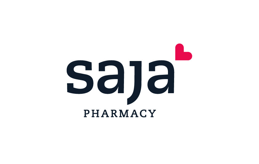
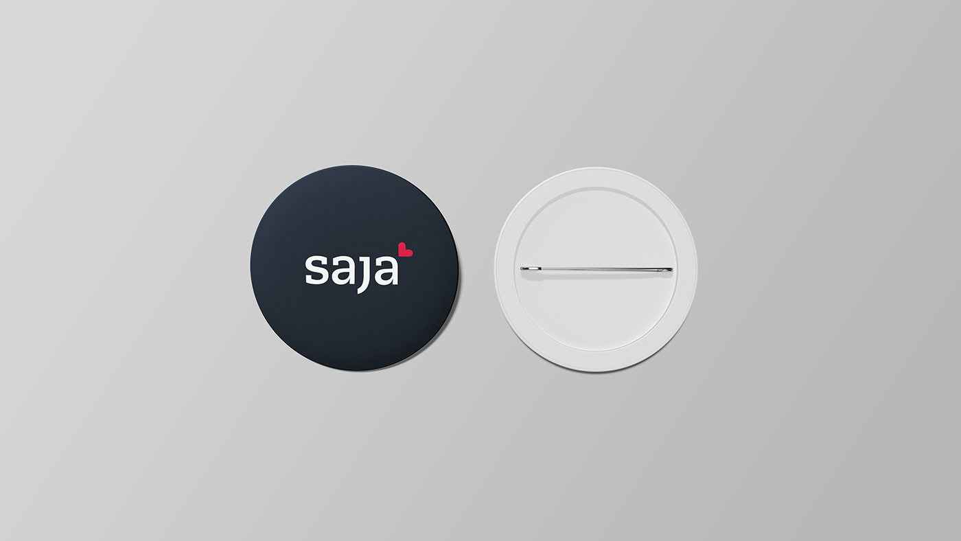
Saja Pharmacy
A modern, simpler redesign makes the identity for Saja Pharmacy more visible and optimal. The tilted heart icon accompanying the wordmark is born out of a fusion of heart and medical red cross. A slab serif font is suitable for this identity for a corporate outlook.