Client:
ALL THE SAINTS.
Contents:
Contents:
Development of a logotype with a brand book and visual identification system.
Description:
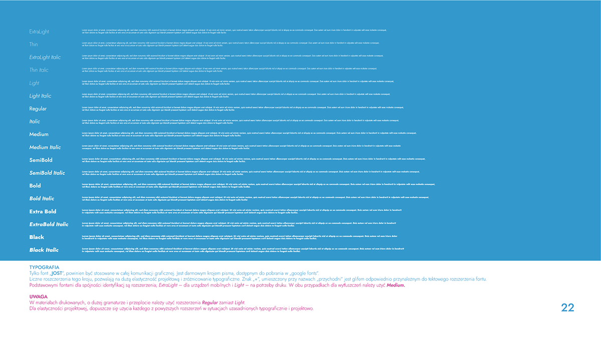
The form of this logotype uses play and the perversity of meanings.A well remembered evocative name, it also refers to the site and tradition of ALL SAINTS hospital.The graphic form of "+" plays a key role here. It refers not only to the old tradition of "cross" placed with a finger on the forehead of a child, sick or traveler. It is also a sign for positive diagnostic tests or a direct reference to All Saints. The style of the sign also refers to the chemical formula.
Description:
The form of this logotype uses play and the perversity of meanings.A well remembered evocative name, it also refers to the site and tradition of ALL SAINTS hospital.The graphic form of "+" plays a key role here. It refers not only to the old tradition of "cross" placed with a finger on the forehead of a child, sick or traveler. It is also a sign for positive diagnostic tests or a direct reference to All Saints. The style of the sign also refers to the chemical formula.