Branding exercise
Mayrand Rathé Rioux
Offering financial and wealth management services, MRR wanted to stand out from the competition with a contemporary and minimalist corporate identity. One crucial factor brought up during our meetings with them was the relational aspect of their business. “There are people beyond wealth management.” Daniel Rioux.
Our approach
As a basis, we relied on a contemporary and legible typographic treatment centred on the first three letters of the partner's names. This orientation had the advantage of initiating the clientele of Mr. Mairand – a partner on the eve of retirement – to the two new associates.
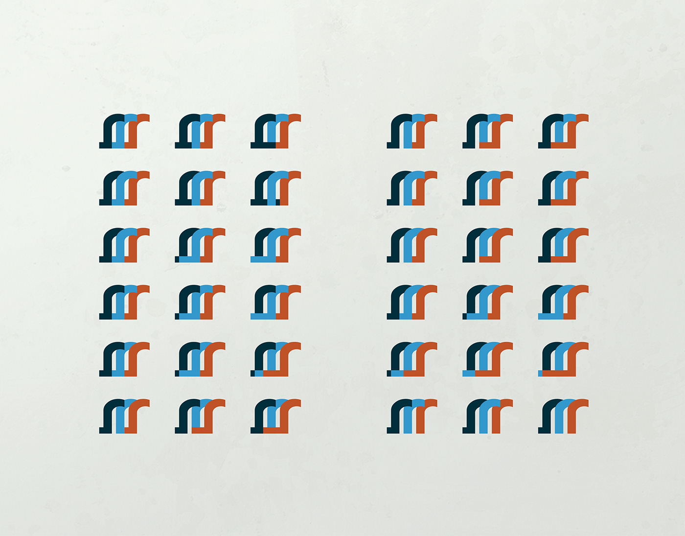
With that in mind, we developed a symbol with two sets of typographical and graphic variations:
¬ One with the first three letters M, R, R, for the family names of the three associates.
¬ A second one, which only paired the first letters of the two new partners.
¬ One with the first three letters M, R, R, for the family names of the three associates.
¬ A second one, which only paired the first letters of the two new partners.
This last symbol pleased two newcomers. It was stronger. The persona – emerging from the fusion of the two “R’s” – was easily identifiable. (“R” for Rathé and Rioux).
Finally, the colours orange and blue, appreciated by the two main partners, were introduced.
Finally, the colours orange and blue, appreciated by the two main partners, were introduced.
Services: Branding, Design and Production.
Deliverable: SWOT analysis, identity design, stationery and miscellaneous promotional item design.