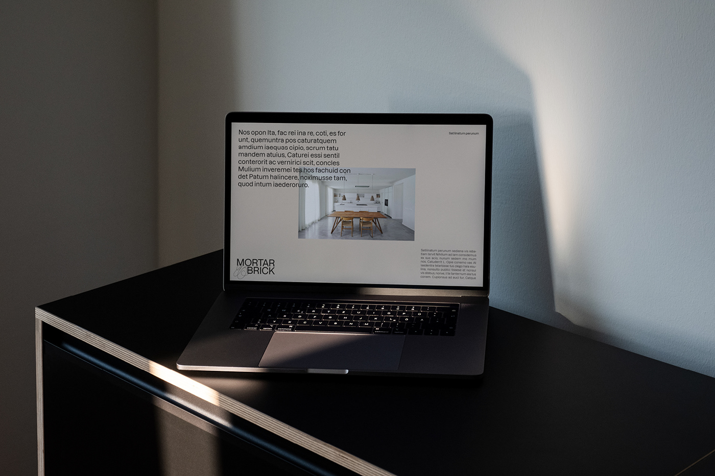
Mortar & Brick is a property consultancy with a high degree of experience. Founder and Director Laura Barrell has built the business that offers property investors security and peace of mind, while being based on ethics and integrity.
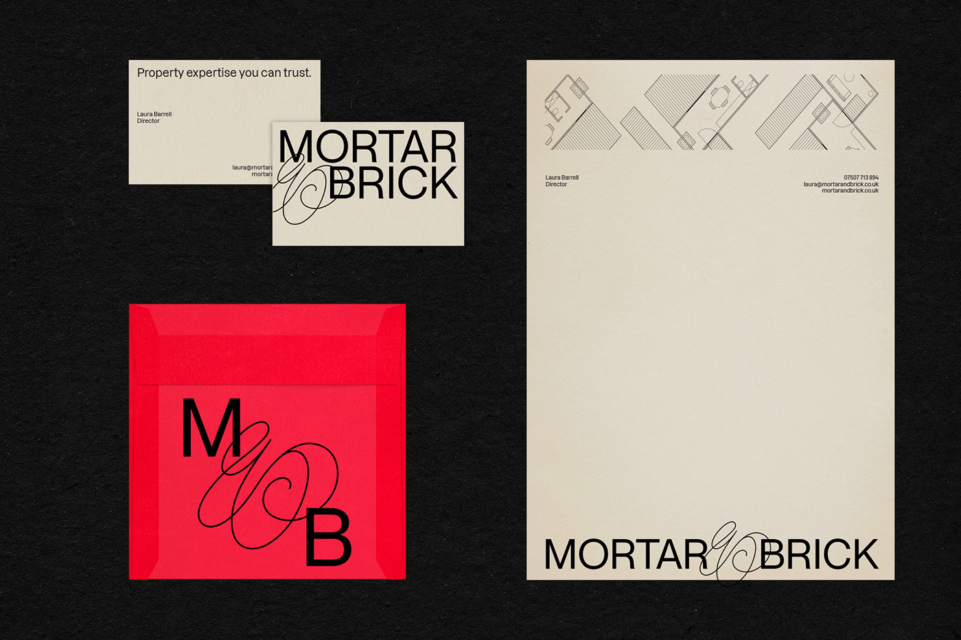
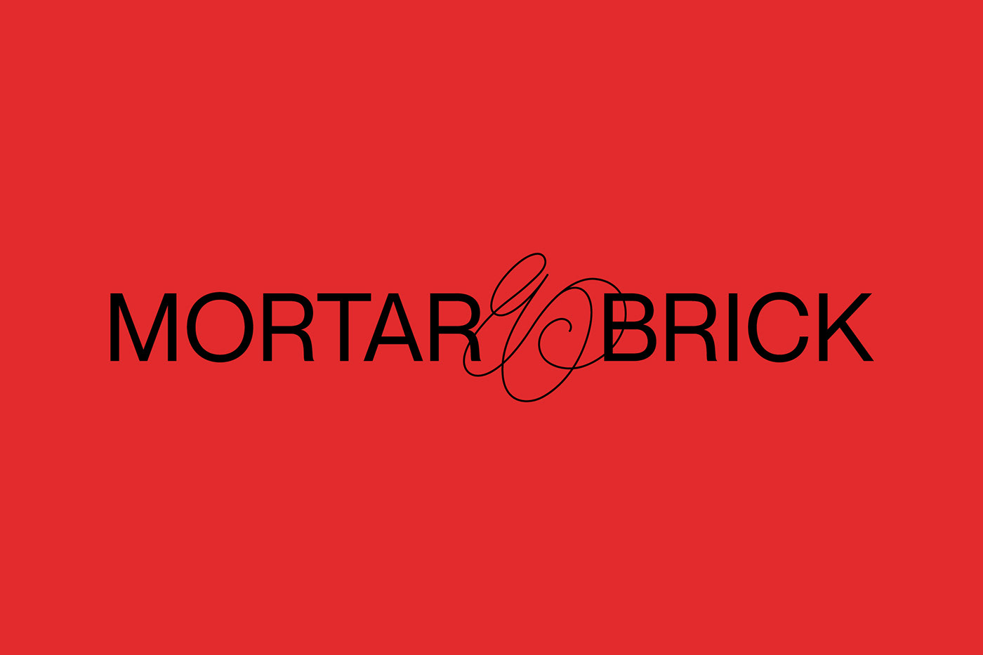
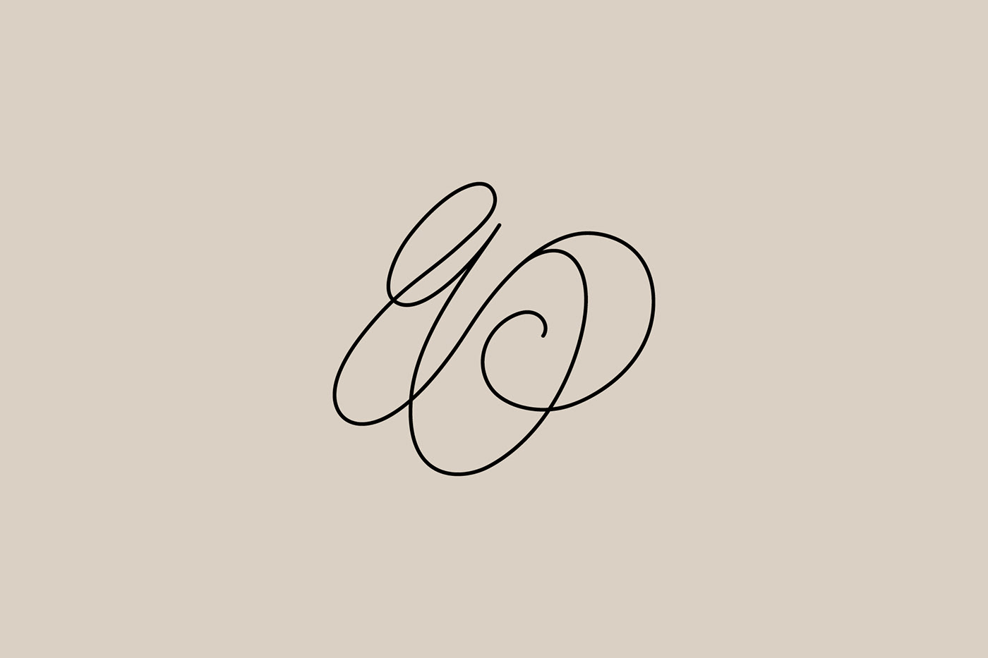
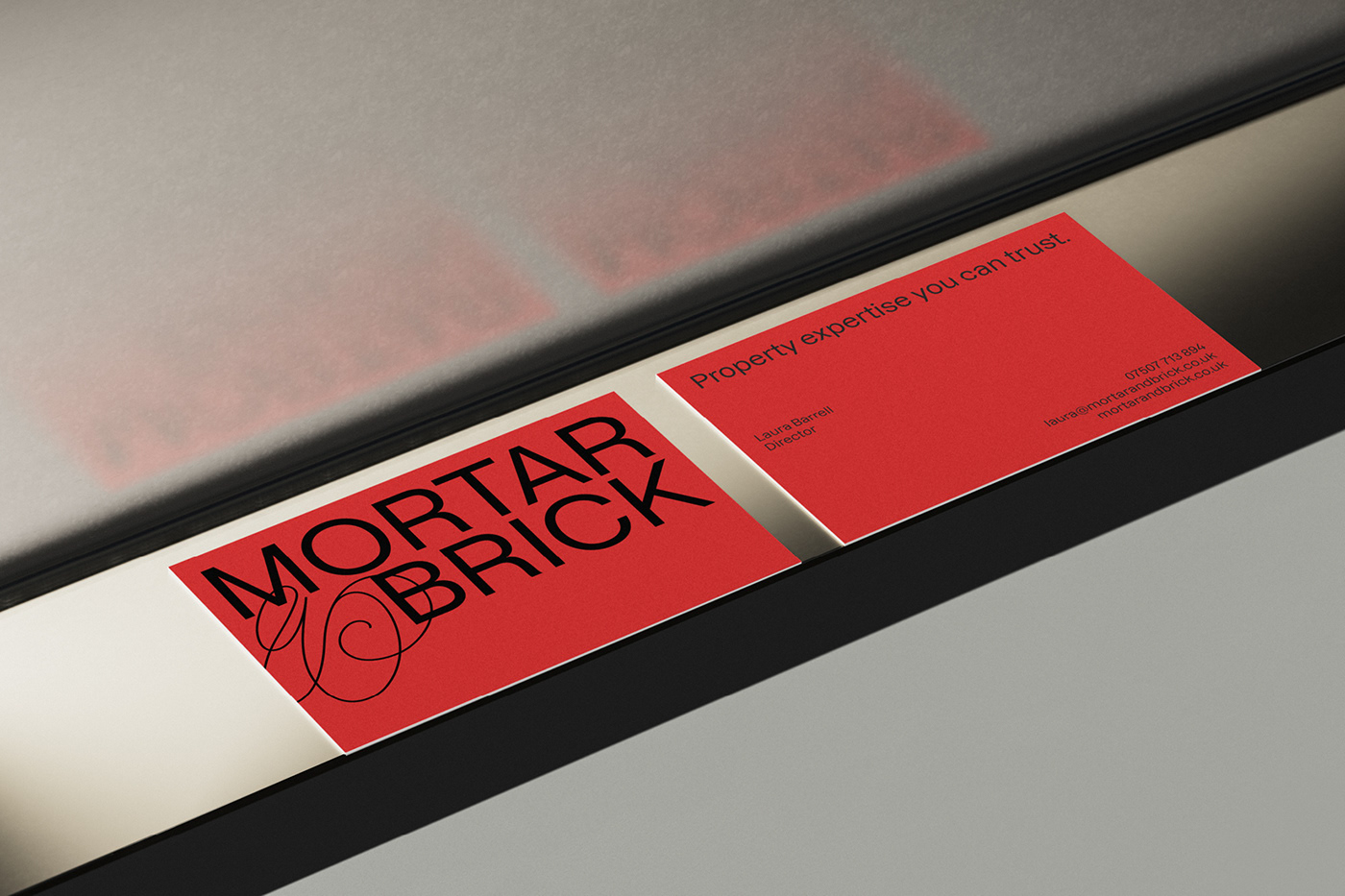
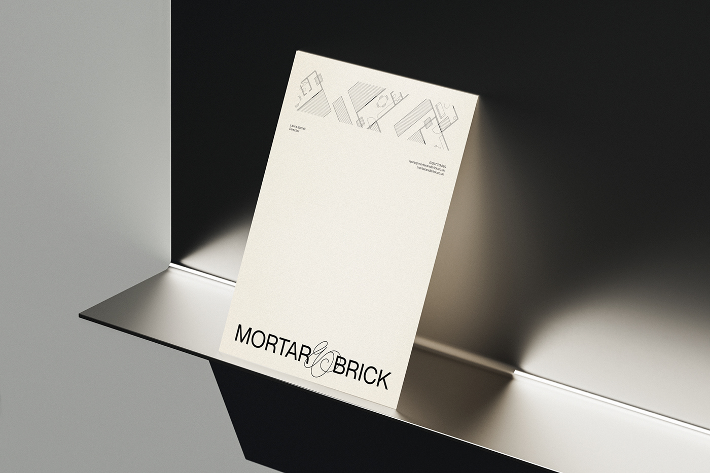
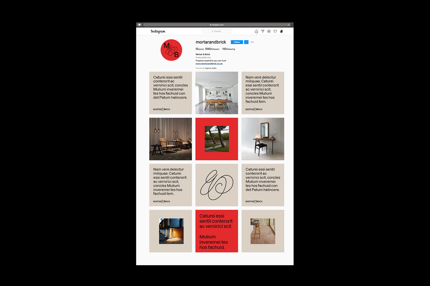
We wanted to highlight the values of Mortar & Brick like integrity, quality and efficiency with a minimalistic but solid typography. To convey the creative and feminine part of the brand we created a custom, hand drawn “&” sign. It flows out of the rigid grids of the logotype. Both elements should create a feeling of trustworthy and personal services. The logo is powerful but also flexible. We created three options for using it. This gives a broad range of possibilities when using it across different brand materials.
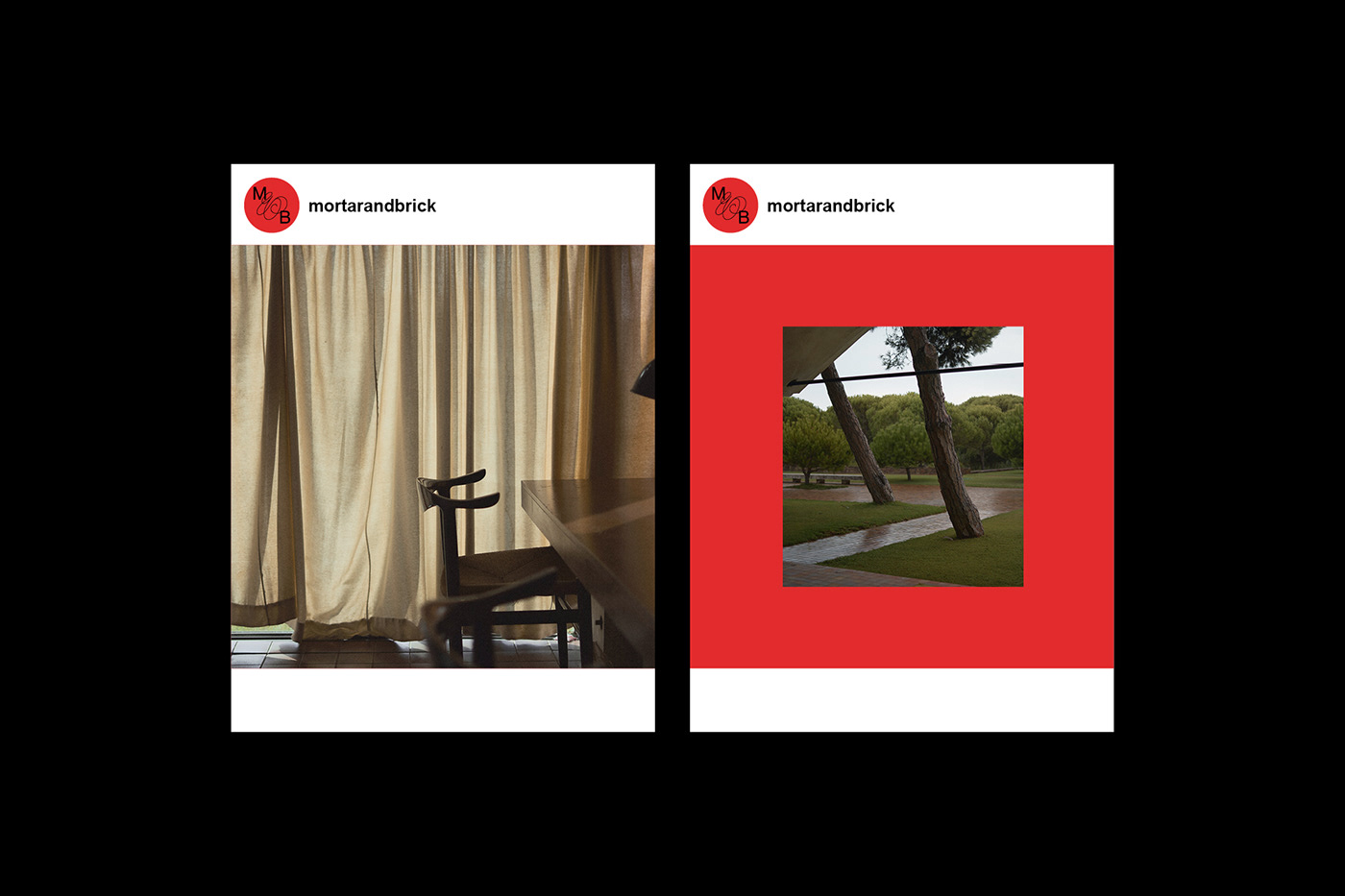
The brand color palette uses black, sand-beige and red. These colors are a combination of earthy and lively. The soft beige is calm but firm, it has connotations of a safe space, home, interiors, something nice and soothing. The red is for the lively, energetic part. The beige and red are also a modern, abstract representation of the mortar together with the brick.
3D: Marek Degórski↗
Typography: Dazzed by Martin Vácha / Displaay Type Foundry↗
Interior photography: Jorge De Jorge Jordán↗
Typography: Dazzed by Martin Vácha / Displaay Type Foundry↗
Interior photography: Jorge De Jorge Jordán↗