Excitement is never out of style.
ElClásico is the match of matches. A LaLiga blockbuster, bringing together millions of people in front of their screens from all over the world, to witness how the two best football clubs in the world tirelessly confront each other with one objective in mind: beating their biggest rival.
The first Clásico in history was held on May 13, 1902 and was nowhere near what it is today. Since then, its audience has grown to become international, becoming a worldwide phenomenon followed by people of different origins, ages and interests. Although there is one thing that everyone has in common: the desire to feel the excitement of football.
The Challenge
ElClásico needed a visual identity capable of representing the transversality of the event. Its image needed to be understood from anywhere in the world. And simultaneously, it had to generate complicity among the youngest audiences, without neglecting the general public.
The Solution
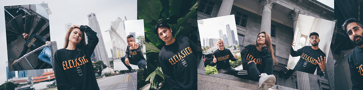
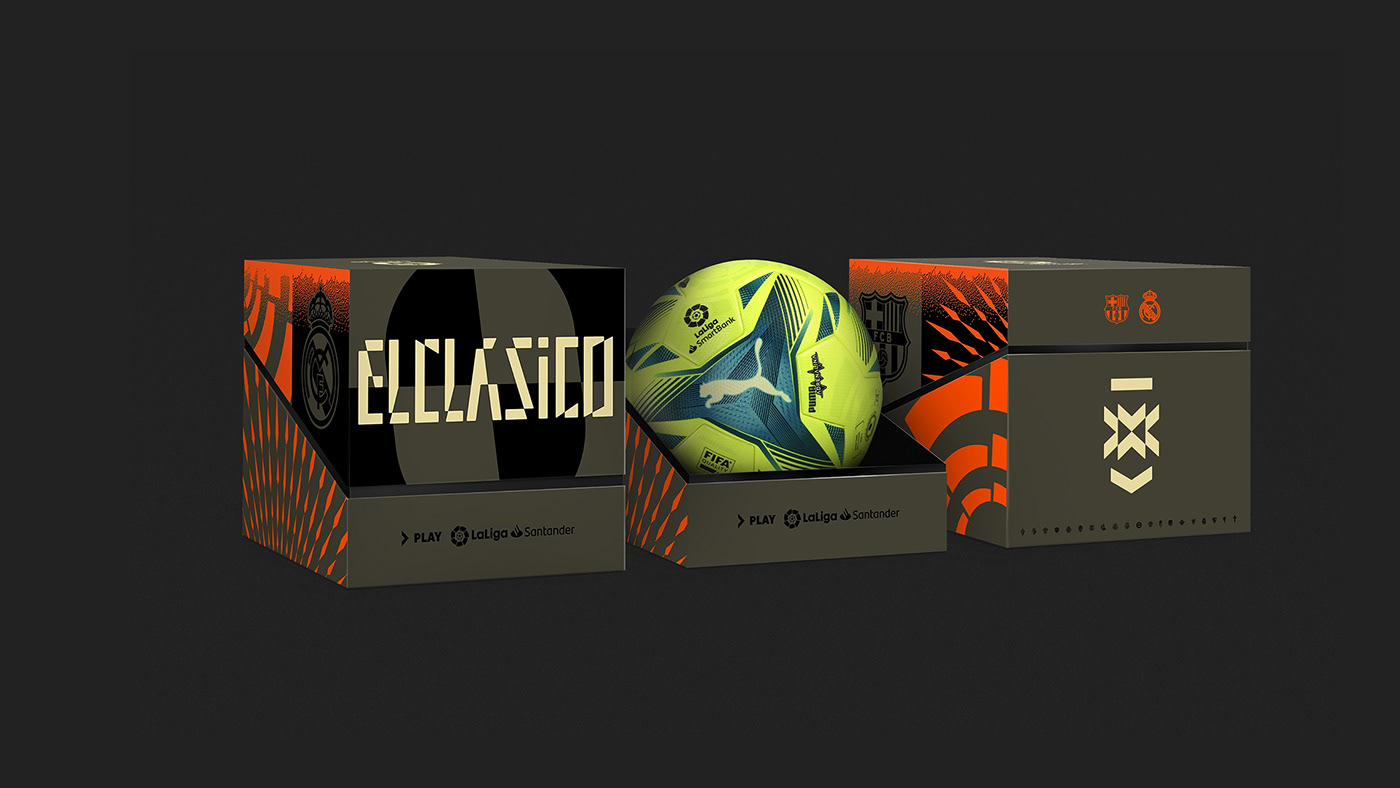
In much the same way that ElClásico crosses all borders, we decided that its visual identity would go beyond the limits of the playing field. We therefore took the way in which the beautiful game impacts street trends as a reference: in fashion, music and street style, which are now, more than ever before, influenced by football.
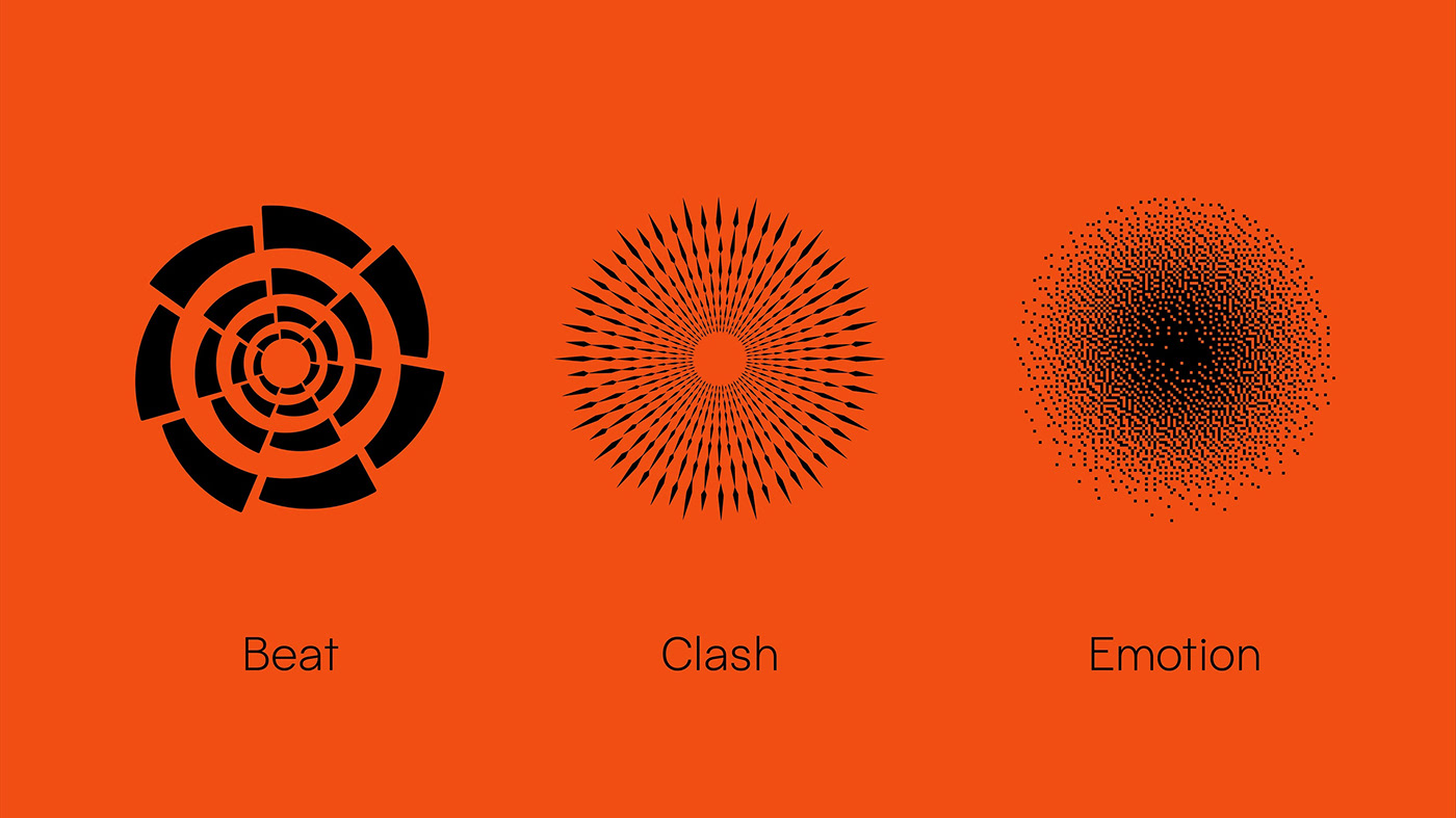
For the graphic system, we took the Beat (LaLiga's symbol) as a starting point. We reinterpreted it and turned it into a symbol of rivalry, strength, passion, technology, innovation, dynamism, spectacle and globality. We worked with opposing symmetries, to generate tension, while reflecting excitement and competitiveness.
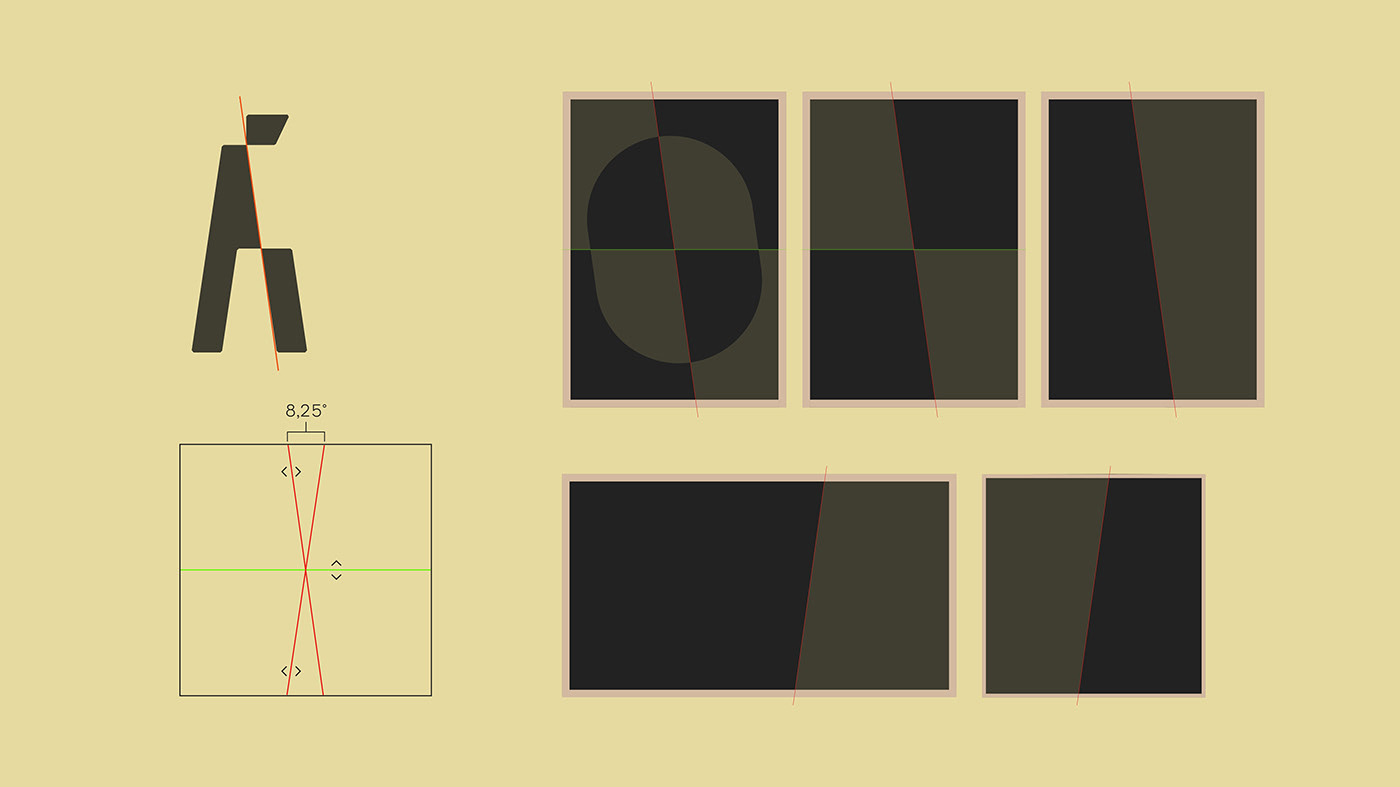
The logo — adapted from the Halunke typeface by Elena Schneider and built to generate a more aggressive and sporty rhythm — has an energetic style, in which angles and verticality play an important role. Though this it expresses movement and brings us closer to the digital essence of the ElClásico of today and tomorrow, as well as becoming the "vs" symbol that comes between Real Madrid and FC Barcelona in every graphic application.


Developing the visual vocabulary
For the graphic system, we took the Beat (LaLiga's symbol) as a starting point. We reinterpreted it and turned it into a symbol of rivalry, strength, passion, technology, innovation, dynamism, spectacle and globality. We worked with opposing symmetries, to generate tension, while reflecting excitement and competitiveness.
For the colour palette, we decided to mainly highlight greenish gold to represent the tradition and the nobility of the two opponents, contrasting it with orange, to bring energy to the creative pieces.

The system is perfectly complemented Pacaembu, a forceful geometric sans serif typeface that's legible, 100% inspired by the world of football and designed
by Naipe Foundry.
by Naipe Foundry.


All of this, spun through a very direct creative concept: IF YOU MISS IT, YOU MISS OUT, a message with which we invoke the convening power of ElClásico and appeal to the insight that mobilises people to be a part of any mass event: FOMO or fear of missing out.
Together, all of these elements result in an iconic and relevant identity, with which LaLiga approaches its enormous and diverse audience by tapping into that which makes ElClásico so special and which will never change: excitement and passion.

LaLiga's brand reveal in collaboration with MTV India

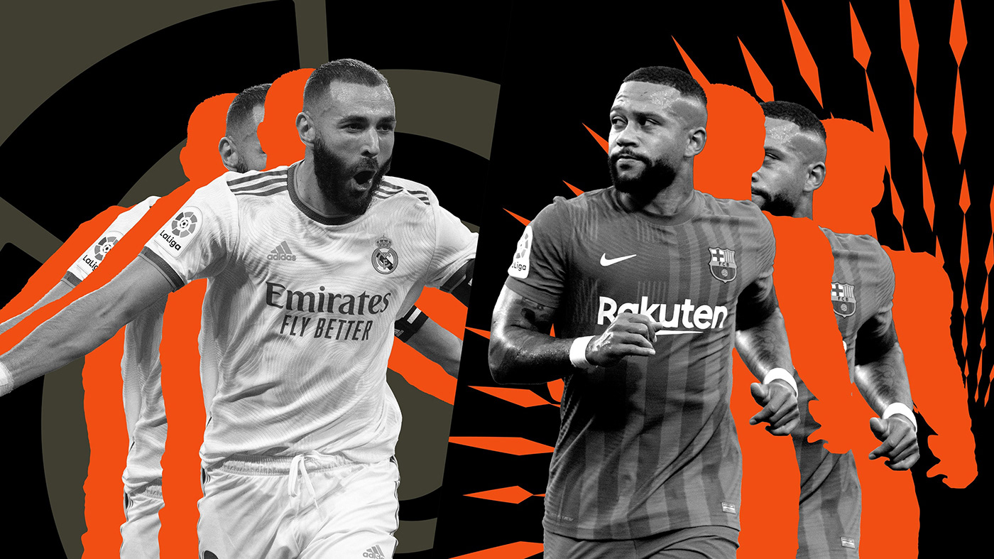
Photo by LaLigaTV

Photo by LaLigaTV


