


BLK LTR – Re-visited . Typographic experiment
–
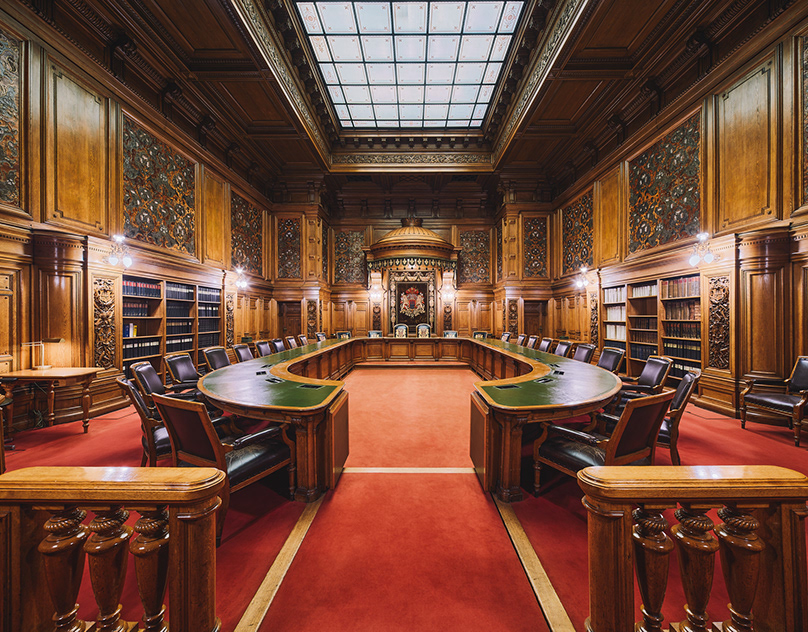
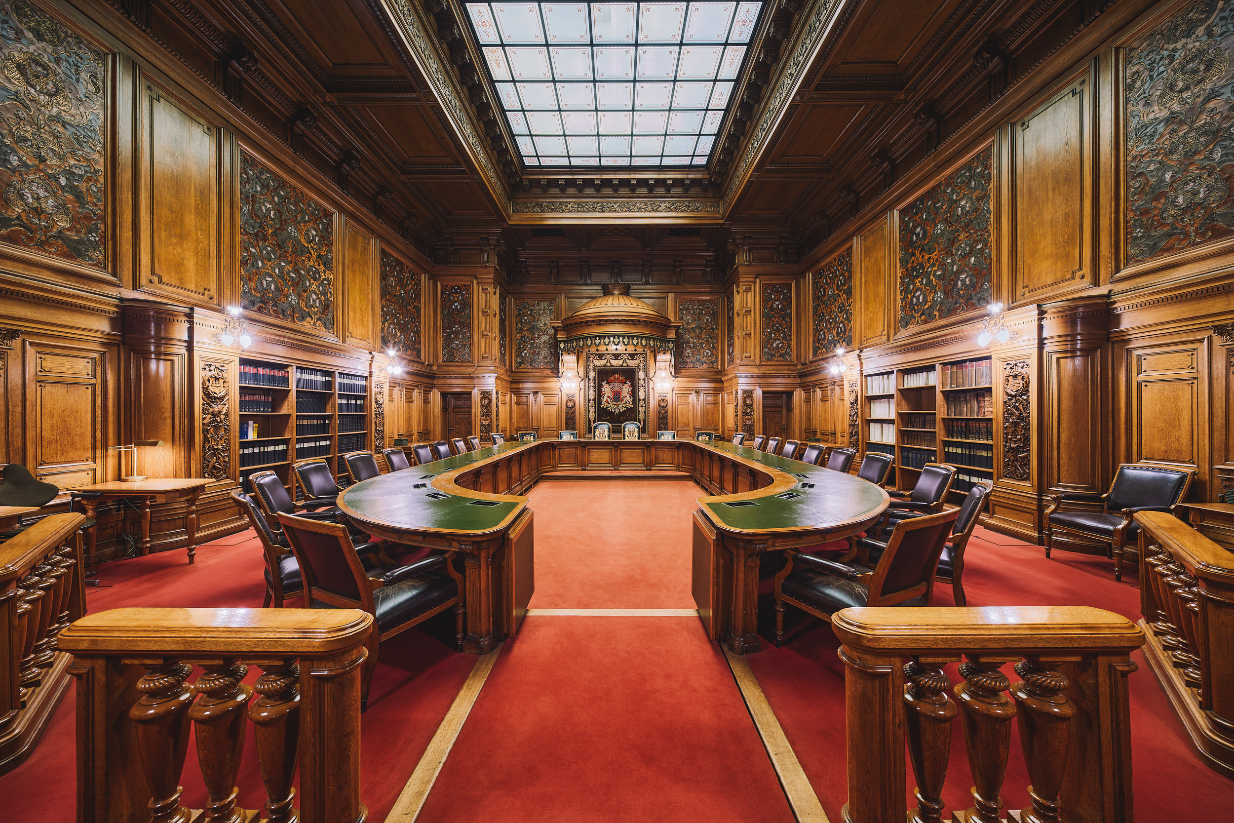
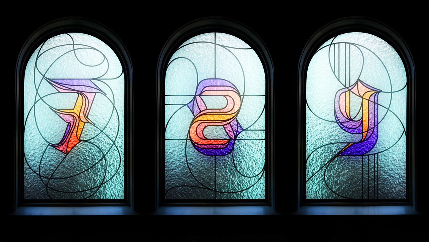
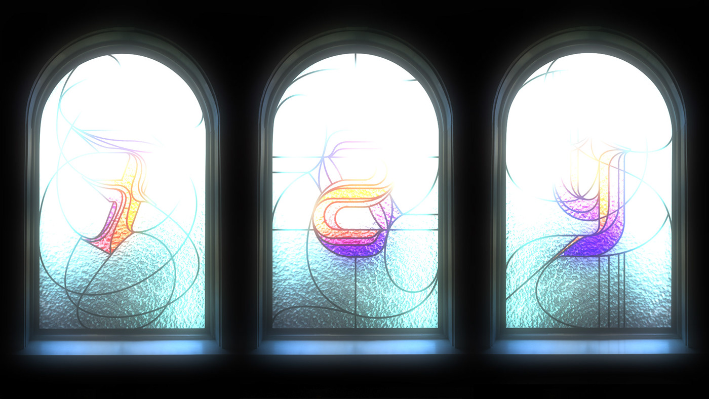
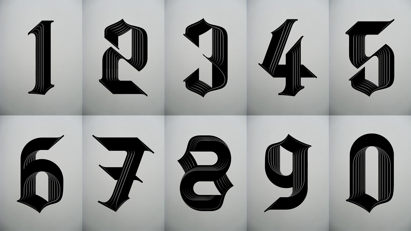
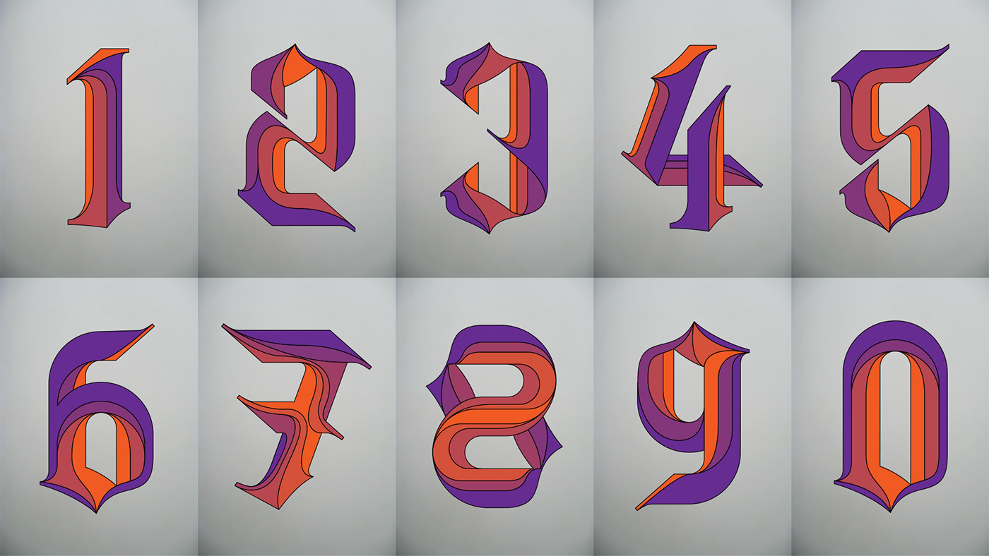
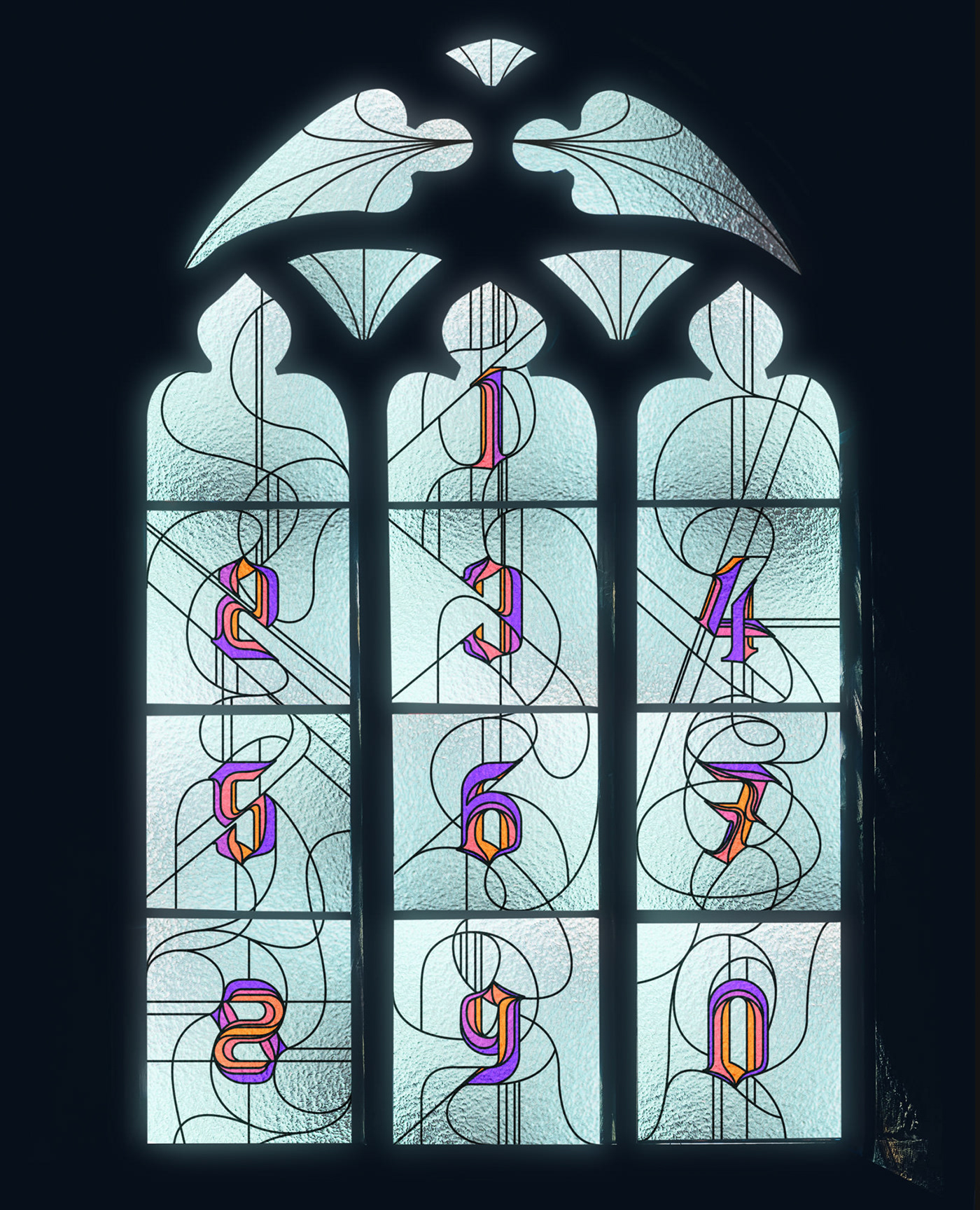
After working on the BLK LTR experiment, I had always felt there was more potential for further exploration. Using the same forms, I wanted to take the numbers in a new direction. The obscure, unpredictable curves and points were screaming out for dissection into separate panels. This approach created a completely new look and feel. As the experimentation progressed they started to resemble sections within a stained glass window. This direction was apt due to the historical nature of both black letter typography and this form of window decoration. With this in mind, I researched a suitable shot upon which to try a test.
–
After working on the BLK LTR experiment, I had always felt there was more potential for further exploration. Using the same forms, I wanted to take the numbers in a new direction. The obscure, unpredictable curves and points were screaming out for dissection into separate panels. This approach created a completely new look and feel. As the experimentation progressed they started to resemble sections within a stained glass window. This direction was apt due to the historical nature of both black letter typography and this form of window decoration. With this in mind, I researched a suitable shot upon which to try a test.
The result was stronger than anticipated enabling further experimentation with line and forms outside the constraints of the numeral. For each window, to create distinction, the letterform dictated the flow, style and direction of the paths. This led to the abstract patterns remaining harmonious whilst connecting to the numeral form.