SENSIENT FOOD COLORS BROCHURE
Research, Copywriting, Strategy, Design
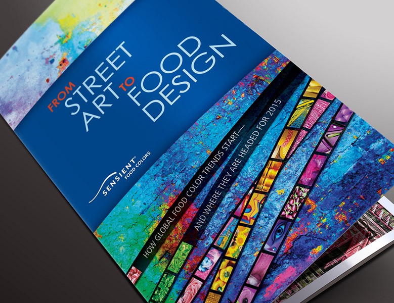
Swerve Creative was asked to research and concept a marketing piece about future color trends for food. With much enthusiam and our love for color, we delve into piles of research (articles, websites, posters, fashion, film, history, books, etc) —we looked backward at where trends have been, how they begin and how they finally end up in food design.
The result was an oversized tri-fold brochure that distills the most important information and communicates the concept visually. This has become an important tool for the Sensient sales group to initiate their talking points with clients. The brochure is dramatically different than anything in the industry—not only in terms of content, but also design.
UPDATE: Swerve Creative is happy to report that as of Dec 5, 2013, Pantone chose RADIENT ORCHID as their color of the year for 2014. This falls exactly in line with a color grouping Swerve Creative predicted in the brochure. This also reinforces Sensient's position to their clients as forward thinking and always on-trend.
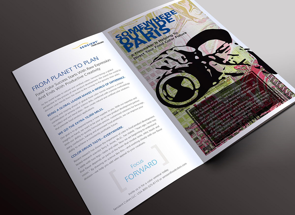
Inside reveal with flap closed.
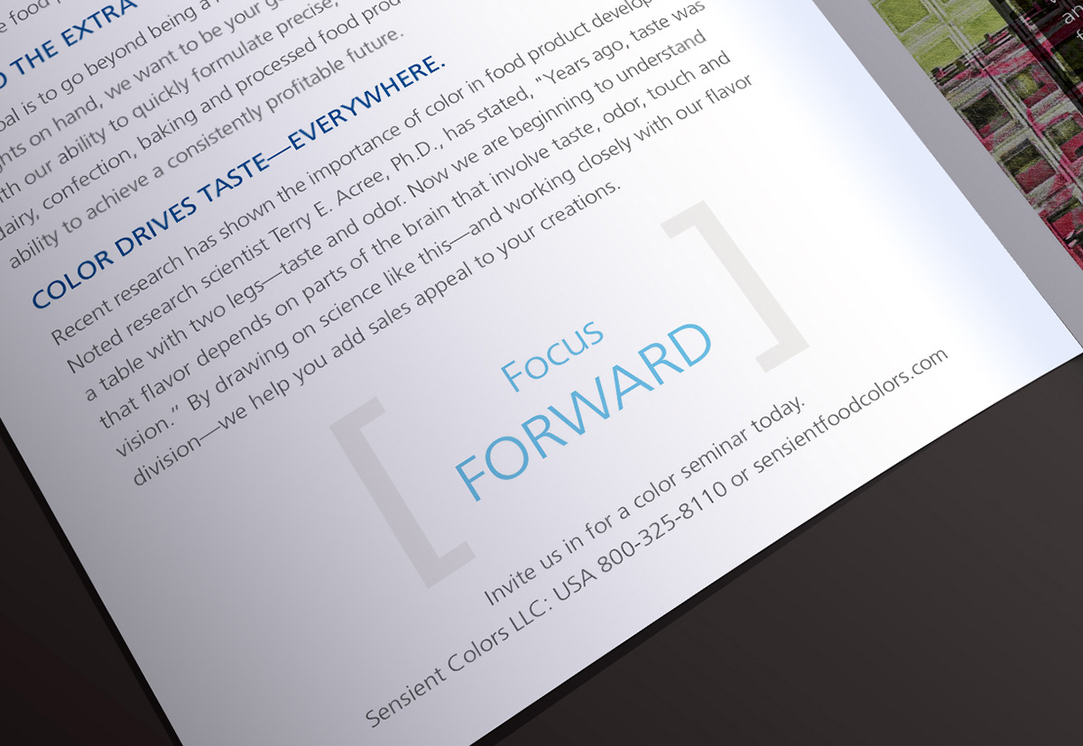
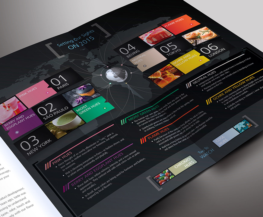
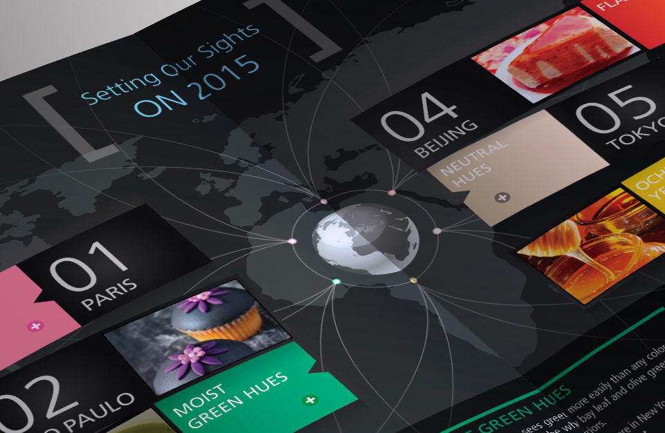
Messaging leads the viewer through the journey of trend discovery and explains why trends are important to spot far in advance.
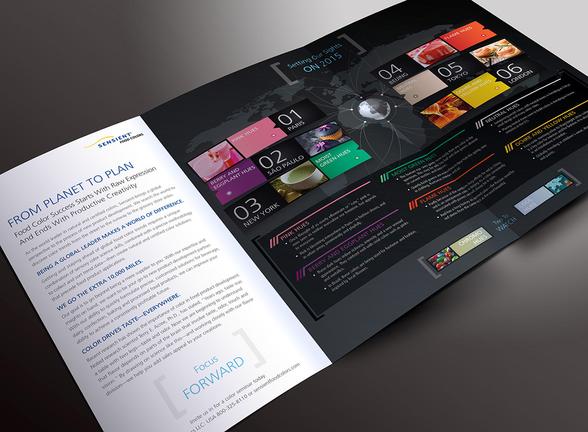
The fully opened tri-fold shows a polished and organized system that explains color trends and why they are important.
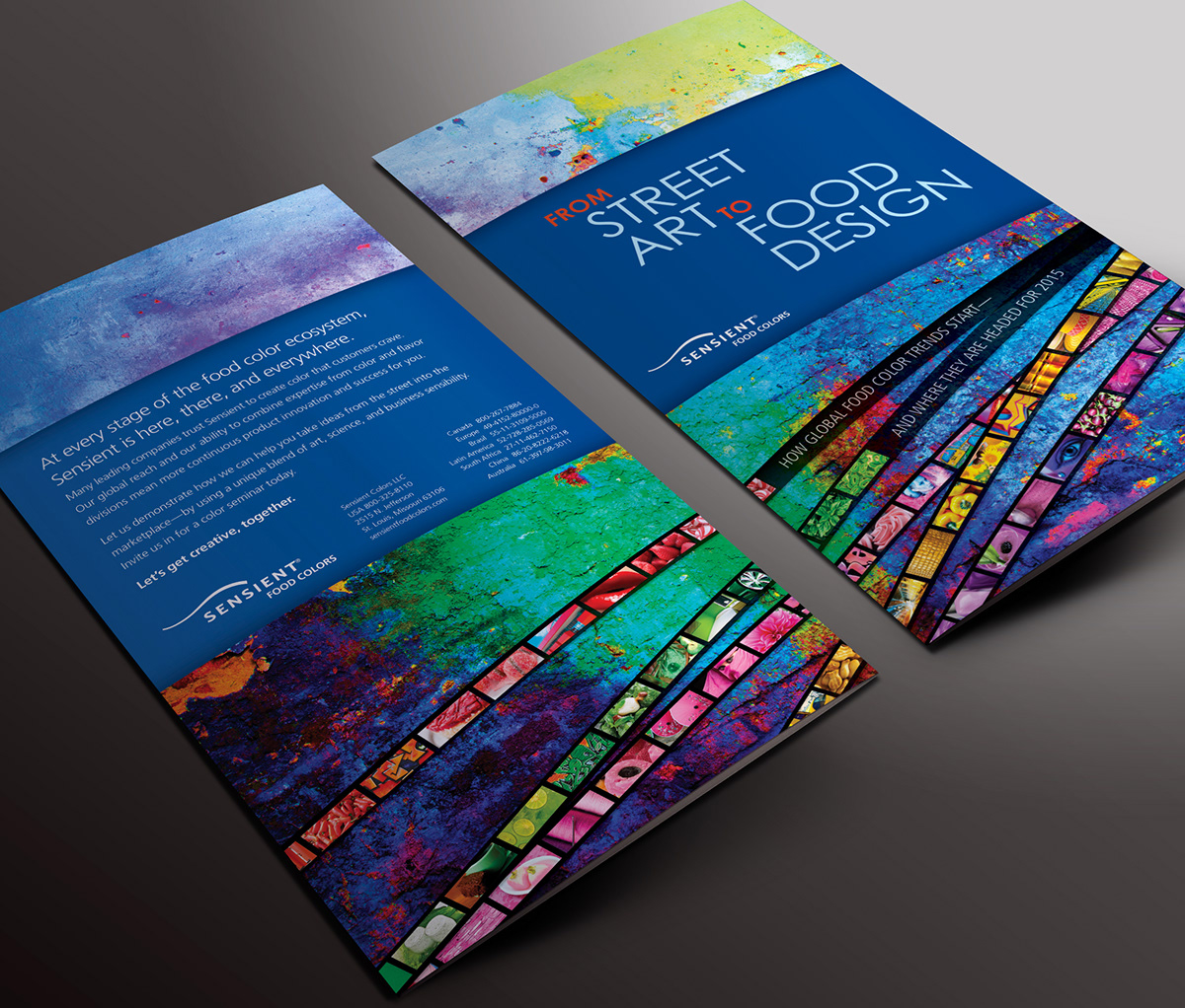
Back cover and front cover together.

