FINCH is a (fictional) boutique hotel set in Singapore, catering to young couples. The boutique hotel is a place of rest in a busy city. The idea behind the hotel was that birds are constantly in flight, but one thing that's common is that they return to their nests when they're done with travelling. Finches travel in pairs and are highly social birds, thus the name FINCH was coined after the highly social species.


The final logo incorporates the Finch's flight pattern.

Colours chosen are a muted palette of colours from sunsets and sunrises, when people leave and return to the hotel. Explored different graphic elements revolving around the idea of finches - feathers, nests and the idea of flying and stopping.
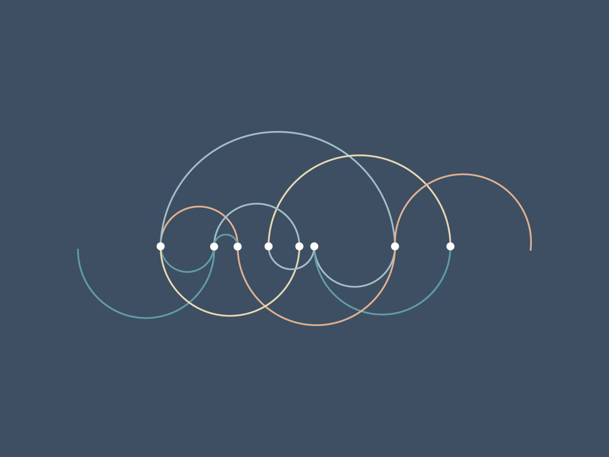
Chosen graphic element symbolizes flight and travel patterns, rest, diversions and convergences. The dot points were marked in places where a line passed through the logo, and symbolize the common place of rest of different paths - essentially what a hotel is.


