Nomina is a family of sans serif fonts for use from large to small sizes. The weights of the family itself contain 16 styles plus italic, ranging from ExtraLight to Black. The font family takes was inspired by classic Grotesk typefaces such as Venus and Akziden Grotesk. Unlike any other modern Grotesk typefaces, the details of the contrast in this font family are quite subtle and yet still harmonize while standing in between another character, the open apertures help them to increase the quirkiness accompanied by the sharp terminals on each rounded glyphs. The Nomina family is well equipped with lots of selective alternates and OpenType features, and the main usage of this font is universal, this means this can use it any design style as long as the look and feel keep match with its characteristics.


Nomina identified himself as a classic Grotesk that has subtle contrast to implement the feel of old-fashioned and contemporary styles. The design has a quirky touch, especially on the terminals that has sharp cuts and dynamic junction.


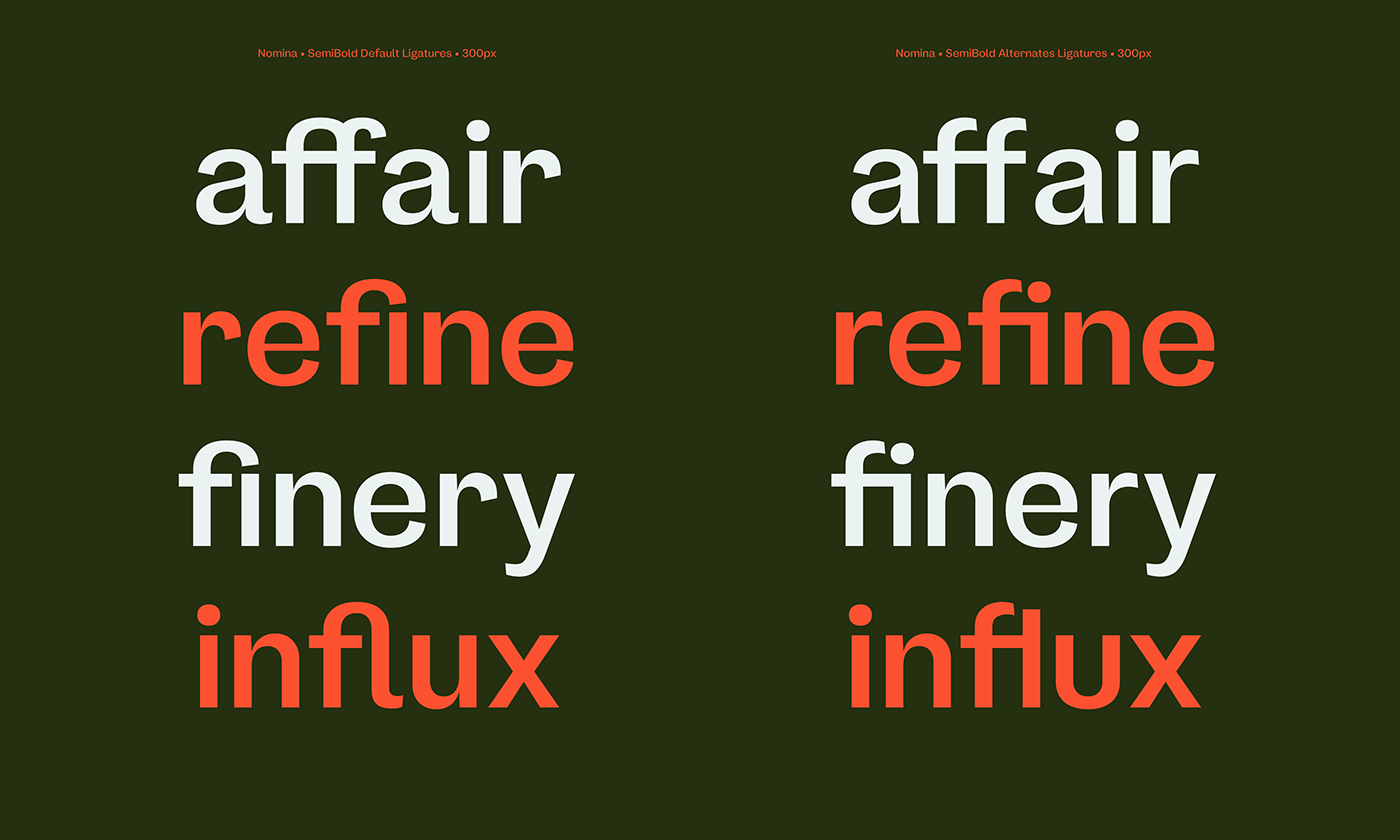
Nomina equipped with selective alternates on the lowercase, the default style has tailed character to empowering the small size features, and has the loopy feels on the "f" and the "r". In addition to that, Nomina adding another alternates to make it looks neutral and still relevant to its alternate style and harmonizing entire family.


The font family itself has lots of opentype features to play with. From the case-sensitive forms to shift the parenthesis characters, superior and inferior figures, ligatures, numerical fractions, and Tabular figures to maintain the standard quality of the font family.