We came up with a name and made a logotype for a workshop which produces custom-made soaps with images on them. Handmade soap with a picture on it is a new type of souvenir production, like a mug with a logo printed on it.

The creation of the logo
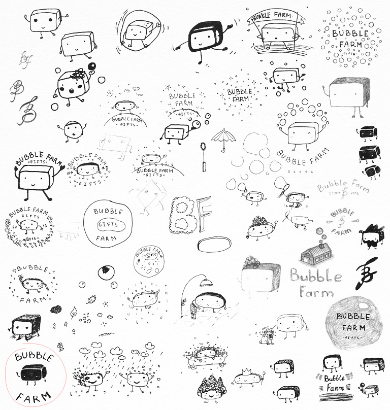
The client likes having characters in logotypes, and he suggests to draw a soap one. Our sketching:
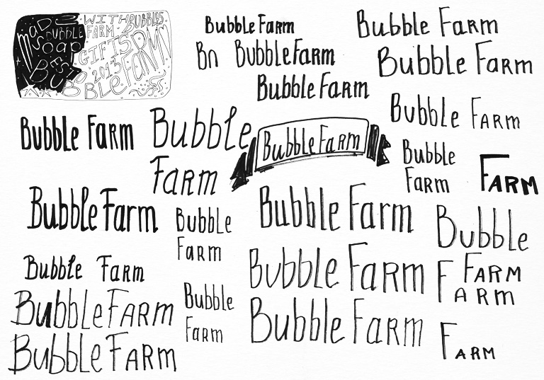
We want to make a multi variant logotype combined of a name, a symbol, a deciphering, a ligature and a sign “established in 2013.” We are testing different possibilities of the collocation of the elements of the logo; the goal is to find a construction, therefore on this stage we skip design for speed’s sake (applying beloved Garamond, ignoring spacing, etc.):

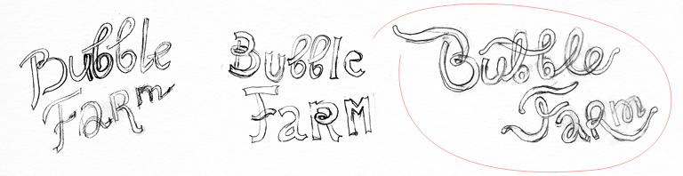
Trying to find the best way of combining “B” and “F”:
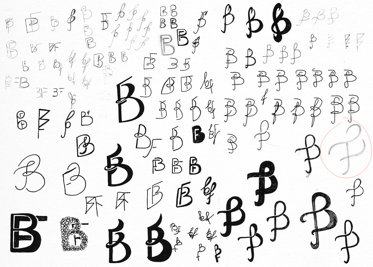
Designing a sketch shape of the ligature, will finish it up later depending on the font:

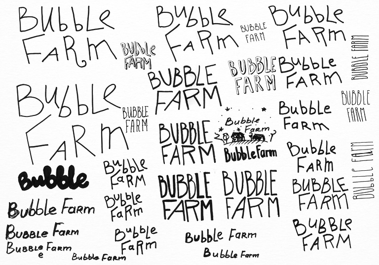
Drawing lots of letters:

It becomes clear that having no complete picture it is hard to come up with the font. The signature appeared to be an easier component and was ready at once:

It feels like we need to see the drawn character first to proceed with the composition and the font. Therefore we are printing several copies of the sketch and drawing strokes (we tried inversion to make it faster; it didn’t work):
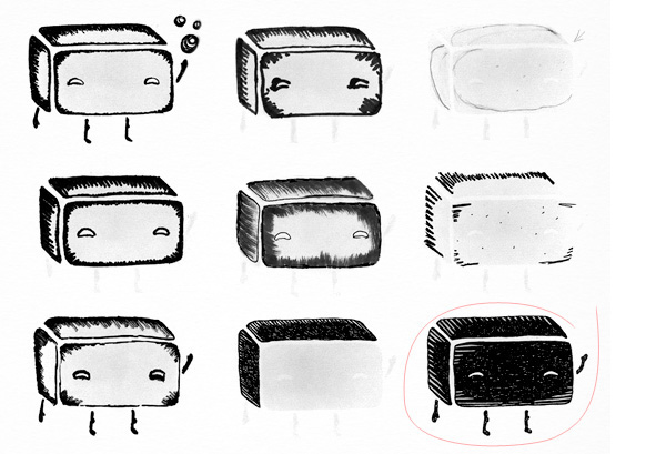
Looking for a good composition; a soap is stepping forward with a little flag attached to it:

Figuring out what the font should look like and put it in drawing:
Putting together vectorial sketch of the logo:
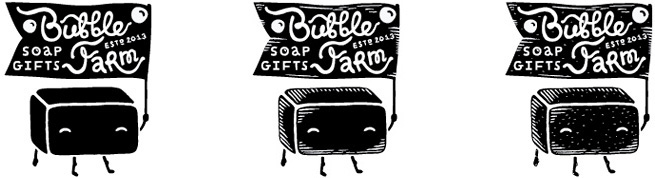
Presenting it:

Our client says the type is awesome but the logo itself seems bulky and complicated. The character didn’t meet the expectations being too obvious, three-dimensional and shaded. The client wants a plain logo with a mystery in it, something unusual, unique and intriguing. He suggests to use bath imagery.
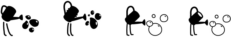
So we are working on new images: farmer’s watering-pot, watering with soap bubbles and “fatty” bubble in a bathtub:
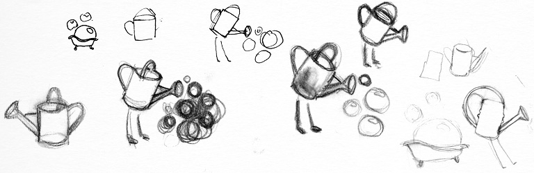
The watering-pot looks more entertaining, and we are turning it to the vector:
Placing it together with approved font. The watering-pot and the font are separated from each other, otherwise the composition looks unbalanced:

On this stage the most important thing is to come up with the most effective image. Therefore we are quickly combining the type with the watering-pot, crudely cutting the letters:

The image of the watering-pot recalls vegetable garden themes, it needs to be closer to the soap and further from the farm. That’s why we are turning back to the image of the babble in a bathtub. It is moved to the farm now and put on the grass:
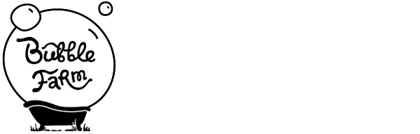
The client is happy, and we are starting with the final, fair version. Experimenting with the shape of the bathtub and the thickness of the grass:

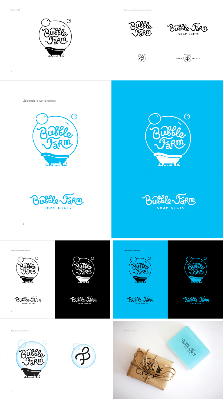
Looking for a compact font composition to be cosily placed in a bubble (meanwhile “playing” with new outlines)

Placing beloved by the client letters in a bubble:

Time for the ligature:

Presentation. Major color is bright “pure” blue:
Happy end!


