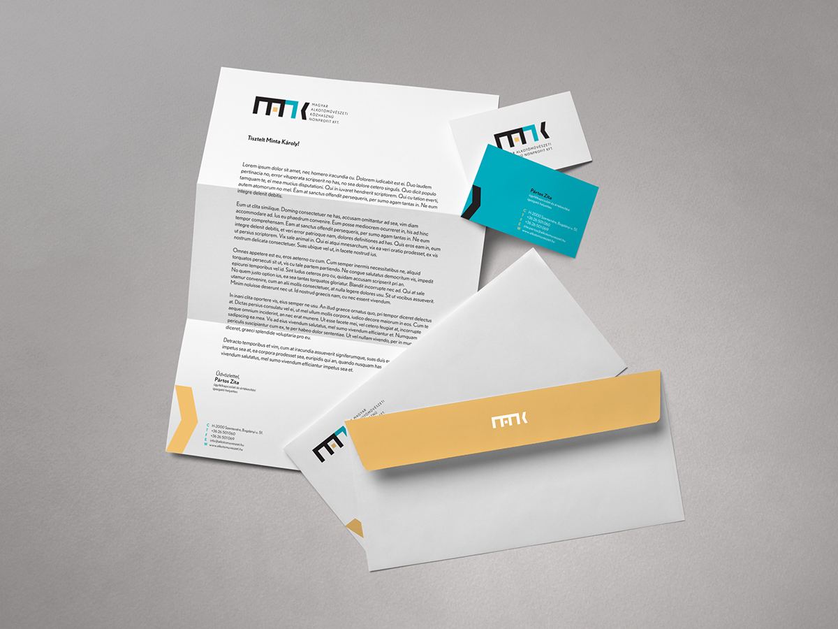
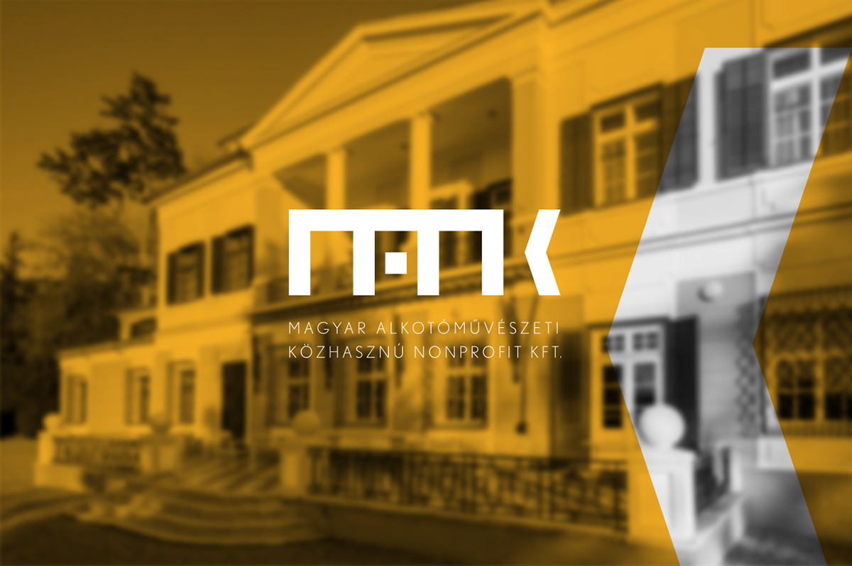
MANK
_ _ _
This is a competition project made for MANK. MANK is an abbreviation of Hungarian Art Financing and Support Ltd.
I focus on safety in the logo design but in playful way. The acronym is built of square, block-like elements. But the colorful, detached parts make the logo design airy and fresh. Letters stand like building structures bringing the message of comfort
and stability for artists. However the “A” element shows the door of this building which is wide open for everyone
who want to join.
My design lets space and freedom for different interpretations, but also gives a clear guidance
for understanding the essence of the company’s philosophy.