QBIS

The problem to solve
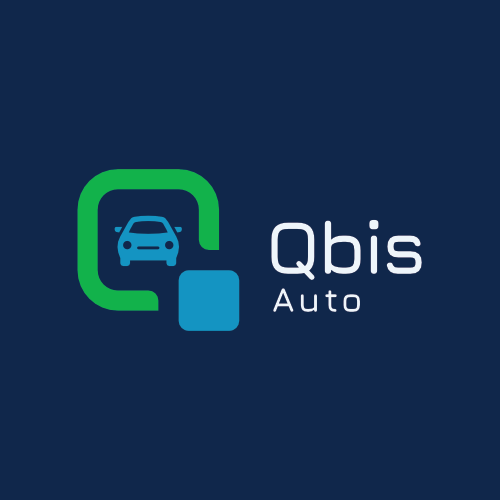
Qbis is an international software development company that focuses on data-flow, automation and getting useful and measurable information to their client. They needed a logo for their brand that will accommodate sub-logos for specialized software going forward. The sub-logos should easily be recognized as part of the main brand, but recognized on their own as well.


Sub-Logo Designs


Typography
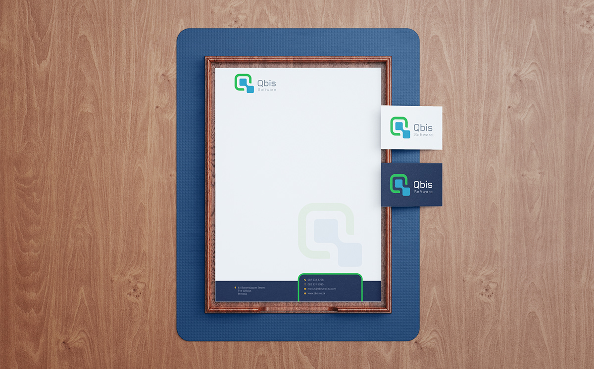
The logo type (font) uses a well designed font by Daniel Johnson from Cyreal that compliments the
logo's square shape and rounded corners. The font family includes five different weights making it
flexible to use on other marketing material.

Colour Palette
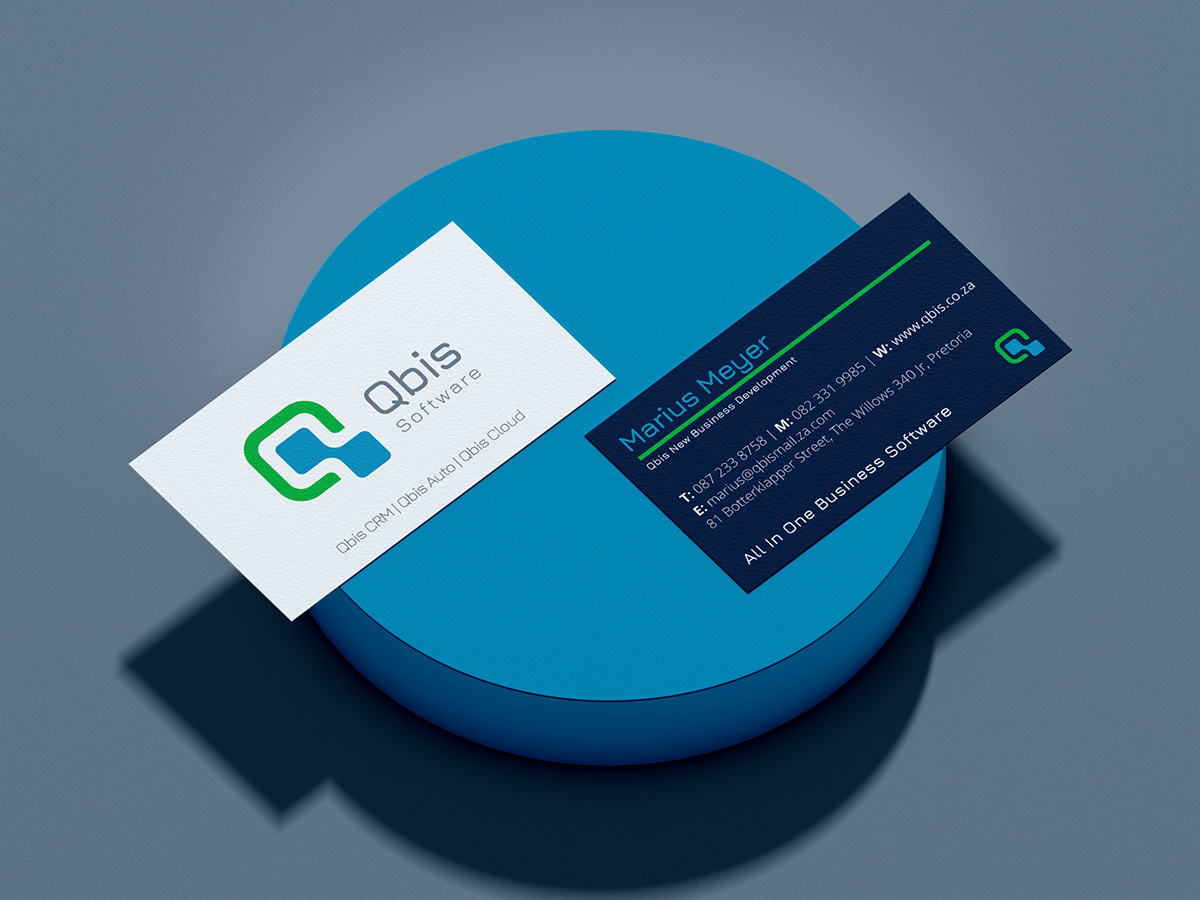
The logo consists of four colours: Oxford blue, Cyan, Yellow Green and Alice blue (white). Since Qbis specializes in moving sensitive and valuable information between the right users, it would make sense that they will need to build a sense of trust with their with clients. We decided to use blue tones to communicate that sense of trust. As for the green, we also wanted to give the brand a sense of user-friendliness to help give their audience the confidence to use their software.
Branding Stationery
Business Card Design
Letterhead Design
Designed by Blue Sphynx Image Engineering
September 2021
info@bluesphynx.co.za


