
Description: Branding project with logotype, corporate applications, outdoor labeling and packaging for a historical bakery – pastry in Athens southern waterfront.
Strategy: Walking through its forth decade, one of the most successful Athenian brands in bakery – pastry industry broadened its vision and decided to renovate its store in full scale, converting it into a modern inclusive space, worthy of the ingenious and extra fine products that sells and serves. Within the framework of its evolution we decided to create a fresh visual communication identity, based upon the heart of the brand, preserving the consistency with the tradition that made it distinctive. We detected its heart deep inside the baking lab, which turns on the lights at two o’clock in the morning, ‘’before the rooster crows…!’’
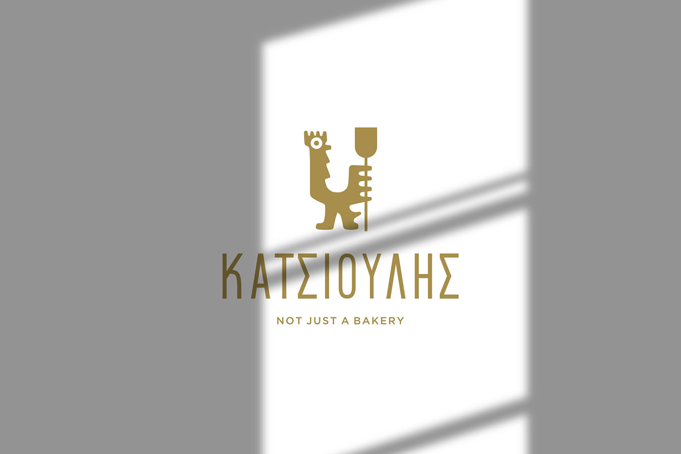
Logo Design: Hence, we designed a logotype that represents a master artisan in the form of a rooster. The logo integrates numerous partial symbolisms, among them a wooden shovel and the prow of a gondola, depicting the fresh hot baked goods and the Italian coffee respectively. Equally in purpose, we designed the penetrating look of our early bird, seeking to catch the eye of each observer individually, providing the feeling that the rooster communicates exclusively with him. Next, we supported the symbol with the brand name, using a clean and modern sans serif typeface. Thus, we offered a joyful meaning to the beginning of a tasteful day. A day worthy of eat and drink and be merry.


Corporate Applications & Outdoor Labeling: We reinforced the rebranding with a series of corporate applications, like clothing, menu, placemats, etc, as well as with the design of the outdoor labels. We developed all these applications using details of the logotype, strengthening each one of them with the appropriate color codes.
Packaging: Concluding the visual communication of the refreshed brand we integrated the packaging. In this case we designed minimal forms, inspired by the diagonal lines that one can spot at the floors of the store, achieving to bring closer the architectural with the graphic design and further reinforcing the new corporate identity. The color palette that we used for the packaging maintains the consistency of the identity, while effectively differentiates its distinctive elements (baked goods, pastries, ice creams, coffee and drinking beverages), hence KATSIOULIS is…. not just a bakery!
Architecture design: Costas Gagos architecture design - www.gagos.gr
Construction by: Nicolas Theocharis
Photography: Nakel Studio
Construction by: Nicolas Theocharis
Photography: Nakel Studio


