
These were my first ever typography layouts, done for a school project in 2010.

Comparison of humanist and modern capitals.

Comparison of humanist and modern lowercase.
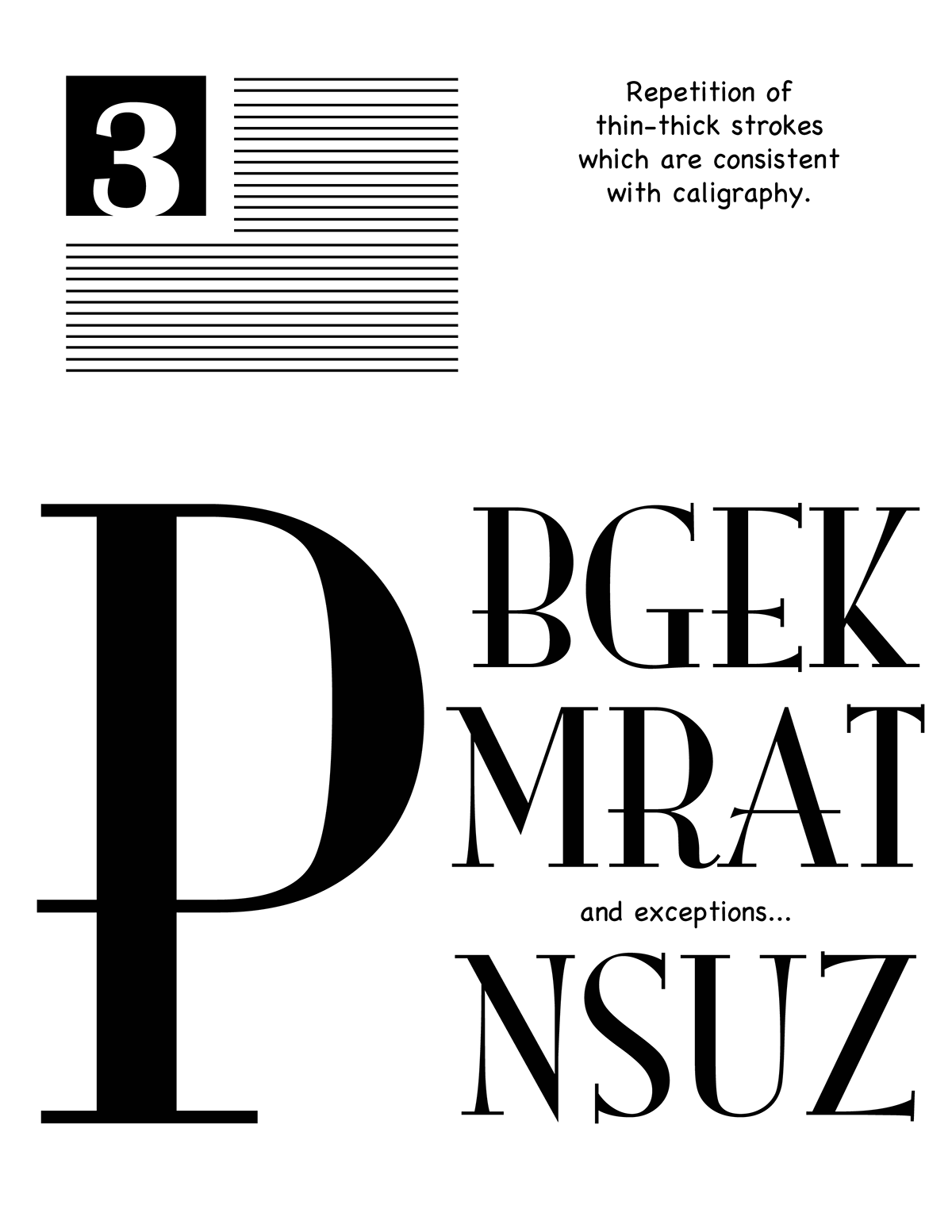
Comparison of thick-thin strokes.
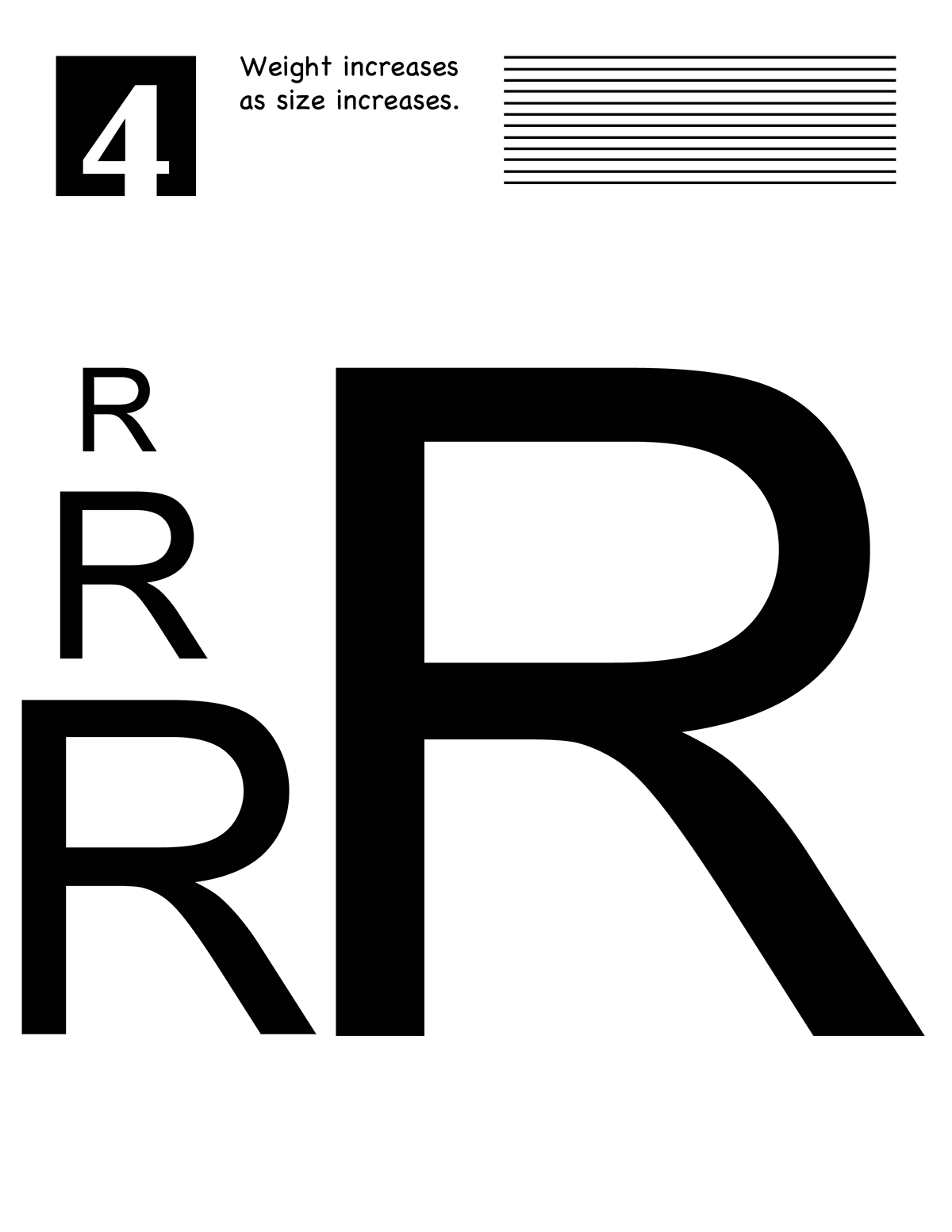
Comparison of weight.
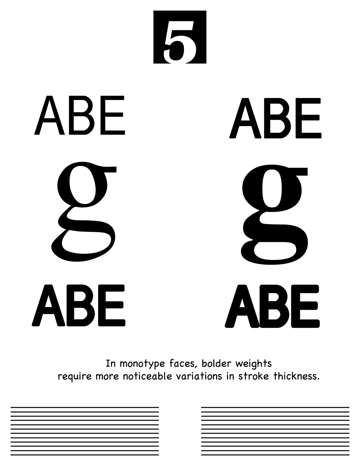
Comparison of stroke thickness in bolder weights.
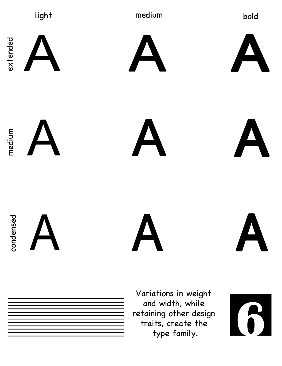
Comparison of type familys in weight and width.
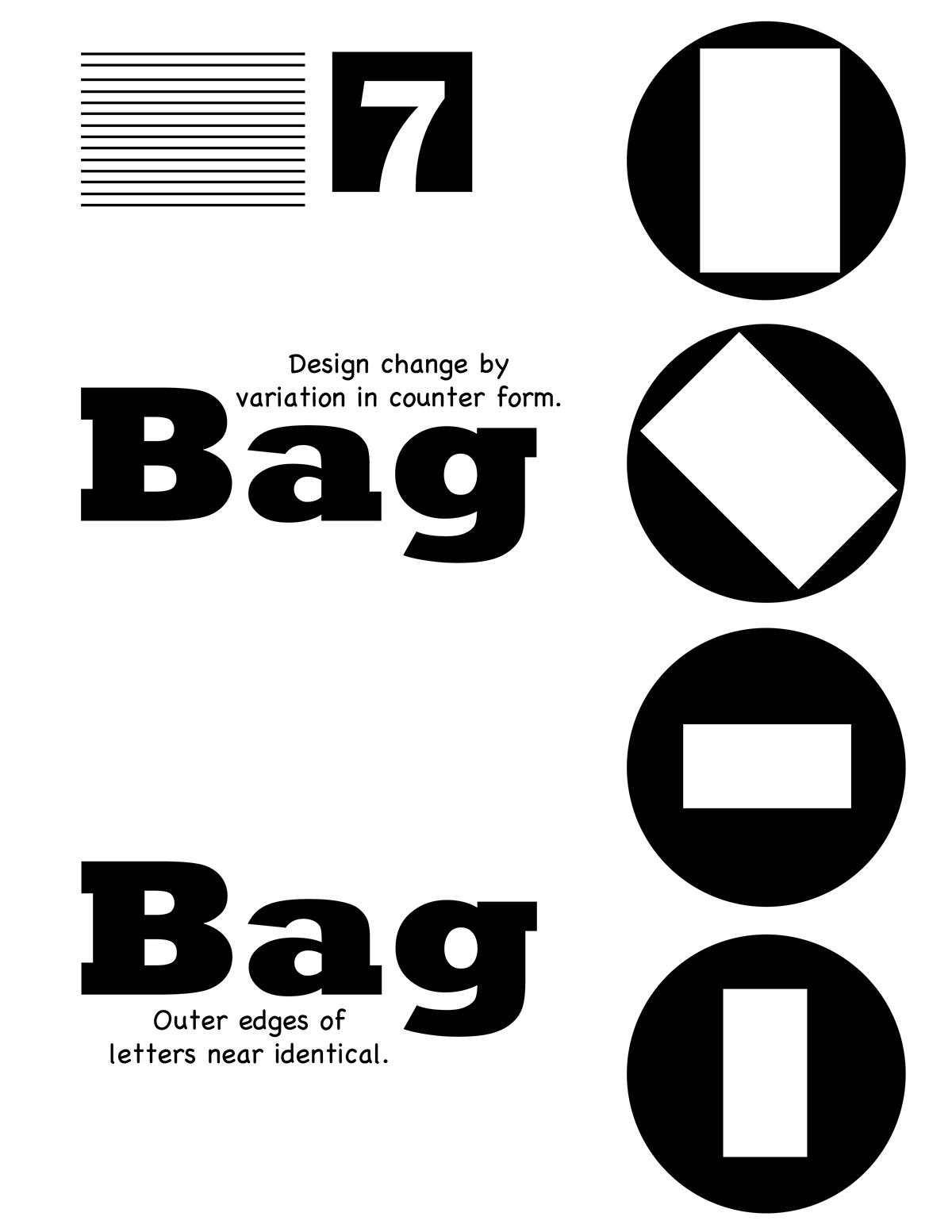
Comparison in form.

Comparison of italics.
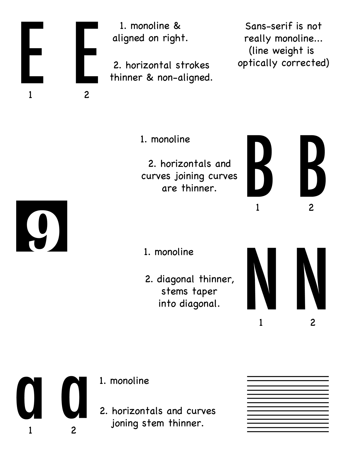
Comparison of monoline.
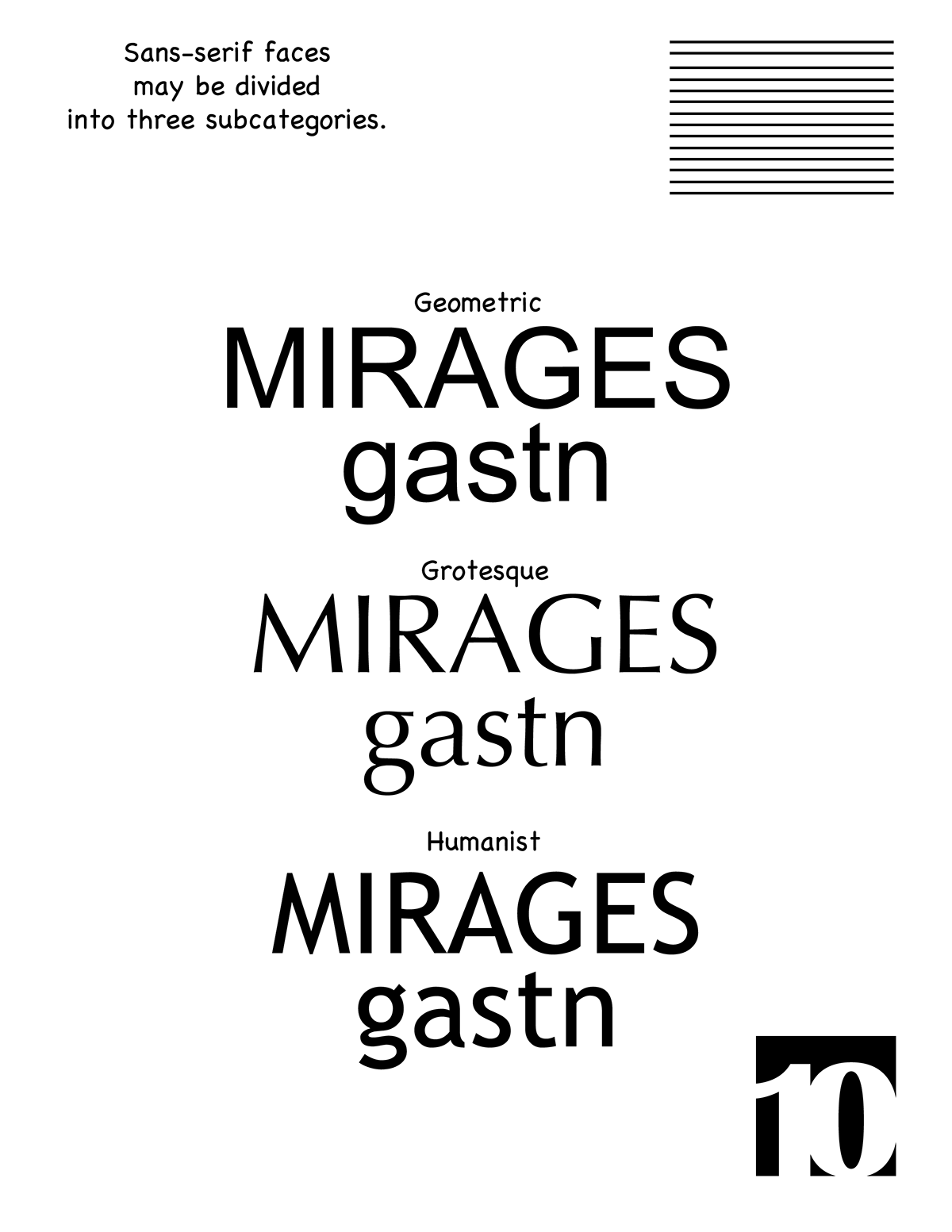
Comparison of sans-serif faces.


