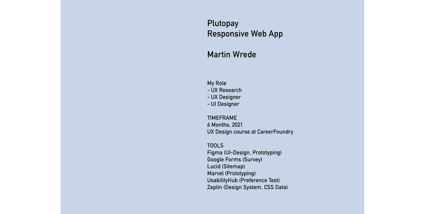
PlutoPay
- Casestudy for a responsive banking app -
Allow anyone to shop, transfer money, and more without a debit or credit card or the need to visit a physical bank or store.

The UX procedure is inspired by the Design Thinking concept
Phase 1
> Problem Statement
> Competitive Analysis
> Business Requirements
Phase 2
> User Survey / Google Forms, 11 participants
> User Interviews / Video Interviews, 4 participants
> Affinity Map
> User Personas
> User Journey
> Task Analysis & User Flows
Phase 3
> Sitemap / Cardsorting
> Sketching
> Mid-Fidelity Prototype
> High-Fidelity Prototype
Phase 4
> Usability Test / Online Test with Prototype, 6 participants with video recordings
> Evaluation
> Preference Test / Online Test with 2 alternative designs, 10 participants
Phase 5
> Design Language System
> Design Collaboration - Final Usability Test / Online Test with Prototype, 4 participants
> Final Prototype
> Conclusions
Phase 1
> Problem Statement
With the "Double Diamond Strategy" we defined a clear problem statement:
The user needs to make digital payments because he wants to go shopping and send money to his friends and family.
We will know this is to be true, when we see how many people use the app regularly for digital payments.
We will know this is to be true, when we see how many people use the app regularly for digital payments.
> Competitive Analysis
Overview
We are going to analyze a German competitor named N26.
https://n26.com/
We are going to analyze a German competitor named N26.
https://n26.com/

SWOT Analysis of N26
Strength
Strength
- First in the market in Europe and Germany
- Size of the bank: Market valuation more than Germany's 2nd biggest bank Commerzbank
- Free bank account
- Paying with the app worldwide for free
- Paying with the app worldwide for free
- The registration process is very simple and fast.
Weaknesses
Weaknesses
- Accused of not preventing Money-Laundering: The simple registration process is at the expense of the security.
- In the app store, N26 has a rating of 3.9. Relatively many poor 1-point ratings.
- Some key points here are a poor help of no efficient help with problems.Opportunities
- The registration process is very simple and fast. This is at the expense of the ID security check.
Threats
- N26 has increased its fees, this could be a reason for customers to switch banks.
- Revolut, for example, recently introduced a new offer: a credit card for teenagers. Perhaps also a small side blow to N26.
The next German competitor is DKB.
https://dkb.de/

SWOT Analysis of DKB
Strength
- DKB ist 2nd biggest direct bank in Germany.
- Favorable conditions for online banking, Visa Card, investment opportunities.
Weaknesses
- In the app store, dkb has a rating of 3.8. Relatively many poor 1-point ratings.
- The current app is more a copy of the website with the same functions, not very innovative
Opportunities
- They want to become a real "Techbank": With a new app they could become more innovative
Threats
- In the near future, even more modern native banking apps will hit the market, so there will be even more competition here: Revolut and other banks.
> Business Requirements
Target Audience
The typical client is rather young (18-30), he likes the idea of using a mobile phone for his financial
needs and since the bank is located in Europe also offer EUR as only currency. He likes to travel
so it would be helpful if he could pay with the card worldwide.
The typical client is rather young (18-30), he likes the idea of using a mobile phone for his financial
needs and since the bank is located in Europe also offer EUR as only currency. He likes to travel
so it would be helpful if he could pay with the card worldwide.
Competition
There are competitors like N26 or dkb, both have a native app as well a standard Website for banking services. N26 is technically more innovative with its app features.
They both offer free accounts, where as DKB offers a real credit card for free (Visa), N26 has only a mastercard debit, which is less accepted by shops.
Risk/Opportunity
There are already some apps here that are 100% optimized for cell phones, and normal banks are also likely to try to gain market share with mobile apps.
After all, it's also about offering a more intuitive app and better customer service than the standard banking apps to stand out.
The majority of N26 users do not use their account as their main account, which means they do not trust this bank 100%. Here you can try to convince with serious offers.
Phase 2
> User Survey / Google Forms, 11 participants
Research goals for survey
– Research which people are interested in the app: age, occupation, salary
– What technical device they prefer, especially for banking and shopping apps
– Research which people are interested in the app: age, occupation, salary
– What technical device they prefer, especially for banking and shopping apps
Survey Results
I used Google Form for this survey, it ran 4 days long and the 11 participants were recruited via CareerFoundry's Slack channel.


Here are the main conclusions:
- The respondents would prefer a mobile app for banking (82%)
- Some still use normal Laptop for banking (18%), which means it makes sense to offer the website as a responsive website, with a version for Laptop and PC.
- As authorization method they would prefer the normal Username and Password.
- There are cultural differencies: In Germany, still many people prefer paying with cash money, (age: 50 years or more), in the USA it is different.
> User Interviews / Video Interviews, 4 participants
After the survey with its quantitative data, the face-to-face interviews were helpful for "follow-up" questions to get deeper insights into users' experiences and to capture positive and negative emotions when using banking apps. Here it was also good to use video recordings to have a way to get all the needed information in detail.
Research goals for interviews
– Document user opinions about competing websites or apps that might influence the
design of the project Plutopay.
– Research what features are important for successful banking app use.
– Determine which banking apps or sites your users enjoy using and which types of apps or
sites leave them frustrated.
> Affinity Map
Interview Results / Affinity Map:
Three sessions were conducted and took about 10-20 min. each.
Later I would organize the information in an affinity map technic. To get a method to transform
a full wall of personal quotes and individual notes in some more general topics.


The topics are:
SECURITY
- Security is very important for all participants and it is one crucial criteria for choosing an app. Though they haven't made any bad experiences, here.
- Security is very important for all participants and it is one crucial criteria for choosing an app. Though they haven't made any bad experiences, here.
CUSTOMER SUPPORT
- Customer support is for all banks still a topic where they have to prove that they can be competitive, where as online banks are still in a weaker position since they have not a real person to help.
SHOPPING CASH OR DIGITAL
- At least for these people cash is still king. That can be understood as a general trend in Germany where people still prefer cash money for shopping
ONLINE BANKING EXPERIENCES
- The participants still find it important that normal banking activities work well. Annoyance arises when technical problems slow down the workflow.
INTERESTING FEATURES
- These features are of course an opportunity to be innovative and sell it as a USP (unique selling point). But still it is more important for the participants that the normal banking functions work sufficiently.
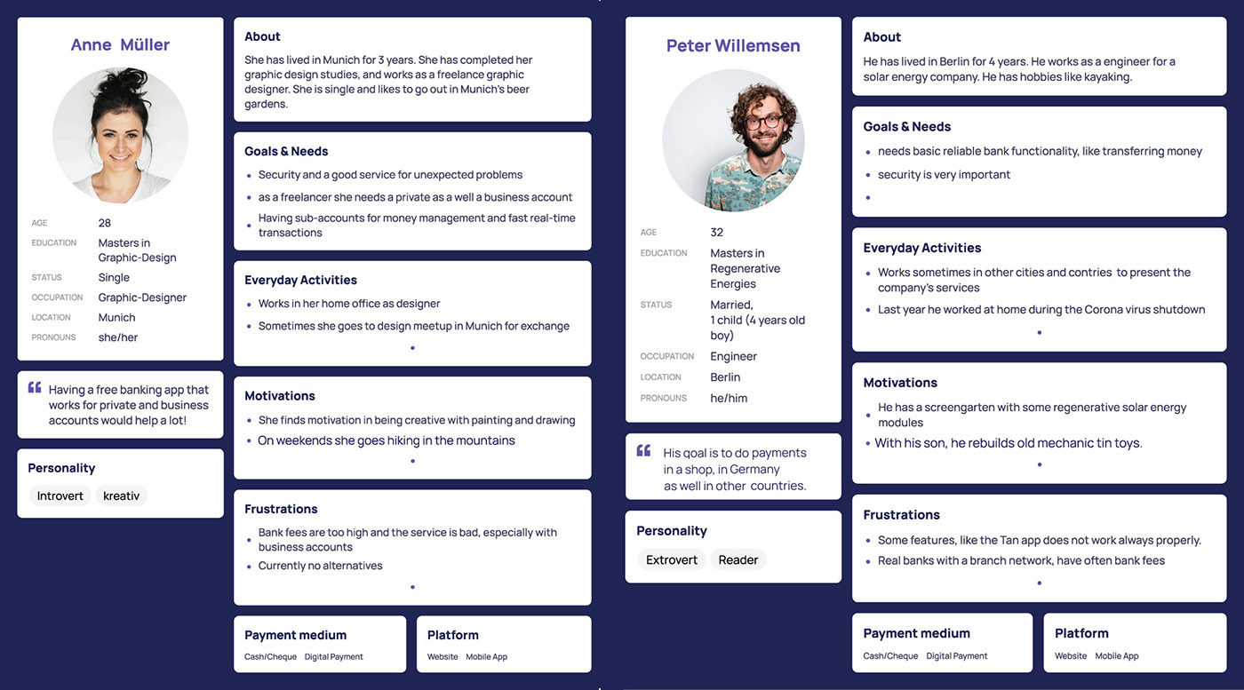
> User Personas
Using the results and characteristics of the interviewees and surveys, I created two user personas which represent the general needs, goals and motivations. It helps also to understand the user's needs and frustrations.
Their needs and goals can be summed in two user stories:
Anne:
"As a freelancer,
I want a free business account
so that I can use it for transactions."
Peter:
"As a traveler
I want digital payment functions
so that I can easily pay in stores abroad."
I want digital payment functions
so that I can easily pay in stores abroad."
> User Journey
To show the process of each step I created user journeys.
It describes the phase of each navigation step, with the description of the task, his or her thoughts, emotions and opportunities.


> Task Analysis & User Flows
Userflow show the screens and interactions which are needed to reach the goal.


Phase 3
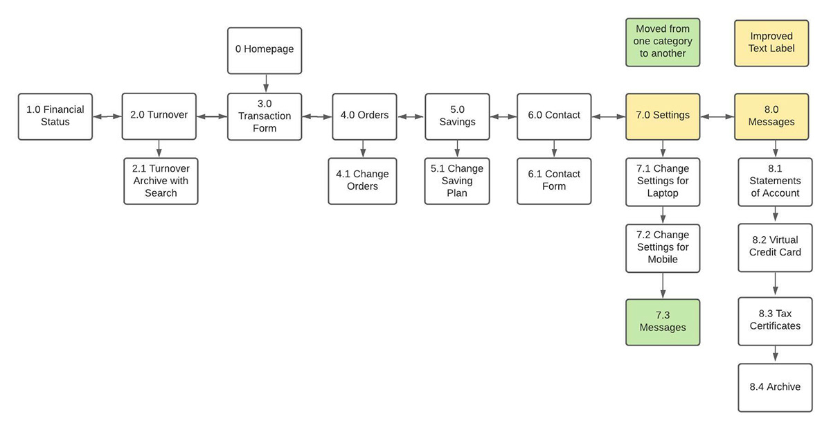
> Sitemap / Card Sorting
Based on the user flow, I created a sitemap and organized a remote open-card sort via Optimal Workshop to check whether it was logical or not. Here is the refined result, built with lucid.app.
The card sorting process brought some changes in the structure of sitemap and changes of label names.


> Sketching
Handdrawn sketches help to get quick results for a first version of a prototype. Here the interactions and navigation structure are important.


> Mid-Fidelity Prototype
To get more realistic results I build some mid-fidelity prototypes: no colors, only simple text fields. It is built with Figma and is already "clickable", it shows the most important functionalities of the app


> High-Fidelity Prototype
The high-fidelity prototype includes more detail like colors, fonts, illustrations and logos: the Design System is applied here.


Phase 4
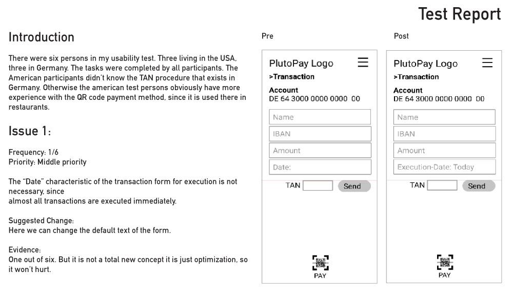
Usability Test & Evaluation
I tried to find at least 6 participants. The participants came on the one hand from my circle of friends, on the other hand from the Slack community.
Goals
The goal of this study is to assess the learnability for new users who are interacting with the PlutoPay Web application for the first time.
We hope to observe and measure whether users understand the application and its value, and how they use basic functions.
With two personas and their success criteria in mind, it’s important to test the app specifically for these defined characters.
We hope to observe and measure whether users understand the application and its value, and how they use basic functions.
With two personas and their success criteria in mind, it’s important to test the app specifically for these defined characters.
Test Objectives
Observe how users complete basics app features:
- Log in/Sign up
- Searching in the archive of transactions
- Modifying the Saving plan with the sub account.
- Using it as a cashless payment (with barcode reader)
Observe how users complete basics app features:
- Log in/Sign up
- Searching in the archive of transactions
- Modifying the Saving plan with the sub account.
- Using it as a cashless payment (with barcode reader)
Sessions
Each session should be 10-20 min. long.
Each session should be 10-20 min. long.
The sessions are video recorded.


PHASE 5
> Preference Test
Here I tested 2 versions on the platform:
https://usabilityhub.com/
Onboarding Process / 4 screens , Version 1:
It has only two buttons elements, which are big enough for the use of your finger. The swipe effect would still work for the mobile vesion.
Onboarding Process / 4 screens, Version 2:
Additionally you have a forward and backward buttons, and a single skip link.


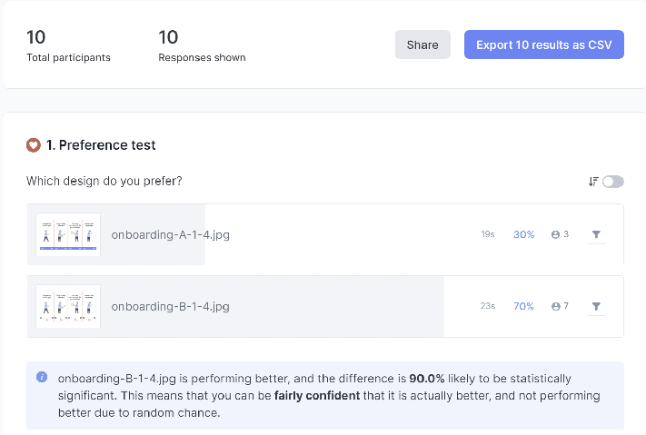
Results
10 persons have participated so far, and the result is realative clear:
30% vesion 1
70% version 2
Summary
The comments go in detail in all directions, it is not a single reason:
- Round button design more clean: 3
- Option to go back and forth: 2
- Skip button in other position (top right corncer, or above cursor button): 1
- Not red color as link: 1
- Arrows aren't really needed either: 1
Updated Version after Preference Test

> Design Systems
A UI Design with space to grow
The UI design is relatively minimalist: variations of the blue/white color gradation are used for all screens.
In the pop-up windows that contain a message or help for the user, a complementary color (orange) is added. Orange is reserved for communication.
It is helpful here to leave room for additional colors and fonts, as a project like this is always growing and you may need to visualize additional functions or features later.
It's similar with the menus and layout. For a banking app, additional buttons may be needed later. Here you can insert them in the responsive menu or in the bottom tab bar.

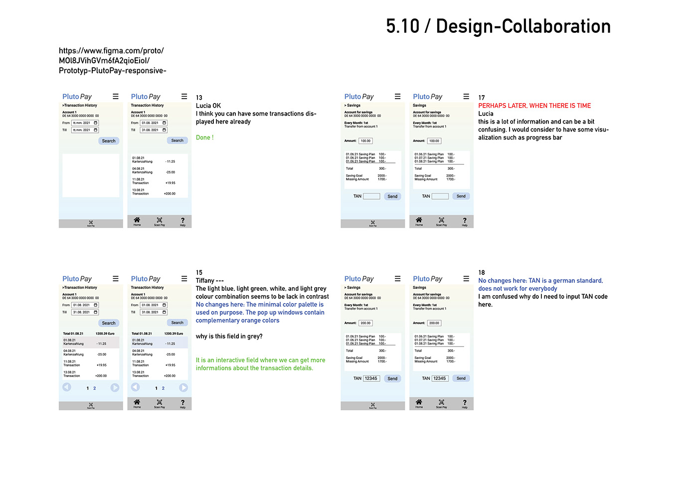
> Design Collaboration - Final Usability Test / Online Test with Prototype, 4 participants
The interactive Figma prototype was then tested again by 4 UX Design students.
Here I got quite many helpful tips and written notes, collected in the Figma Prototype.
11 optimizations were found and updated.


Final Version Prototype


> Final Prototype
> Conclusions
Problems and Challenges
Finding interview partners
Sometimes time is a factor, and it's not always easy to find enough interviewees. Sometimes I looked for European students (Euro based countries) but could only find American participants. There are also different cultural backgrounds to consider.
How do you integrate or adapt unexpected results into the app's functionality?
One hypothesis was, that people love it to pay digital. The survey and interviews show a difference between German people over 50 years and young American folks. Where as the young people prefer to pay with cash money, it seems in Germany a different case, especially for people over 50 years.
Here it would be possible to adjust the statistical results to the functionality of the app.
Next steps
Responsive version for laptop
The survey shows, that at least 20 % of international young user (18-35 years) are also interested in the responsive version and would use the app on the laptop or PC.
Interviews with German users also show that in the age group over 50 year, a responsive website is preferred over native apps.
Also under the spect of accessiblity that would make it open for people without mobile phone or older people.
Native Apps versus responsive websites
Native apps have a development time of several months / years until they appear, updates are made occasionally.
With a Responsive website, we have a situation from the beginning that means constant updating, as here the content, images or programming can be adapted relatively quickly.
You have the situation of many small tests and updates, which entail a different way of working, compared to a Native App.
With a Responsive website, we have a situation from the beginning that means constant updating, as here the content, images or programming can be adapted relatively quickly.
You have the situation of many small tests and updates, which entail a different way of working, compared to a Native App.
