

JIHE Sandwiches
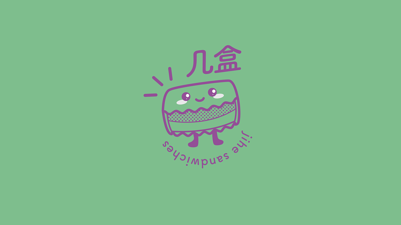
JIHE sells a great variety of taro sandwiches: a typical breakfast food from Taiwan. Taro sandwiches consist of multiple slices of bread filled with taro and other flavors.
The client was looking for a bold image and a funny character to represent its new and young brand. It was important to catch the eyes of customers right away. At the moment, they operate with small stores, typically a hole in the wall. Thus, having a recognizable image means a successful business for them.
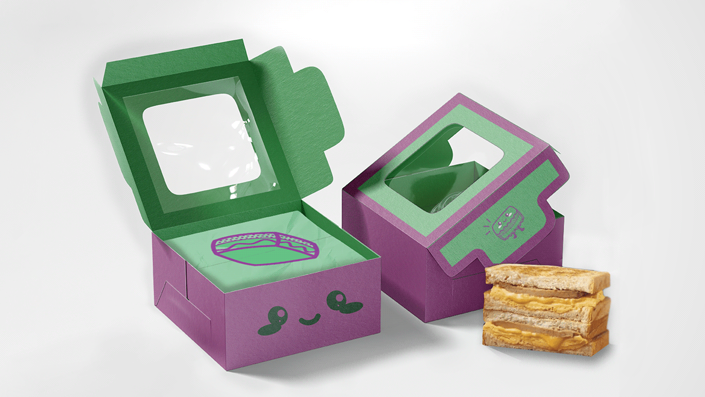
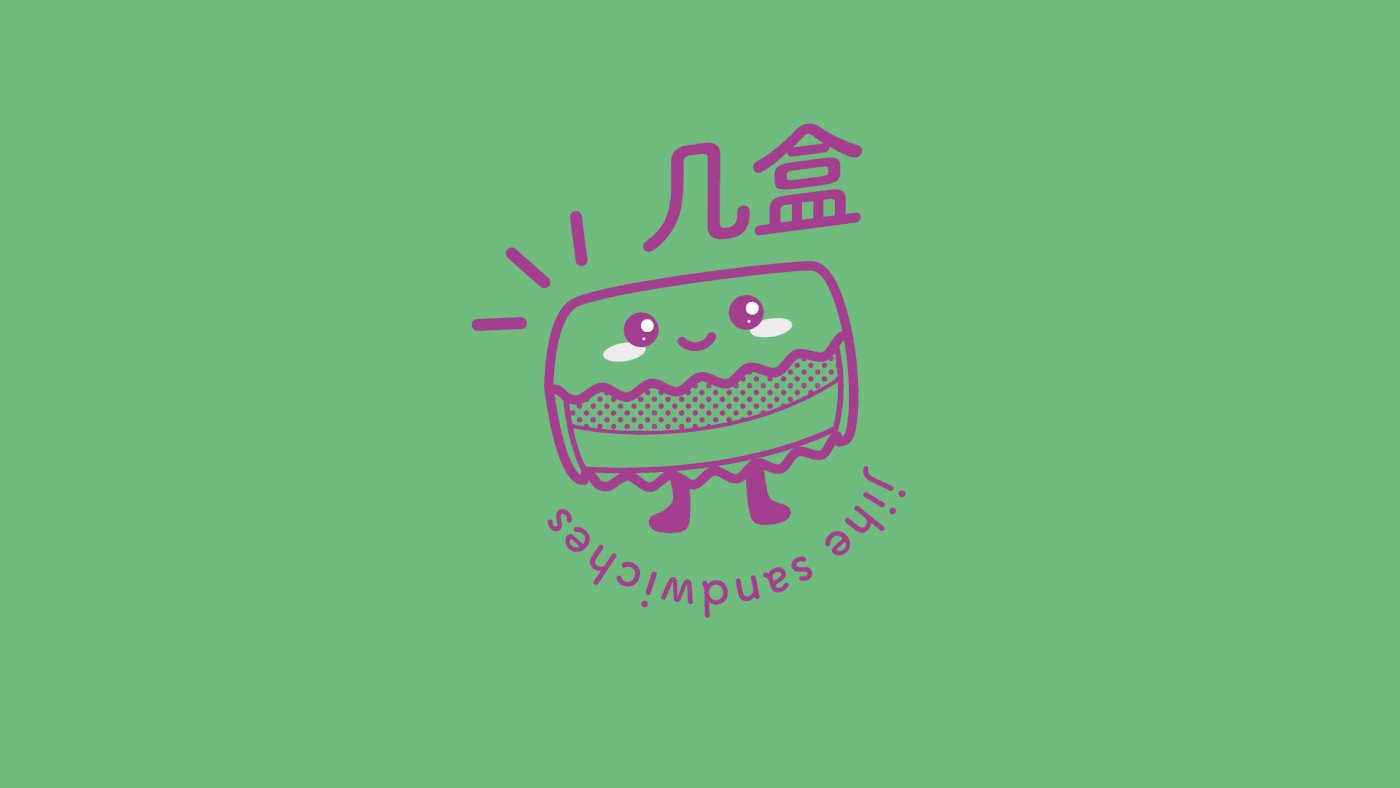
We designed a Mascotte that resembles the typical taro sandwich. We wanted to showcase their main product to who don’t know it yet but also, to create a connection with the customers that already know it. The green represents the genuine character of the food and with the purple its sweetness. We use the purple to create a visual contrast in the composition, a more captivating color.


Client: 几盒手作芋泥吐司
Design Studio: yzpro
Location: Beijing
Account Manager: Zaylin Lian
Art Director: Isaia Pruneddu
Graphic Designer: Sarah Vermeulen
Year: 2021
Design Studio: yzpro
Location: Beijing
Account Manager: Zaylin Lian
Art Director: Isaia Pruneddu
Graphic Designer: Sarah Vermeulen
Year: 2021
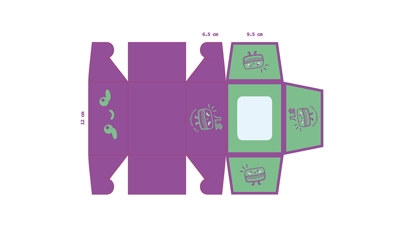
Brand image, logo and packaging.


