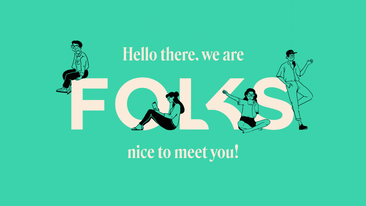
We are thrilled to present Folks.
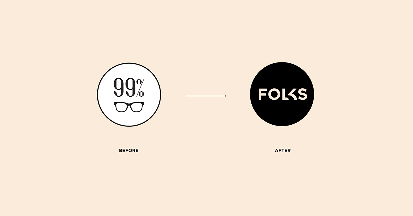
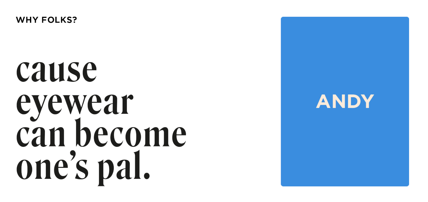
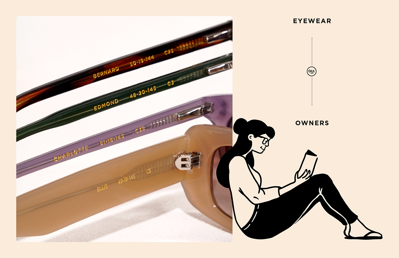
We began the branding process at a naming phase, given the fact that the name 99% gafas (i.e 99% sunglasses) wasn’t responding to the core of their business anymore. After the research stage, we proposed the name Folks as we noticed eyewear hangs out with their owners almost the same amount of time that best friends, buddies and mates spend together. Actually, eyewear can become one’s pal.
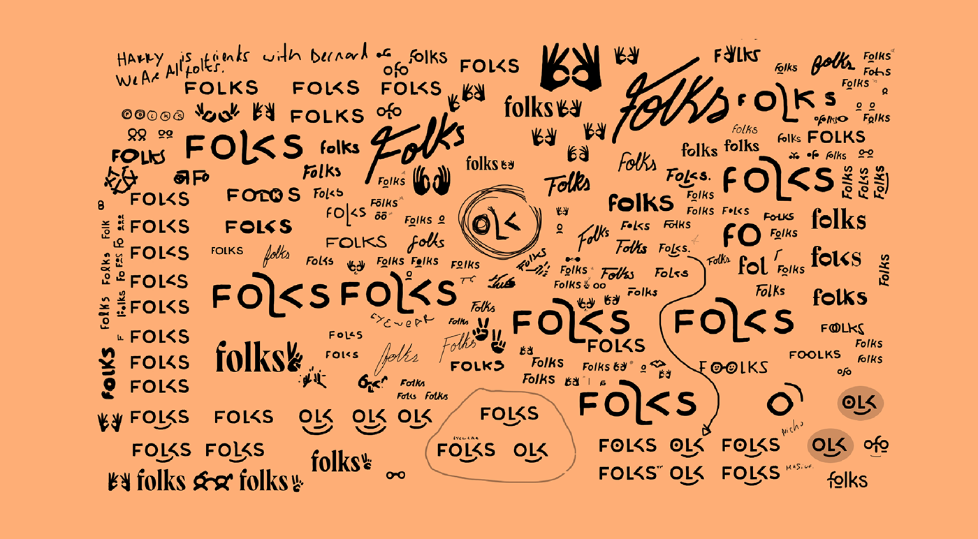
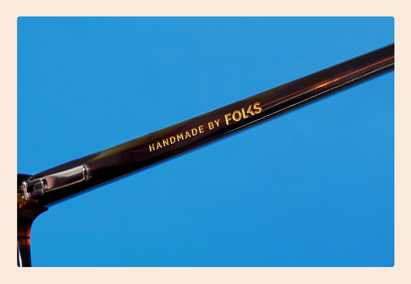
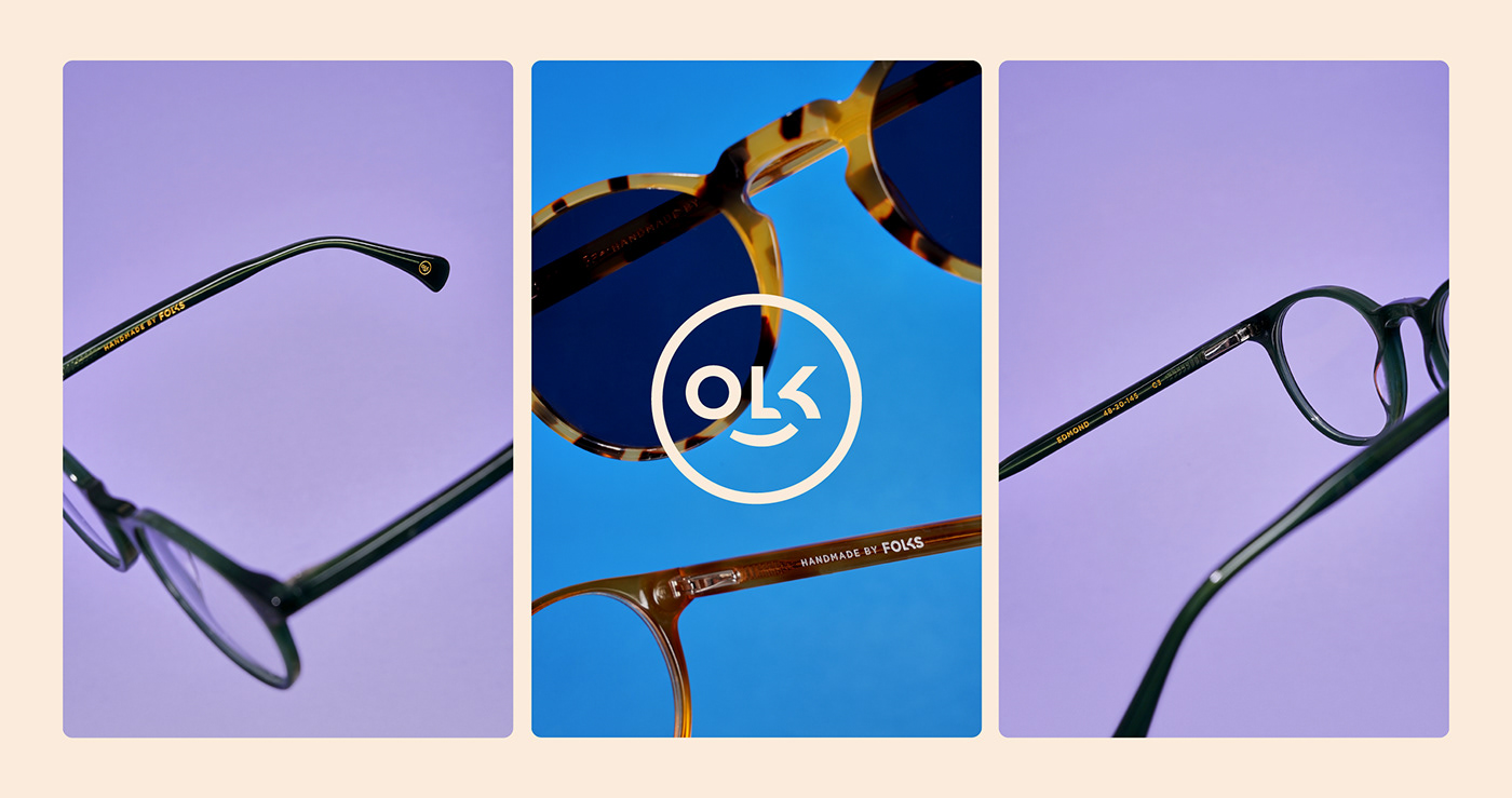
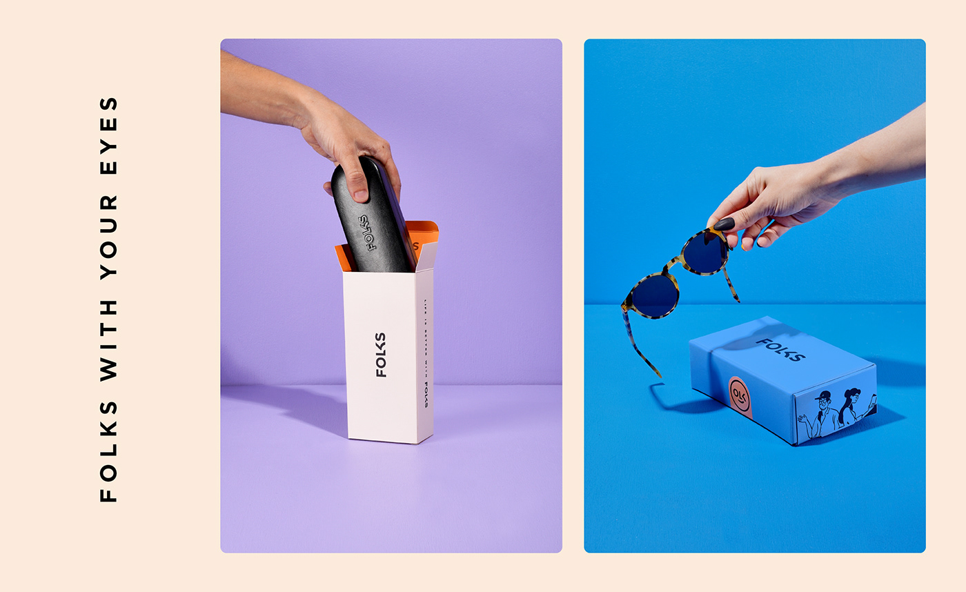
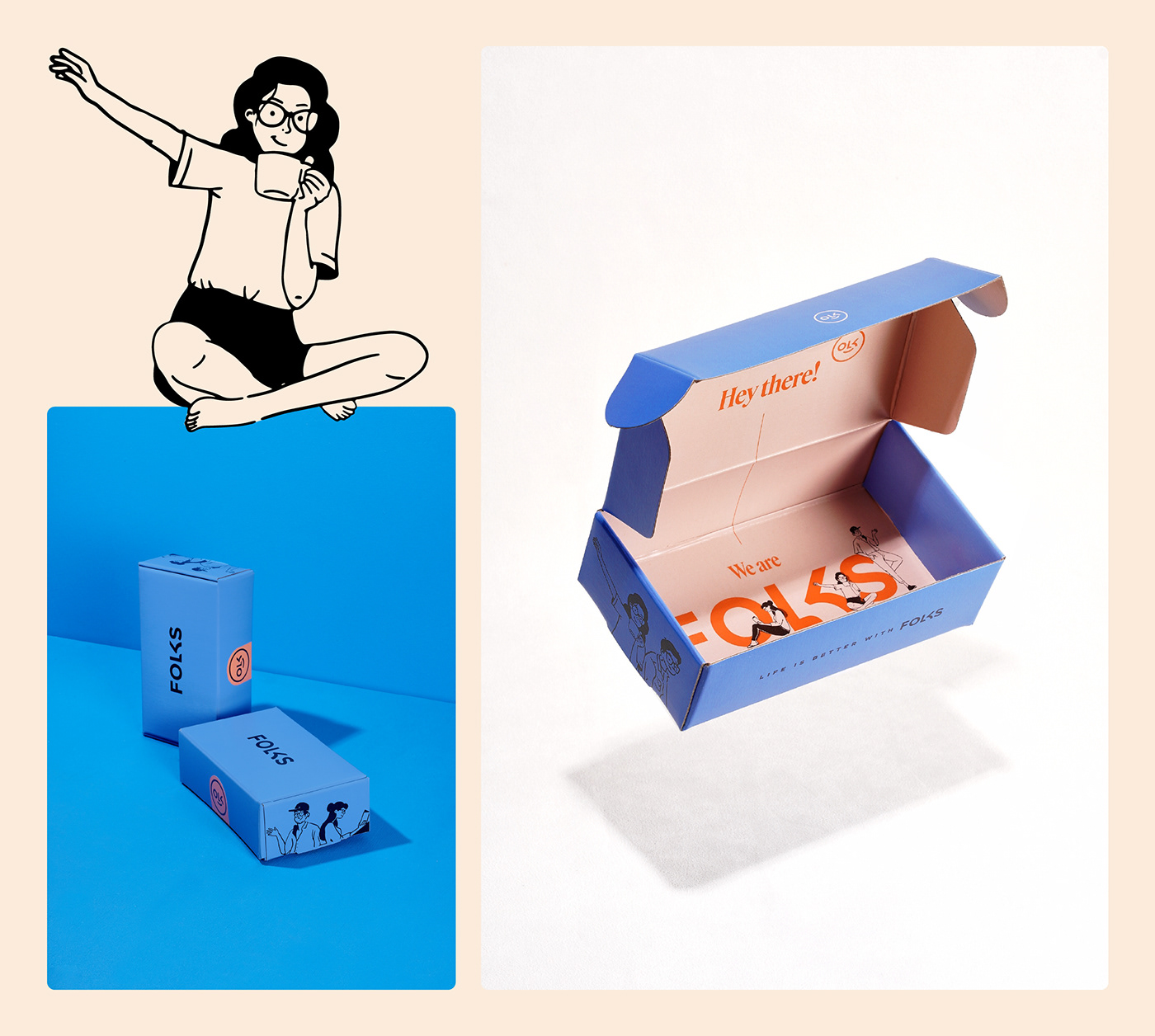
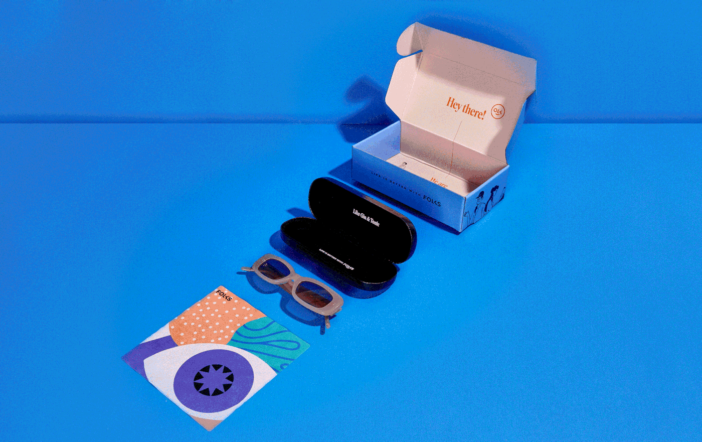
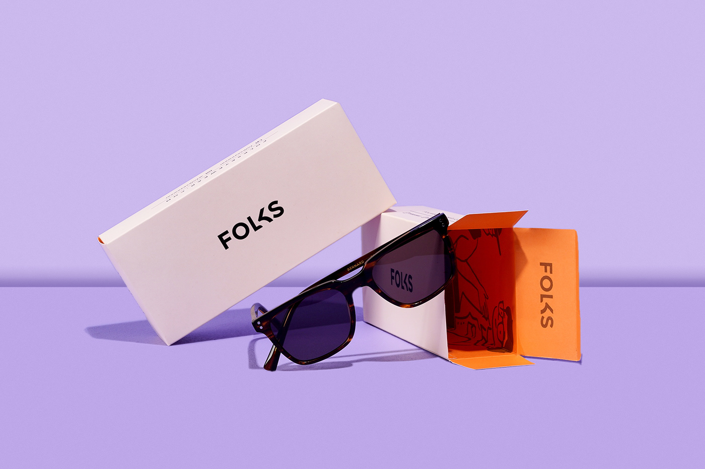
Then we created the visual identity: a logotype with a sophisticated design supported by a sans serif typography and a complementary wink symbol formed by the letters O-L-K designed as a shorthand that can be placed in social media, cases and the sunglasses itself.

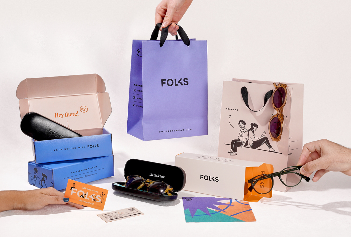
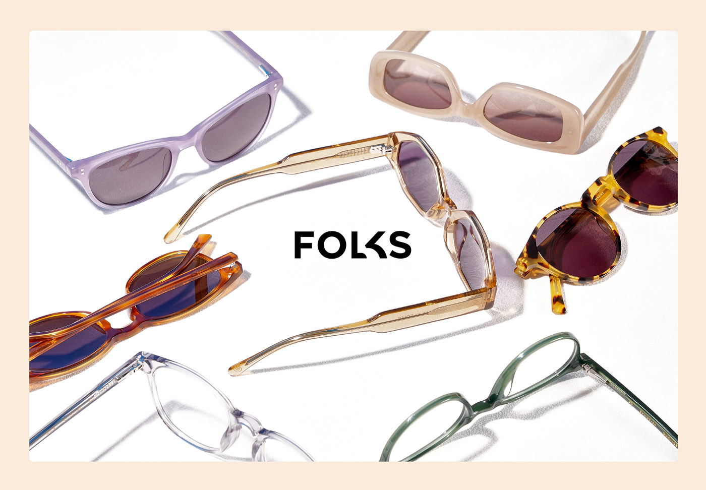
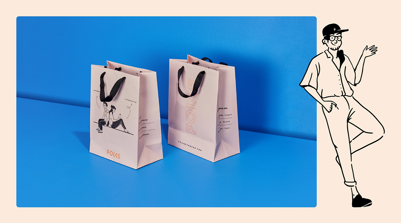
We also developed a distinctly characterful color palette, a group of abstract elements and a gang of characters to be used in their packaging.
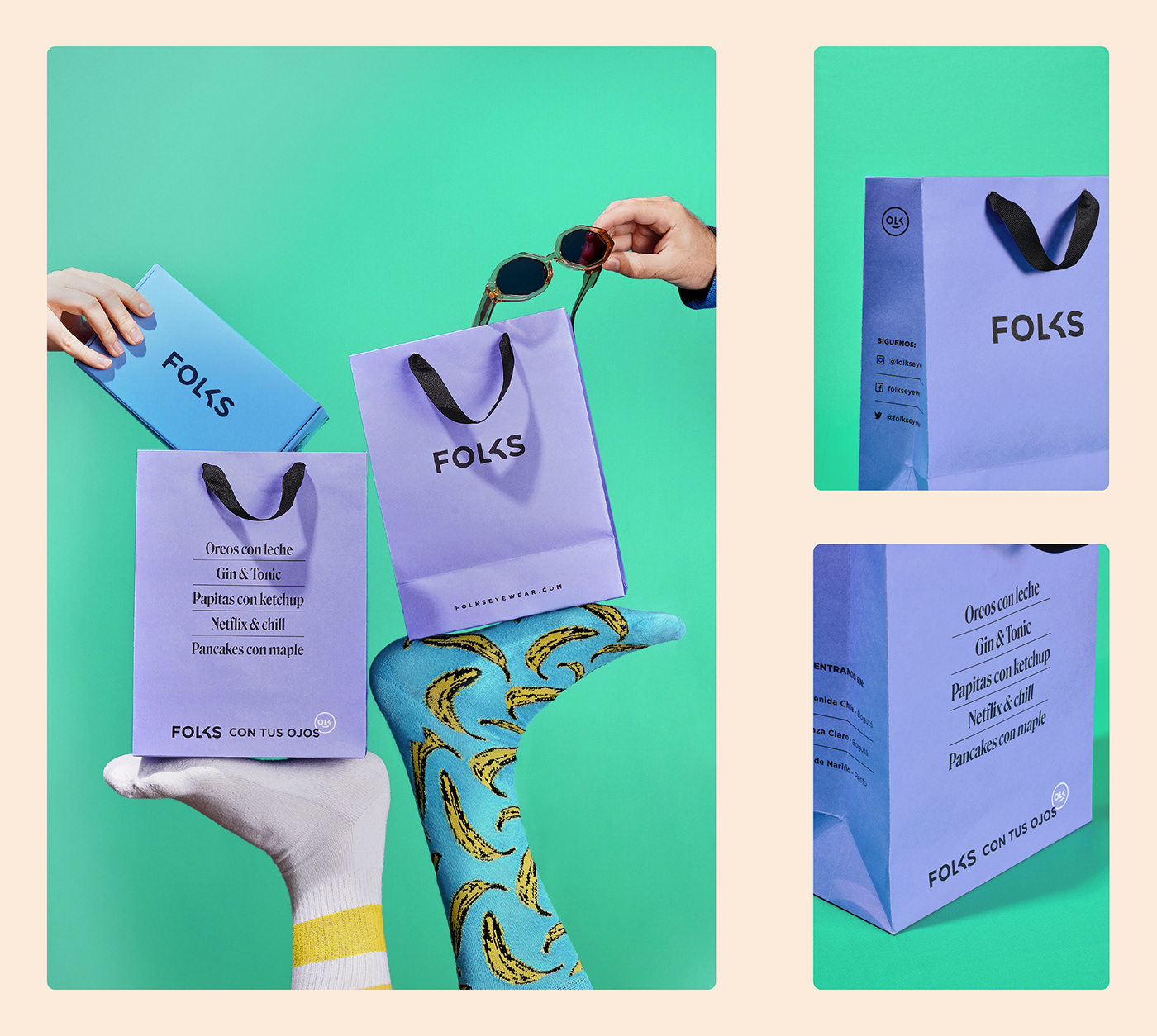


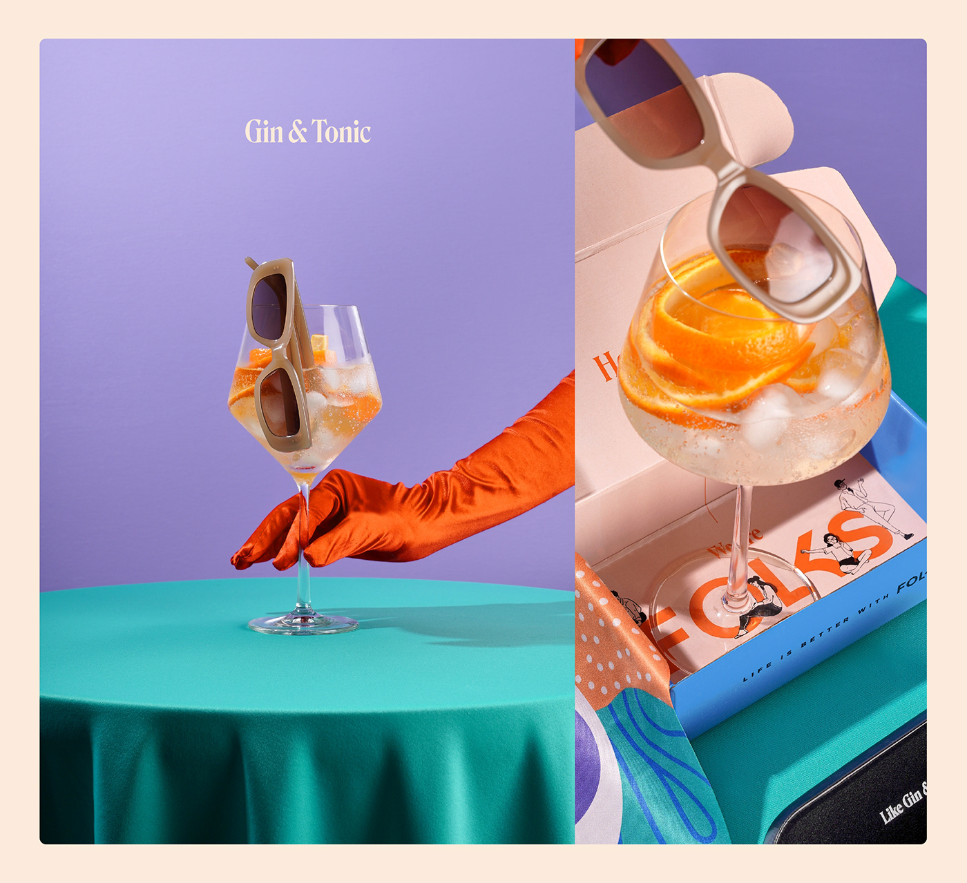
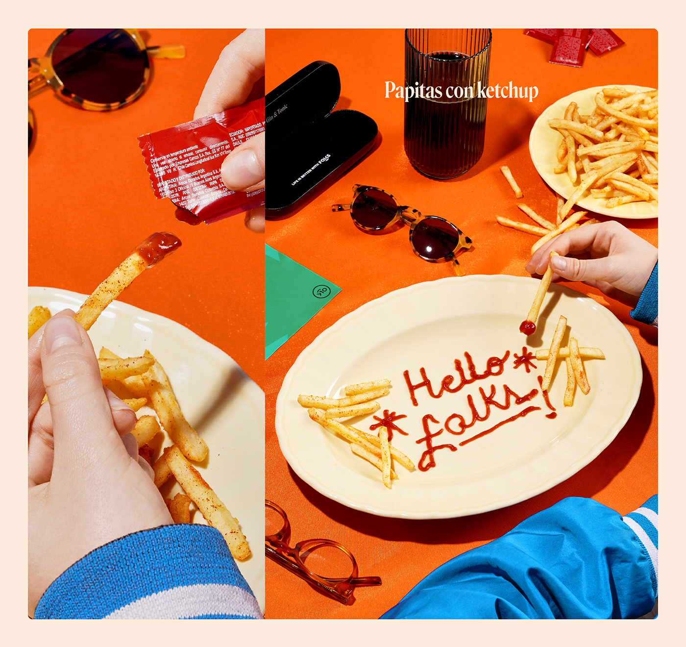
Let’s get one thing straight: good friends go together like fries and ketchup, like gin & tonic, like reading a good book with a cup of coffee on a sunday morning.