identity of the insurance company
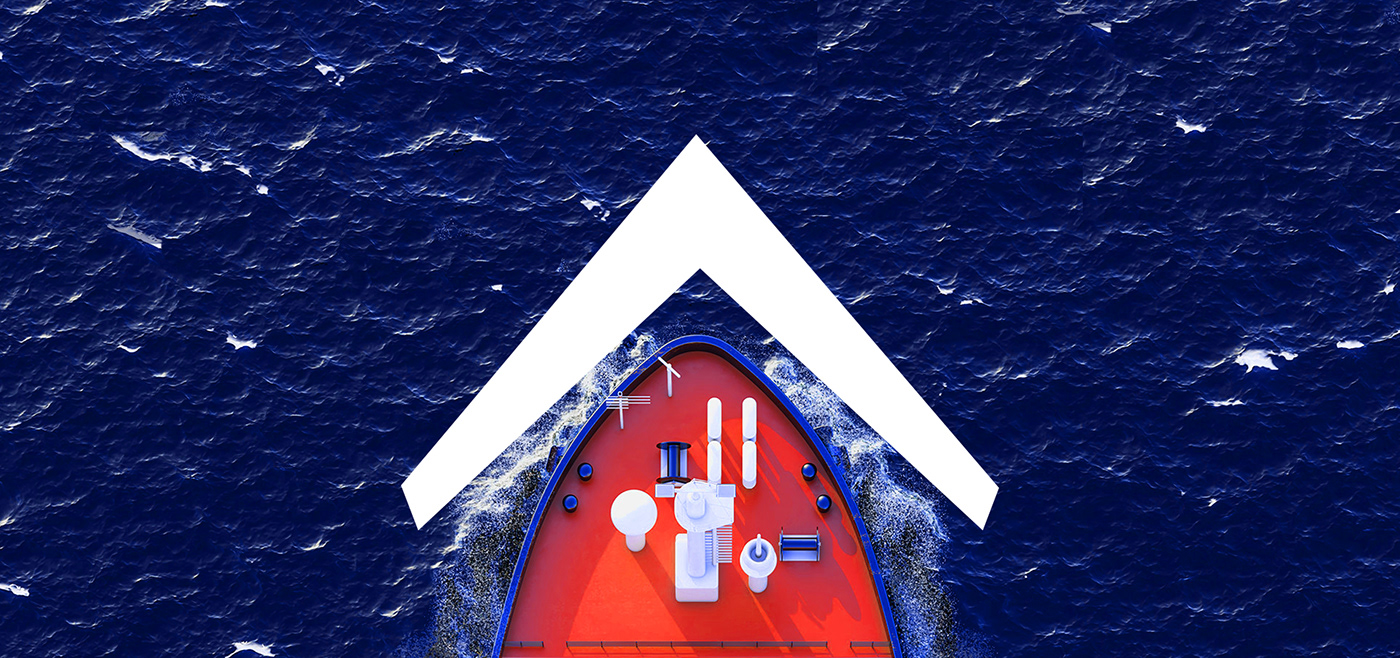
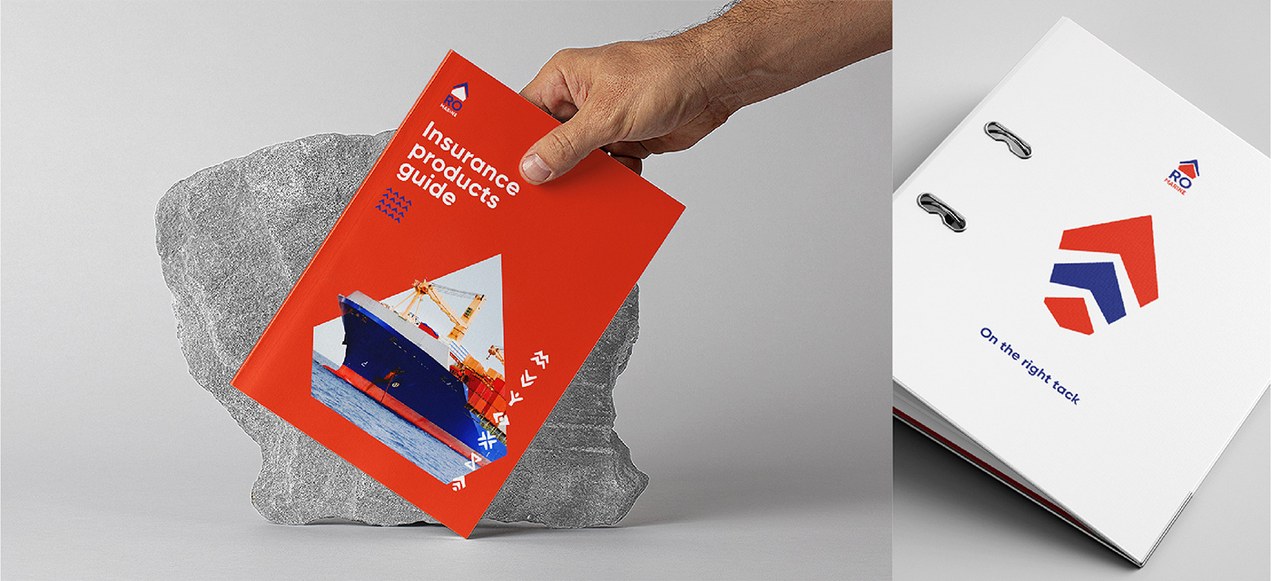
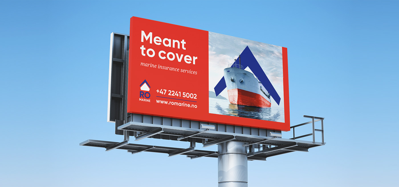
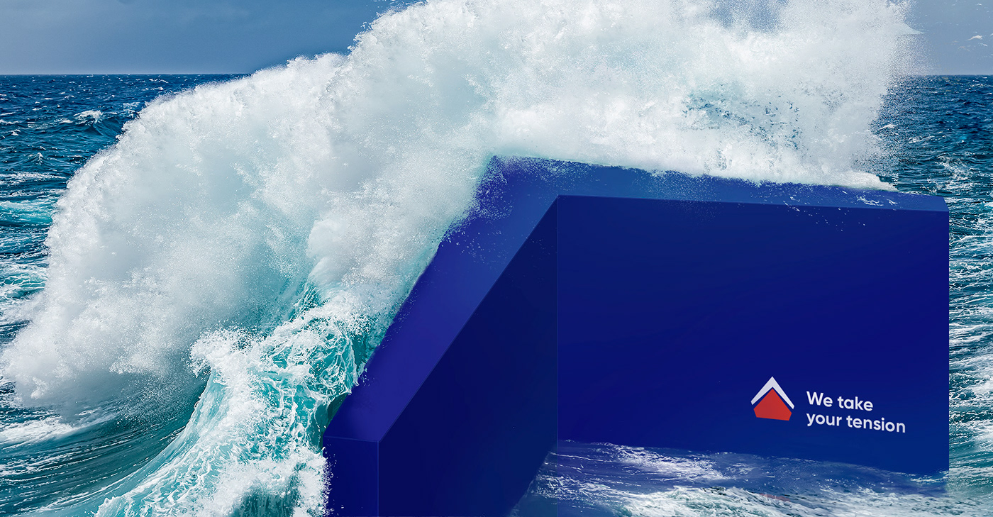
Sea shipping is a high responsibility area. A shipowner is in charge of a vessel, cargo and a crew both onshore and offshore, in good and bad weather. The Norwegian company Ro (means «calm» in Norwegian) is a marine insurer which deals with complicated cases and ensures «flat calm sea» for any client’s business.
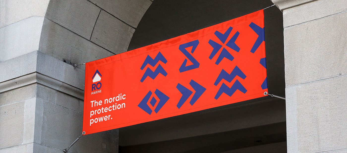
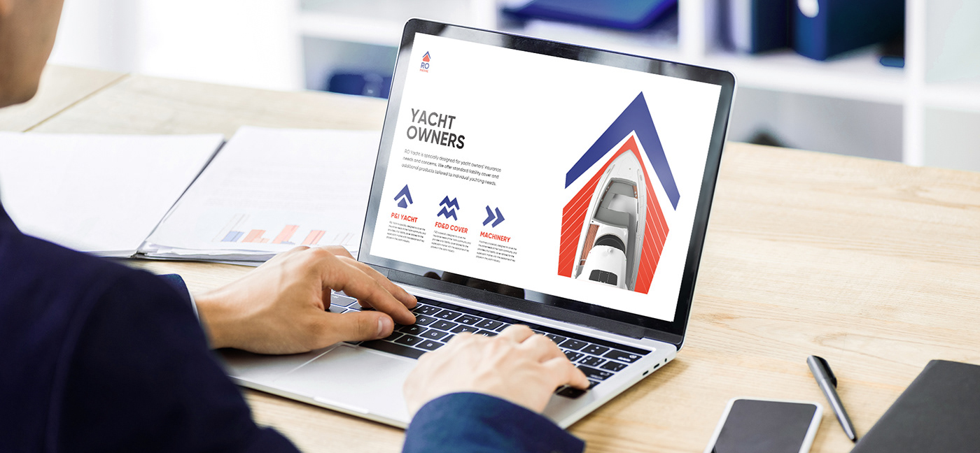
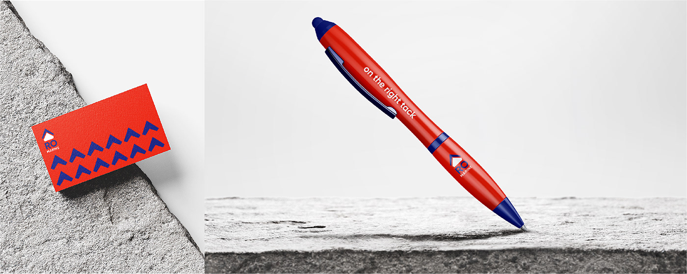
The core of the concept is a ship and a shield in front of it symbolizing onshore and offshore protection. To capture the national semantics we designed the identity in colours of the Norwegian flag. And dynamics of the key element renders the following: no matter how turbulent your business can be, Ro will protect you and take you on the right tack.