For the Major Project conducted within the completion of my Master’s Degree, I wanted to focus my research and design rationale around rebranding a local charity concept, which I had named Talk!. With the organisation based on advocacy and the wellbeing of the public, I wanted to reflect a bright, recognisable brand identity for Talk!, combatting the ongoing issues of smaller organisations lacking public recognition, and charities appearing untrustworthy due to not having a recognisable visual identity.
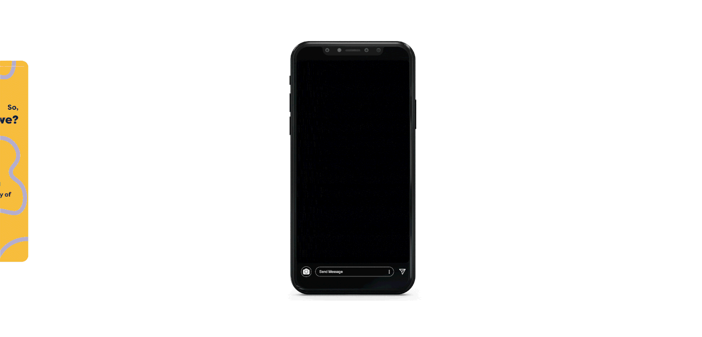
A flat design was considered for this project’s design outcome, reflecting a modern and simplistic appearance, that isn’t overwhelming and cluttered. The use of wiggly lines continues throughout the booklet, standing in as the brand’s staple identifiable element, and represents the charity’s offer of continuous flow of support with no pauses or breaks.
This fresh visual identity includes friendly typography with a considered large x-height for increased legibility. With the sole use of one typography, this should increase the recognisability of the charity, which should also contribute towards identifying attempts of fraud. The four-way colour palette featuring yellow, green, red and purple reflects individuality and provides a distinguishable identity for the organisation throughout their branding.


Following the delivery of Talk!'s brand identity guideline, below are examples of how the booklet can be used to reflect the charity through examples of branding.