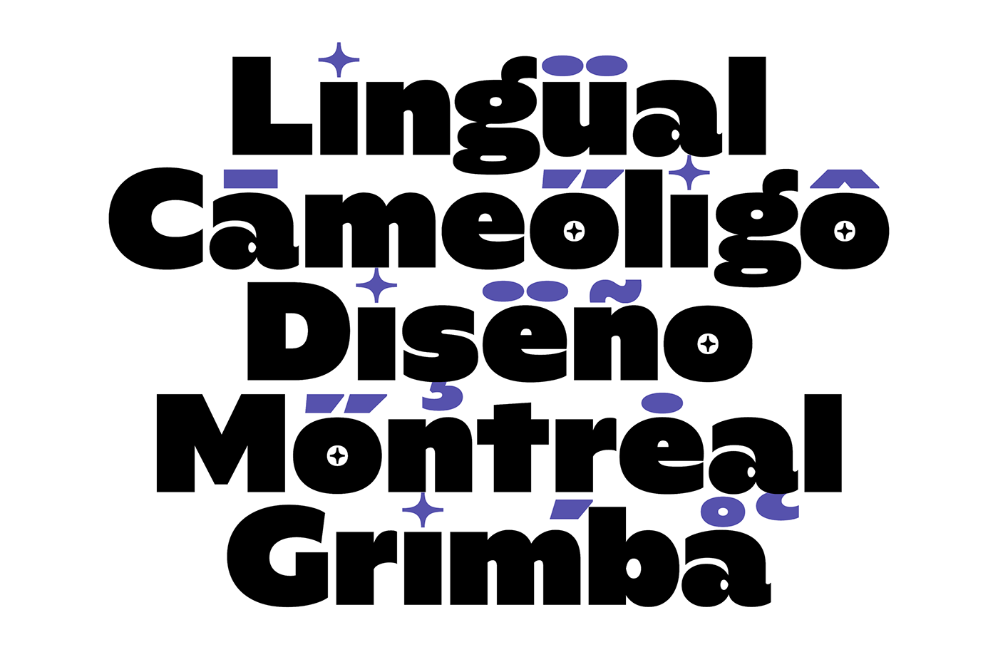
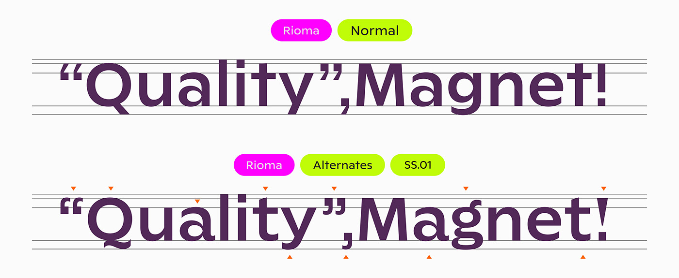
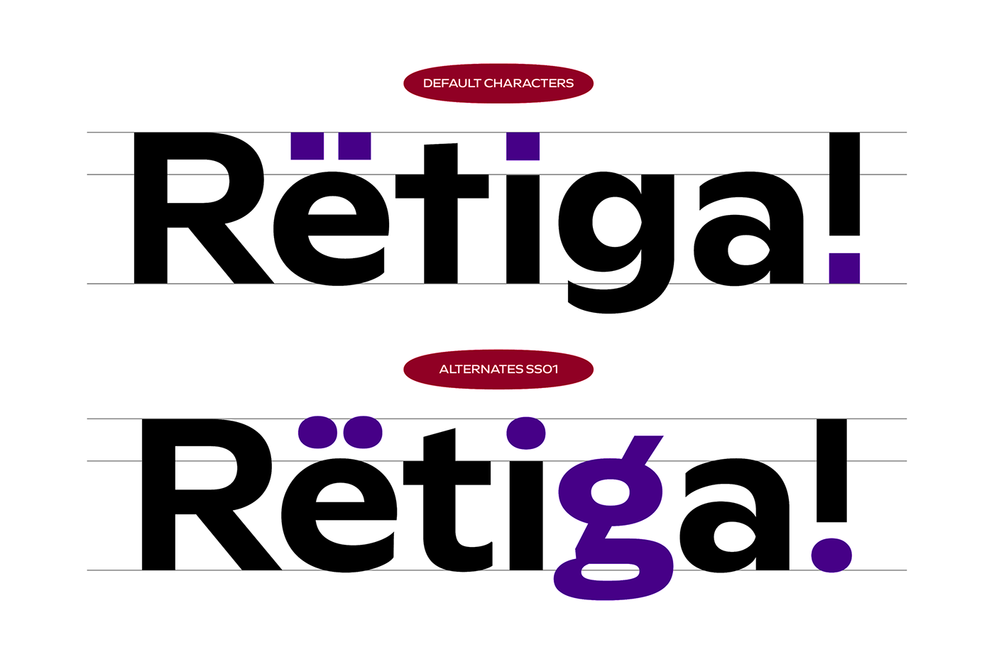
Rioma is a geometric typeface inspired by a legend of type design: Antique Olive. As a font family, Rioma ships in two different formats. Depending on your preference, you can install the typeface as two Variable Fonts or use the family’s 16 static OpenType font files instead. Those weights run from Light to Heavy. While the static-format fonts offer a good intermediary-step selection, users who install the two Variable Fonst have vastly greater control over their text’s stroke width. The weight axes in Rioma’s Variable Fonts allow users to differentiate between almost 1,000 possible font weights. That enables you to fine-tune your text’s exact appearance on-screen or in print. Rioma is an excellent choice for both corporate design and editorial design projects because of its range of weights as well as its legibility in text. Around the typeface’s regular weight, character shapes feature optimized proportions and an improved balance that is perfect for use in text. The bolder weights have a strong character, with a unique style and smooth shape that is well suited for any display use. The heaviest looks contemporary and classic at the same time. When you have a strong message, it will help create an identity-setting mark.


Rioma
16 Static, 2 Variables
16 Static, 2 Variables
Rioma is a geometric typeface inspired by a legend of type design: Antique Olive. As a font family, Rioma ships in two different formats. Depending on your preference, you can install the typeface as two Variable Fonts or use the family’s 16 static OpenType font files instead. Those weights run from Light to Heavy. While the static-format fonts offer a good intermediary-step selection, users who install the two Variable Fonst have vastly greater control over their text’s stroke width. The weight axes in Rioma’s Variable Fonts allow users to differentiate between almost 1,000 possible font weights. That enables you to fine-tune your text’s exact appearance on-screen or in print. Rioma is an excellent choice for both corporate design and editorial design projects because of its range of weights as well as its legibility in text. Around the typeface’s regular weight, character shapes feature optimized proportions and an improved balance that is perfect for use in text. The bolder weights have a strong character, with a unique style and smooth shape that is well suited for any display use. The heaviest looks contemporary and classic at the same time. When you have a strong message, it will help create an identity-setting mark.
Buy Rioma at Fontstore.com


