
(FR)
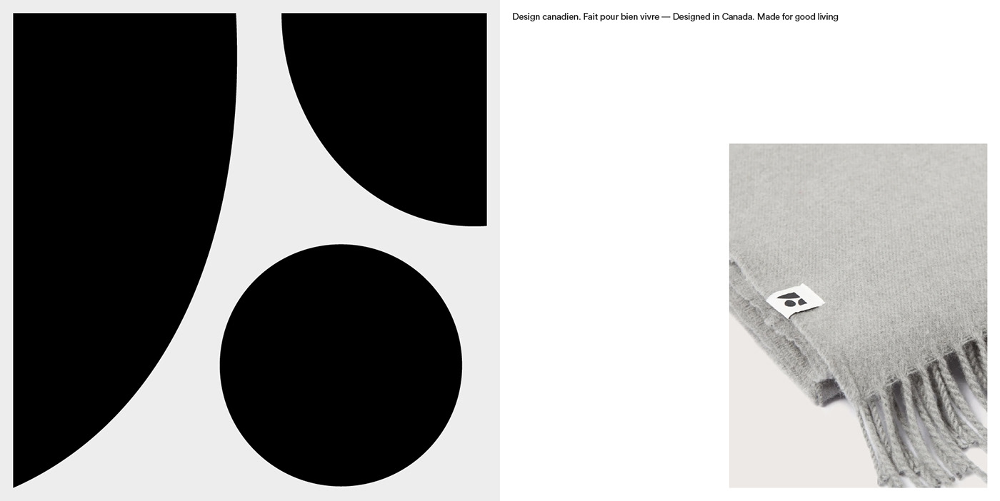
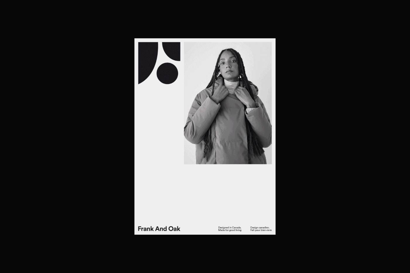
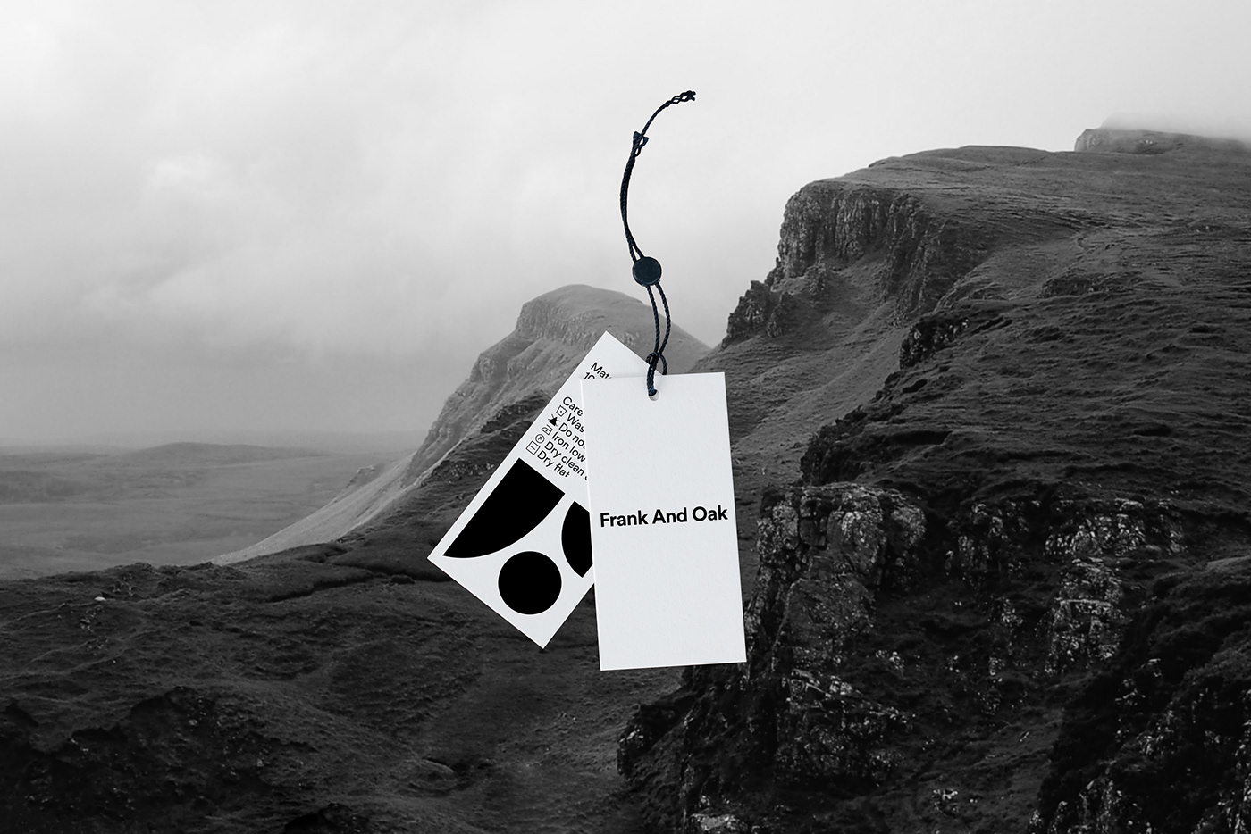
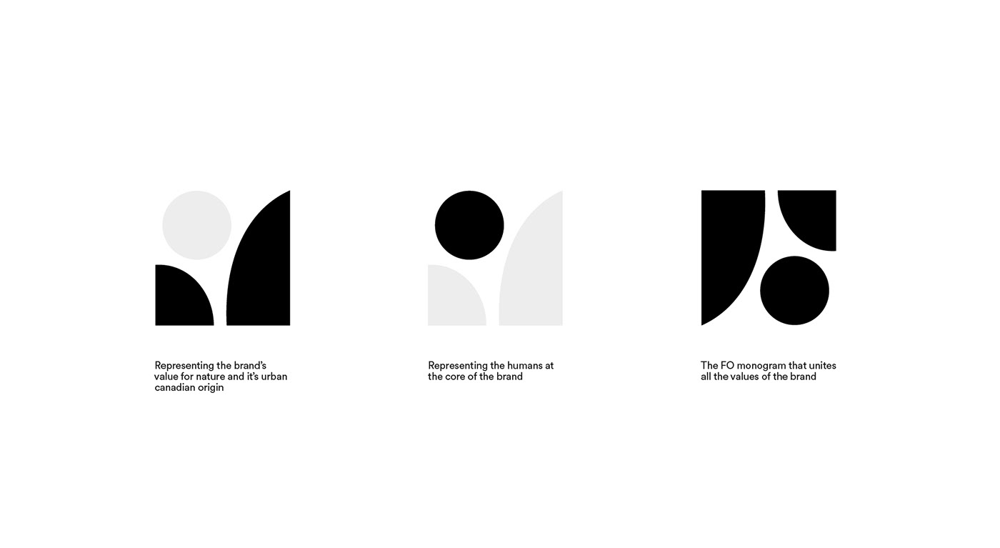
En 2019, Frank and Oak nous ont approché pour la conception d'une emblème reflétant leur valeurs, origines Canadienne et nouvelle direction visuelle. À travers ce mandat nous avons travaillé à solidifier les bases existantes sur lesquelles allait venir s'appuyer le nouveau symbole. Pour refléter les origines et l'aspect urbain de la marque nous avons voulu ancrer l'esthétique de l'emblème dans le mouvement moderniste Canadien, tout en évoquant la relation étroite entre l'humain et la nature. Avec simplicité le logo créer fait aussi office de monogramme formant un F et un O.
(EN)
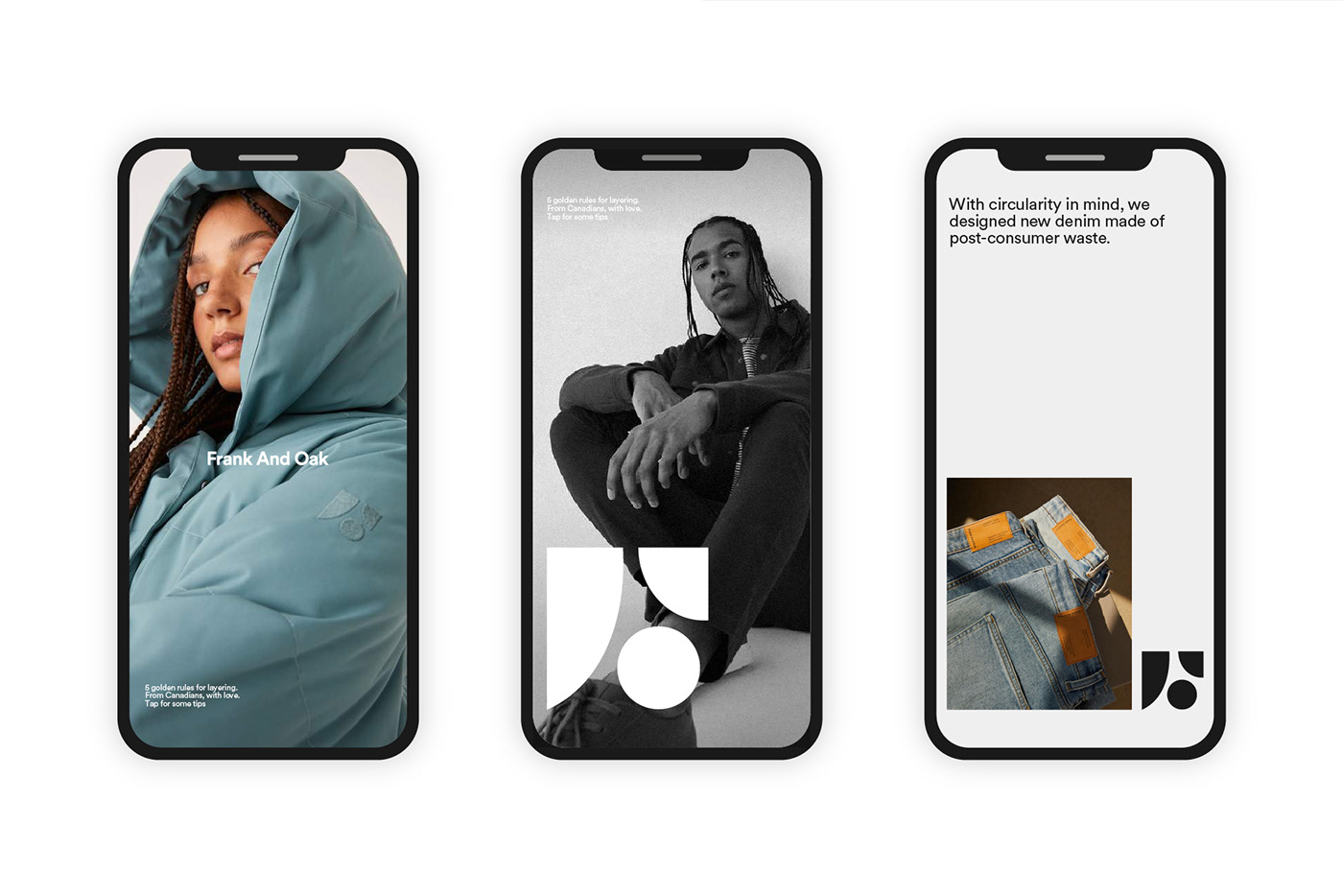
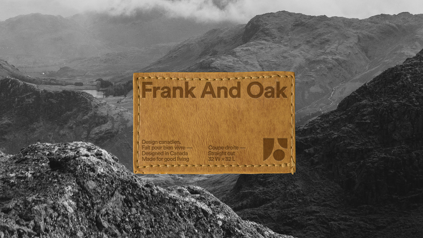
In 2019, Frank and Oak approached us to design an emblem reflecting their values, Canadian origins and new visual direction. Through this mandate we worked to solidify the existing bases on which the new symbol was to be based. To reflect the origins and the urban aspect of the brand, we wanted to anchor the aesthetics of the emblem in the Canadian modernist movement, while evoking the close relationship between humans and nature. With simplicity the logo created also acts as a monogram forming an F and an O.
FAO Team :
Edmund Lam (Creative Director)
Andrea Hooker (Creative Producer)
Sophie Desbiens (Marketing Director)
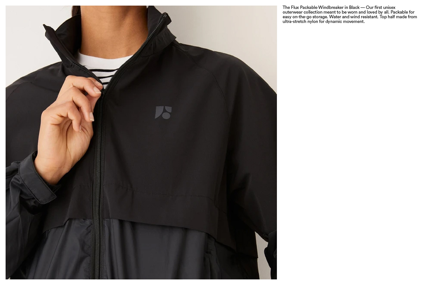
Product photography : Frank and Oak


(FR)
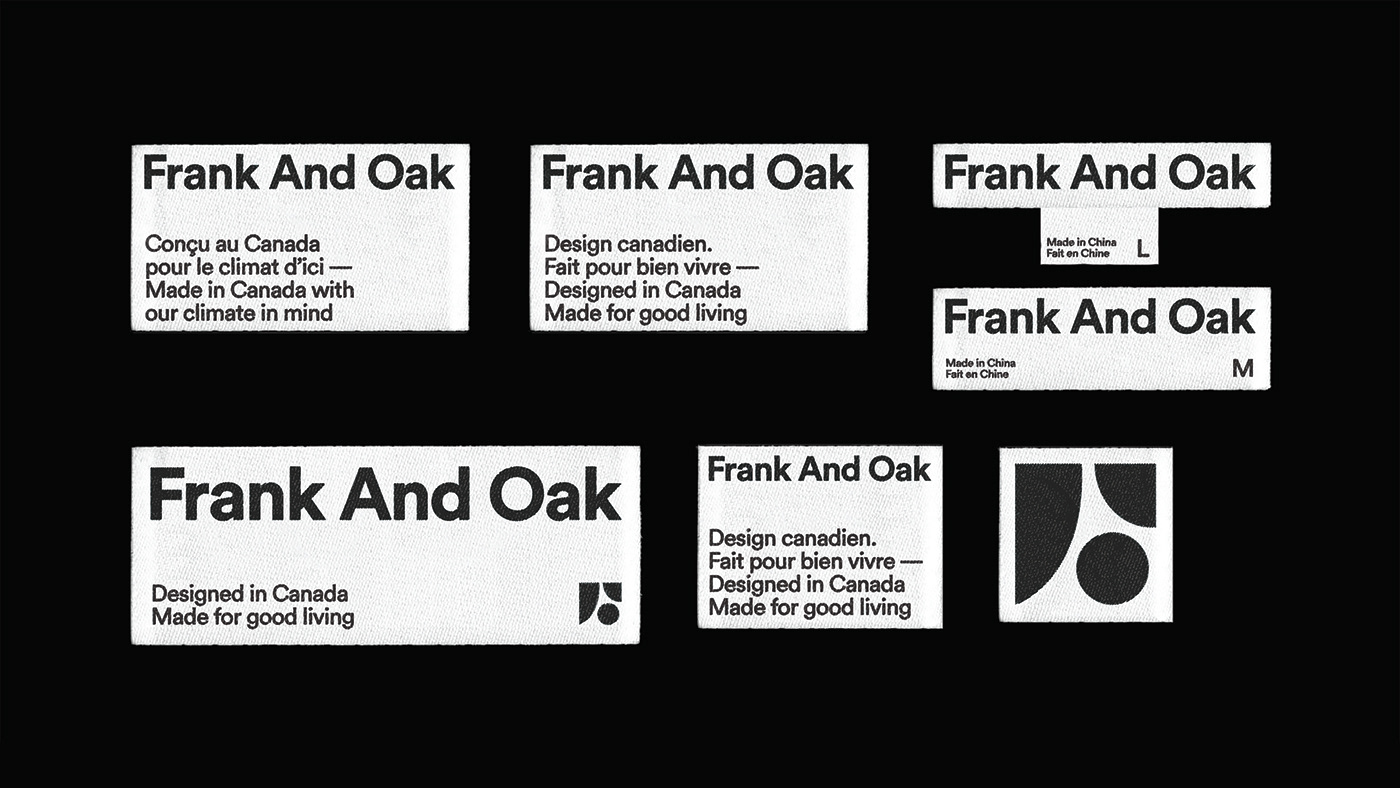
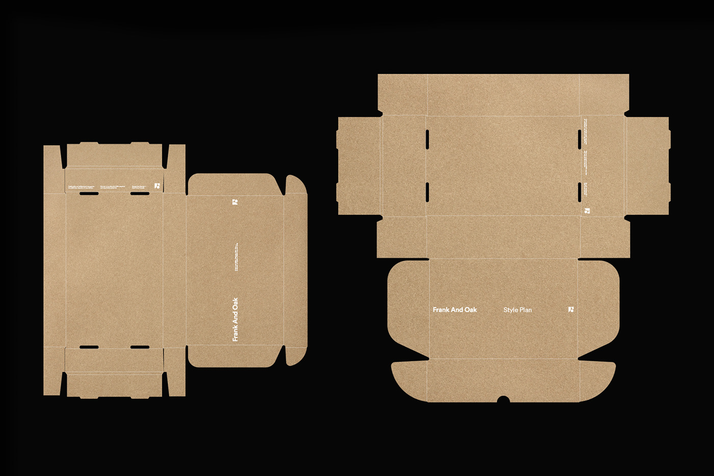
Les déclinaisons identitaires présentées dans cette étude de cas sont notre interprétation de ce que nous avons développé avec l'équipe de Frank and Oak.
(EN)
The brand applications presented in this case study are our interpretation of what we developed with the FAO team.


