ITA
La consegna iniziale riguardava la progettazione del solo logo per una nuova realtà che opera nell'ambito immobiliare.
Il nome scelto dal cliente è stato "Immorock", naming che unisce le parole "immobiliare" e "rock"; la parola rock si riferisce sia al genere musicale, di cui il cliente è appassionato, sia al concetto di roccia, di pietra. Immorock quindi vuole esprimere dinamismo e solidità allo stesso tempo.
Il simbolo astratto che affianca la parola Immorock vuole trasmettere proprio questa solida dinamicità. Le sue forme che vanno a crescere verso l'alto possono richiamare il design di una architettura moderna, oppure può essere visto, scomposto nei suoi tre elementi principali, in dei tetti stilizzati resi come delle frecce che coprono/proteggono l'elemento più piccolo.
La brand identity che ne deriva è un ipotesi sviluppata successivamente.
ENG
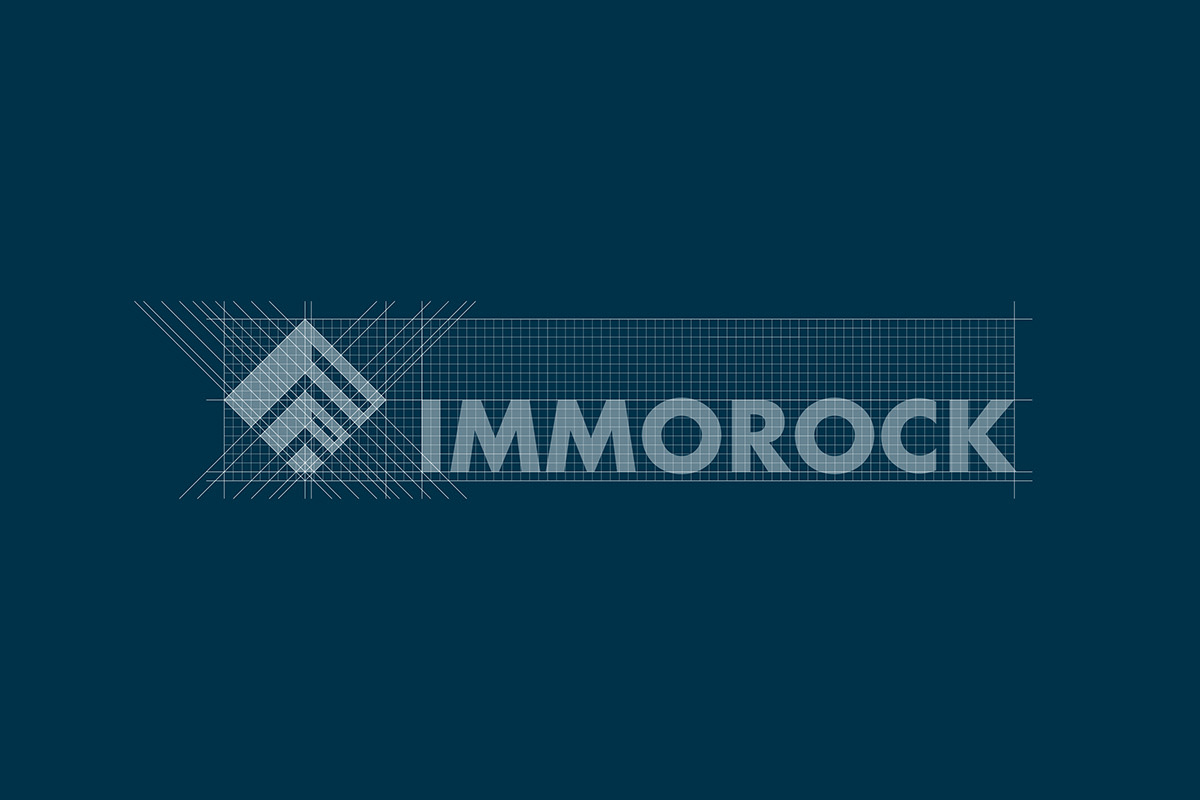
The initial delivery concerned the design of the logo for a new company operating in the real estate sector.
The name chosen by the client was "Immorock", a naming that combines the words "immobiliaire" (real estate in italian) and "rock"; the word rock refers both to the musical genre, of which the customer is passionate, and to the concept of rock, of stone. Immorock therefore wants to express dynamism and solidity at the same time.
The abstract symbol alongside the word Immorock wants to convey this solid dynamism. Its shapes that grow upwards can recall the design of a modern architecture, or it can be seen, broken down into its three main elements, in stylized roofs rendered as arrows that cover/protect the smaller element.
The resulting brand identity is a hypothesis developed later.