

Shree G.K. Chudiwalas
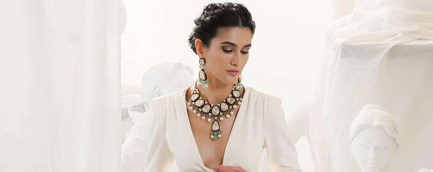
Shree G.K. Chudiwalas is a family-run jewelry brand that boasts of a legacy across generations,
draws inspiration from its heritage, and stays authentic to its roots.
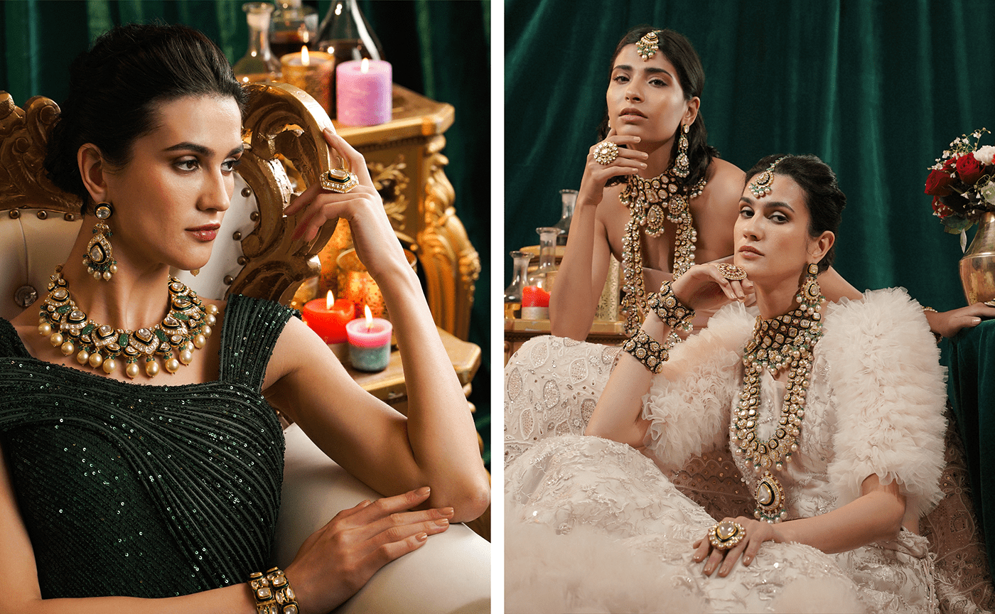
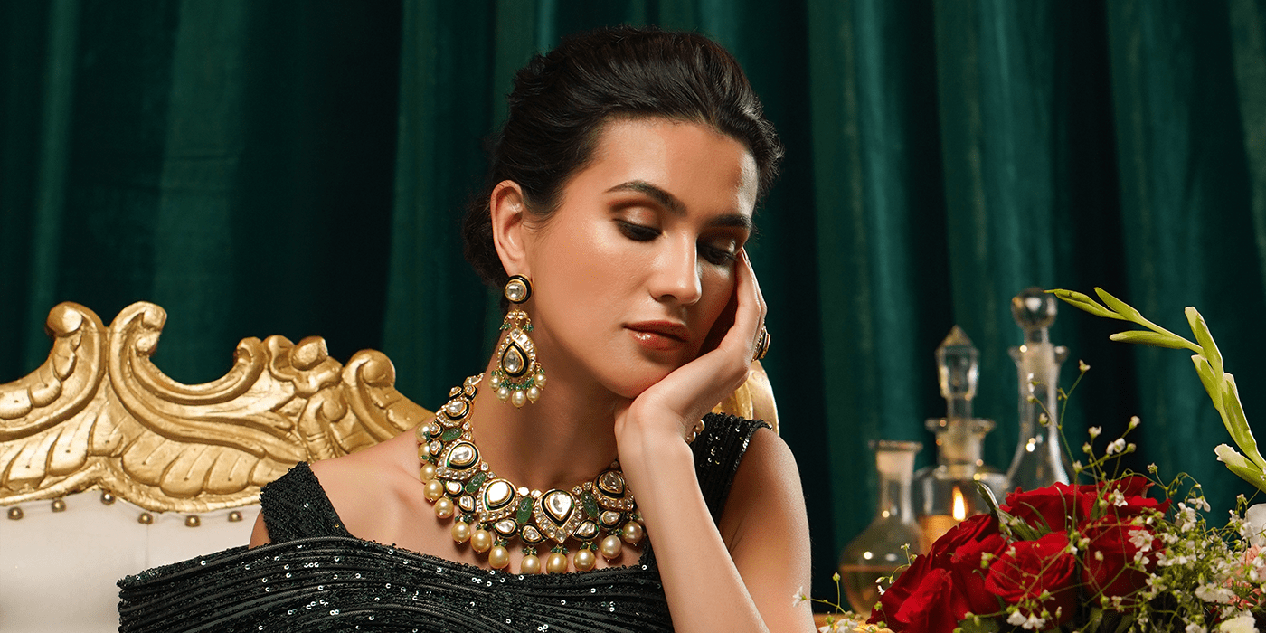
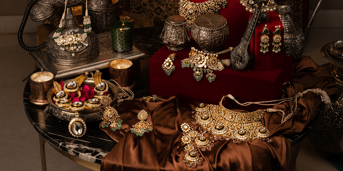
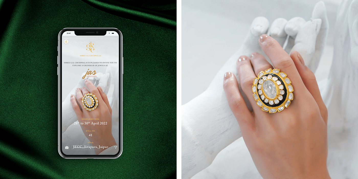
They believe in creating family heirlooms with the most bespoke Kundan Meena Polki jewelry
that echoes the sentiments of the person adorning it.


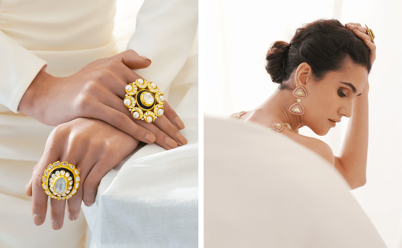


At Shree G.K. Chudiwalas, jewelry is a piece of art that transcends the boundaries of age and time.
They offer a treasure trove of an exotic range of Kundan Meena Jewellery, Diamond Jewellery,
and Fusion Jewellery, all under a single roof.



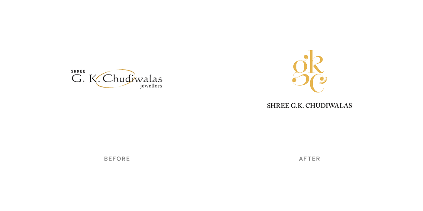
New Visual Identity
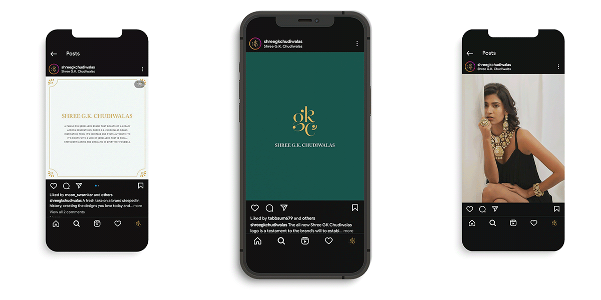
A brand that is royal, statement-making, and dramatic in every way possible, it was a challenge for me
to re-brand its visual identity that carries the same legacy and narrates its story to future generations.
For the new identity of Shree G.K. Chudiwalas,
it was necessary to take the design elements from the brand's history.
Royal, Heirloom, Rajasthan, Bridal, Indian Motifs, Heritage, Luxury - these are the keywords
I found through my brand research and mood boarding.


Logo Process
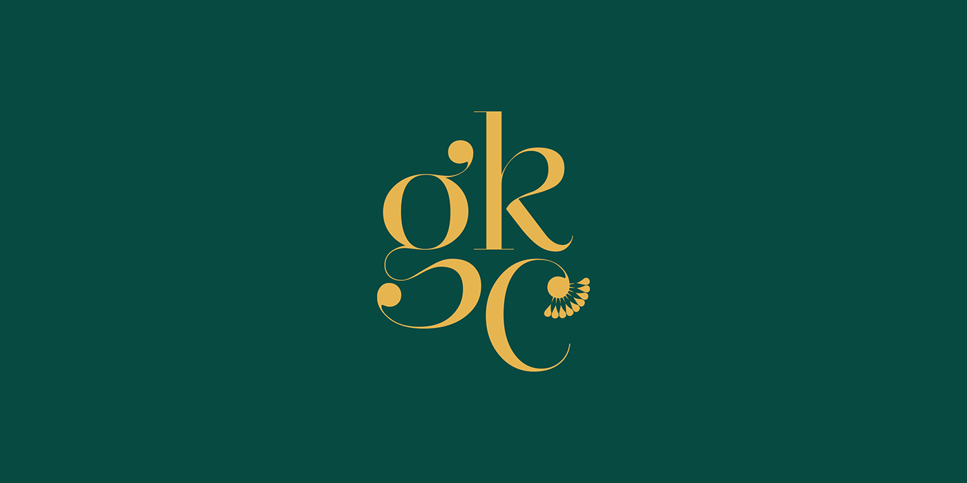
While designing the logo, I started by using the brand initials and trying to use heritage and
luxury typeface combinations, which gave me some directions for the wordmark.
I also played with some shapes related to brand motifs and also tried to come up with
a shape that can look like a Bangle.

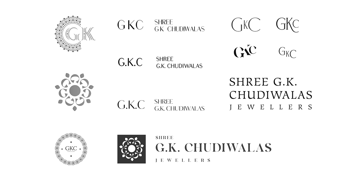

Logo Process - Brand Story
The new logo needed to express the brand's core values of making bridal jewelry.
So I started to look for a mark in the history of Shree G.K. Chudiwalas.
The meaning of "Chudi" in Hindi is Bangle, but here the word "Chudi" refers to Borla Jewelry
which in Rajasthan is called "Maang Tikka" - forehead jewelry, typically worn by Indian married women.
In Rajasthan, "Maang Tikka" is not just a piece of jewelry, it symbolizes the crown of a married woman.

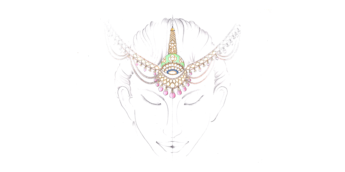

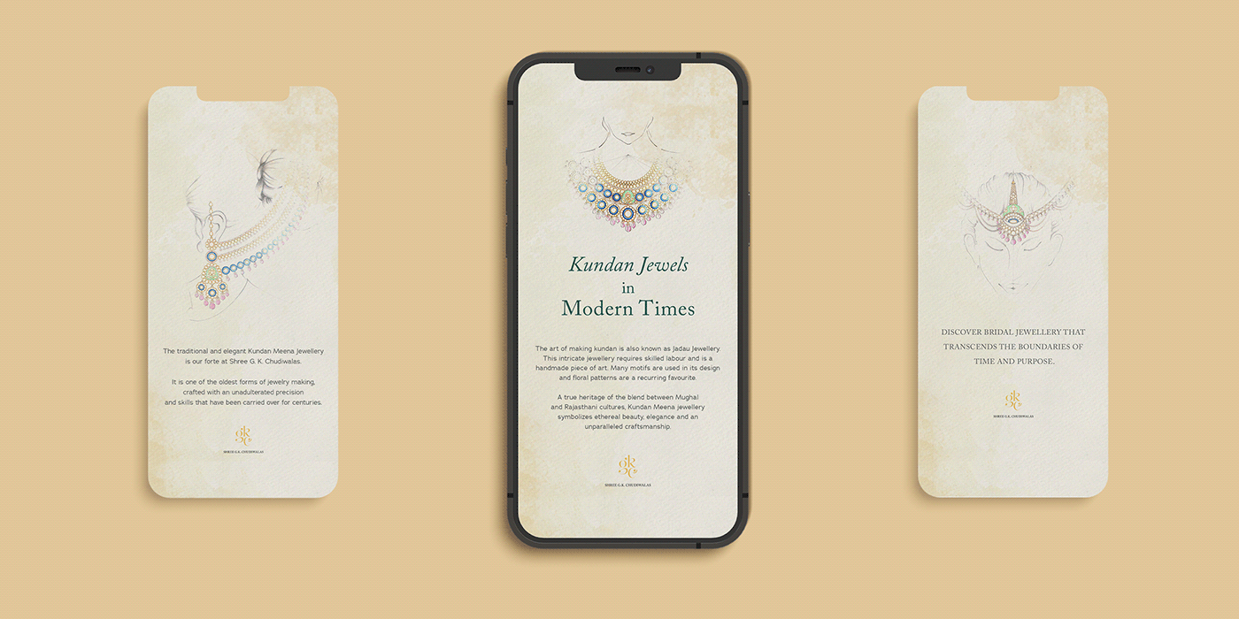
It was generous of them to provide us with their jewelry sketches made by their in-house jewelry artists.
After thoroughly examining every jewelry sketch, I found some drawings of peacocks and jewelry
inspired by peacock feathers and crowns.


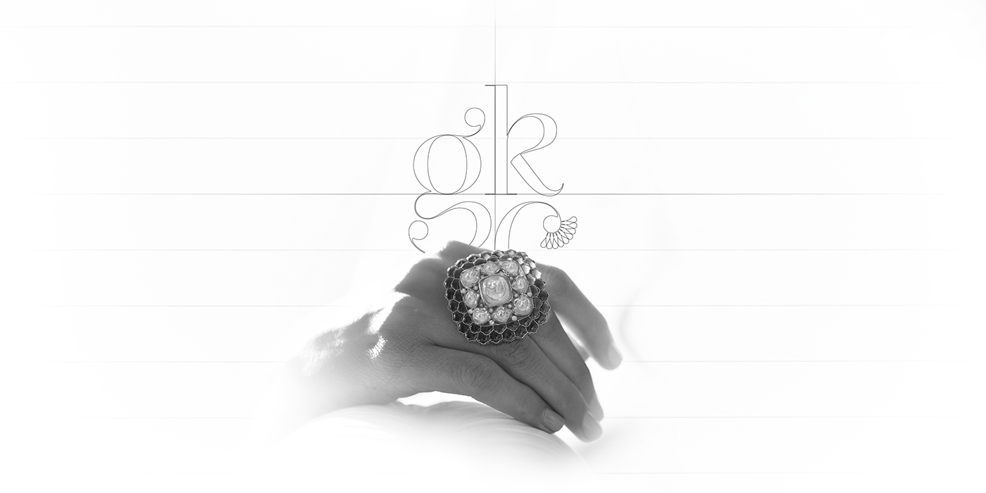
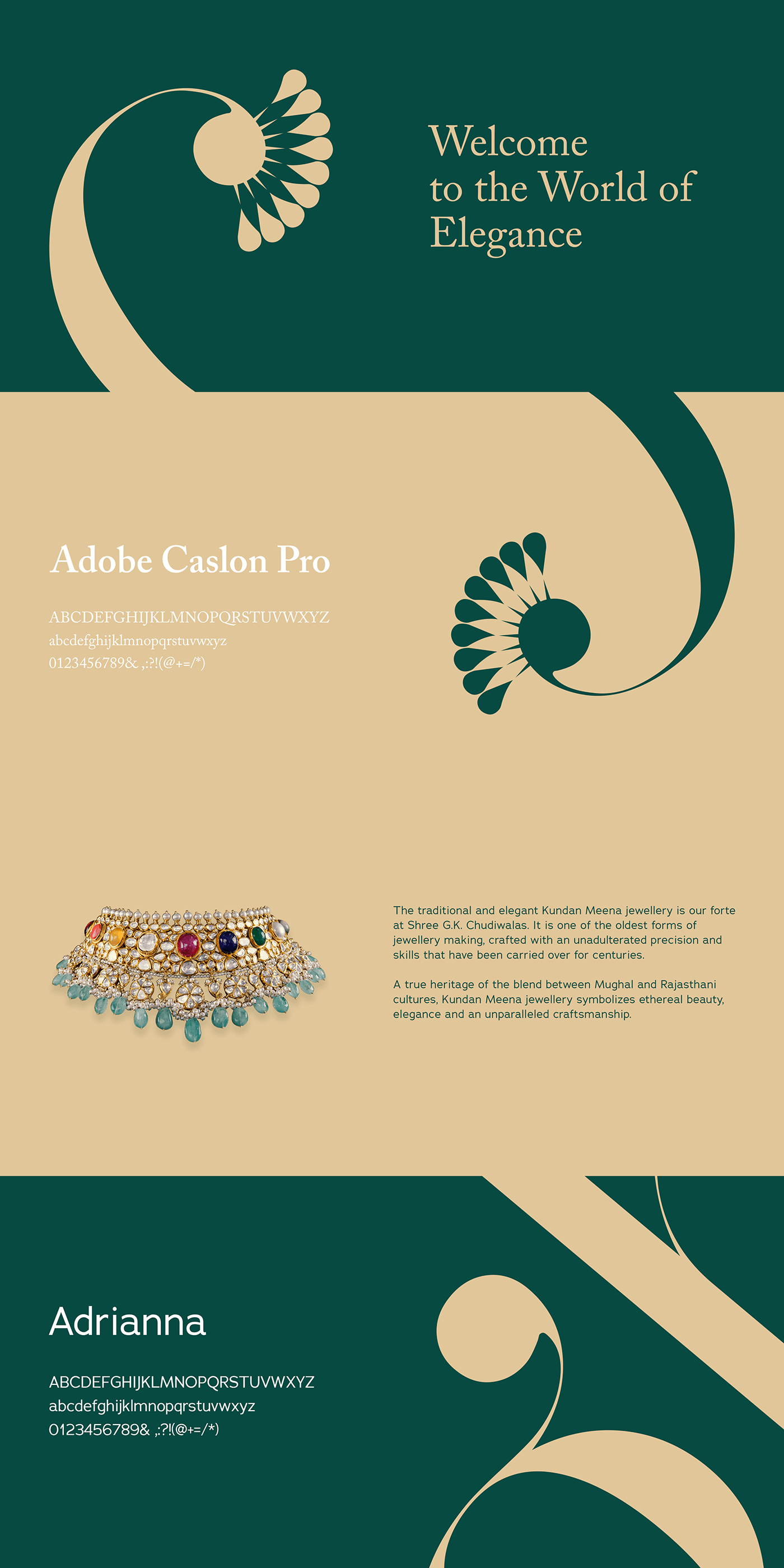
The Crest of the Peacock became the mark for the logo.
It perfectly conveyed the brand values and gave meaning to the name of
Shree G.K. Chudiwalas, the maker of beautiful bridal jewelry.








Colors
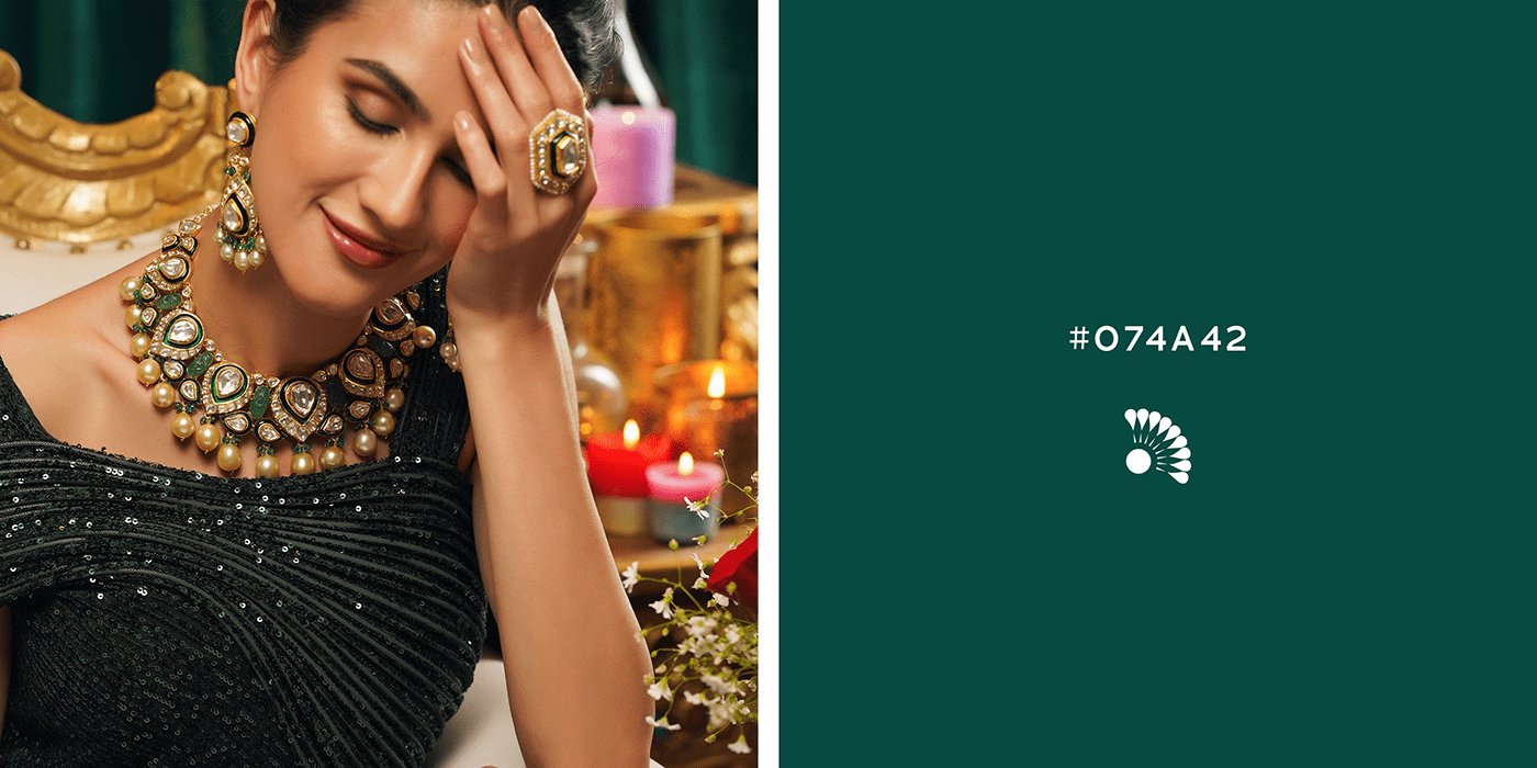
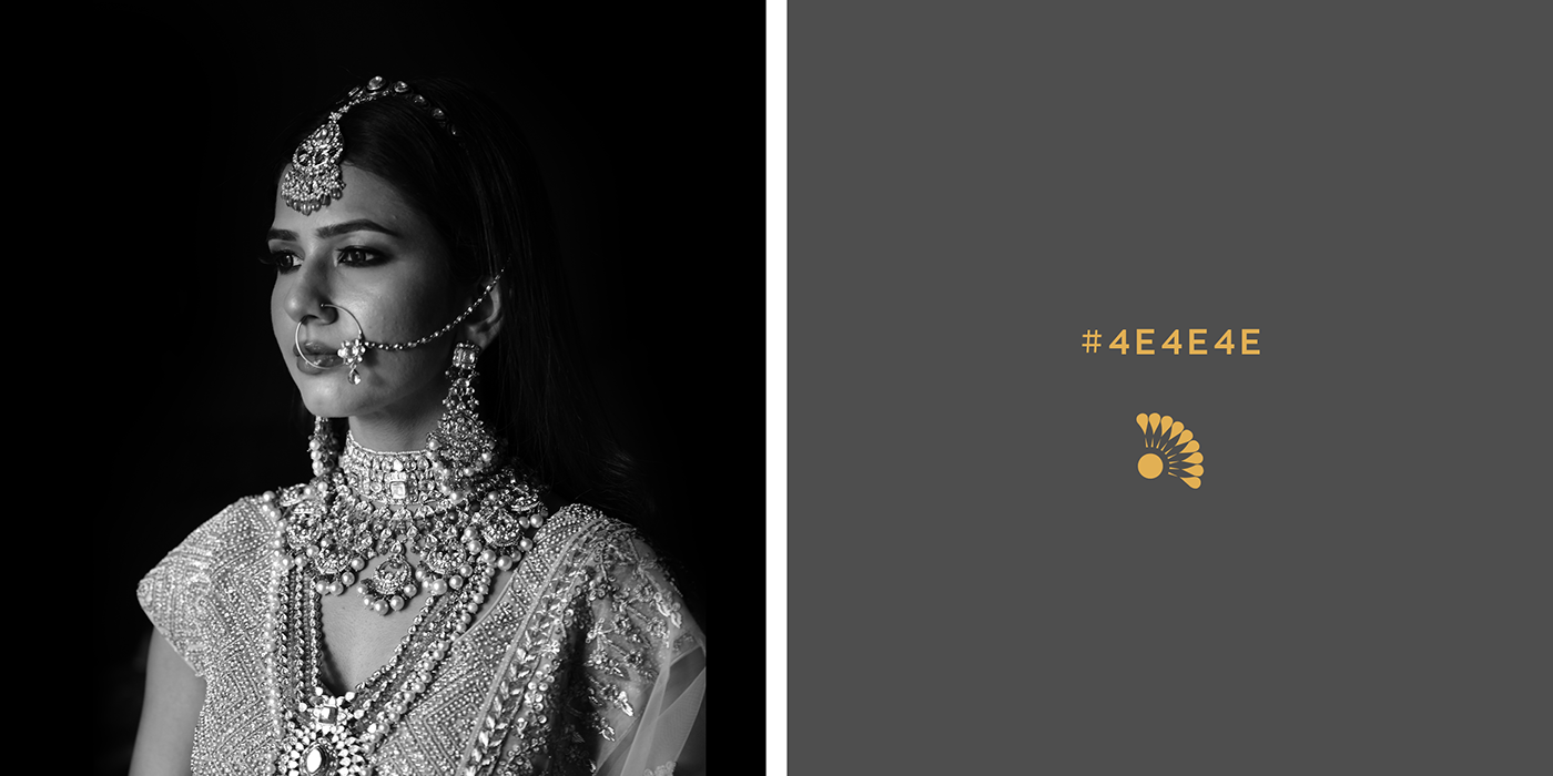
The color palette of Shree G.K. Chudiwals is inspired by the colors of their jewelry,
especially Kundan Meena jewelry and their Bridal jewelry.
especially Kundan Meena jewelry and their Bridal jewelry.
The Kundan Meena gave the shades of dark green and bright gold, which became the primary colors.
The Secondary palette includes soft beige, maroon, and shades of grey and white.













Typography
It was clear from the start that the primary typeface of Shree G.K. Chudiwalas would be a serif typeface,
which should give the feeling of an elegant wedding invitation, so I chose Adobe Caslon Pro,
a luxury, capricious typeface, which suited the brand perfectly.
For the secondary typeface, I chose Adrianna, which is a fashionable typeface that will give
For the secondary typeface, I chose Adrianna, which is a fashionable typeface that will give
the brand language a contemporary touch and will work as a great supporting element
to a prominent serif typeface.






CREDITS
Client - Shree G.K. Chudiwalas
Agency - Scribble Solutions
Project Manager - Malvika Dusad
Creative Direction & Graphic Design - Shubham Sharma
Agency - Scribble Solutions
Project Manager - Malvika Dusad
Creative Direction & Graphic Design - Shubham Sharma


