Gaya Regular + Italic


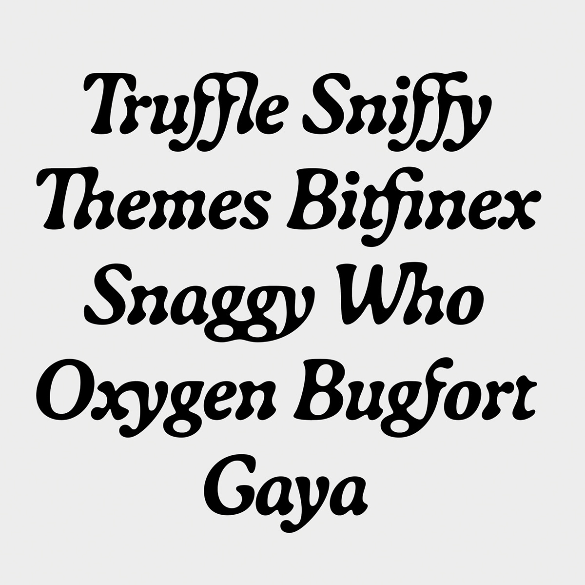


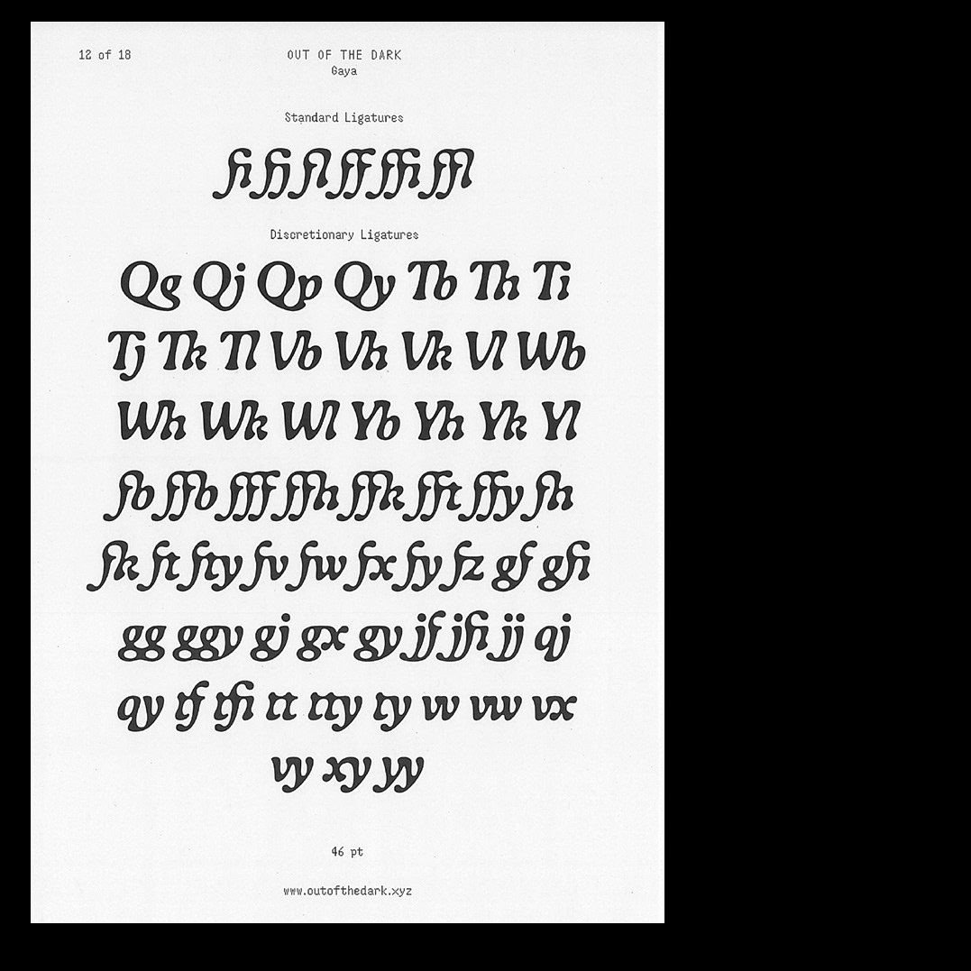


Gaya follows the structure of highly legible roman typefaces but takes another turn with its intriguing flowing shapes — pushing it to the limit within the Italic. Researches on blurred typefaces* formed the starting point for soft vector interpretations. However Raphaël de La Morinerie chose an always precisely controlled digital approach to create a balanced grey value in running text. Letterforms are designed to optimize tight spacing: stems are flared to match round shapes. Discretionary ligatures have been added to reinforce the liquid aesthetic of the font and once again to optimize tight spacing. Gaya developed from Raphaël de La Morinerie’s diploma project “Constellation Typographique” at ECAL.
Now available at Out of the Dark Typefaces.
