New Start
Logo and corporate identity for a law company
Russia
New Start is a law company which helps its clients get rid of financial problems in a legal way. The name of the company represents the beginning of a new life for a person who got rid of their debts and constant calls from collectors.
The Main Goal
Russia
New Start is a law company which helps its clients get rid of financial problems in a legal way. The name of the company represents the beginning of a new life for a person who got rid of their debts and constant calls from collectors.
The Main Goal
To develop a name without negative associations with bankruptcy and minimalistic identity that will reveal the scope of the company's activities without using hackneyed law symbols and will distinguish the company among its competitors.

Naming
The name of the company should not have negative associations associated with bankruptcy, so in the name we have excluded the words "debt", "bankrupt" and their derivatives.
Customers should be confident that the company will make their lives better. The name New start represents the beginning of a new life for a person who got rid of their debts and constant calls from collectors.

The Solution
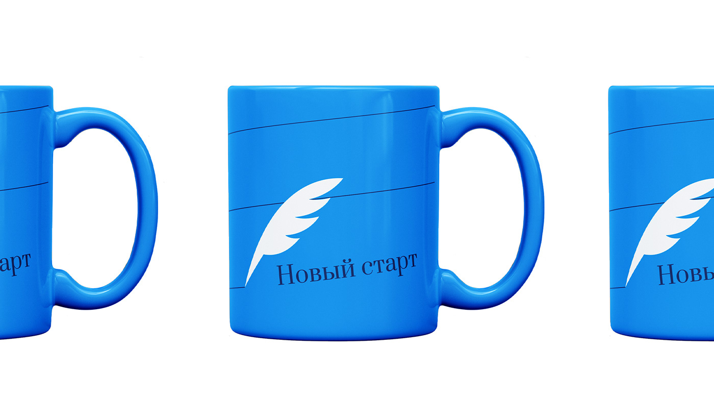
Our designers have developed the typographic logo in which the line above the letter «й» is replaced by a pen sign — this symbol is associated with law, but is not used by the competitors. The sign can also be used separately as a reduced version of the logo.
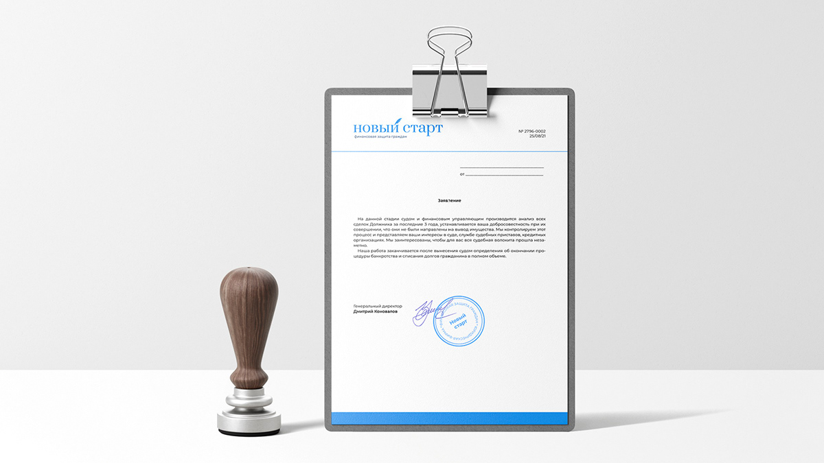
The company colors are strict light blue and dark blue. The fonts are elegant Prata with serifs and Montserrat, the last one fits well with both online and offline media. The first one is suitable for headings, and the second one for subheadings and the body text.
Along with everything else, the designers have developed a pattern for printing. It is based on a pen symbol and the line it leaves when writing.
Our designers have developed the typographic logo in which the line above the letter «й» is replaced by a pen sign — this symbol is associated with law, but is not used by the competitors. The sign can also be used separately as a reduced version of the logo.
The company colors are strict light blue and dark blue. The fonts are elegant Prata with serifs and Montserrat, the last one fits well with both online and offline media. The first one is suitable for headings, and the second one for subheadings and the body text.
Along with everything else, the designers have developed a pattern for printing. It is based on a pen symbol and the line it leaves when writing.