"Conservare lo spirito dell'infanzia dentro di sé per tutta la vita vuol dire conservare la curiosità di conoscere , il piacere di capire , la voglia di comunicare." Bruno Munari.
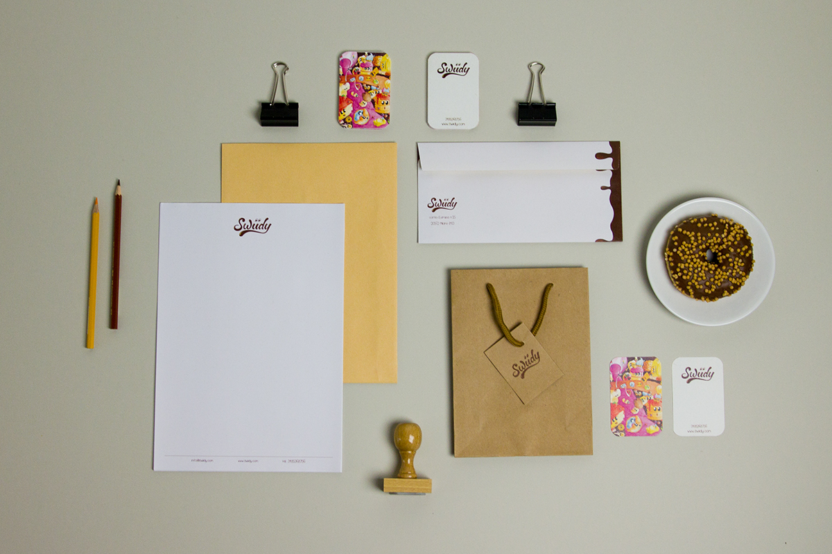
The idea of the project is called " Swiidy " and it is the Brand of a retail chain of confectionery only made in Italy. It is mainly based on the concepts of authenticity, tradition, respect for the environment and socialization. It is specially directed at a young target aged up to 20 years, so that they can re-evaluate the values associated at the tradition and ensure the survival of these. The products are all made by hand, so that the same products in each location will never be the same as the other because the flavors will take the characteristics of their country of origin. All this has been achieved without losing the respect to the environment by using eco-friendly materials and recyclabe packaging. For the choice of naming it was thought the merger of the English word " Sweet " and the verb " Candy ", then the term was born from this merger " Sweedy " was italianate in " Swiidy ". The logo was designed with a lettering round and full, as far as the colors were chosen warm tones that evoke the chocolate and cream. It was also decided to communicate through fun and colorful illustrations all made by hand with watercolors and reproposed on the packaging of the products. The whole corporate image has the characteristic to express what the Brand wants to communicate, so that faced with any item, the customer is able to identify its belonging.


