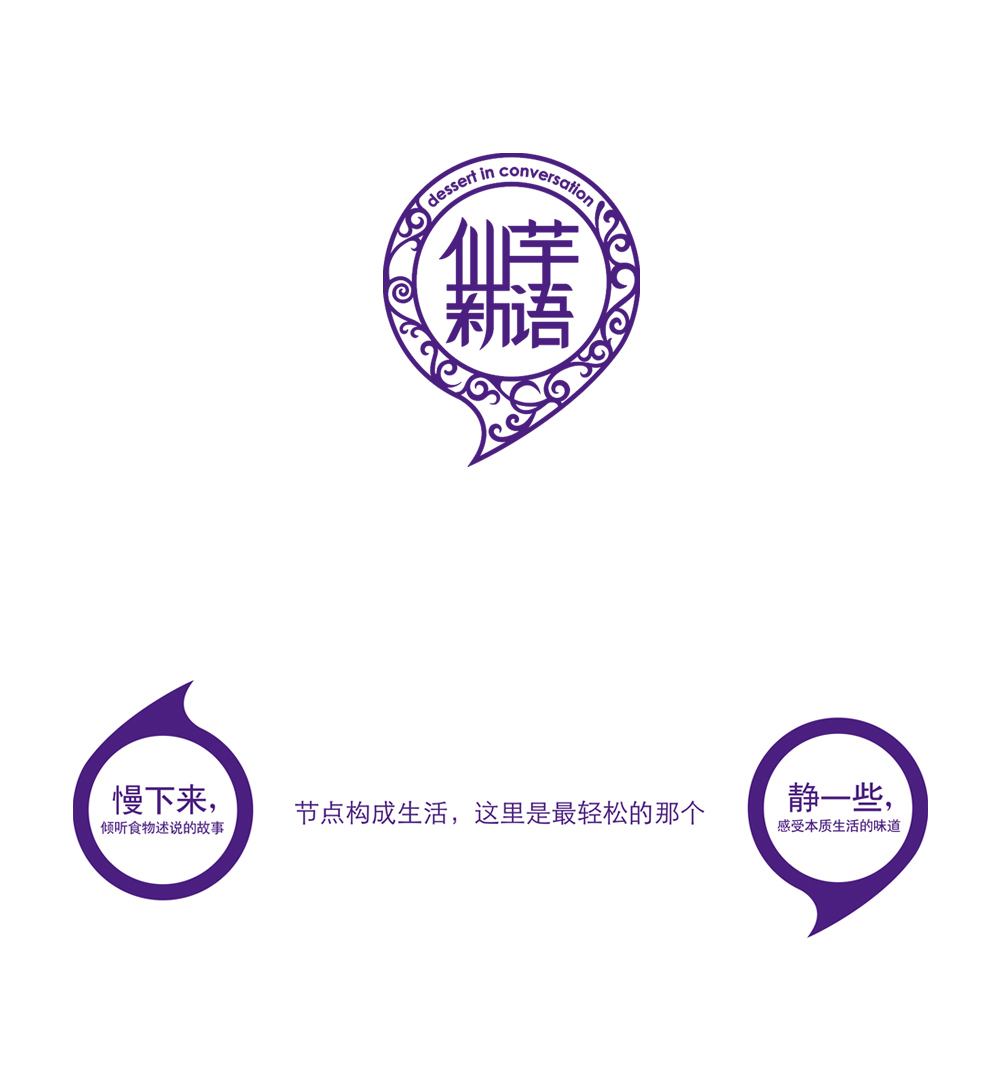
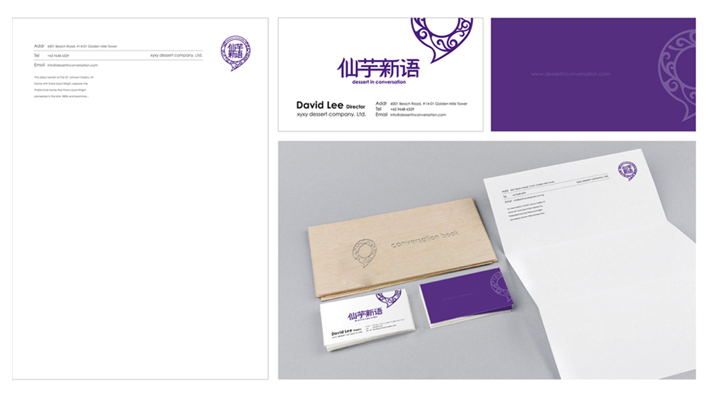
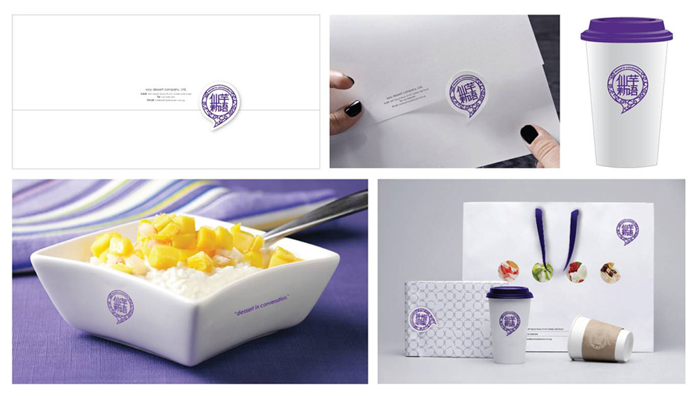
Dessert in Conversation / 仙芋新语
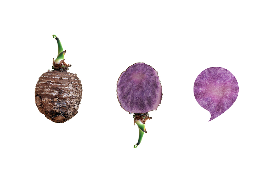
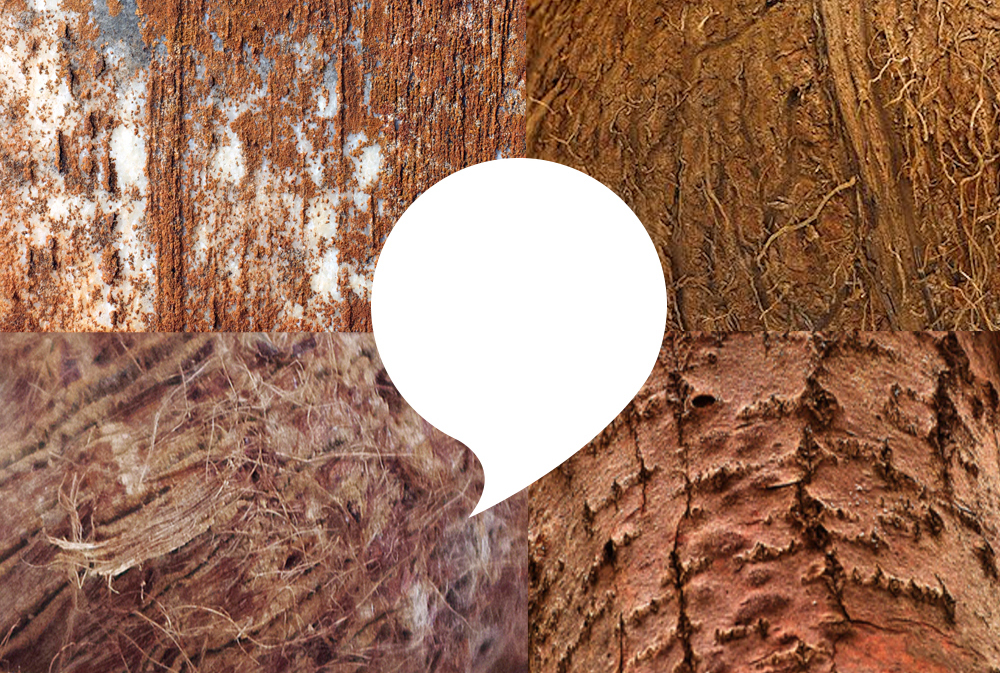
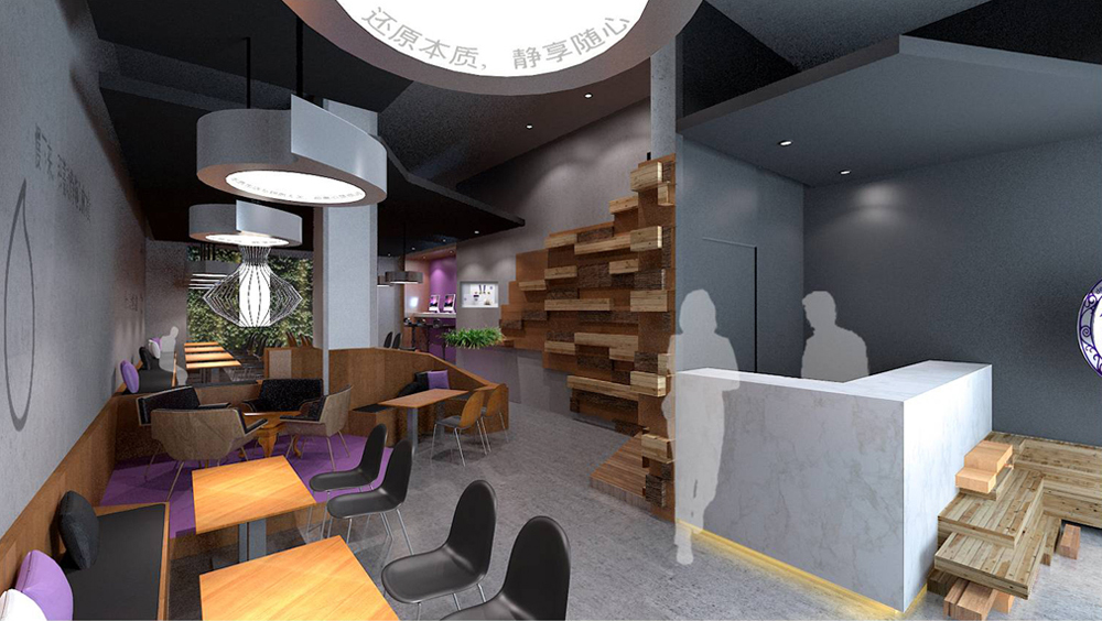
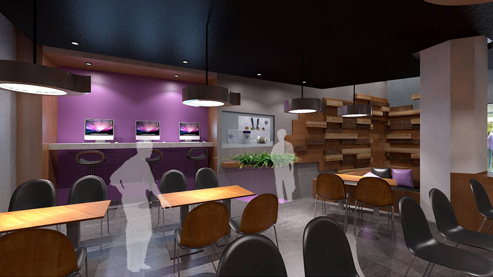
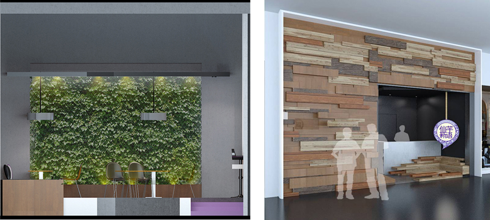
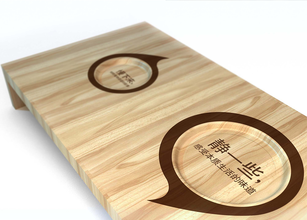
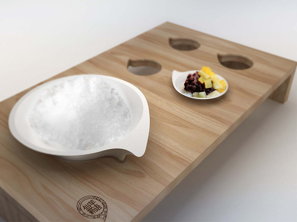
The insight into female consumers in China inspired the design of the brand. Working females put up a strong and bristly appearance on the outside, but inside they are soft and purple, waiting to be cared for and loved. We want to create a brand they will feel at ease with, a space where they can let down their guard and be themselves, and a resting stop before they go on their next challenge and adventure. Hence we used the design metaphor of the yam to guide our choice of colors and materials, woody on the outside, soft velvets and leathers on the inside. Also the use of the comma as a logo element, to express this transitional and recharging process.
我们洞察了中国女性消费者,她们的心理激励了这次的品牌设计:职业女性外表看起来刚强坚定,但她们的内心敏感柔软,就如紫色。所以,我们创造的就是这样的一个地方,可以让她们卸下防备展现原本属于自己内心的一面,可以在她们继续迎接下一个挑战及冒险之前,有这样一个地方稍作休憩。由此,我们运用香芋这个外表如木般夯实,内里却柔软绵密的食材作为隐喻引出我们在品牌空间中的颜色和材质。同时,我们使用了一个逗号来做为标志元素,来表述休憩的过程。