Krebs电动工具品牌升级
____________________
Color scheme
Ningbo / 2021 客户名称:krebs电动工具
服务内容:品牌全案、包装/产品设计、电商
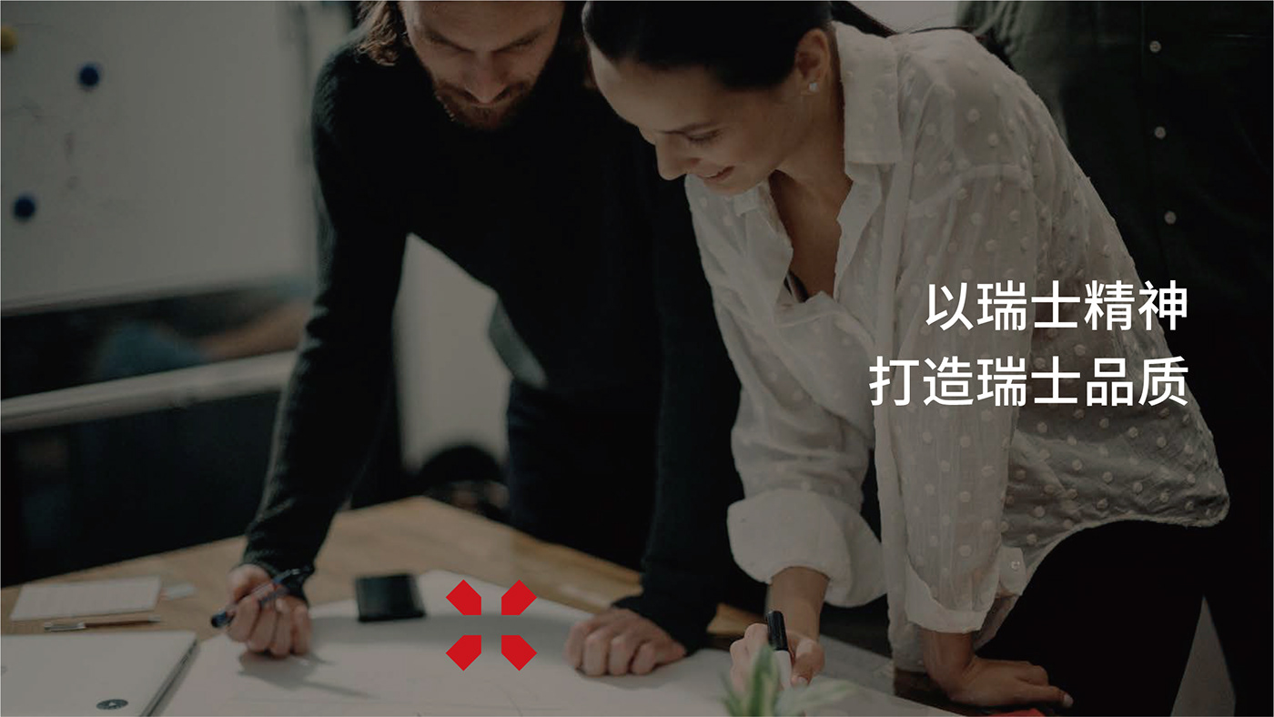
Krebs是一个源自瑞士的、集电动工具研发、制造、销售为一体的工业品牌。
一直以来,电动工具行业面临的痛点问题始终在于其过于浓重的工业化产品基调给使用者产生的疏离感。随着消费市场的需求点转移,传统电动工具的局限性被无限放大。笨重、不易用、低颜值成了电动工具行业面向消费者市场最大的绊脚石。
在此背景下,Krebs的转型课题围绕销售模式由传统线下模式转为电商销售网络;产品研发由传统工业工具转为个性化家用工具的方向展开。
服务内容:品牌全案、包装/产品设计、电商
Krebs是一个源自瑞士的、集电动工具研发、制造、销售为一体的工业品牌。
一直以来,电动工具行业面临的痛点问题始终在于其过于浓重的工业化产品基调给使用者产生的疏离感。随着消费市场的需求点转移,传统电动工具的局限性被无限放大。笨重、不易用、低颜值成了电动工具行业面向消费者市场最大的绊脚石。
在此背景下,Krebs的转型课题围绕销售模式由传统线下模式转为电商销售网络;产品研发由传统工业工具转为个性化家用工具的方向展开。
Customer Name: Krebs power tools
Service content: brand case, packaging / product design, e-commerce
Krebs is an industrial brand from Switzerland, integrating R & D, manufacturing and sales of electric tools.
For a long time, the pain point faced by the electric tool industry has always been the alienation of users caused by its too strong tone of industrialized products. With the transfer of demand points in the consumer market, the limitations of traditional electric tools have been infinitely enlarged. Bulky, difficult to use and low appearance value have become the biggest stumbling block for the consumer market of the power tool industry.
In this context, Krebs's transformation topic focuses on the transformation of sales mode from traditional offline mode to e-commerce sales network; Product research and development has changed from traditional industrial tools to personalized household tools.
____________________
CREATE YOUR BRAND MARK
所谓印记,即刻印与市、烙记于心。
印记是2015年在浙江宁波成立的专业品牌设计服务机构,
致力于为客户提供品牌策略、品牌定位、基因打造、形象
升级、品牌落地及品牌推广等服务。
@ 2012-2021 EPIS Brand inc. All rights reserved.

除此之外,印记发现由于品牌保护意识薄弱,未设计和使用具有独立性和辨识度的商标,致使整个品牌的隐性风险巨大。
为解决上述问题,印记从krebs品牌基建、产品外观风格走向到面像消费者的包装形态进行的全方位的升级工作。
为解决上述问题,印记从krebs品牌基建、产品外观风格走向到面像消费者的包装形态进行的全方位的升级工作。
In addition, Epis brand found that due to the weak awareness of brand protection and the failure to design and use trademarks with independence and recognition, the hidden risk of the whole brand is huge.
In order to solve the above problems, Epis brand has carried out all-round upgrading from Krebs brand infrastructure and product appearance style to consumer like packaging form.

工具不应只是冷冰冰的机器
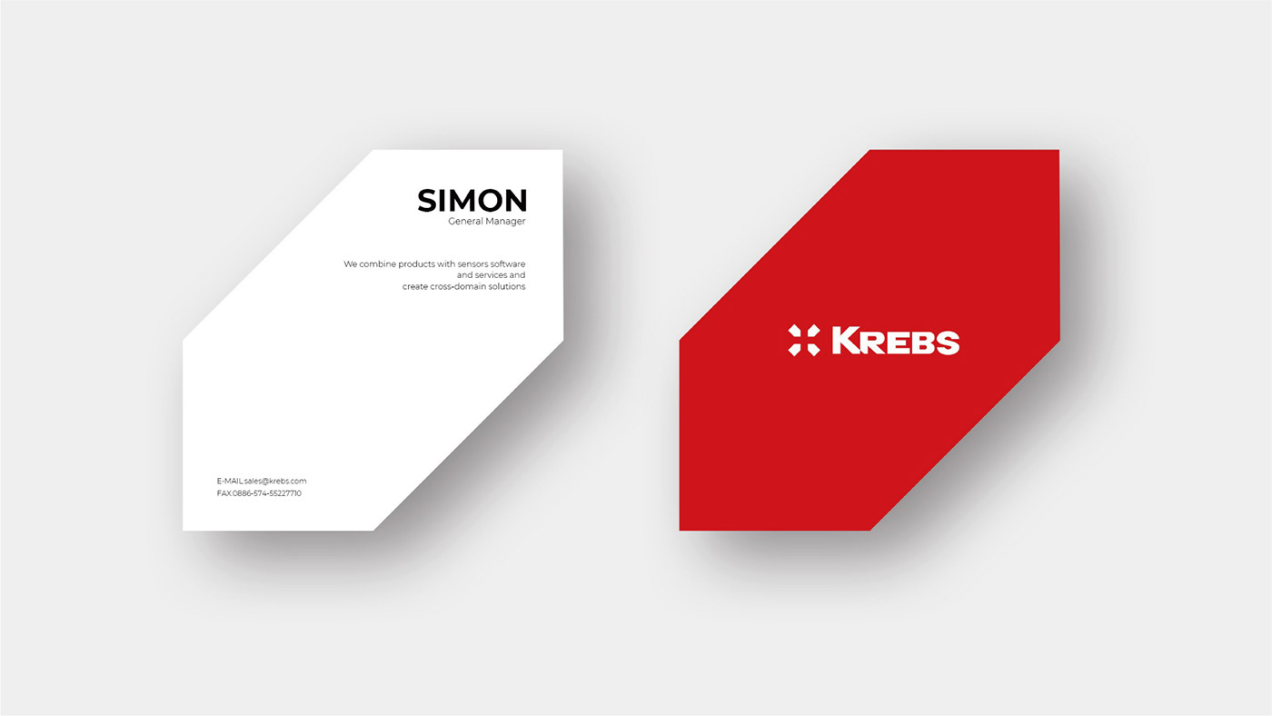
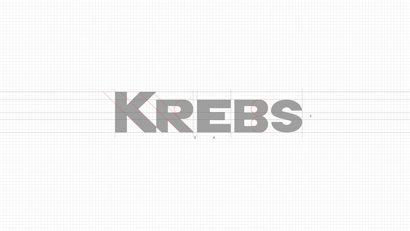
在品牌层面,印记为krebs建立了全新的品牌理念,“发现生活问题的得力助手”是krebs品牌理念的核心。围绕这个核心,印记首先以品牌标识作为切入点进行了改造,在保留瑞士品牌基因的基础上,将“发现问题”的概念融入到标识的设计之中。
在品牌层面,印记为krebs建立了全新的品牌理念,“发现生活问题的得力助手”是krebs品牌理念的核心。围绕这个核心,印记首先以品牌标识作为切入点进行了改造,在保留瑞士品牌基因的基础上,将“发现问题”的概念融入到标识的设计之中。
Tools should not be just cold machines
At the brand level, Epis brand has established a new brand concept for Krebs, and the "right-hand assistant to find life problems" is the core of Krebs brand concept. Around this core, the imprint first took the brand logo as the starting point for transformation. On the basis of retaining the Swiss brand gene, the concept of "finding problems" was integrated into the logo design.


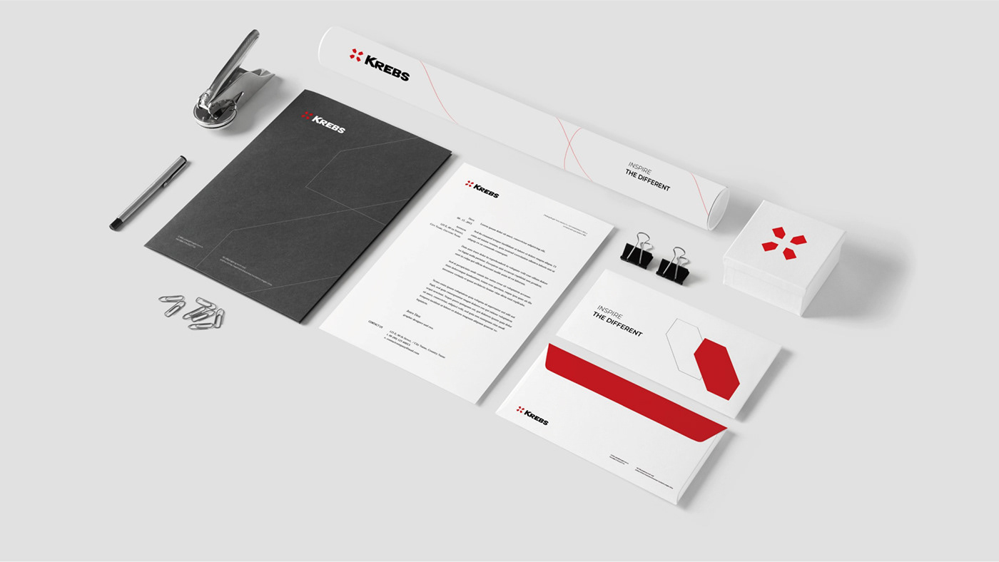
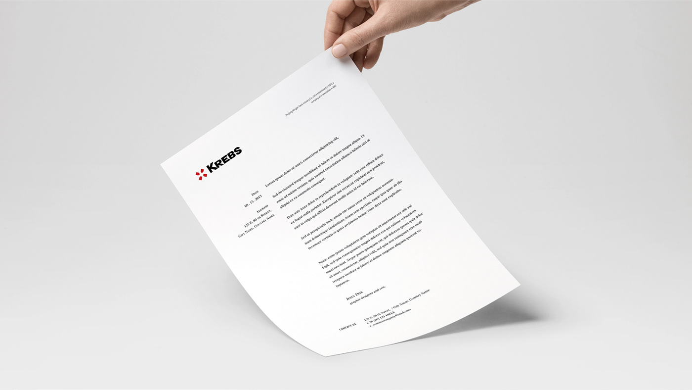
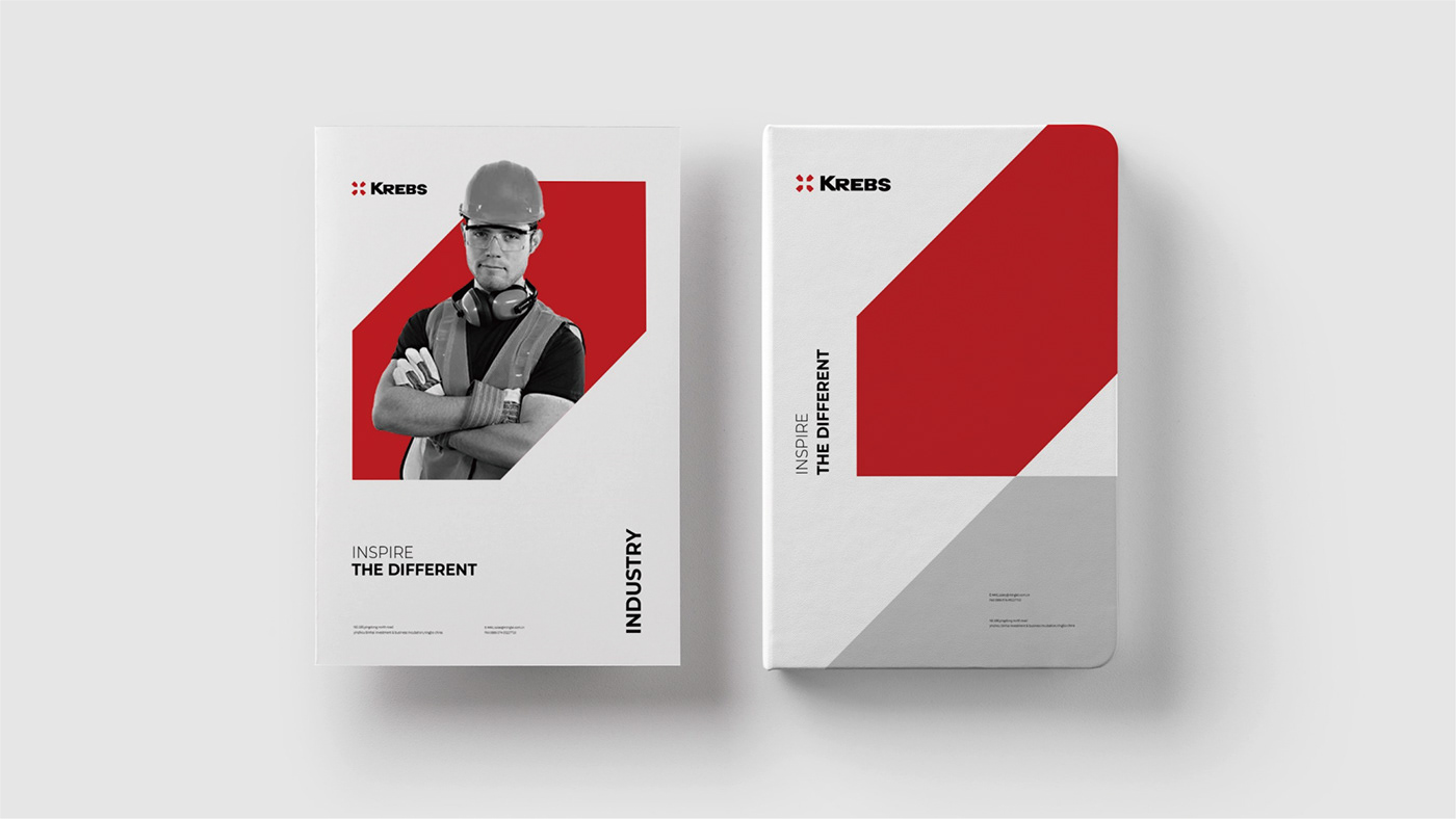
针对krebs内部管理和C端销售产生的严谨/活泼之间的反差,印记的解决方案是使用两套独立的色彩管理系统:内部管理时的品牌形象以瑞士红+灰度的双色来体现严谨的作风;而面向C端时则使用多种色彩来拉近与消费者的距离,这些颜色体现在产品本身以及线上店铺、物流包装上。
In view of the sharp / lively contrast between Krebs internal management and C-end sales, Epis brand's solution is to use two sets of independent color management systems: the brand image in internal management is represented by Swiss red + gray to reflect the rigorous style; When facing the C-end, a variety of colors are used to shorten the distance with consumers. These colors are reflected in the product itself, online stores and logistics packaging.