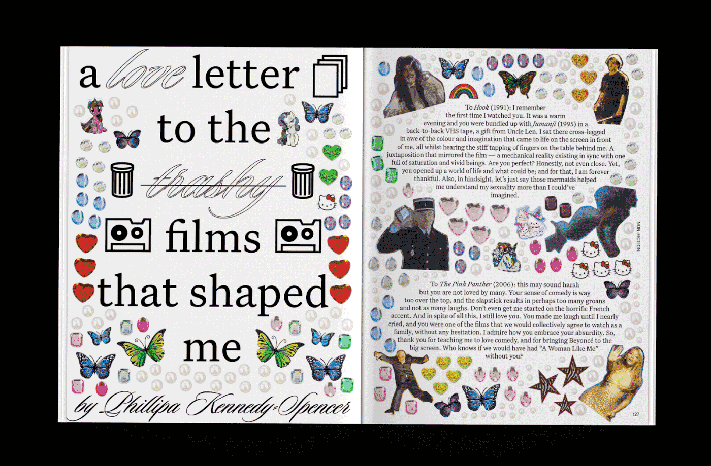

Vertigo Magazine is the official UTS student publication, and acts as a platform for the student voice. The University of Technology Sydney is a diverse inner-city university with students from all walks of life - from different countries, backgrounds, ages and sexualities. Vertigo allows students to express themselves - whether it be their opinions, or their creativity. A new editorial team is elected by the student population each year, to bring this platform to life.
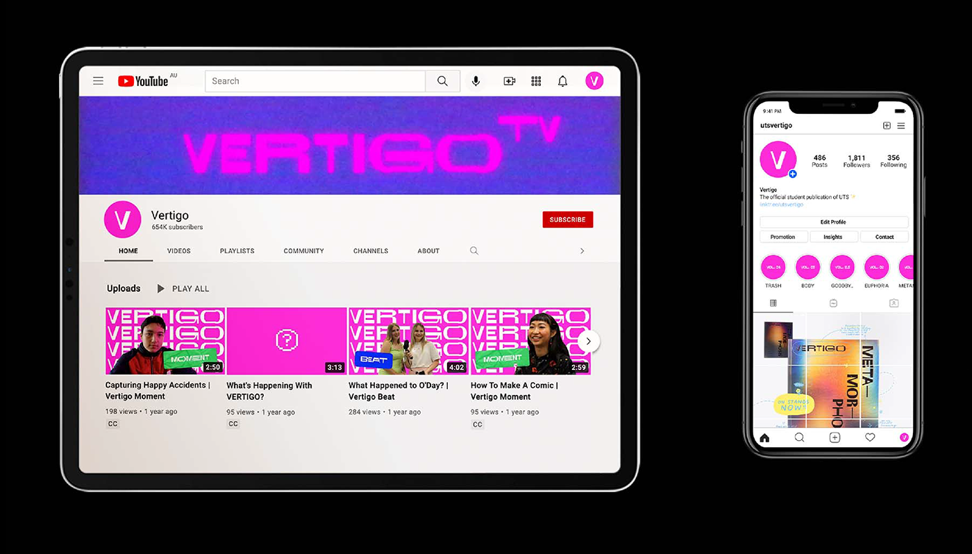
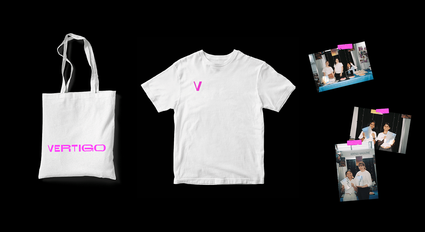
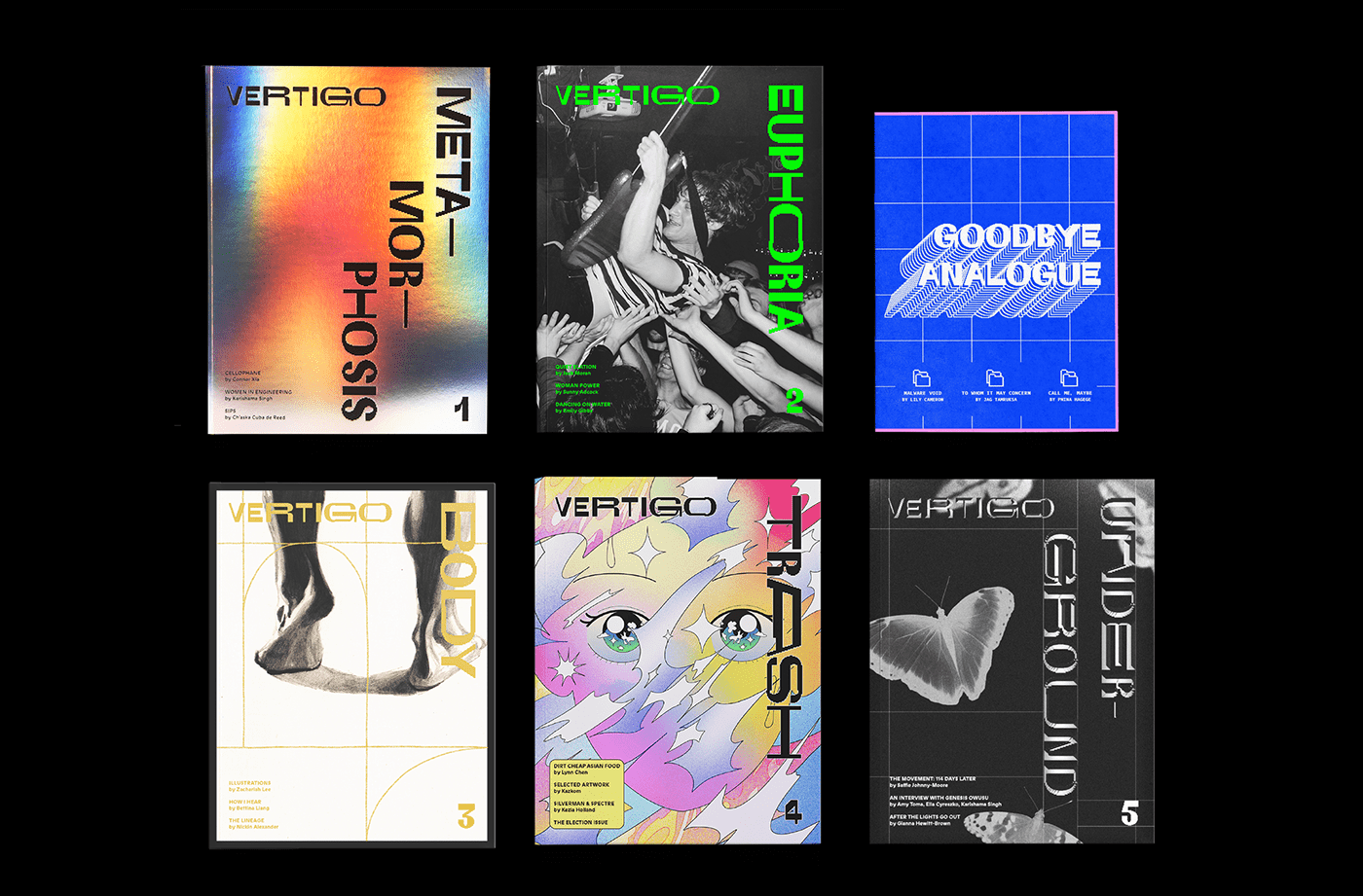
We wanted to create a visual identity for Vertigo that spoke to the student population. Our core values centred around accessibility and inclusivity - we didn’t want to create a student mag that felt like it was too polished for students to submit their work to.
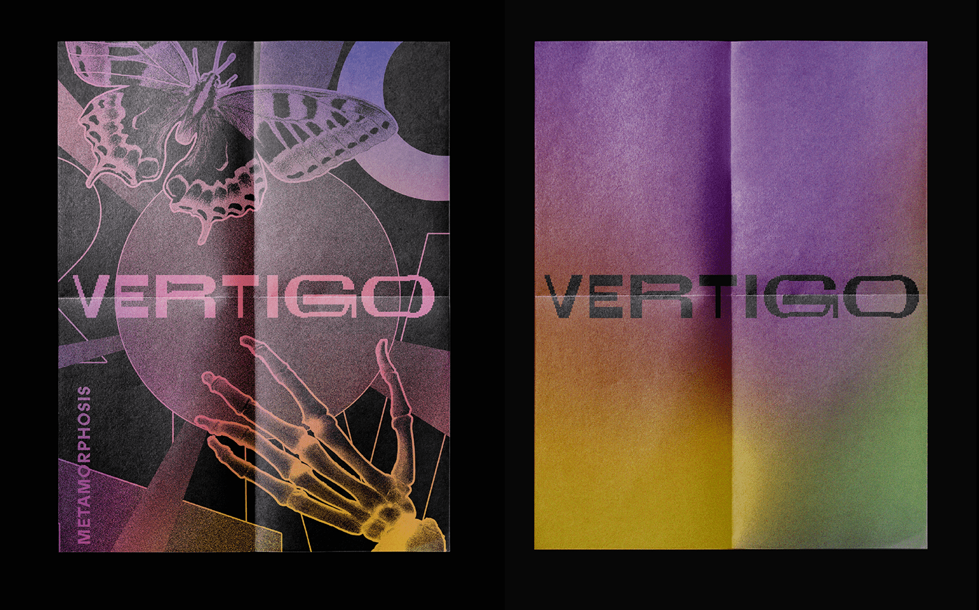
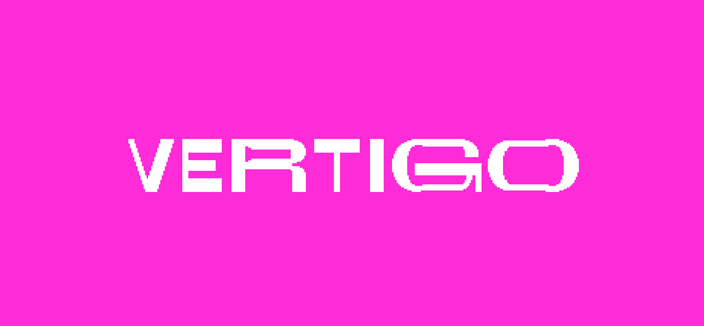
As a result, we developed a masthead that had a lo-fi aesthetic, that harkened back to the days of DIY and everyone having a go, no matter how amateur. Our primary typeface was also a variable font, that shifted and changed, much like the student population and the varied issues we covered through our tenure of Vertigo. Our hero colour, a bold and vibrant pink, reflects the publications boundary-pushing editorial approach.Our hero colour, a bold and vibrant pink, reflects the publications boundary-pushing editorial approach.