


肉次方・燒肉放題
王品集團全新日式燒肉吃到飽品牌—肉次方,主打各式無限供應的肉品與海鮮,滿足每一位無肉不歡的饕客。呼應極致的味蕾饗宴,我們運用強烈的視覺,共同打造視覺與味覺的過癮體驗!
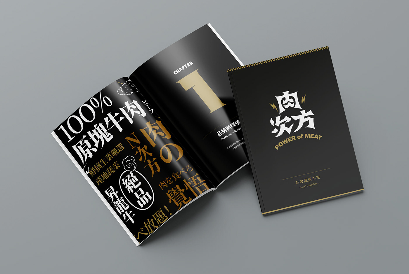
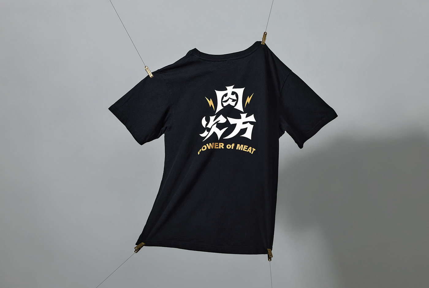
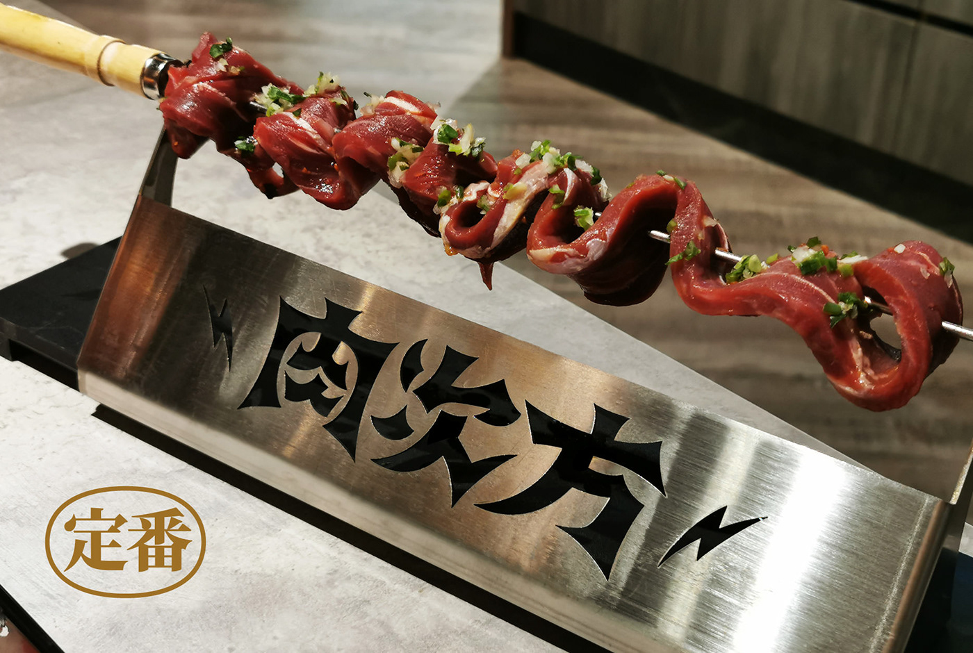
我們將「肉的蛋白質被消化後成為能量來源」的概念轉化,呈現能量如電力爆發的震撼,以電力符號為設計元素,貫穿商標、菜單、食器、餐廳空間等大小延伸物,將餐廳塑造成一座熱烈的肉力發電廠。
爆破狀的標準字,有著擴張的視覺張力,展現電力四射的視覺效果,黑與金的品牌色,也呼應精緻的餐點品質與高級的用餐感受。
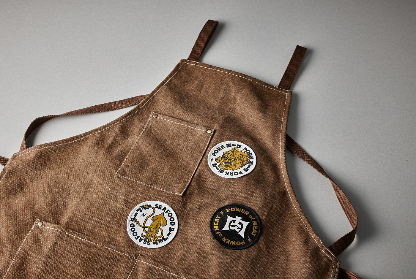
品牌運用了許多插畫延伸表現,以細膩筆觸刻畫出富有生命力的牛、豬、雞與魷魚,與肉之火山的滾滾能量噴發,呈現於無法忽視的滿版牆面與服裝上,凸顯食材的新鮮生猛與日式風格,讓食客不只味蕾上大快朵頤,視覺上更感受到強大燒肉之力的歡騰能量,擁有一頓豐沛滿足的感官體驗。
我們將「肉的蛋白質被消化後成為能量來源」的概念轉化,呈現能量如電力爆發的震撼,以電力符號為設計元素,貫穿商標、菜單、食器、餐廳空間等大小延伸物,將餐廳塑造成一座熱烈的肉力發電廠。
爆破狀的標準字,有著擴張的視覺張力,展現電力四射的視覺效果,黑與金的品牌色,也呼應精緻的餐點品質與高級的用餐感受。
品牌運用了許多插畫延伸表現,以細膩筆觸刻畫出富有生命力的牛、豬、雞與魷魚,與肉之火山的滾滾能量噴發,呈現於無法忽視的滿版牆面與服裝上,凸顯食材的新鮮生猛與日式風格,讓食客不只味蕾上大快朵頤,視覺上更感受到強大燒肉之力的歡騰能量,擁有一頓豐沛滿足的感官體驗。
值得一提的是,品牌IP角色設計廣泛應用在行銷宣傳的應用,我們為品牌設計了虎妖、肋眼人、麋鹿與暴龍等多種角色,以更趣味的形象在消費者心中留下印象。在整年度的行銷活動中,虎妖隨著節日化身為太空人、聖誕老人、吸血鬼,除了達到行銷吸睛的目的之外,同時演譯出品牌多元延伸與富有生命力的特性。
Power of Meat is a yakiniku (Japanese barbecue) restaurant satisfying meat lovers with its flavorful all-you-can-eat meats, and a powerful visual experience that can’t be neglected.With the concept of meat power and converting protein into body energy, we transfer the restaurant into a power plant. The lightning symbol is used as a core element for all designs including logo, interior space, menu, nameplates, utensils, etc. The puckered logotype expands the power of meat to a point of explosions that forms an energetic visual tension. To meet the meal’s quality and pleasant dining experience, black and gold are chosen as the theme color.We depict fresh meats (beef, pork, chicken and squid) as vigorous animals, along with an erupting volcano creating a strong visual impact on diners in the Japanese restaurant. The strong power of meat satisfies customers with not only flavors but a joyful and sensational dining experience.


Credit:
Client:王品肉次方
Project Director:Chi Yao Tang
Design Manager:Hsiang Chia Wu
Art Director:Chun Yao Huang
Project Manager:Hsiang Chia Wu
Designer:Chun Yao Huang, Jian He Lin, Jiang Xin Zhang
Photography:唯物攝影、Chi Yao Tang


