


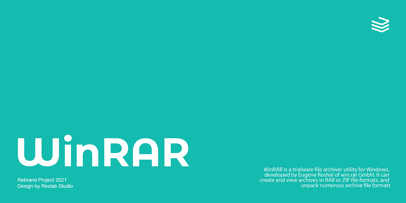
Throughout this project, the primary objective was to modernize and simplify the branding elements of WinRAR. Within this project, a variety of ideas and concepts are explored ranging from the creation of the potential brand mark, the signature typefaces and colours, and the usage of the logo sampled on UI/UX concepts.
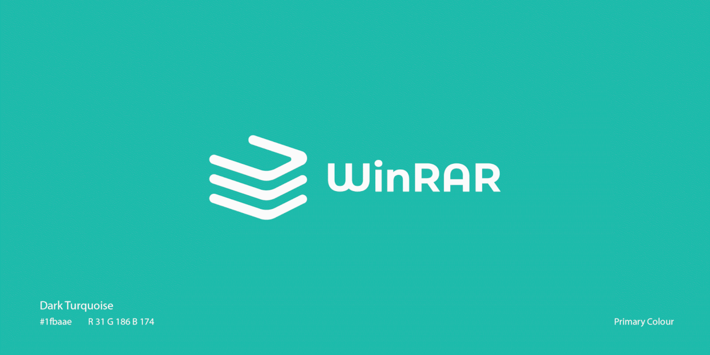
Branding Colours
"Turquoise, the captivating sea-green stone of the ancients, represents wisdom, tranquility, protection, good fortune, and hope. Likewise, contemporary crystal experts celebrate it for its representation of wisdom, tranquility, and protection." Ultimately, the colour Turquoise has a strong affiliation with the meaning of the brand as well as it is also visually appealing.

Motion Logo
The purpose of the motion logo acts as a piece which promotes brand awareness. Animated logos are both more memorable and more recognizable to consumers than static logos.

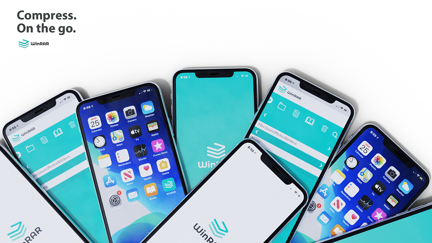
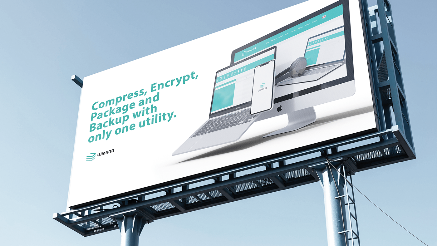
UI/UX
Provided are a variety of Mobile, Web and Software concepts placed on the 'iPhone 11', the '2017 MacBook Pro' and the 'iMac'. (These products are available at Apple). The mobile concepts are used to represent a potential app release in the future allowing users to compact and organize files from their smartphones. The Web and Software based concepts explore how WinRAR could potentially simplify and modernize the visual appearance of their products making the User Interface and User Experience less complicated.


Thanks for viewing the project!
------------------------
Email : wrldf.pain@gmail.com


