
CB&I Rebrand Exploration - current identity and usage - it is very generic, has transparencies, and uses a small town font called Benguiat which isn't that appealing to an international audience

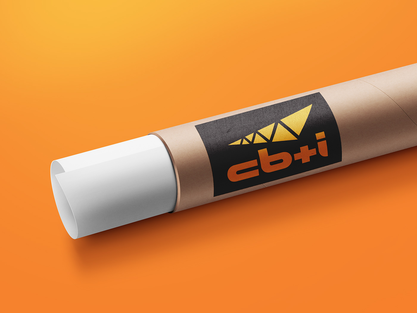
CB&I Rebrand Exploration - updated identity in orange on black sticker on blueprint tube


CB&I Rebrand Exploration - updated identity on orange hard hats screened in 1 color and 2 color identities

CB&I Rebrand Exploration - front and back of business card design in Pantone 804 neon orange and black


CB&I Rebrand Exploration - updated identity versions in black and Pantone 804 neon orange

CB&I Rebrand Exploration - updated identity color formulas


CB&I Rebrand Exploration - updated identity in black and orange on orange and white long sleeve shirts


CB&I Rebrand Exploration - updated identity versions on black and orange coffee mugs

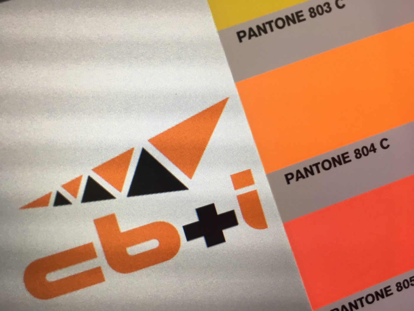
CB&I Rebrand Exploration - color swatch choice of Pantone 804 neon orange


CB&I Rebrand Exploration - updated identity versions on black, white, and orange polo shirts


CB&I Rebrand Exploration - updated identity versions on Pantone 804 neon orange background, on black background, and on Pantone 804 neon orange gradient background


CB&I Rebrand Exploration - updated identity versions on in white, black, and orange ball caps

CB&I Rebrand Exploration - final favorite identity ideas with updated colors -
some identity ideas have renaming based on founder's names


CB&I Rebrand Exploration - final 2nd favorite alternate identity idea after the one featured above


