

Identity Development VEXILA
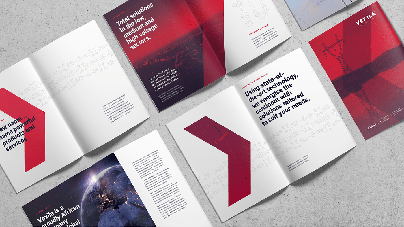
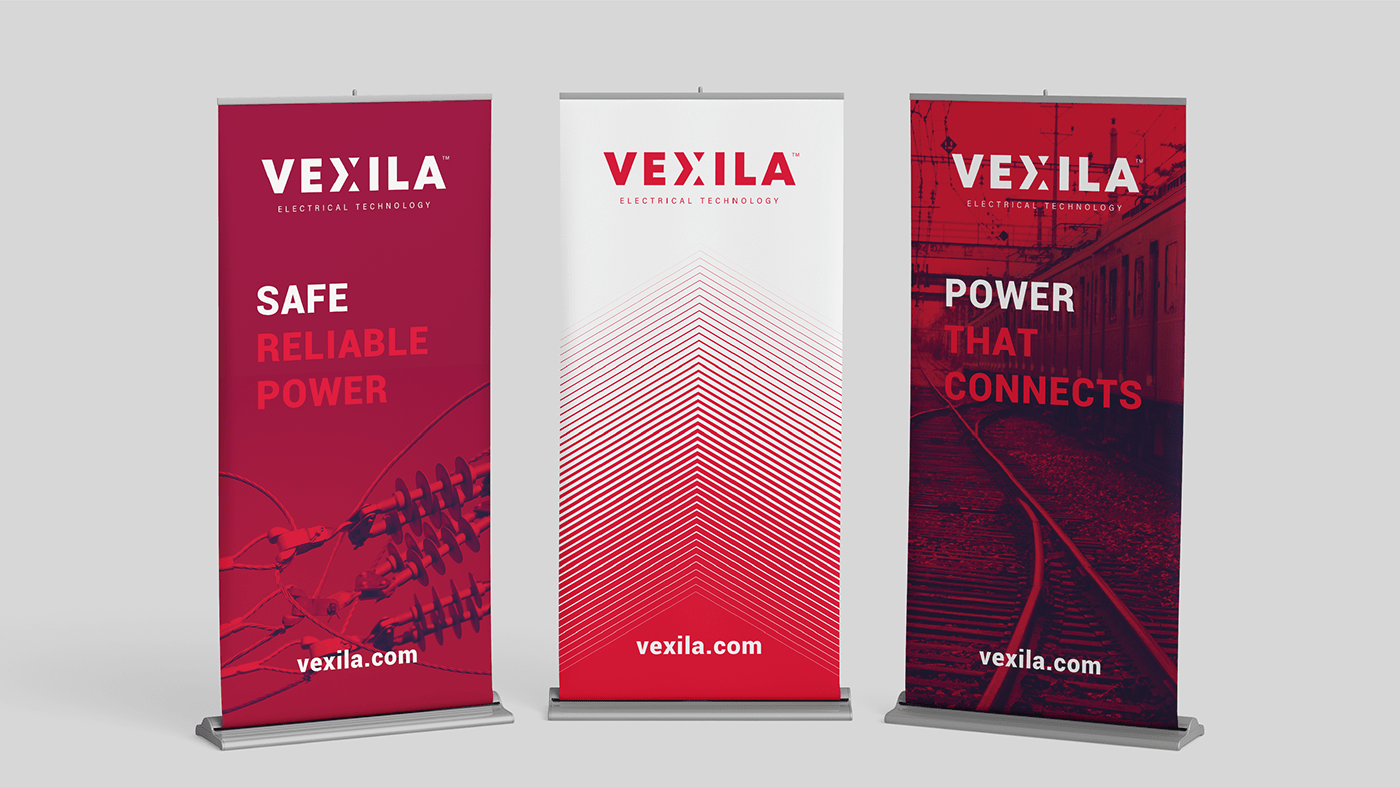
We were asked to develop an identity for an electrical technology company previously known as Pfisterer South Africa. We were involved at every stage of the brand development, including name generation. Inspiration for the wordmark was drawn from the strength and structure of large electrical components, with the X in Vexila referencing positive and negative electrical charges and the flow of electricity. For the colour palette, we chose a bold, rich red to represent energy and power. Using the X as the centre point, we created a pattern based on the framework and cross lattice structure of an electrical pylon, as well as the effect of an electric current. A secondary pattern was created by simplifying and stylising technical drawings of the components Vexila manufactures. Brand elements included corporate stationery and collateral, a website, corporate profile, a cinematic, uniforms, signage, and elements for the launch event.


The team
All work property of Xfacta. All rights reserved.
Creative Director: Shaun Botes
Designer: Kim Francey
Copy Writer: Carole Watkins
Animation: Greg Cook
Account Manager: Xhanti Mahlangeni
Thanks!


