The Butcher Shop is a new restaurant set to open in Manila sometime in 2014. It's a high end restaurant pegged as a New York meets Chicago style deli. I was contacted to do initial branding work for them. I proposed 2 logo studies playing on the elements of butchering.
I stuck with warm toned down colours like orange, brown, black, and white, as elements of the place would mostly be made from wood, metal, and leather.


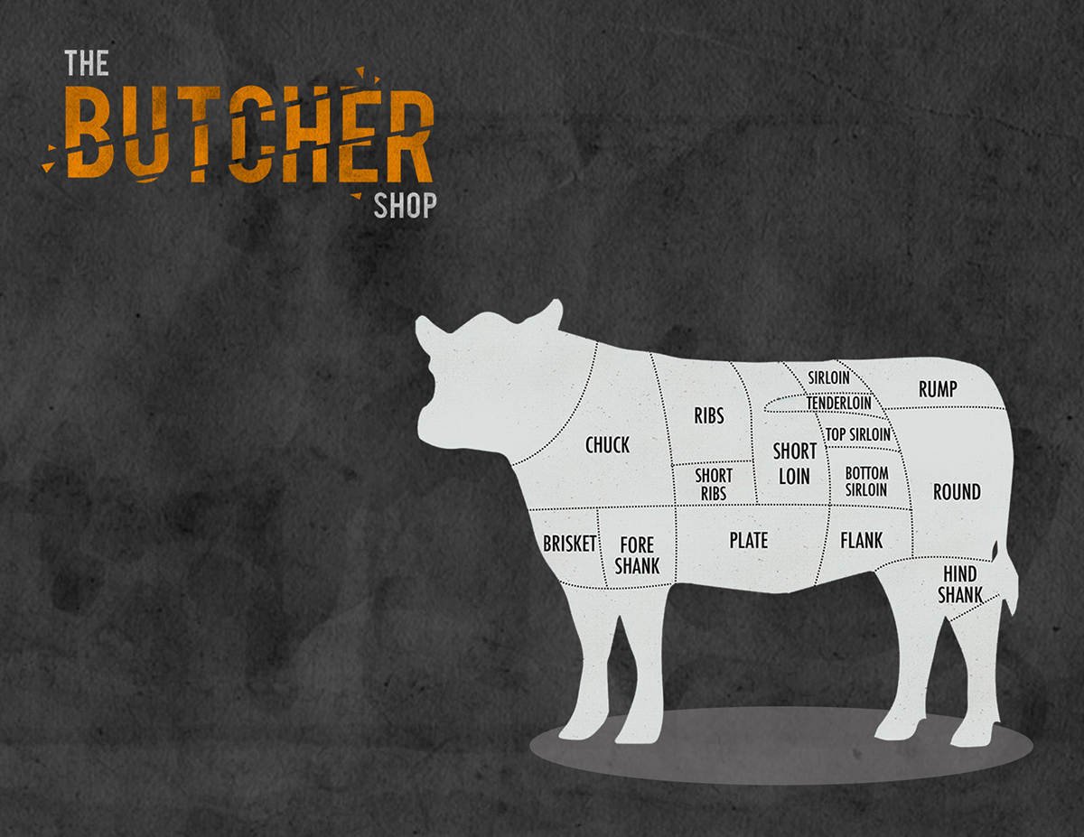
I wanted to make the first logo clean and very minimal so I played around with the chopping motion the butcher does when carving meat. For the placemats, I kept the rough paper texture from the logo to give a gritty but sophisticated look. I put in parts of the meat directly on the placemats to help the customers in choosing the type of cut they'd want. This can also be used as a visual aid between the waiter and customer for easier selection during ordering.

For the second logo, I pictured a butcher's block with the copy burnt and debossed on a thick cut of wood. I wanted it to look clean and eye-catching when placed as a hanging side sign outside the establishment. This stuck with the warm colours as initially proposed with softer natural textures from the grain. Again, keeping true to the organic elements, paper lined with wax from the inside is used as packaging material for take-outs. Coloured twine based on the approved colourway would be used to tie everything together, along with a paperthin woodburnt chip with the restaurant's logo.


