


Músicamarca
PT
Toda música conta uma história, marca um momento, entrega muito sentimento. O projeto Músicamarca traz uma representação dos sentimentos das músicas para o mercado de branding, explorando as características de cada som para uma construção de marca criativa.
A ideia é extrair a mensagem de uma música e dar vida a ela através de um universo visual, seu território criativo, seu comportamento e outras expressões da música aplicadas na marca.
A ideia é extrair a mensagem de uma música e dar vida a ela através de um universo visual, seu território criativo, seu comportamento e outras expressões da música aplicadas na marca.
Projeto não comercializado.
EN
Every song tells a story, marks a moment, delivers a lot of feeling. The Musicamarca project brings a representation of the feelings of the songs to the branding market, exploring the characteristics of each sound to build a creative brand.
The idea is to extract the message of a song and bring it to life through a visual universe, its creative territory, its behavior and other expressions of music applied to the brand.
Project not marketed.
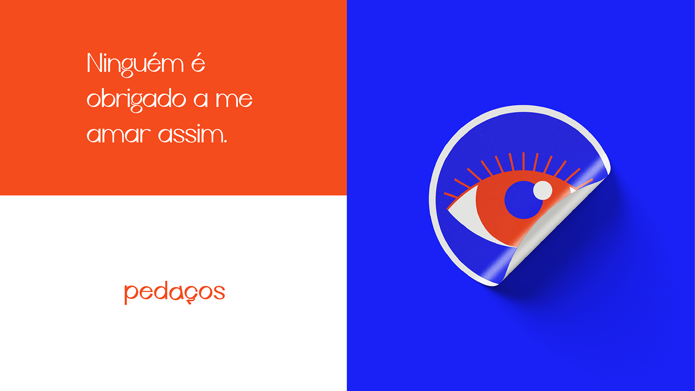
Pedaços
PT
Pedaços foi inspirado na música Meu Pisêro - Duda Beat, onde a protagonista tem um amor não correspondido, ela relata um desgaste em tentar manter esse relacionamento, mas que no fim entende que não seria possível sustentar algo assim.
O nome "Pedaços" foi escolhido para representar um pouco da ideia da música, onde a personagem recebe apenas um pouco do amor de um companheiro que ela se entregou por inteira. Também representa como ela fica em relação a essa situação, que se despedaça, que sofre, mas que no final se mantém.
EN
Pedaços was inspired by the song Meu Pisêro - Duda Beat, where the protagonist has an unrequited love, she reports a weariness in trying to maintain this relationship, but in the end understands that it would not be possible to sustain something like this.
The name "Pieces" was chosen to represent a little of the idea of the song, where the character receives just a little of the love of a partner that she gave herself completely. It also represents how she stands in relation to this situation, which falls apart, which suffers, but which in the end remains.

Conceito
PT
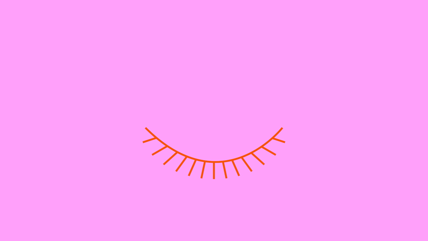
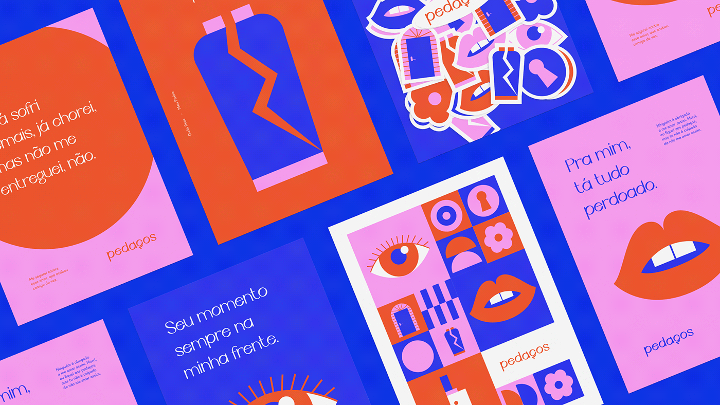
O logotipo é limpo e ligeiramente organizado, assim como a música. Uma música que soa de forma suave nos ouvidos, mas apesar de ser leve a protagonista relata algo que a fez sofrer.
A marca possui a letra "A" fora de posição, assim como um amor do passado, que por mais que esteja perdoado algo muda, sai do lugar que estava, se modifica. A letra "A" está levemente inclinada a um ângulo de 10°, como um quadro que por mais que você tente posicionar no ângulo certo, ele sempre inclina. Uma representação tipográfica experimental, algo que une modernidade com uma característica clássica, muito inspirada no videoclipe da música.
EN
The logo is clean and slightly organized, as is the music. A song that sounds soft in the ears, but despite being light, the protagonist tells something that made her suffer.
The brand has the letter "A" out of position, as well as a love from the past, which, however much is forgiven, changes, leaves the place it was, changes. The letter "A" is slightly tilted at a 10° angle, like a frame that no matter how hard you try to position it at the right angle, it always tilts. An experimental typographic representation, something that unites modernity with a classic characteristic, very inspired by the music video.

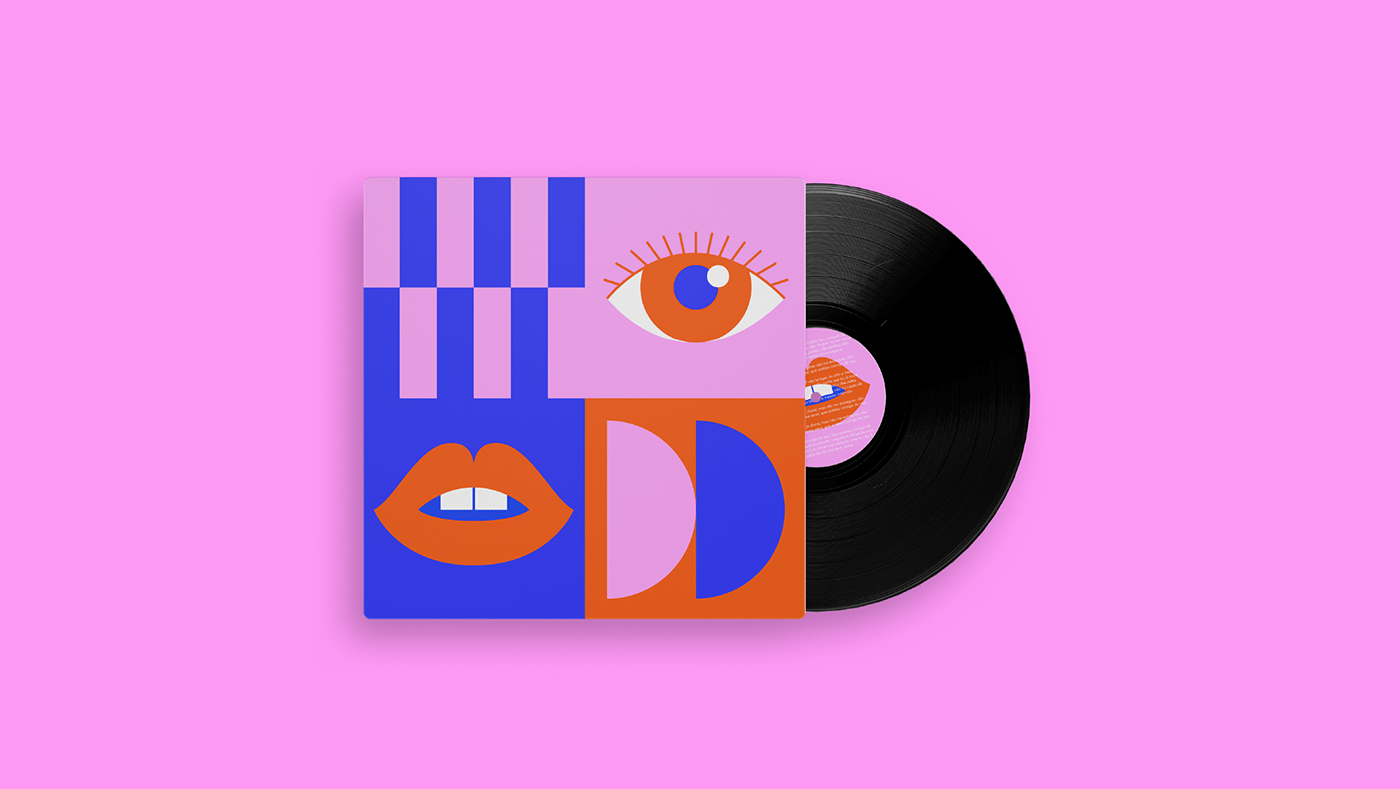
Cores e Ilustrações
PT
As cores foram pensadas para trazer as sensações da música, o rosa traz o sentimento de amor, a delicadeza e sedução da música. O vermelho traz a fúria, a decisão de não aceitar mais aquela situação de amor não correspondido. O azul traz a estabilidade e frieza do fim da música, que a protagonista perdoa o parceiro e entende que ele não é obrigado a amá-la.
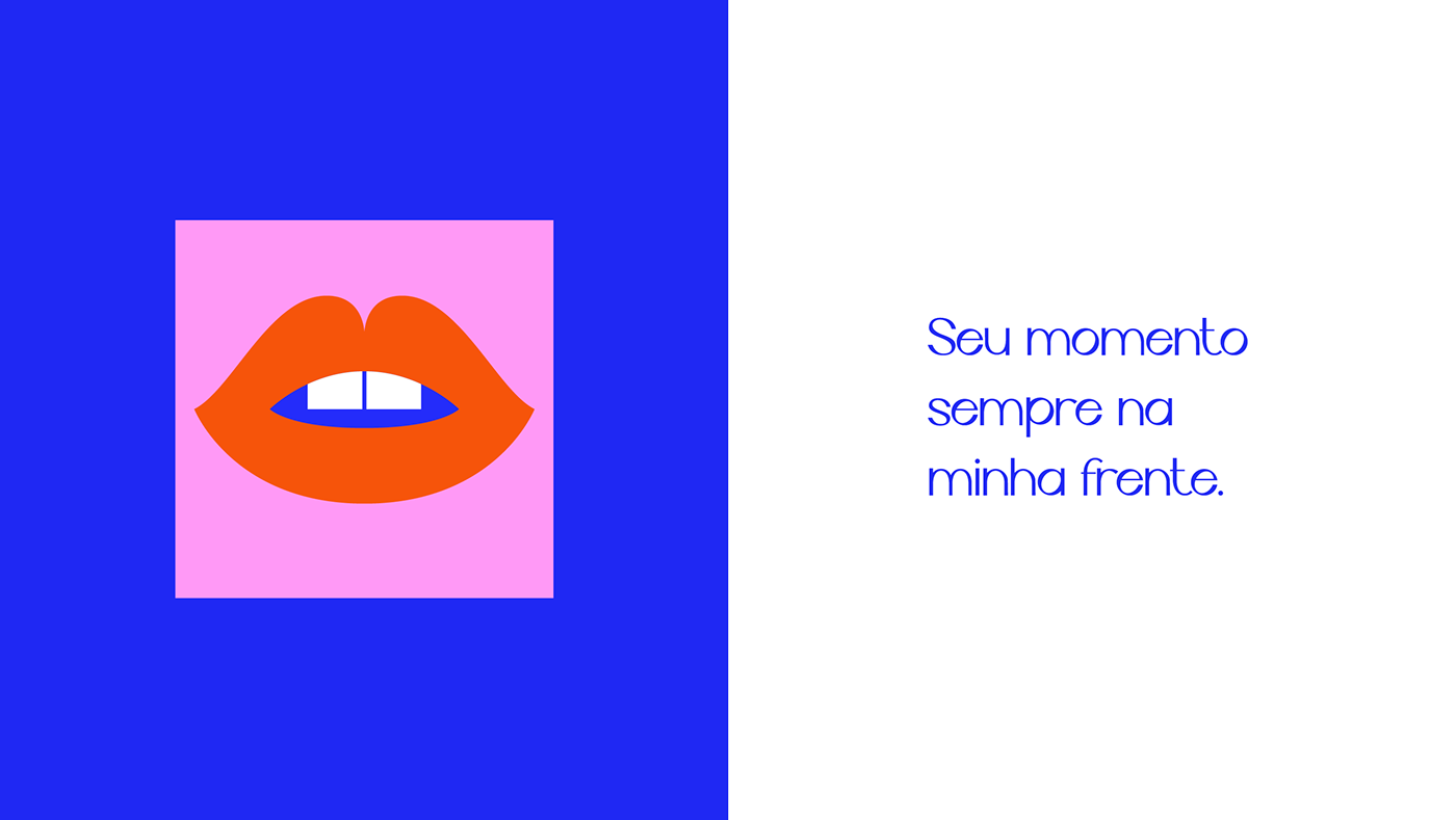
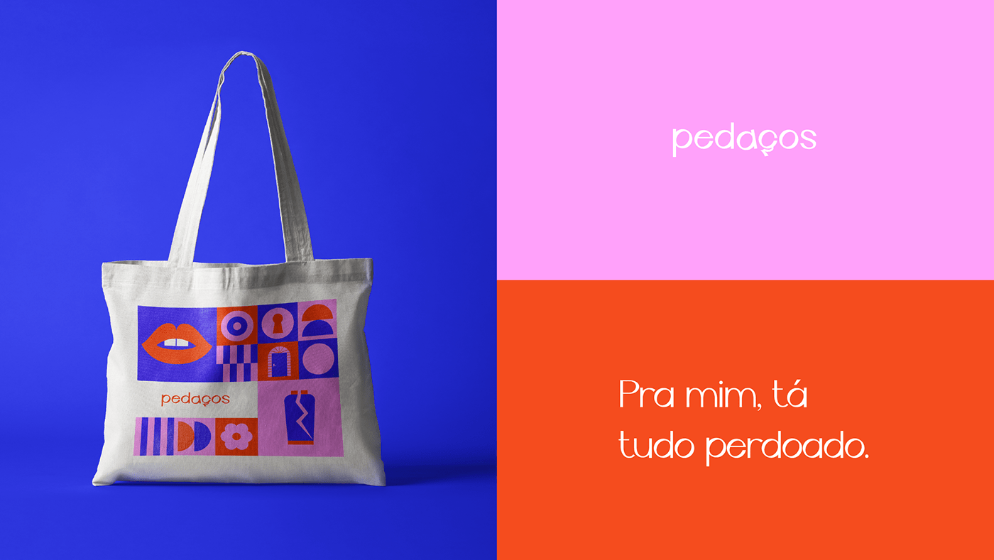
As ilustrações do projeto são inspiradas em alguns traços da música e do videoclipe, o olho representa a conexão de uma relação. A porta representa a passagem e convite para alguém entrar em sua vida. A boca traz a sedução de uma paixão. A flor representa o sentimento de carinho e afeto. O vaso quebrado, traz a ideia de partir um sentimento bonito. A faca representa o corte dessa relação. A fechadura representa o olhar de quem está de fora, como se a protagonista não tivesse permissão para acompanhar a vida do parceiro e acaba espiando pela fechadura.
EN
The colors were designed to bring the sensations of music, pink brings the feeling of love, the delicacy and seduction of music. Red brings fury, the decision not to accept that situation of unrequited love anymore. The blue brings the stability and coolness of the end of the song, that the protagonist forgives her partner and understands that he is not obliged to love her.
The project's illustrations are inspired by some traits from the music and the music video, the eye represents the connection of a relationship. The door represents the passage and invitation for someone to enter your life. The mouth brings the seduction of a passion. The flower represents the feeling of affection and affection. The broken vase brings the idea of breaking a beautiful feeling. The knife represents the cut of that relationship. The lock represents the look of the outsider, as if the protagonist was not allowed to follow her partner's life and ends up peeking through the lock.


Precisa de um projeto?
Envie um e-mail para: contato@carvadesign.com
Envie um e-mail para: contato@carvadesign.com
Me siga no instagram!
@carvadesign
@carvadesign


