
SolRising is an app focused on making mental health care more accessible. A place where people can safely communicate with a licensed mental health professional, and access all related resources in one place, from the comfort of their home. The main focus of the app is for those who may not know where to start and are seeking immediate help. SolRising promises to provide a guided path curated for each individual needs, with an emphasis on crisis situations.
Project Overview

The Challenge
There is a huge gap in accessible mental health care which creates hindrances for people seeking immediate help. There needs to be a way for people to have access to affordable and inclusive mental health care where urgent help is emphasized.
Target Audience
According to research, the prevalence of serious mental illness (SMI) is the highest between 18-25 years of age (8.6%), and 2nd highest being 26-49 (6.8%). This app will target age groups 18-49, with an emphasis on the age range of 25-35 as research shows mental health is most prevalent during this time. This app should still have easy enough usability for older tech users, as mental health has no age.
The mindset of our target audience are those who struggle to not only talk about their mental health, but people who are having a hard time accessing resources or services. This app is for those who want the privacy and comfort of their home while accessing mental health services, and those who need guidance to get started. This will aim to be a one-stop-shop for mental health, with an emphasis on 'getting patients started' as this is one of the toughest barrier for many.
The Process

Empathize
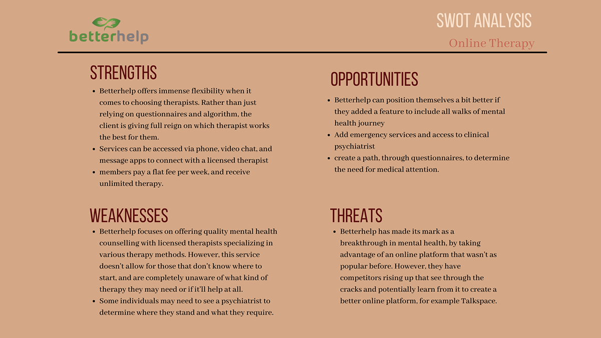
Competitive Analysis
Mental health has been a front runner for topic of discussions, very much accelerated by the pandemic. This has opened doors for companies to make mental health care more accessible using digital products. Competitors like Talkspace and Betterhelp has made the headlines for being the 'new way' of communicating with licensed mental health professionals from anywhere they want.
I started my research process by conducting a competitive analysis to get a better understanding of the market and identify some key strengths and weaknesses to seek out opportunities that could be advantageous for my app design.
Although there is some competition as it's a growing industry, this also allows for an opportunity to bridge any existing gaps and join the competition.

UX Analysis
I moved onto UX analysis in order to gain a more in depth knowledge on the layout, functionalities and features in existing services, and identify the strengths and areas of improvement for the app. This also gave me inspiration for potential app designs and layout for my app.


Understanding the User
Now that I have an understanding of the market, business opportunities and areas of improvements, it was time to get know my potential users and their needs & goals by conducting user surveys and user interviews.
User Surveys
I started by conducting a survey for an initial understanding of human behavior around mental health care and any problem areas.
The survey is broken into four sections, mainly gauging demographics, human behaviors, and preferred outcome of mental health as a unit. The survey encouraged individuals that may have had experience with mental illness and/or mental well-being, and how this may have impacted their lives.


The survey was conducted over the course of 24 hours using Google Forms. 24 Participants completed the survey.
The survey Results show that a lot of people are willing to get help, but is lost in the sea of information with no guided route to receive the help they need. Most participants may be aware of their local services, but due to inaccessibility they forego their search for taking better care of their mental health. Further interviews will delve into the specific reasons, hindrances, and how a virtual platform can be used to fill the gap.
User Interviews
Next, I conducted user interviews to see how people approach and practice self care and their experience with mental health care and resources. Also to have a better understanding of barriers people face that may hinder their ability to maintain a happy & healthy life. This information will help in creating a more inclusive platform that caters to a larger audience.

The interview was conducted virtually through Zoom with 4 participants, each session lasted 25-35 minutes. The age range was 23-30 years old with various occupations.
Define
Problem Statement
Users need a reliable & affordable platform where they can receive immediate help and safely communicate with licensed mental health professionals so that they can have a better understanding of their mental well being. We will know this to be true when patients and licensed mental health professionals are using the app for ongoing communication & treatments, along with an active and extensive community outreach.
Problems
- Lacking Unity
- Professional guidance & Crisis aid
- Handling Finances
- Safe Communications
& Accessibility
- An app that allows for a virtual mental health clinic, where patients can access psychiatrists, psychotherapists, social workers, spiritual guidance counselors, without the need for a reference from their family physician.
- Provide a 'one-click' service for people in crisis situation that may need help right away
- Patients should also have access to additional community resources pertaining to mental health services, that may not require money
- An app that is encrypted for confidential and secure conversations, safe keeping of health records and all personal and sensitive information.
User Personas
After collecting and sorting through all the data from the survey and interview, I proceeded to create 2 main user personas that reflect two of the main personalities and viewpoints, to help create the foundation for my design moving forward. These personas tell a story of human behavior around mental health, their needs, motivations and frustrations that will serve as a guide in designing features and functionalities for my app.


User Journey
Using my personas, I created user journeys to get a better understanding and a visualization of my users emotions while navigating through the app. This helps identify the pain points and frustrations that my app design can potentially solve.


User Flows
Once I had a solid understanding of my users' emotions, I created some user flows to get an idea of the steps users can take to complete a desired action. The user flows focuses on some of the main features of the app with a focus on minimizing the screens users have to go through.


Ideation
A mental health is heavily focused on feeling and communicating emotions. With all my gathered data and a fundamental understand of my user and their needs, I started to build the structure of the app, focusing on a flow that makes users feel motivated and encouraged to use the app.
Open Card Sort & Refined Sitemap
I had 7 participants do a open card sort through Optimal Workshop based on my initial sitemap. They were given 20 cards to sort into categories they deemed fit.
Gathering the data from the card sort, I noticed certain patterns in behavior that indicated to certain categories like; settings, which I did not have in my original sitemap.
This process also helped me realize that my original site map’s category placements may have been a bit confusing for users, as they expect certain pages to be in certain categories that they are used to seeing.
I ended up revamping most of my sitemap, with better hierarchy to accommodate for better usability.


The Evolution Of SolRising
Low-Fidelity Wireframes: Pen & Paper sketch
Gathering all the research data and with a fundamental understanding of my users' needs & goals, I started putting down some initial designs for my app with low-fidelity pen & paper wireframes. I focused on four core features of my app: Initial Intake, subscription, specialist profiles and community outreach.


Mid-Fidelity Wireframes
Once I had an idea of how the layout could potentially look, I started putting my paper sketches into mid-fidelity digital wireframes. I started adding more screens and features along with the core features shown above. I used Balsamiq to start, and then refined those wireframes using Proto.io for a mid-fidelity prototype.


Onboarding & Login/Signup


Subscription Plans


Initial Intake


View Therapist profiles
Now going into a more High-fidelity (still greyscale) prototype using proto.io which was used for the first round of user testing. As shown, the screens have evolved as I review functionality and usability of the layout throughout my design process.


Prototype & Test
Gathering Feedback
"Coming together is the beginning, staying together is progress, and working together is success".
- Henry Ford
The discovery phase for SolRising began with competitive research and user interviews. I discovered that people are struggling to find the right mental health care and is frustrated and demotivated by the lack of accessibility. The resulting prototype is an initial hypothesis on how I hope to solve the problem. Now, I would like to amend and test the most important features and functionality that I have discovered through usability testing. This was the first round of testing, so prototype was in greyscale so users can focus on the tasks rather than the UI.
Usability Test
The purpose of the usability test was to gain insight on how participants went about each task and pinpoint any frustrations or difficulty with finishing the given task. Most importantly, I wanted to observe individual behavior while completing each task, specifically how it made them feel.


Participants are color coded
Analyzing the results
Having done the initial round of user testing, I was ready to start analyzing the results to see what is working and where improvements can be made. I started with affinity mapping to group together 4 main areas in question; positive quotes, negative quotes, observation, and errors.


Metrics- Jacob Nielson's Error Rating
0 = I don't agree that this is a usability problem at all
1 = Cosmetic problem only: need not be fixed unless extra time is available on project
2 = Minor usability problem: fixing this should be given low priority
3 = Major usability problem: important to fix and should be given high priority
4 = Usability catastrophe: imperative to fix before product can be released

To view the full rainbow spreadsheet please click here
Using a rainbow spreadsheet, I chalked out some possible solutions to the errors that came up during usability tests. The focus was on making amendments to the most urgent errors in order to improve the usability and functionality of the core features of the app.
Insights & overall results
All participants overall had a good experience with the test, the tasks were clear cut and they understood what they needed to do. The most difficult task was finding the subscription button. I believe that we can improve the navigation and understanding of the user by making some adjustments on the information provided on the home screen, changing the wording of some features, and simplifying the navigation they got confused about.
Overall, participants found the concept refreshing and simple layout to be easy to use. All participants said they would much appreciate this app in the real world due to it's accessibility and prioritization of urgent care and a guided path. With the amendments proposed above, we can further the ease of use and shine light on the main goal of the app, which is transparency & human connection.
Refining the Design
Time to bring my app design to life and incorporate some UI elements to start bringing some emotion into the app.
Norman's three levels of Design
Visceral- SolRising being an app for health, users need to believe that the app is safe & secure, with privacy emphasized. Introducing users to the app using onboarding should allow for users to understand and resonate with exactly what the app will do for them.
Behavioral- Being a mental health app, users should feel confident using the app. Using one of the main focus of the app which is immediate care, the design will emphasize ease of use and efficiency so that people aren't having to scramble to get the information or help they need.
Reflective- The app needs to provide value to users for them to want to come back to it for all their mental health care needs. The design should evoke emotions of being welcomed, and reassurance that they are in good hands.
Design Collaboration
A huge part of the design process is collaboration. I shared my work with my peers from school to get a viewpoint from another designer. Below are some of the modifications made from the feedback.


Designing For Accessibility
Personally, as a designer, accessibility is and always will be at the forefront of my design decisions. In order for me to empower my users through my design, it is crucial that I make sure that my design holds true to diversity and inclusivity.
My app design is still ongoing so all the accessibility features are not shown.
My app design is still ongoing so all the accessibility features are not shown.
Some of the features I would look into adding are
- The ability for users to choose their desired language for app use
- wherever possible, voice commands and screen reading
- an option in settings for accessibility mode
- The ability for users to choose their desired language for app use
- wherever possible, voice commands and screen reading
- an option in settings for accessibility mode

I would also have options to have continued feedback in regards to accessibility, amongst other things. This app focuses on immediate help for those seeking it, which will also help with accessibility for those that may need human interaction.
Another thing to keep in mind would be to have translators on the help lines and service offered (of all kinds, language, deaf & hard of hearing, people using sign language)
Another thing to keep in mind would be to have translators on the help lines and service offered (of all kinds, language, deaf & hard of hearing, people using sign language)


Polishing the Design


High-Fidelity prototype (Current Design)


For the Figma prototype please click here
The Future of SolRising
Future iterations / Hypotheses
For this app, I will continue to work the functionality and layout of the app. I will create more screens to show different features and share prototype with peers and other participants for feedback. Do more preference tests to see what users prefer. As I go along, I will have a better understanding of what functionalities and features users are finding useful and what could be either amended or taken away, thus furthering my design. I would also have options to have continued feedback in regards to accessibility, amongst other things. This app focuses on immediate help for those seeking it, which will also help with accessibility for those that may need human interaction.
Another thing to keep in mind would be to have translators on the help lines and service offered (of all kinds, language, deaf & hard of hearing, people using sign language)
Another thing to keep in mind would be to have translators on the help lines and service offered (of all kinds, language, deaf & hard of hearing, people using sign language)
Testing
Testing will continue throughout the design process. I will continue to create more screens and test the functionality of a feature by conducting user testing. I will also use preference test and design collaboration to further my design aesthetics.
TimeLine
For the sake of this project, I would conduct another round of user testing with new tasks to complete for new features that will be added. Creating the new prototype, and running the usability test would take approximately 1.5 - 2 weeks. After that I would take another week to go through and refine the design. This is where I would share my prototype and design with peers to have ongoing feedback as I refine it.


