Biomeology
We were approached by the founder, Yasmine Moussa to redesign the basic identity, packaging and Shopify website for Biomeology. Since we loved their initial logomark and the science motifs that connect it to the brand's name we decided to keep that and create a much needed sophisticated visual system. That visual system was translated into soft typography styling, feminine and gentle color palette, and minimalist science-related graphics used in a subtle manner for the packaging system.
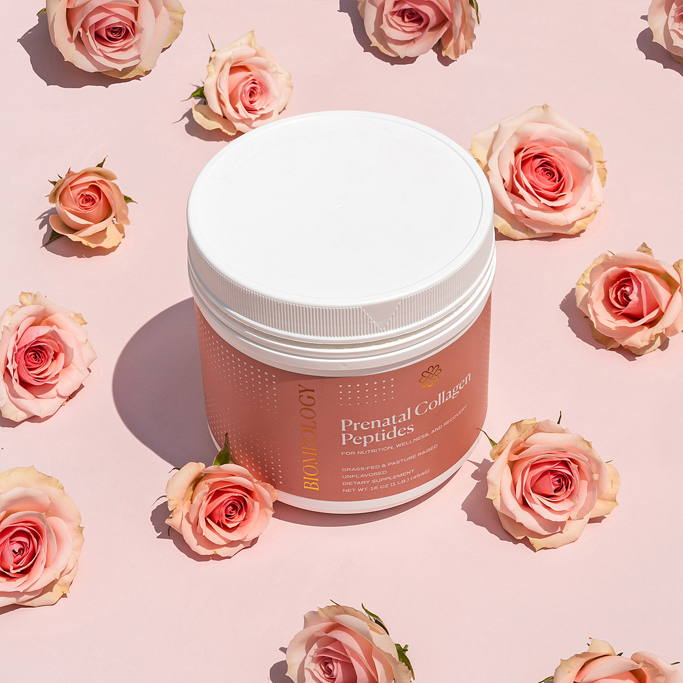
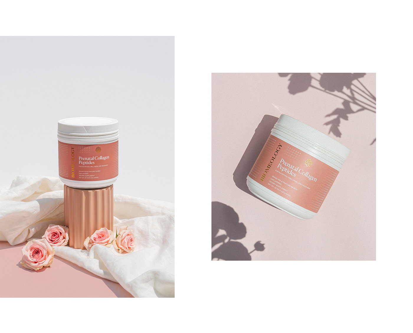
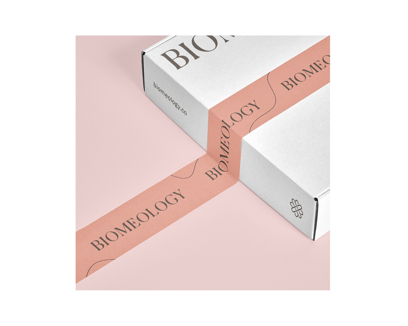
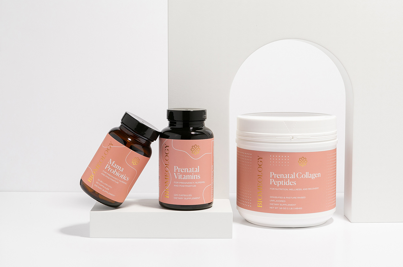
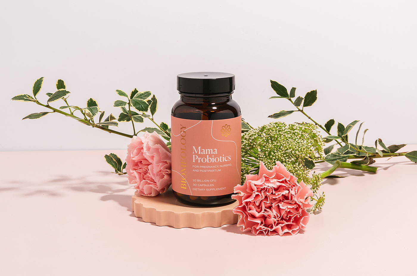
For the packaging system, we used soft coral signature color for mama products and warm beige for baby products. Different patterns were designed to make distinctions between various subcategories, like the organic, fluid thin lines for capsules and the abstract, delicate dot pattern for powders. The gold foil logo system on the packaging is beautifully combined with the signature coral pink and the elegant packaging patterns, making the whole identity and packaging system one of a kind for the natal supplement market.
The photography studio, Fluff Media, did a wonderful job with their product photos, which are based on floral scenes to represent the delicacy and nurturing behind motherhood and mamas caring for themselves AND their babies.