


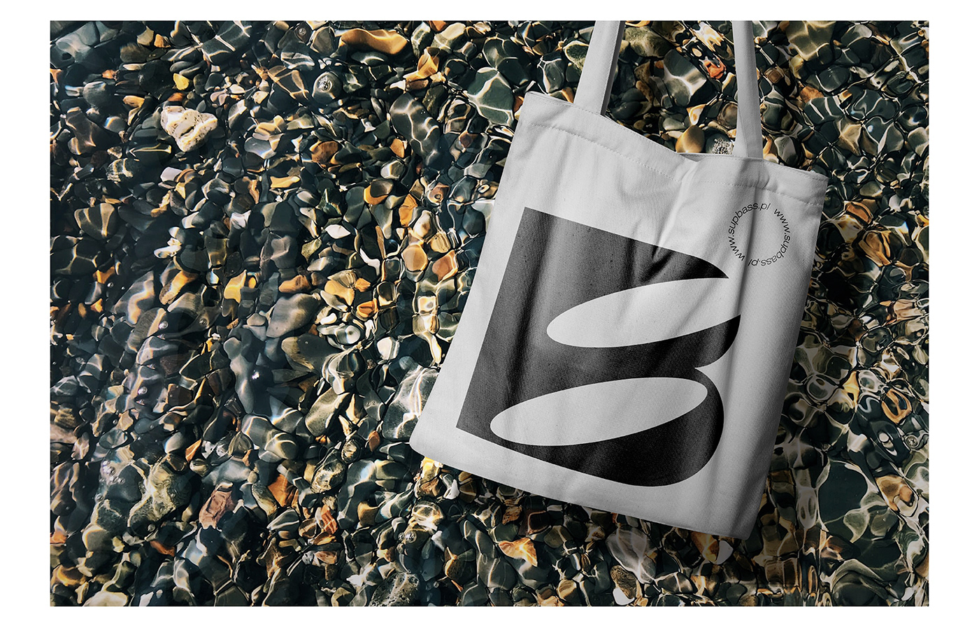


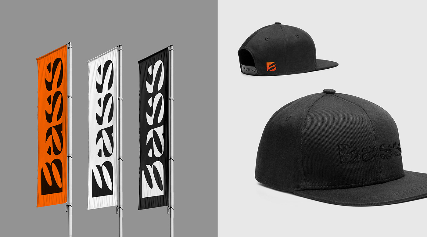
The building basis of the image for the SUP BASS brand was the creation of a logotype with original incised letters. The B mark sharp drawing is based on logotype typography. Bold and dynamic prints are using orange solid back to show a distinctive, vital line with a sporty character which goes well with the brand DNA: 'FEEL THE ENERGY_FEEL THE BASS'.


01. STONES and WATER background / Photo by Joyce McCown on Unsplash 02. STONES background / Photo by Lindsey Middleton on Unsplash


