Facebook Messenger UX case study - designing a parental guide feature to improve teens safety.

Introduction
Firstly, I'm not associated with Facebook—this is simply a passion project to deeply understand and proffer solutions to a real people problem.
Messenger is the messaging platform of the tech giant—Facebook. Messenger helps you stay close with your favorite people.
However, Messenger has grown to being a hub for predators and other dangerous individuals.
Understanding the People problem
Parents want to be proactive in handling their teens, since Messenger has opened teens up to a lot of negative experiences—communicating with predators. Teenage girls are most vulnerable to being head hunted.
Facebook is constantly seeking new ways to increase activation and the retention of users on their platforms—to remain competitive and stay ahead of the curve, while providing more value to users.
What I Did
UX research and UI/UX Design
How can we improve the safety of teens?
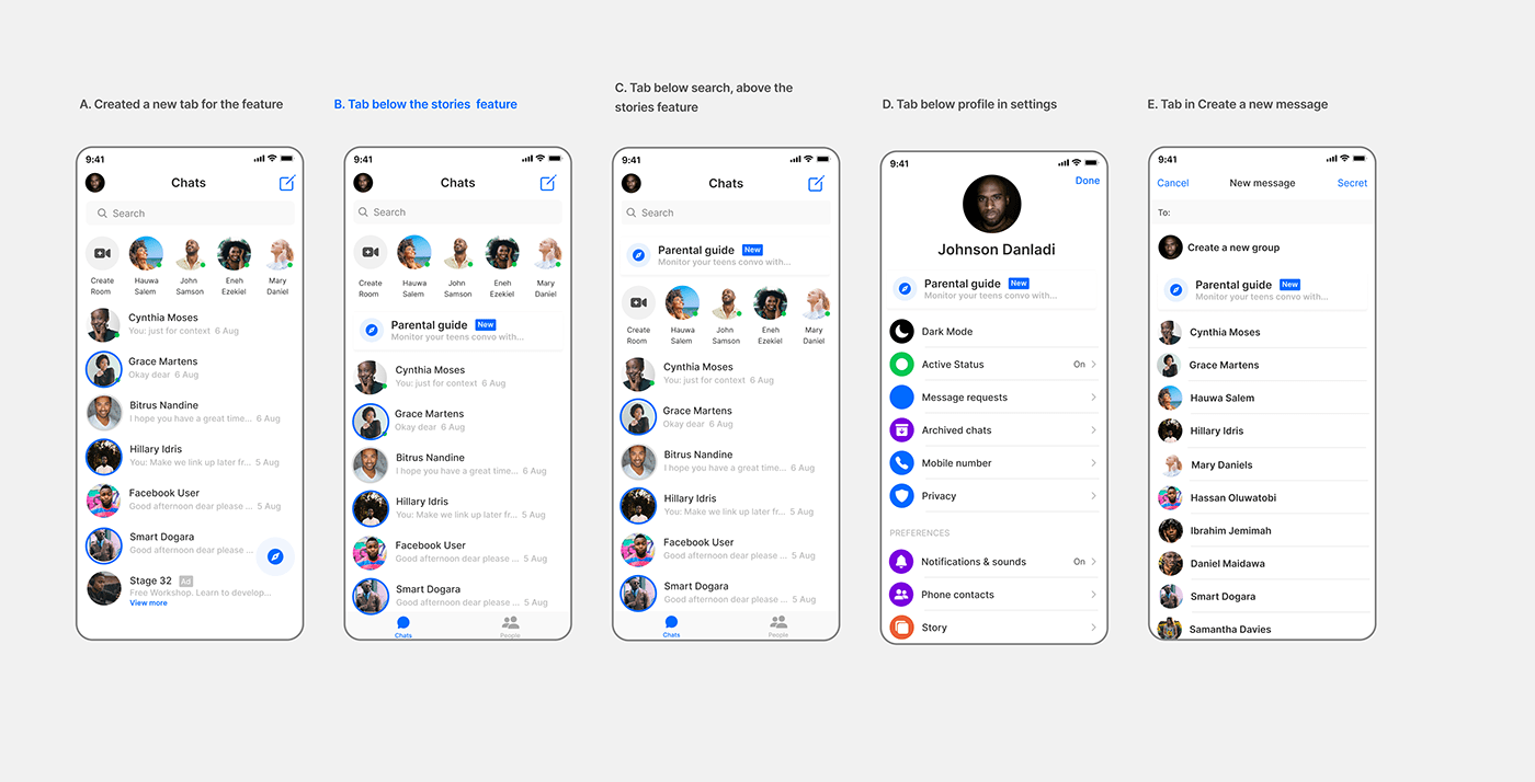
With a parental guide feature, parents and guardians can educate their teens on online safety—this would improve the relationship and communication between parents and teens. After several iterations, I chose the layout of the new feature below the stories—it's easier for users to understand and aligns more with their mental models.
Parents with access to teens conversations
Parents with teens under their care, have access to their conversations. I chose the vertical layout as It was carefully designed to display the teens in layouts closely aligned with Messenger's design language—improving users' understandability of the feature..

Monitor teens chats easily
From my research—a parent pointed out; "I'd like to monitor my teens' chats without intruding on their privacy", this was a valid point and I thought the best way to achieve that is by displaying only chats with strangers. This leaves teens' privacy on check and parents monitor conversations from strangers. I chose the vertical display of recent chats with strangers while highlighting important information about them for added context.


Another way to improve teens safety
A modal with safety tips was designed with attention to subtle details that'd capture their attention and improve their understanding of the tips I chose the design that provides more visual interest and improves the understandability of the feature—with an opportunity for teens to dive deep and learn more.


Final Screens

Here's a link to the prototype
Outcomes
I shared the prototype with 3 users and got great responses. A user asserted "...this is Facebook Messenger...", another user stated "this looks exactly like Facebook Messenger" and the final user said "I would love to use this feature".
Learnings
I'm more empathetic with the designers and product team that worked on Messenger. I noticed subtle design decisions and tradeoffs they made to create a product that best fit user needs.
I learned to work with a design language in place. I paid attention to details and sought to craft an experience that feels more like an extension of Messenger.
Our job as designers isn't only about coming up with a right solution. It also involves working to deeply explore the problem space, speak with users, uncover insights, and identify the real problem.


