
Companies selling carbon offsets tend to utilize quite similar approaches in promoting their wares. For Borealis, it made sense to position in a more distinct way; doing so would allow us to differentiate their offering from others’, convey a sense of credibility, and leverage their evocative name.

The Borealis palette and mark are informed by a more stark, fashion-like sensibility than anything from the world of sustainability. There are no soft, touchy-feely textures, nor are there images of windmills and happy people in the sunshine. Instead, a base of navy, cyan, and white are all brought to life with bold hits of magenta. Meanwhile, the wordmark uses simple, functional uppercase type, which we left largely unaltered.

Anyone who has seen the aurora borealis would agree that it’s a spectacular sight to behold. In a way, this is less about the color, and more about the magical vibrations it creates in the night sky. Sadly, most visual representations of this fail to convey such magic. In this system we play with a group of concentric circles that seem to dance on the page, all in an effort to convey the physical sense one experiences in the presence of this phenomenon.

Pictured (from top left, clockwise): presentation folder; business card; mailing envelope; logo on water bottle; templates with report information contained; standard presentation template (PowerPoint).
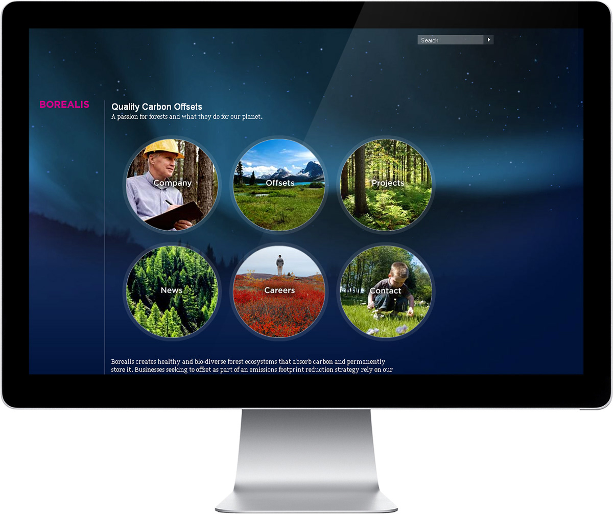

The Borealis website uses an incredibly simple grid system to organize content, in which text and images indent as one moves through the site. This allows users to easily situate themselves in the website and move back and forth at will.

From a usage standpoint, this simple overall design approach helps users make sense of information quickly. Additionally, considerations like the shorter line-lengths help maintain overall legibility, making the information easy to scan and assimilate.
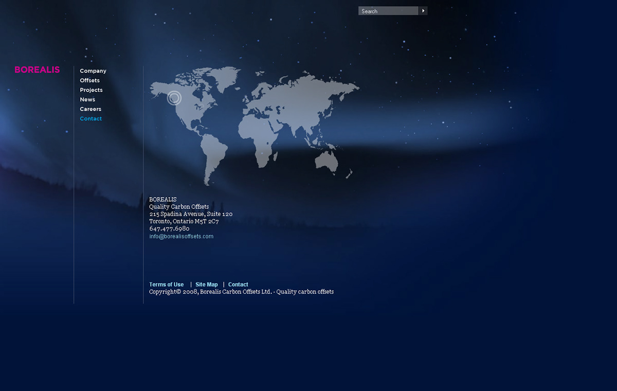
On a visual level, the site employs a very simple background treatment, which most users may not even notice. It’s a subtle shifting of color that mimics the beauty of the aurora borealis. These kinds of details aren’t uncommon in smashLAB projects. For most, they mean little, but for some they can be rather delightful little surprises.
View full case study here.


