

Mikrogorzelnia is a new and coming brand of premium spirits, established by 12 friends. We wanted to emphasize two things when designing the brand’s identification. The grassroot, informal nature of its origin and the high quality of the offered products.
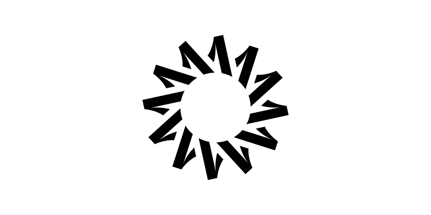
The brand’s logo metaphorically represents the founding myth of Mikrogorzelnia. We’ve designed a form in which each of the twelve partners is represented by the number 1. Each of them has a different and unique personality that is equally important. As a result, a dynamic form was created, a weave of numbers resembling the sun. As its foundation, the letter M which also contains an indentation resembling a glass.


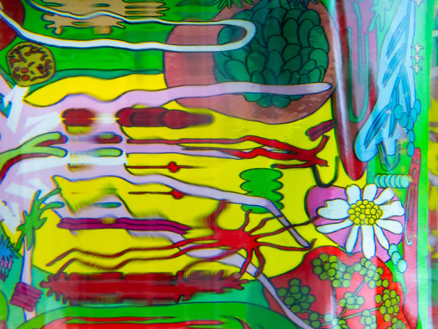
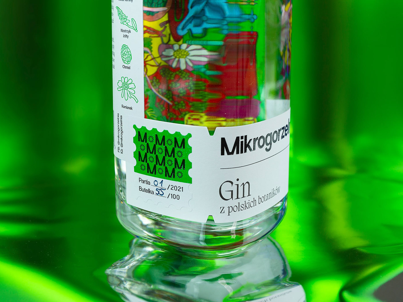
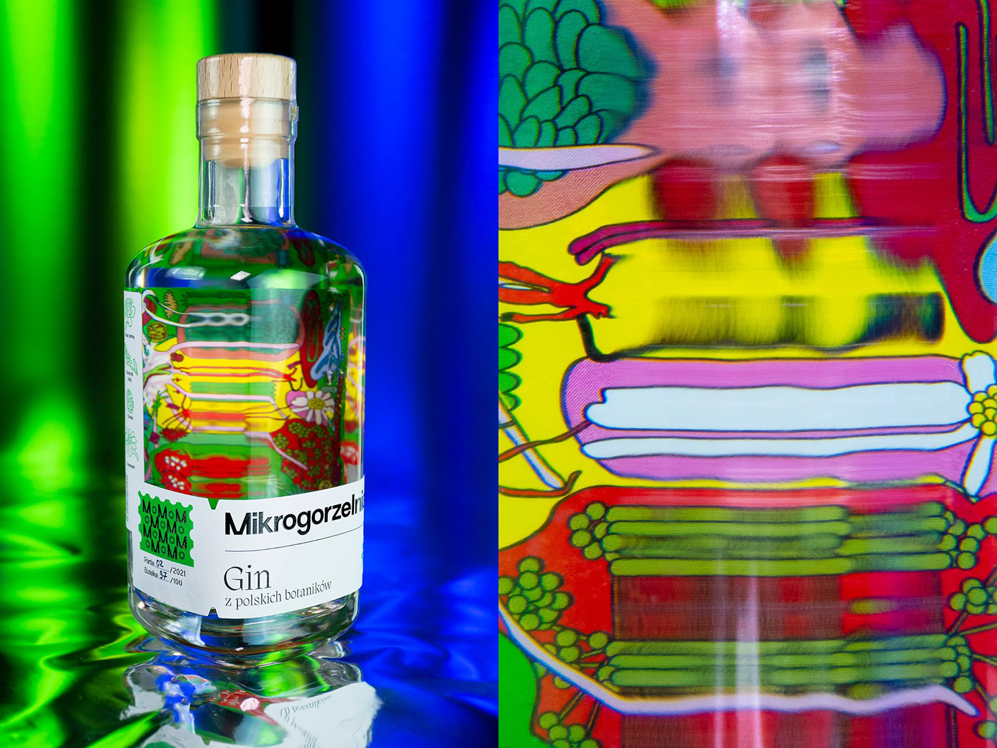
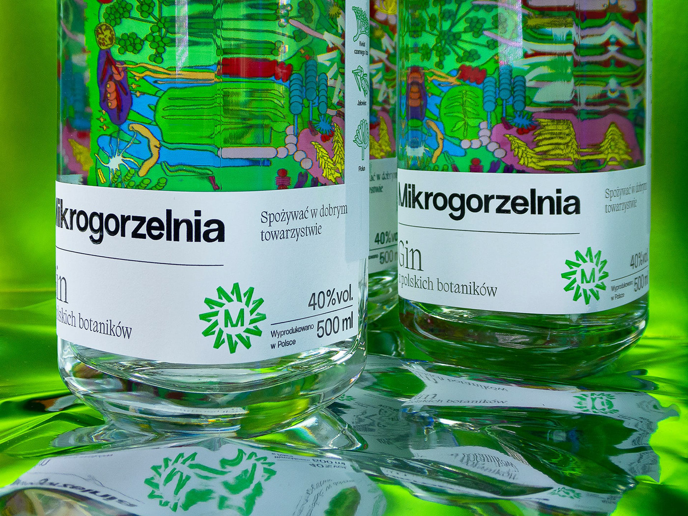
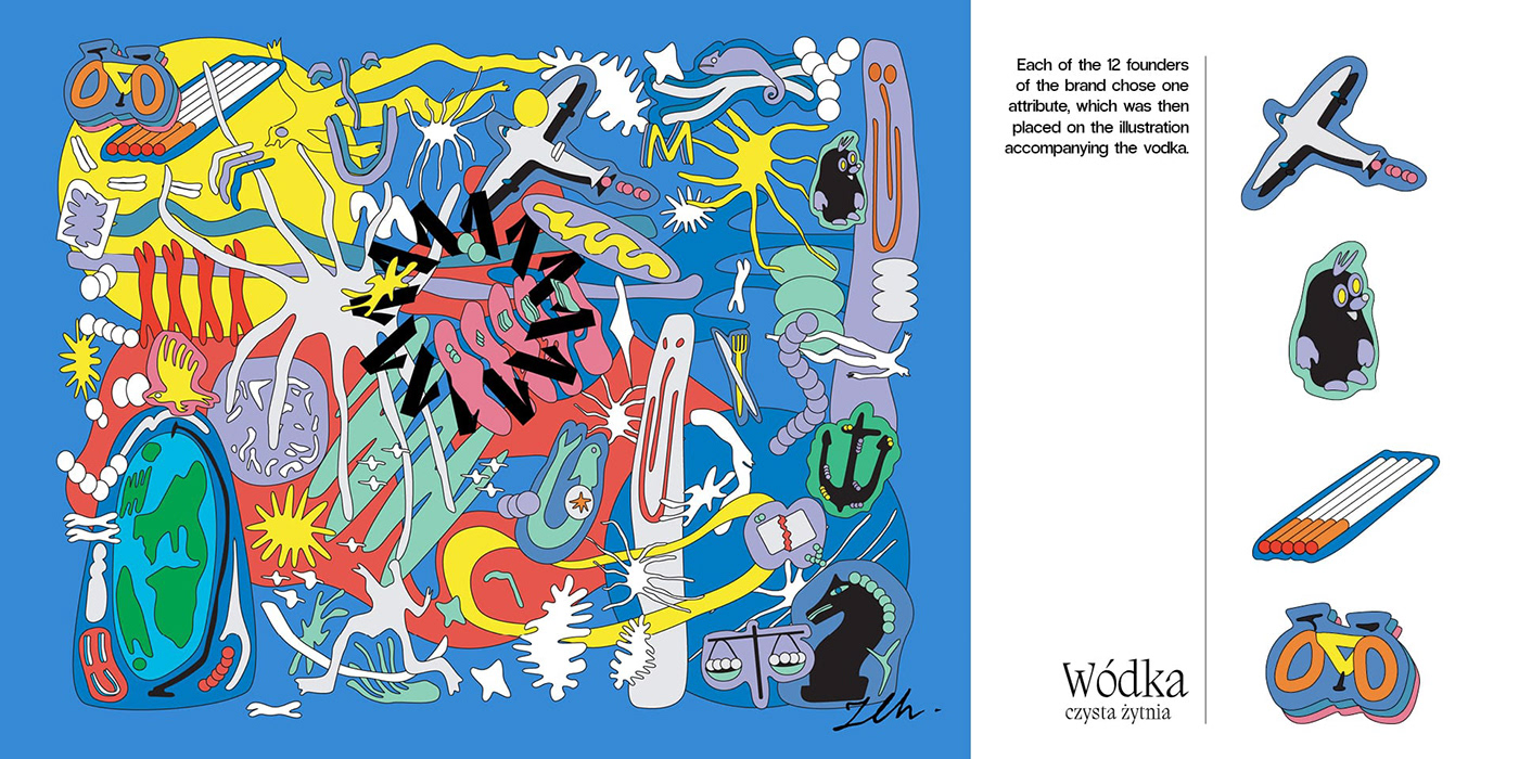
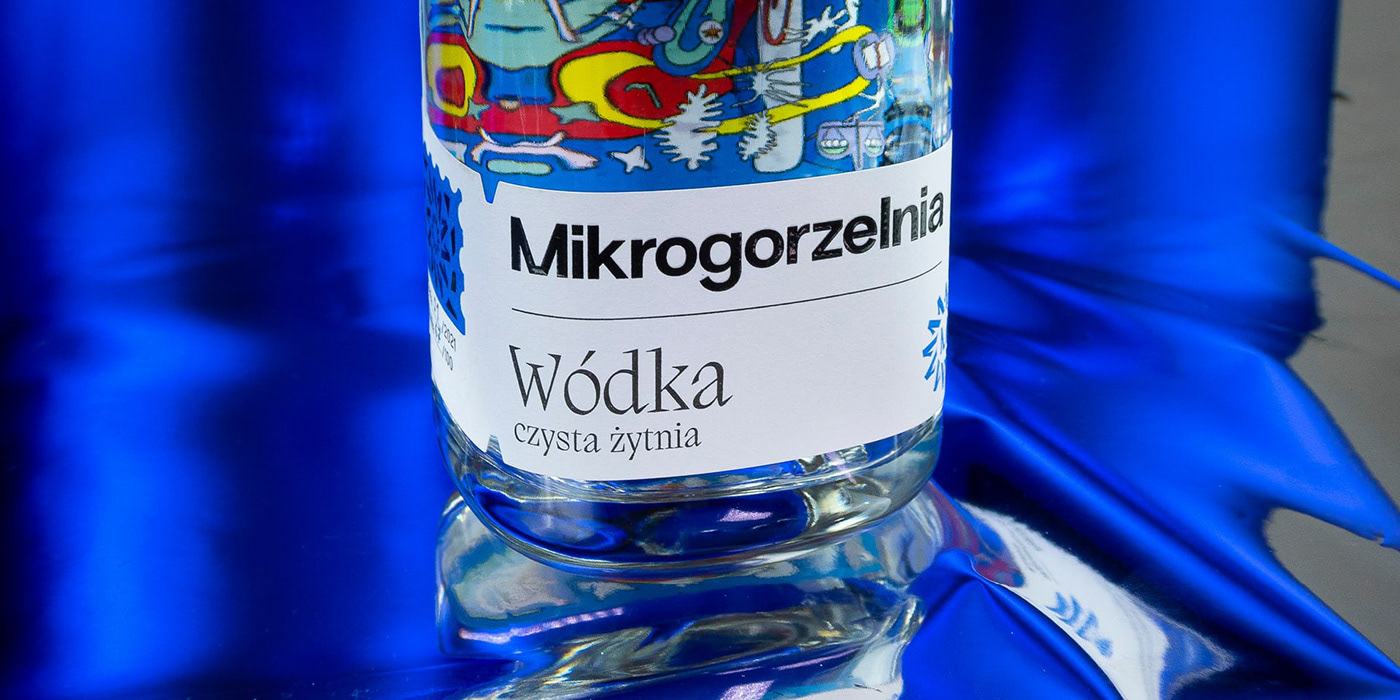
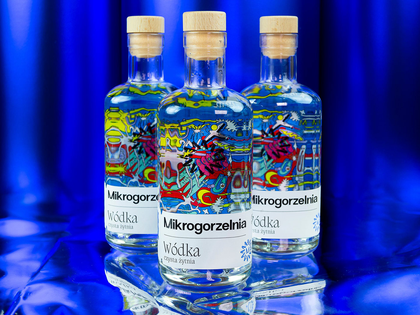
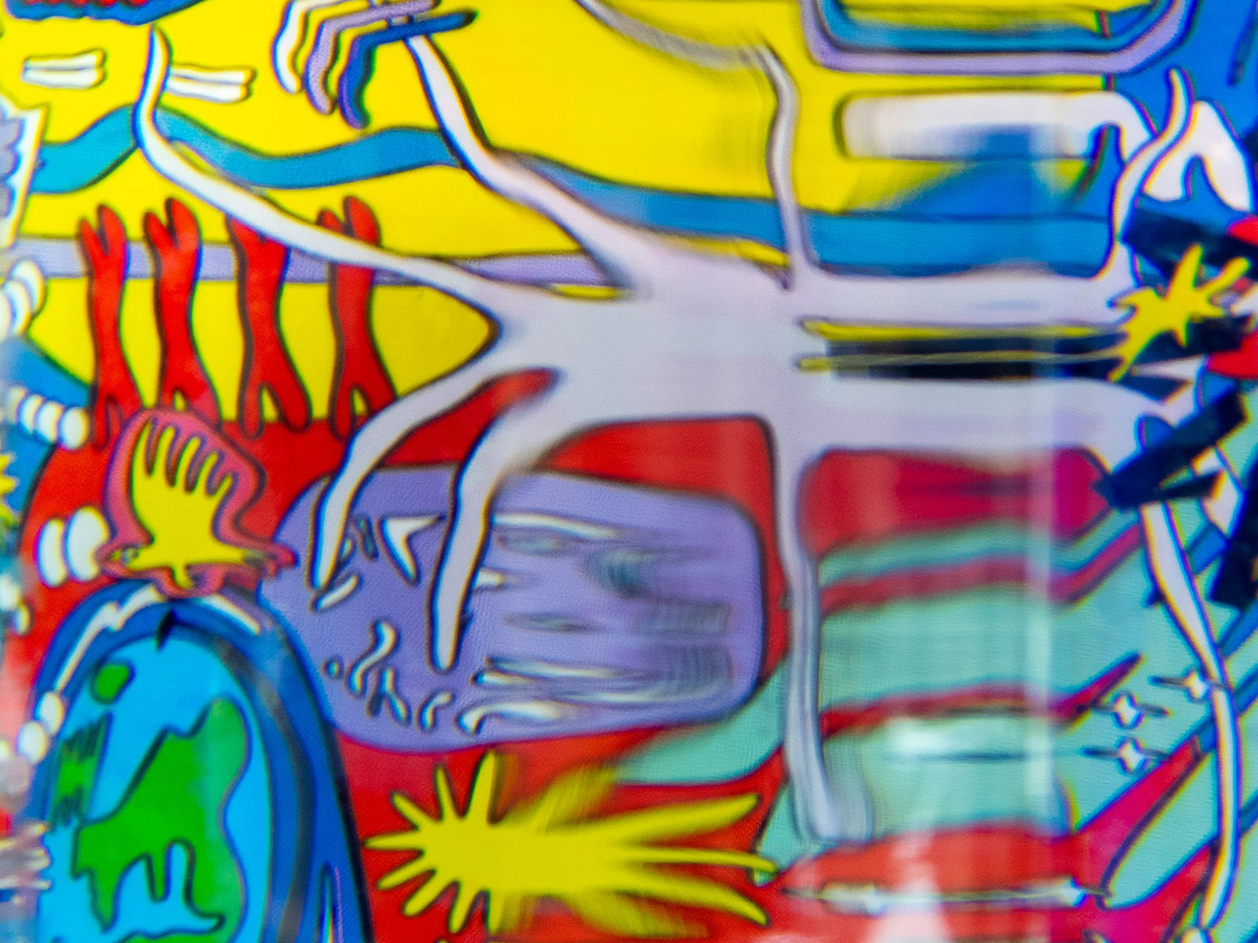
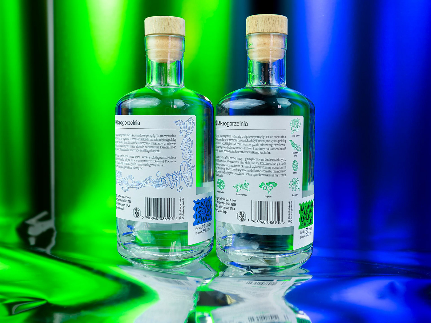
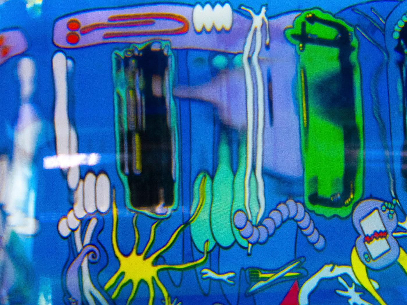
The first two products introduced onto the market by Mikrogorzelnia are pure rye vodka and gin made from Polish botanicals. By emphasizing the visual identity of the brand in the packaging design, we’ve decided to combine a clean, simple front label with a psychedelic illustration inside the bottle. Each of the founders of the brand chose one of the attributes from which the illustration accompanying the vodka was built. The Gin illustration talks about the ingredients. It contains images of all of the 11 Polish botanicals used to create the unique recipe of the spirit.
Each label is hand-numbered and includes a stamp of each series. The packages contain embossed and varnished elements that emphasize the premium character of the brand.


UVMW ©
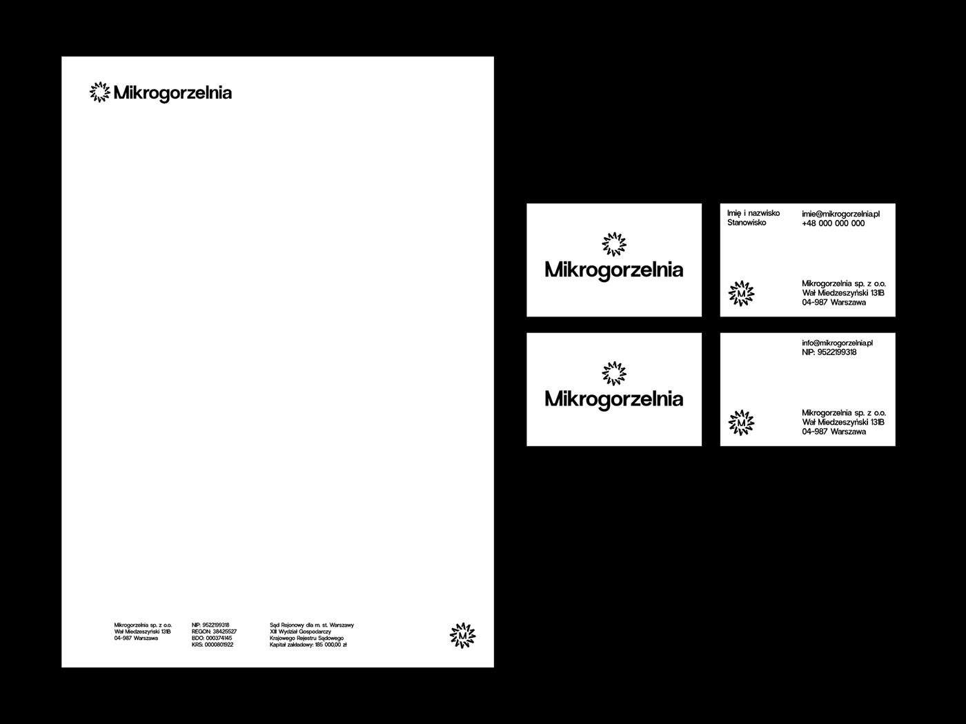
Creative Direction & Design: Robert Mendel, Jacek Walesiak
Illustrations: Zuzanna Charkiewicz
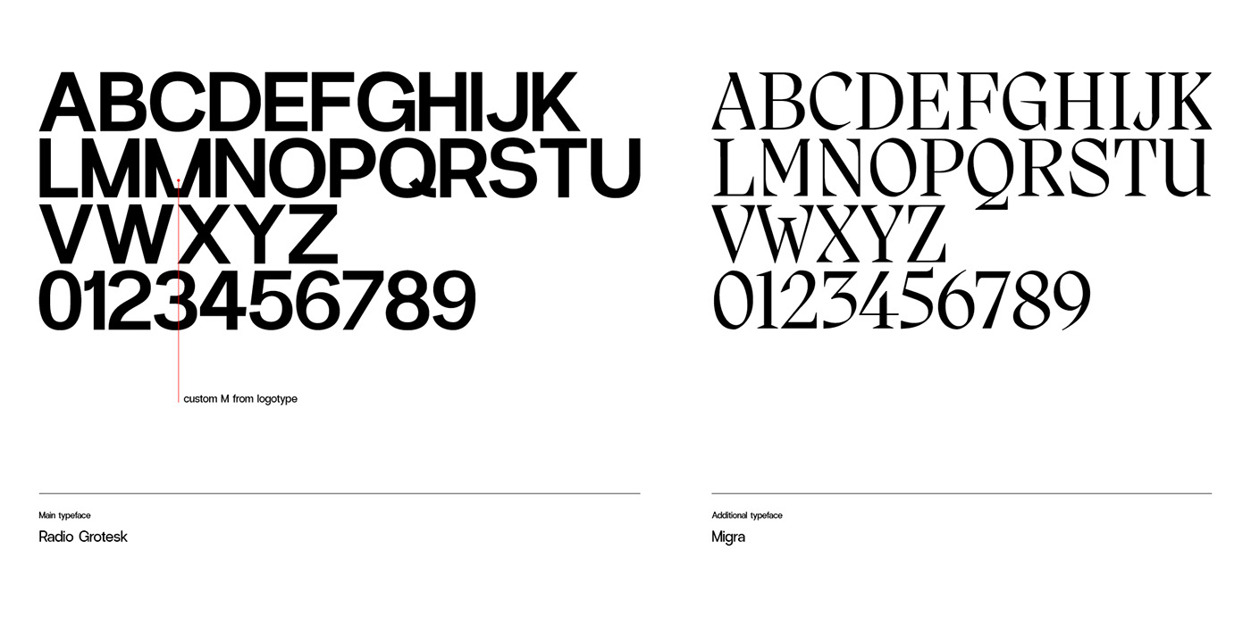
Fonts: Radio Grotesk, Migra (Pangram Pangram)


